Graphic
Milk 75 Honeysticks
-
Pou Auaha / Creative Directors
Anthony Hos, Sarah Melrose -
Pou Rautaki / Strategic Leads
Sarah Melrose, Ben Reid
-
Ringatoi Matua / Design Director
Ethan Lowe -
Kaituhi Matua / Copywriter Leads
Judah Finnigan, Bronwyn Williams
-
Ngā Kaimahi / Team Members
Harriet Campbell, Alyssa Miller, Jemima Christie-Limbrick, Gemma Scott, Josh Daly, Adeline Chua, Jacinta Conza -
Client
Honeysticks
Description:
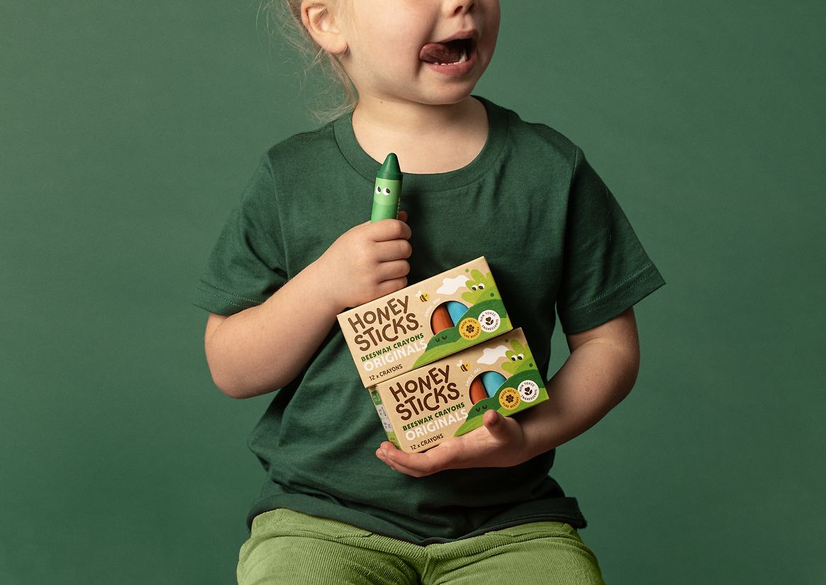
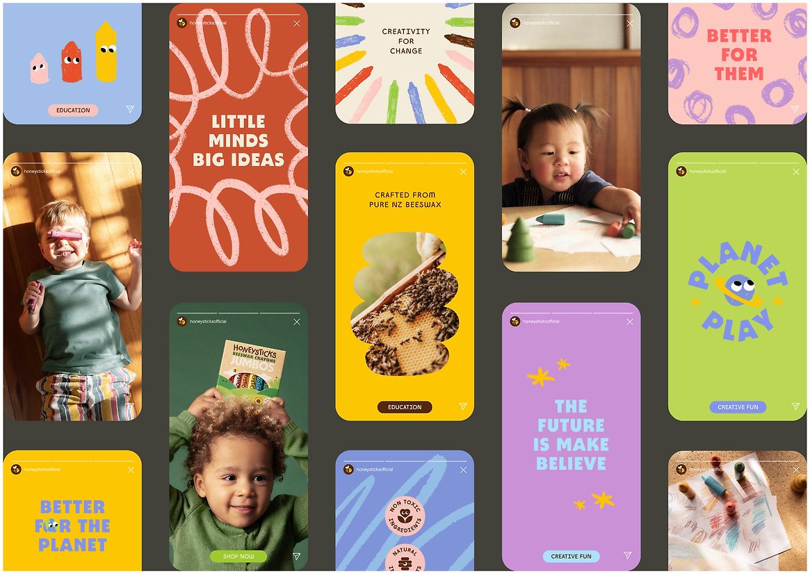
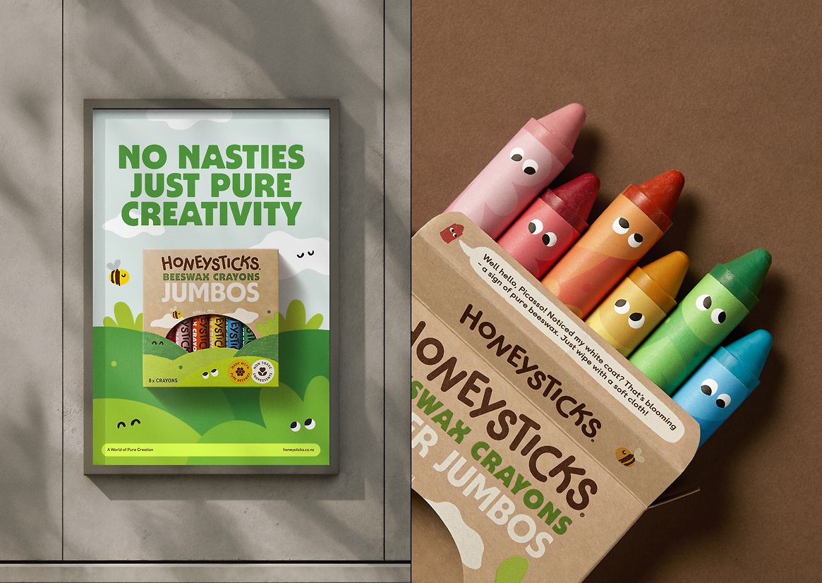
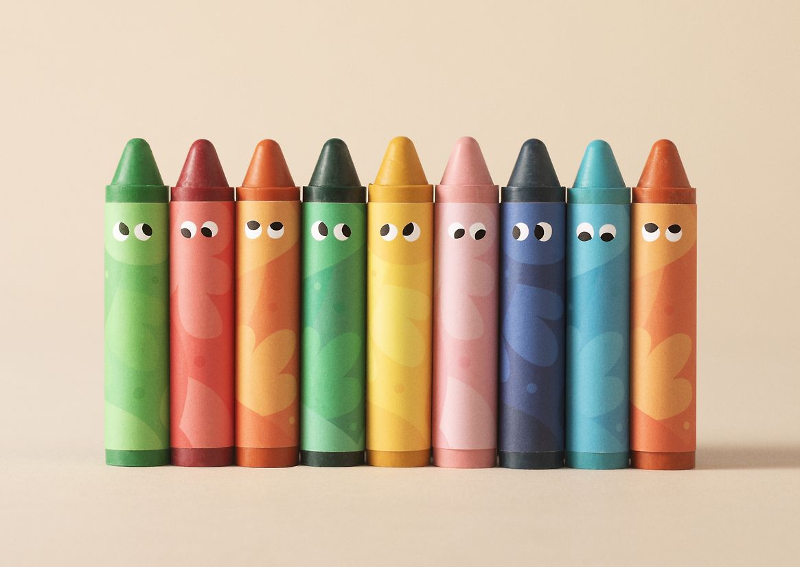
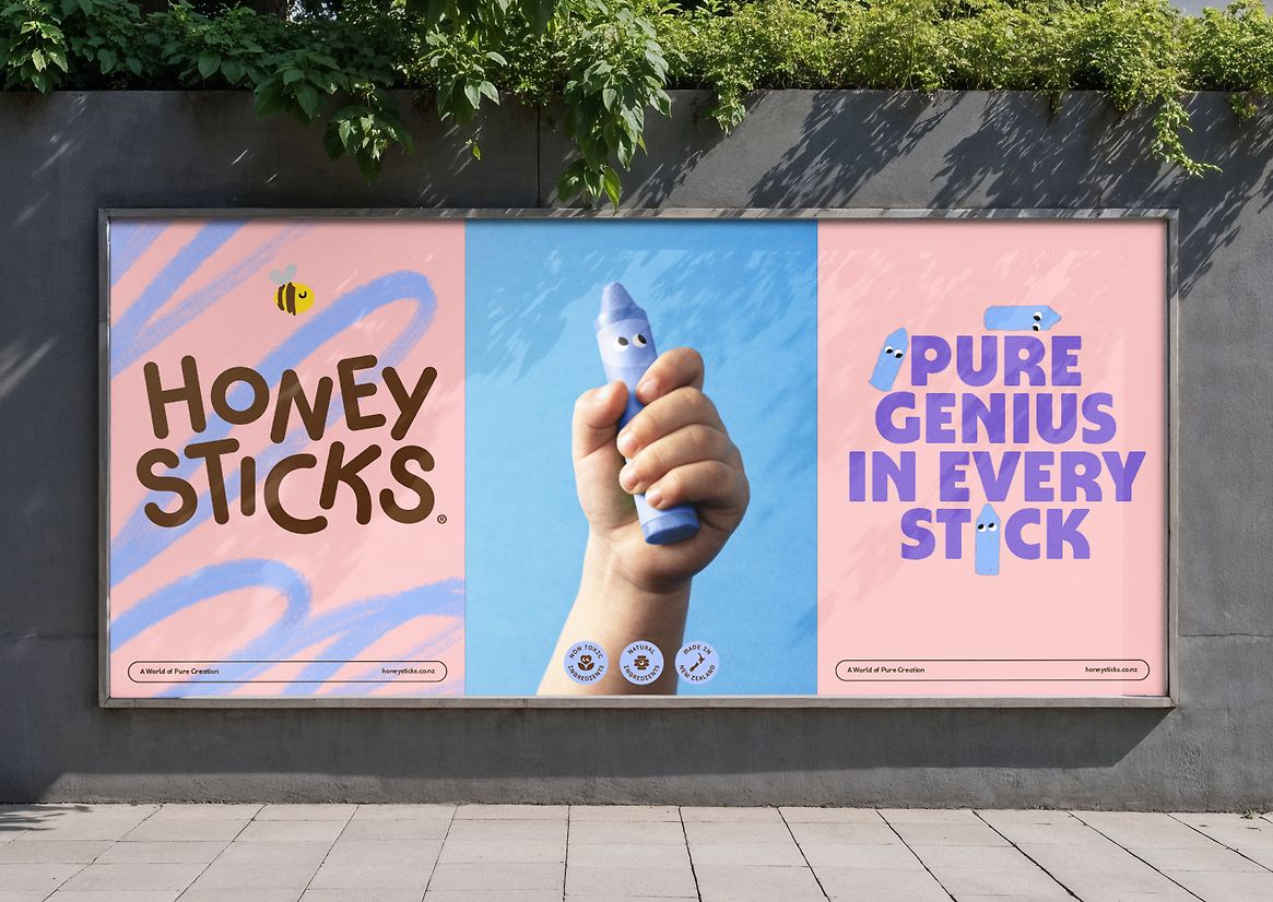
Honeysticks began in Aotearoa New Zealand with a simple goal: to make safer crayons for kids – using 100% natural beeswax and nothing nasty. Backed by NZTE, they’ve since become the #2 crayon brand in the world, second only to petroleum-based giant Crayola. As a crayon brand, a clearly defined approach to colour is essential – after all, a rainbow of possibilities is quite literally what’s being sold. Led by the overarching brand idea “A World of Pure Creation”, we honed in on Honeysticks’ colour ethos – both as a product and as a brand.
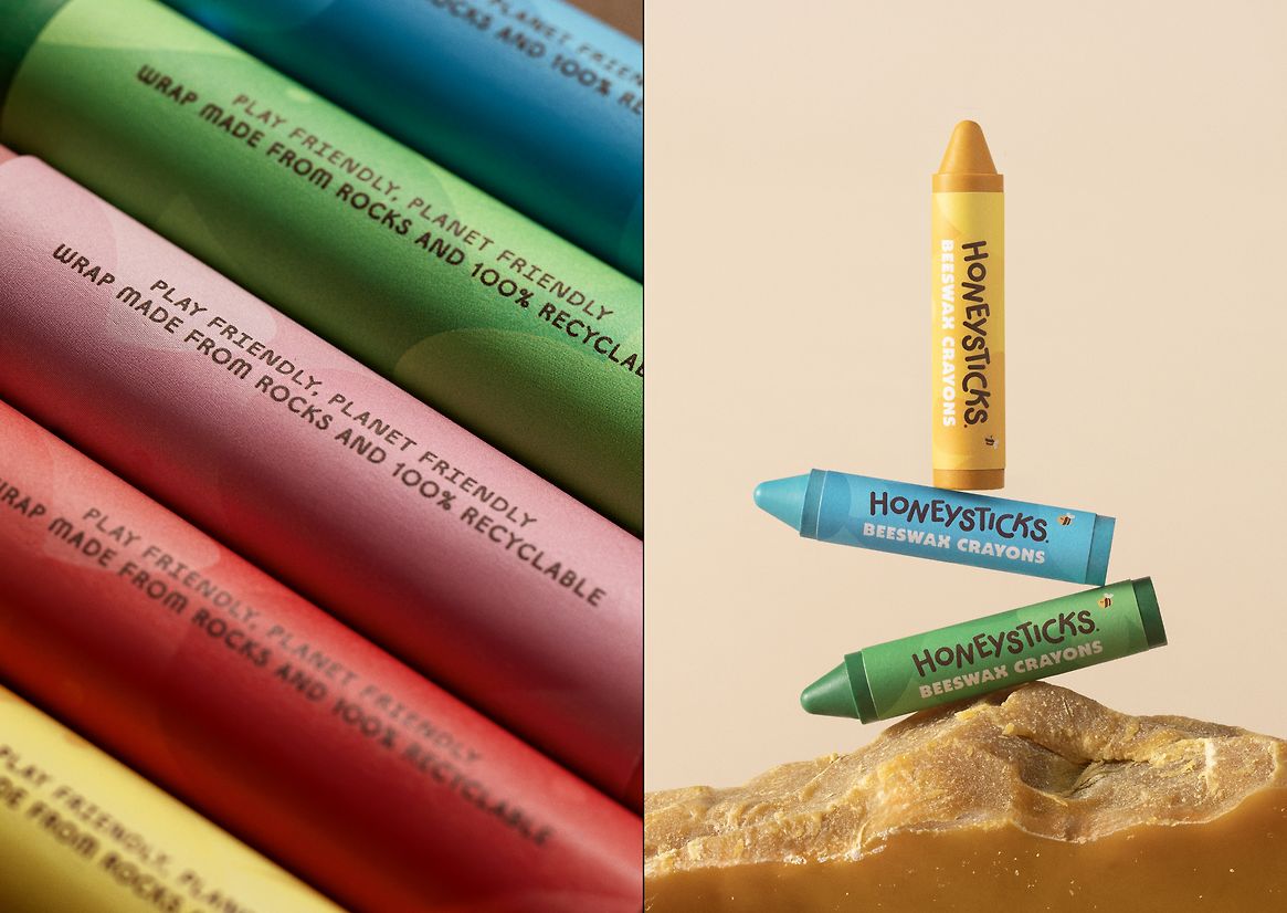
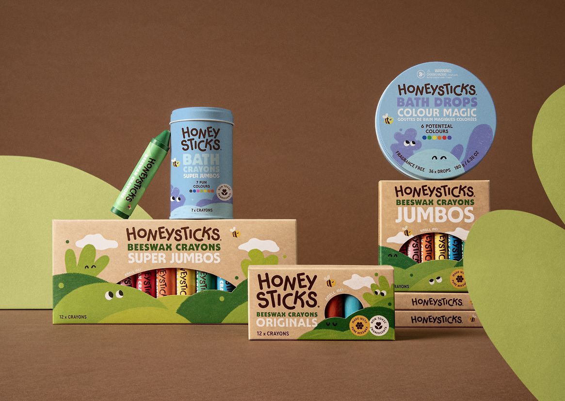
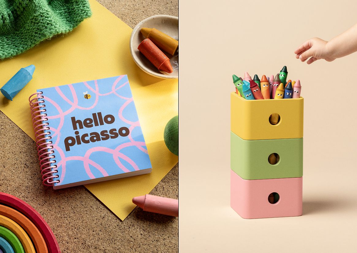
As crayons, Honeysticks come in a full spectrum of natural colours. They stand apart from their synthetic competitors with a unique colouring process, using only natural pigments and food-grade ingredients. It felt important to follow suit, drawing our palette from the crayons themselves and using natural vegetable inks. The result eschews artificial vibrancy in favour of natural tones. For our hero colour, we chose Beeswax Yellow for its clear links to the brand, evoking beeswax, honey, and sunshine. Supported by Mud Brown and Petal Off-White, this earthy trio grounds Honeysticks firmly in the natural world.
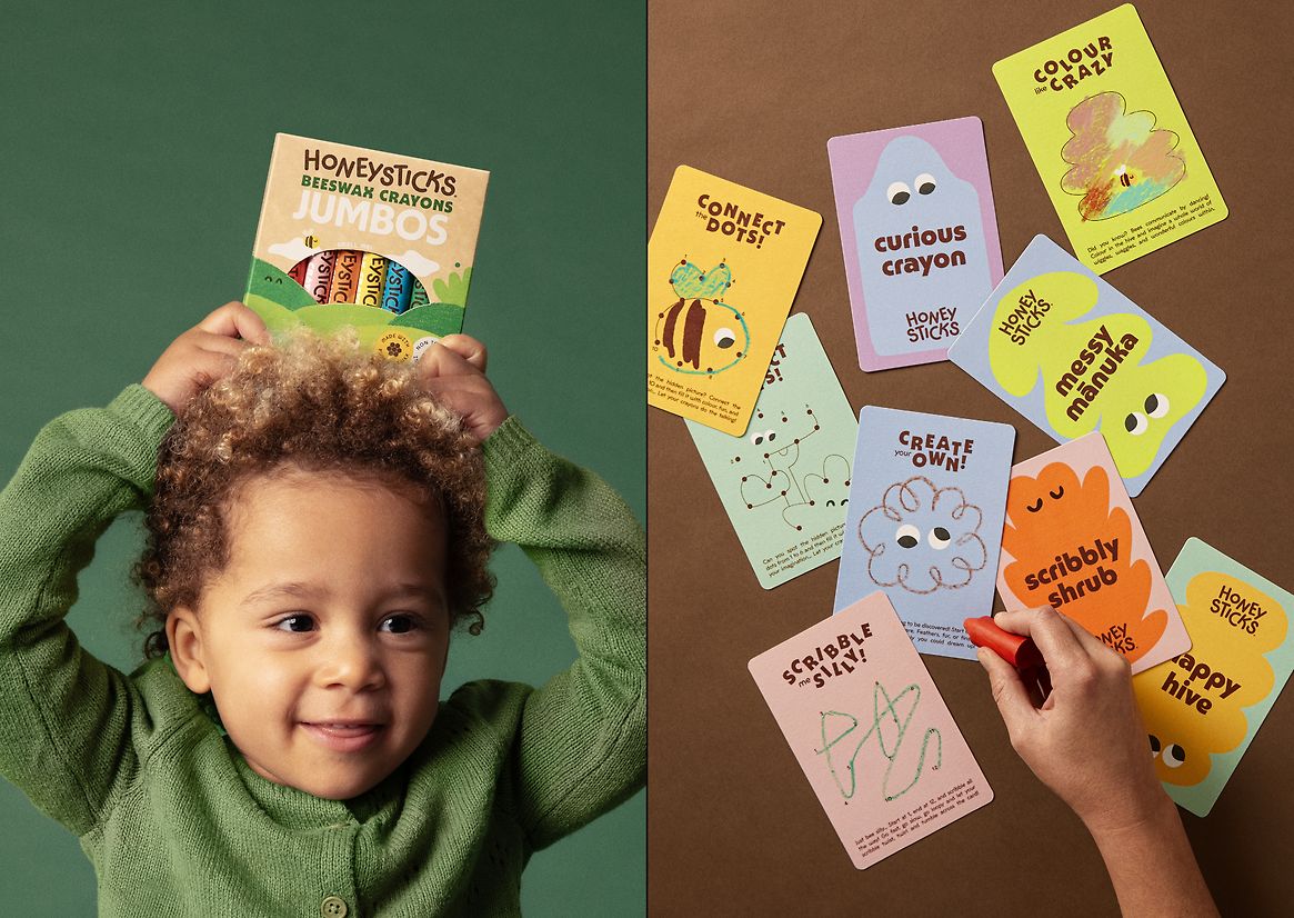
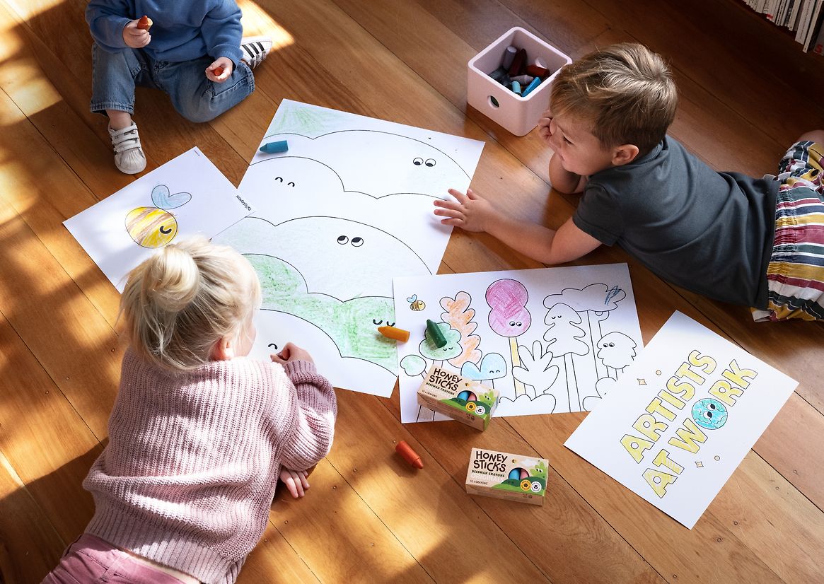
But as a brand, Honeysticks leads with a slightly messier ethos. Their messaging is constantly encouraging kids to splash, scribble and scrawl colour however they see fit. Shouldn’t we follow the same advice? As such, we decided to channel our inner toddler. We championed clashing colour combos and scribbly textures. We ruled out safe palettes and set rules. We embraced pure creation, where it’s always OK to colour outside the lines. The result is a world rich with imaginative illustration, playful pairings, and opportunities for each colour to seize their moment.
For Honeysticks, colour represents more than aesthetic. It’s a philosophy – both a creative call to action and a conscious promise to the next generation. At once anarchic and authentic, the Honeysticks approach to colour is one where self-expression comes naturally.