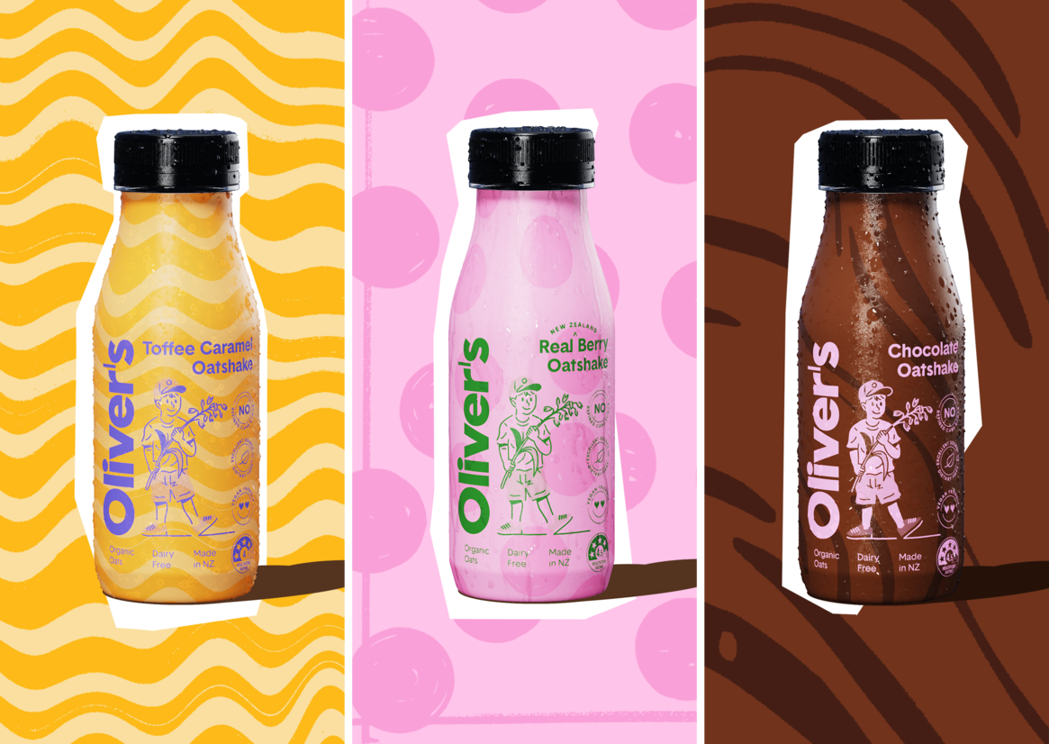
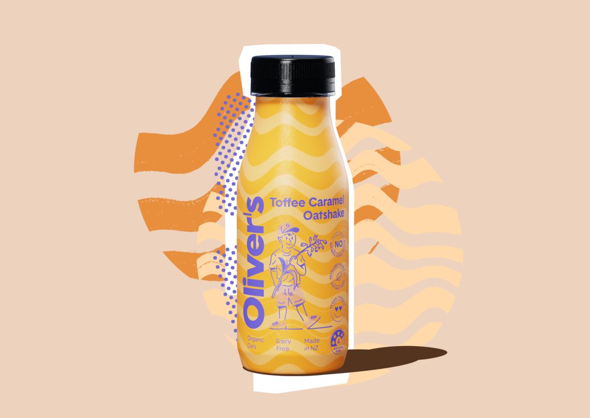
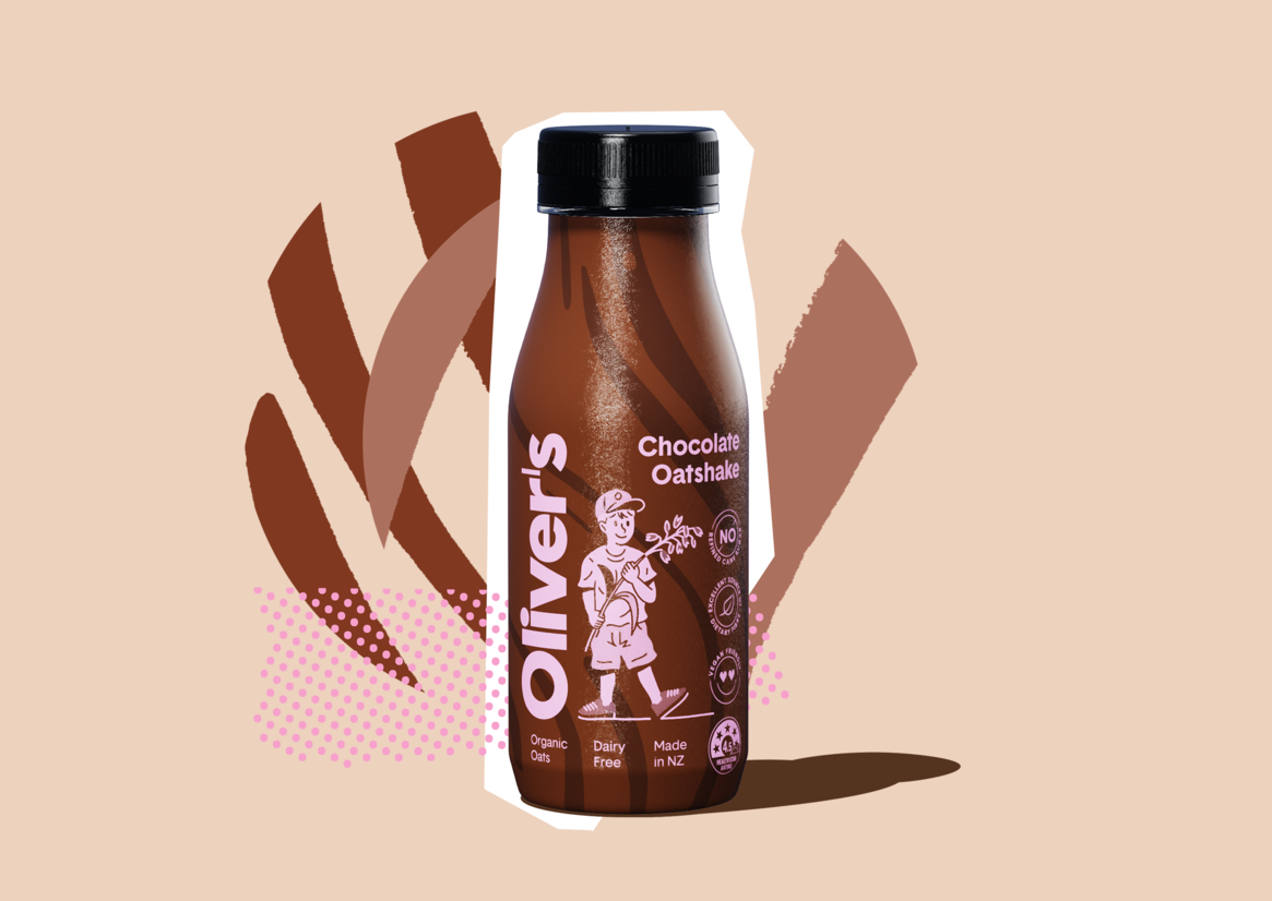
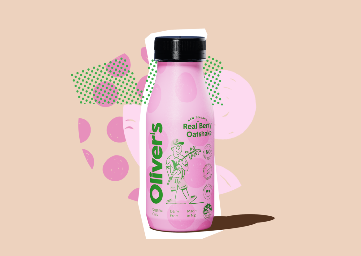
Oliver’s Oatshakes are a new product within a somewhat new category — a functional, plant-based “milk” drink made with organic oats and natural flavours, including Toffee Caramel, Real Berry, and the staple favourite, Chocolate.
The humble shake is traditionally associated with ‘dairy’ - not just in the cow’s milk sense but also in childhood memories of skipping down to the local corner dairy for the ‘longest drink in town’. How could we introduce a new offering that would appeal to the dairy-free curious and plant-based alike, while still retaining the playful nostalgia of the classic shake?
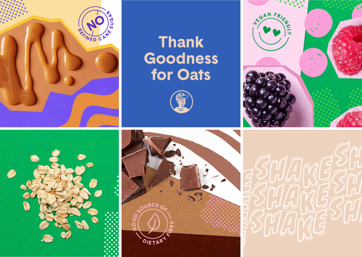
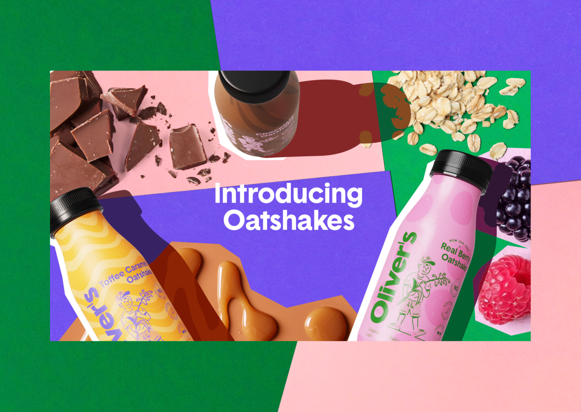
We created a packaging-led design system, interpreting the characteristics of each flavour through expressive colour that allowed us to communicate ‘wholesome’ without relying on old tropes of milk splashing in a glass in front of a farmscape backdrop. Each flavour employs familiar colour cues – in this case, butterscotch yellows, berry pinks and velvety browns – yet these are countered with unexpected and curious secondary colours to create a unique attire for each flavour.
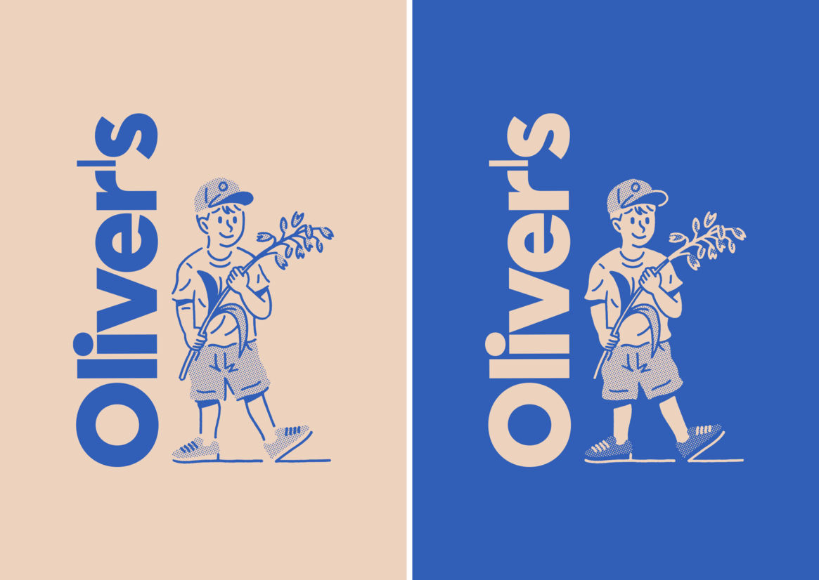
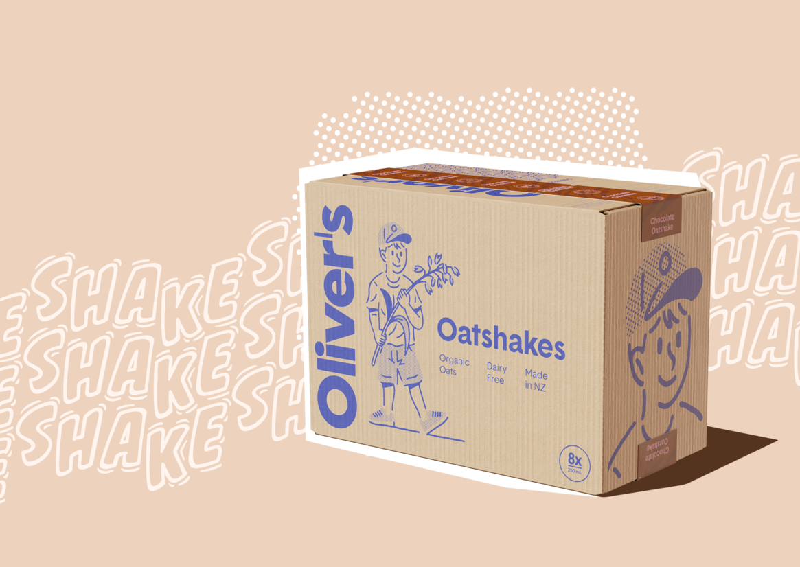
Across the wider brand identity the packaging colours are supported by foundation tones of nostalgic blue and creamy oat milk – the latter a warm and modern neutral that anchors the palette while providing a visual cue of the product’s hero ingredient.
Together the final result is a cohesive palette that balances the freshness of a new offering with a wholesome, youthful appeal, creating a look and feel to delight the discerning shake lover of all ages and dietary faiths.
Description:
Oliver’s Oatshakes are a new product within a somewhat new category — a functional, plant-based “milk” drink made with organic oats and natural flavours, including Toffee Caramel, Real Berry, and the staple favourite, Chocolate.
The humble shake is traditionally associated with ‘dairy’ - not just in the cow’s milk sense but also in childhood memories of skipping down to the local corner dairy for the ‘longest drink in town’. How could we introduce a new offering that would appeal to the dairy-free curious and plant-based alike, while still retaining the playful nostalgia of the classic shake?
We created a packaging-led design system, interpreting the characteristics of each flavour through expressive colour that allowed us to communicate ‘wholesome’ without relying on old tropes of milk splashing in a glass in front of a farmscape backdrop. Each flavour employs familiar colour cues – in this case, butterscotch yellows, berry pinks and velvety browns – yet these are countered with unexpected and curious secondary colours to create a unique attire for each flavour.
Across the wider brand identity the packaging colours are supported by foundation tones of nostalgic blue and creamy oat milk – the latter a warm and modern neutral that anchors the palette while providing a visual cue of the product’s hero ingredient.
Together the final result is a cohesive palette that balances the freshness of a new offering with a wholesome, youthful appeal, creating a look and feel to delight the discerning shake lover of all ages and dietary faiths.