Graphic
Inhouse 78 Dicey
-
Pou Auaha / Creative Director
Arch MacDonnell
-
Ringatoi Matua / Design Director
Toby Curnow
-
Ngā Kaimahi / Team Members
Arch MacDonnell, Toby Curnow, Alexandra Turner, Alistair McCready -
Kaitautoko / Contributors
Odelle Morshuis, Morevn McAuley, Courteney Peters, Tim Hawkins -
Client
Dicey
Description:
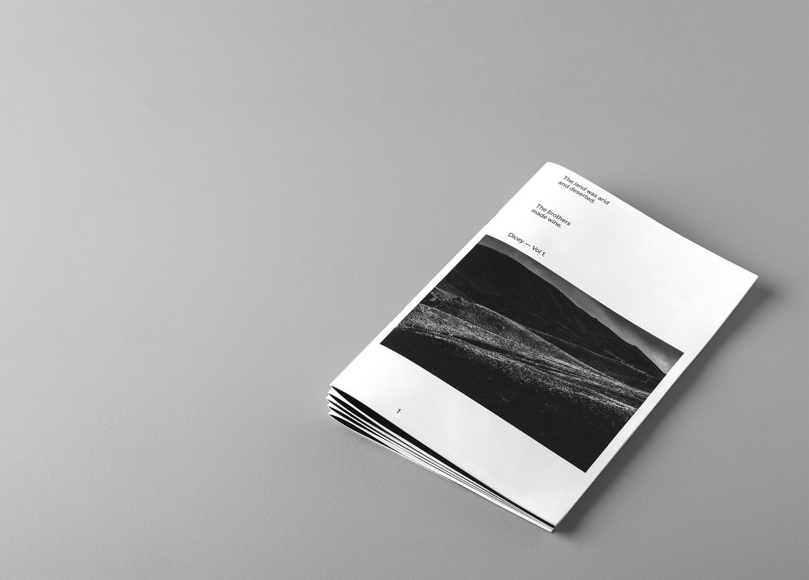
Dicey:
Unpredictable and potentially dangerous.
An apt description of wine-making on this land.
Dicey;
Two brothers.
Two neighbours.
Two forces in harmony and opposition.
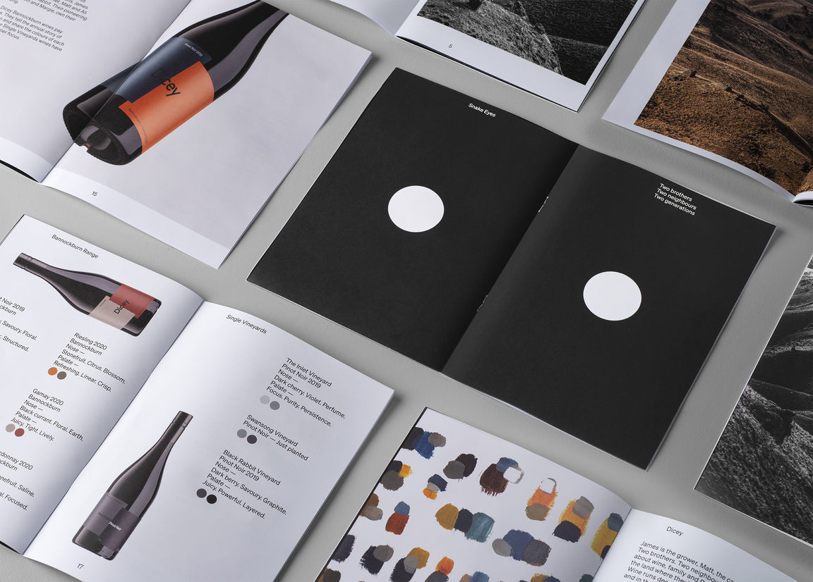
Snake Eyes.
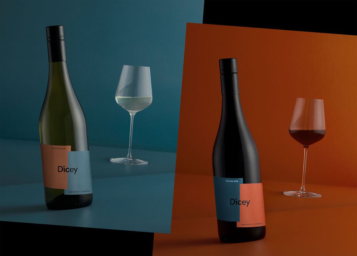
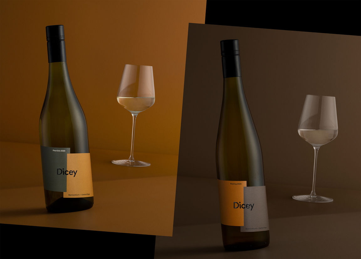
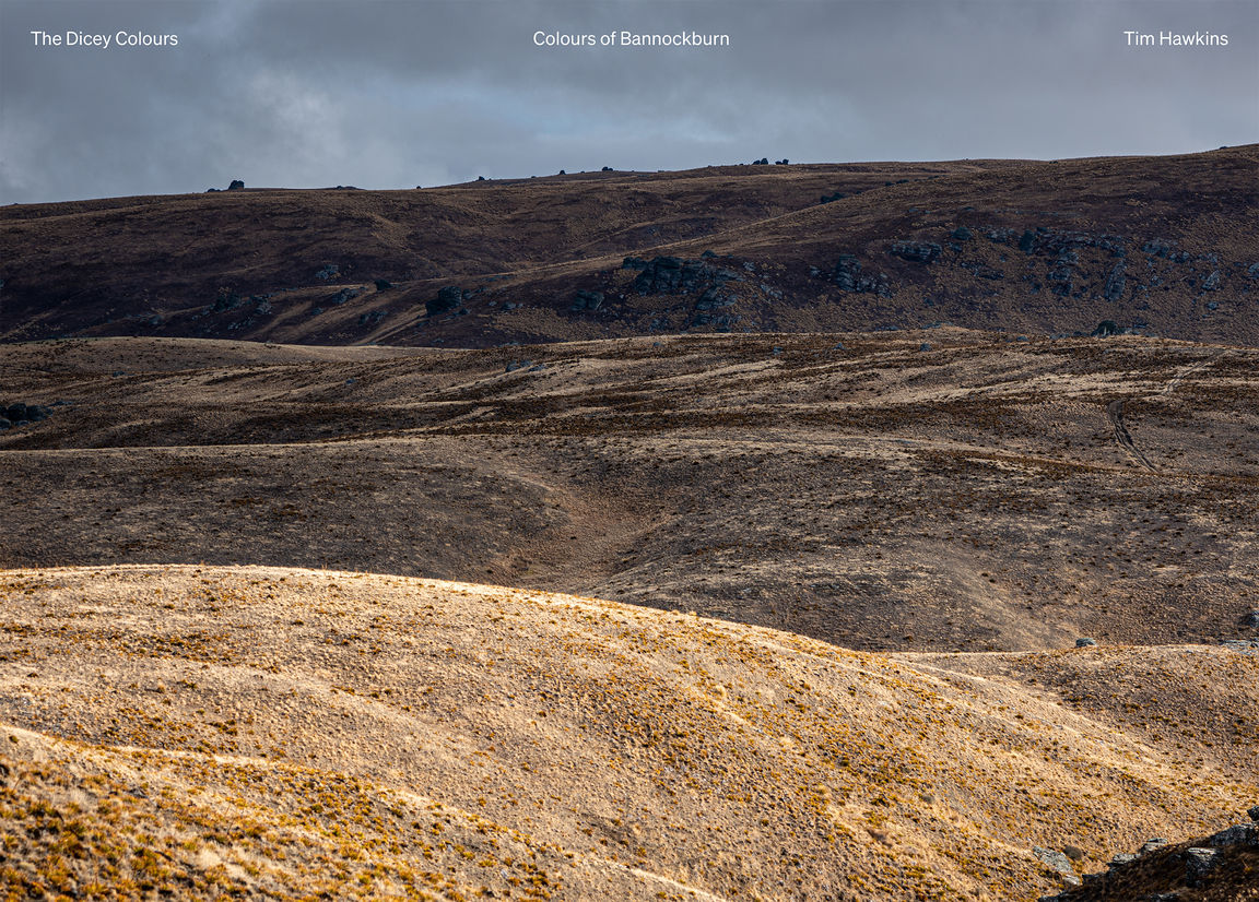
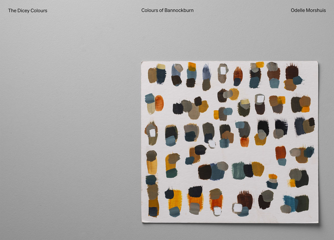
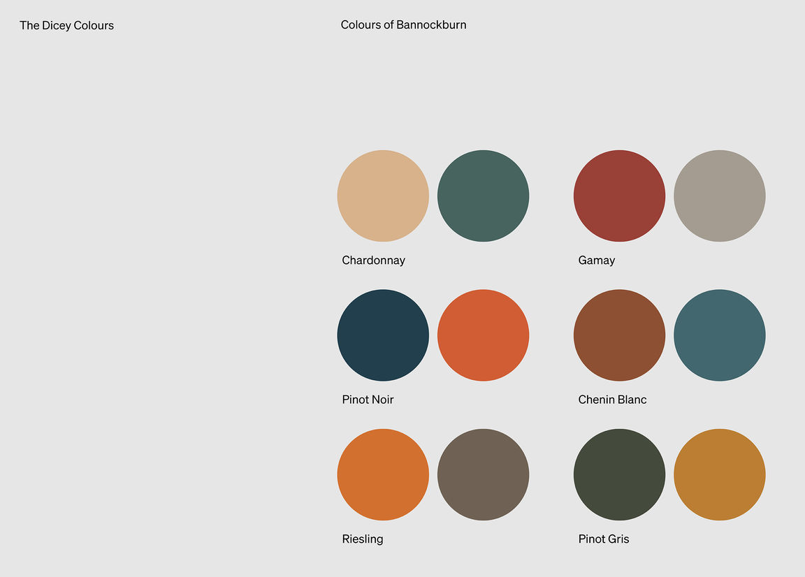
On first approach, Bannockburn seems brown but it’s cut by a myriad of colours. James Dicey's partner Odelle, an artist, captured the palette — to share what can be seen when you know the land. These colours inform the language of Dicey. The brothers wanted a label that told their story in all its complexity. Something that captured the essence of collaboration and conflict, struggle and reward, work and play, family, and rocky ground.
“Make it simple,” they said. The design approach finds a connection with Odelle’s coloured brush strokes and the pleasing strike the landscape provides with its severity. There’s a playfulness about the name Dicey too. The very idea of making wine in a place like that.