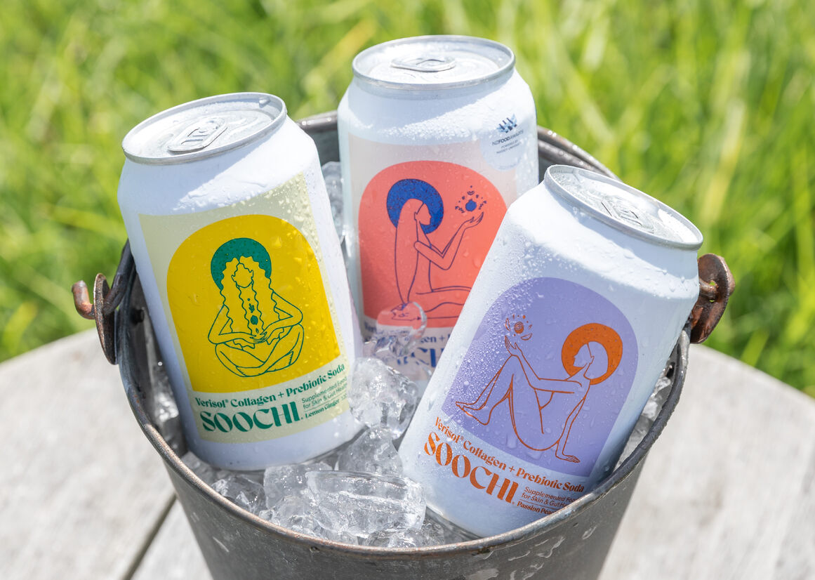
Soochi drinks merge the science of nature, taste and innovation to deliver on functional benefits for the skin, body and mind. With added collagen, vitamins and prebiotics, Soochi was created to fill a gap in the market for a refreshing, yet functional supplement drink that didn’t compromise on taste.
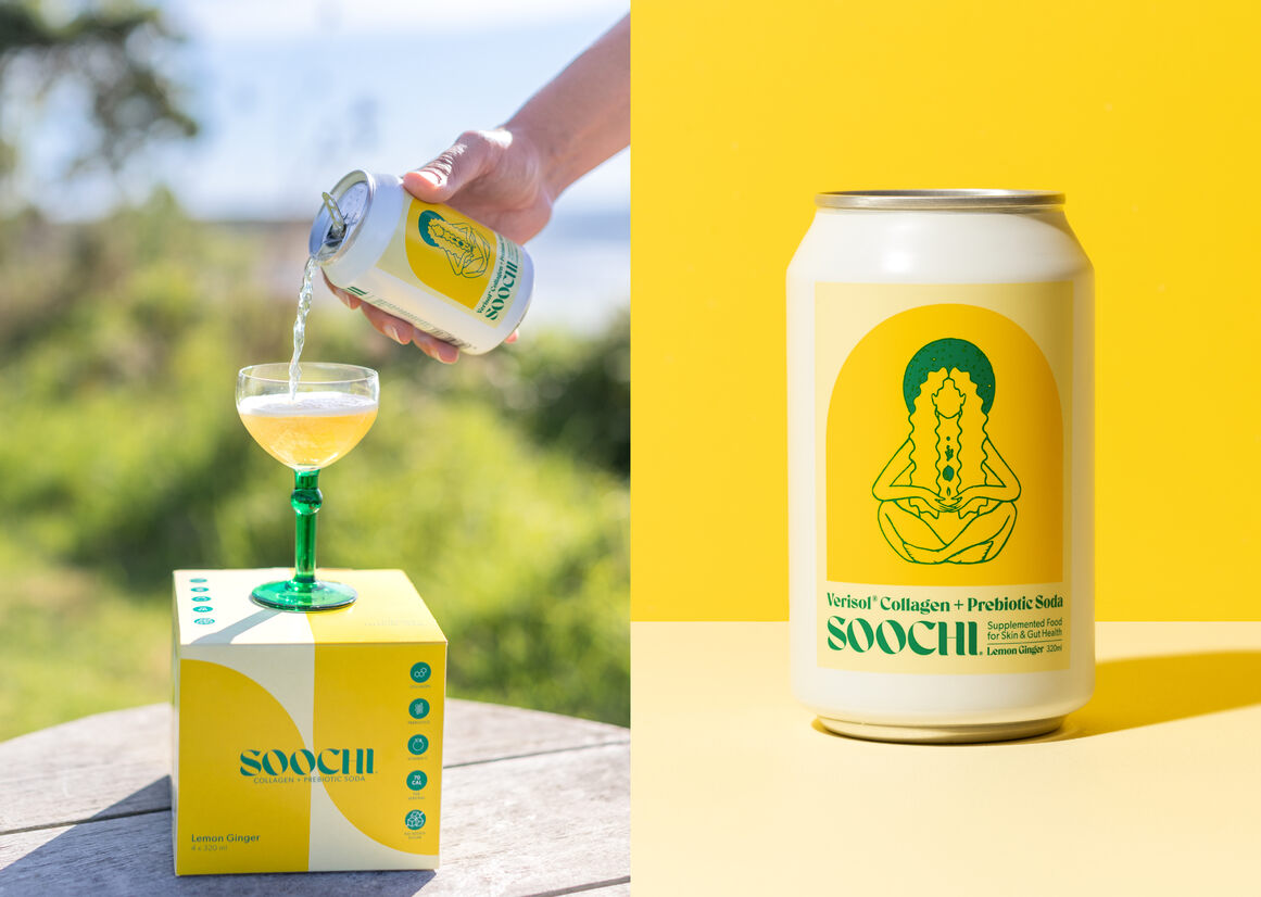
Soochi is a unique category of beverage – it sits on the shelf space between 'food and beauty supplement', so it posed an interesting brief as an entirely new product. Unlike other canned beverages it was important to create a packaging design that didn’t follow the typical norms of fruit drinks, alcoholic mixer labels or experimental craft beer; neither adhering to the commonly used minimalist aesthetic of cosmetics. As Soochi is its own ‘drink genre’ there were many possibilities to play with and the opportunity to create a very different packaging design with a striking colour palette.
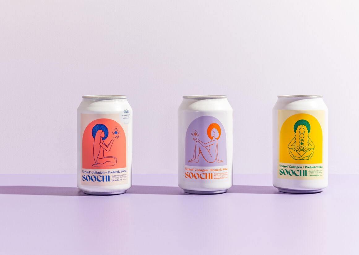
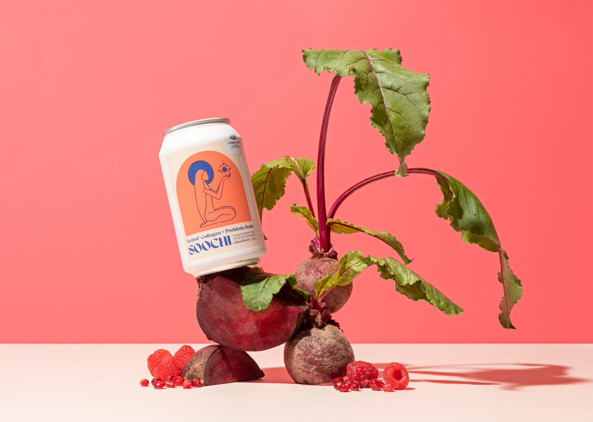
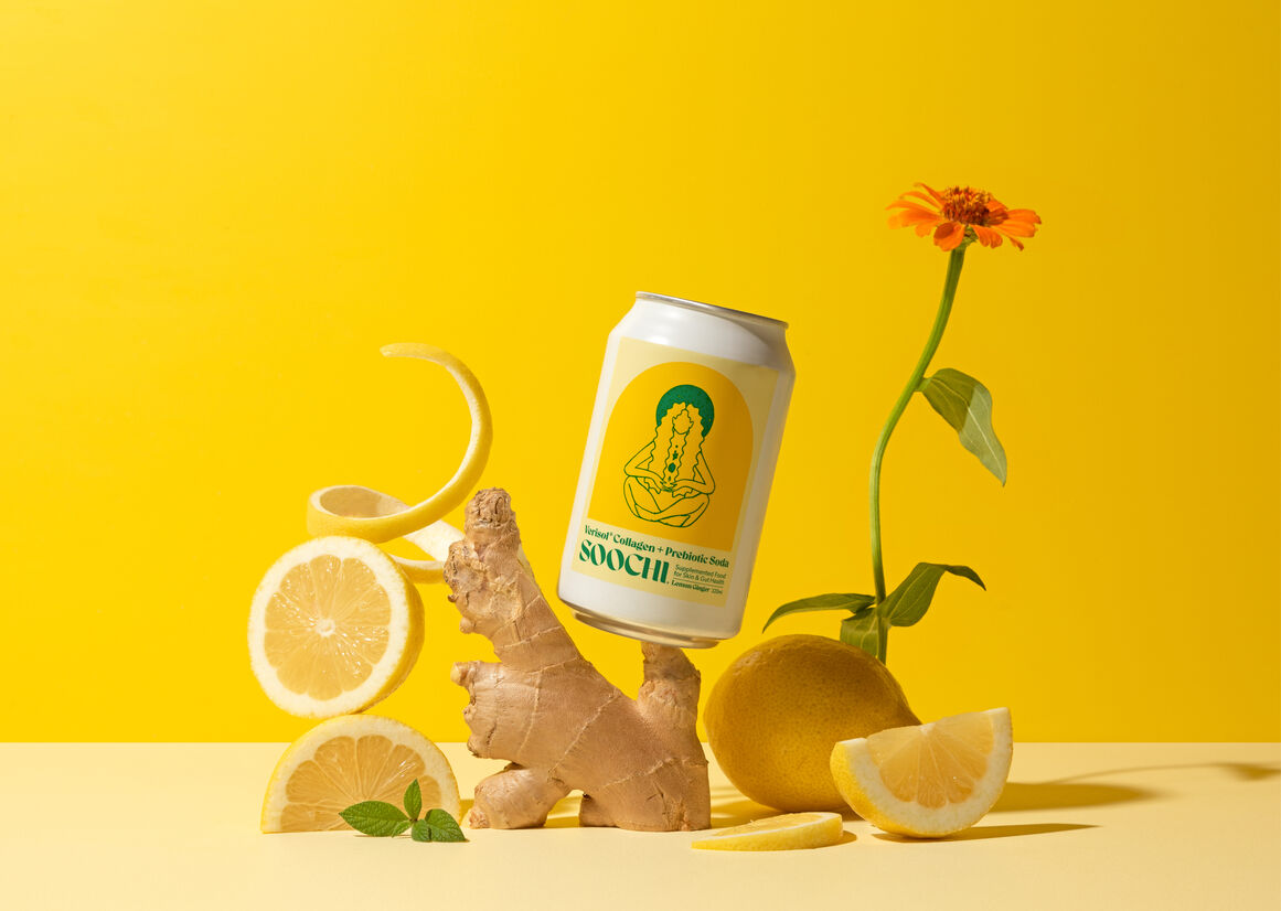
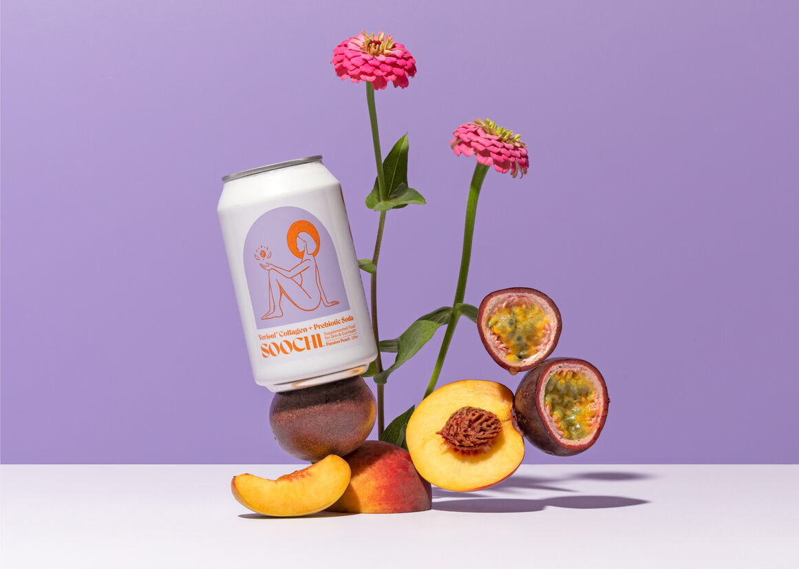
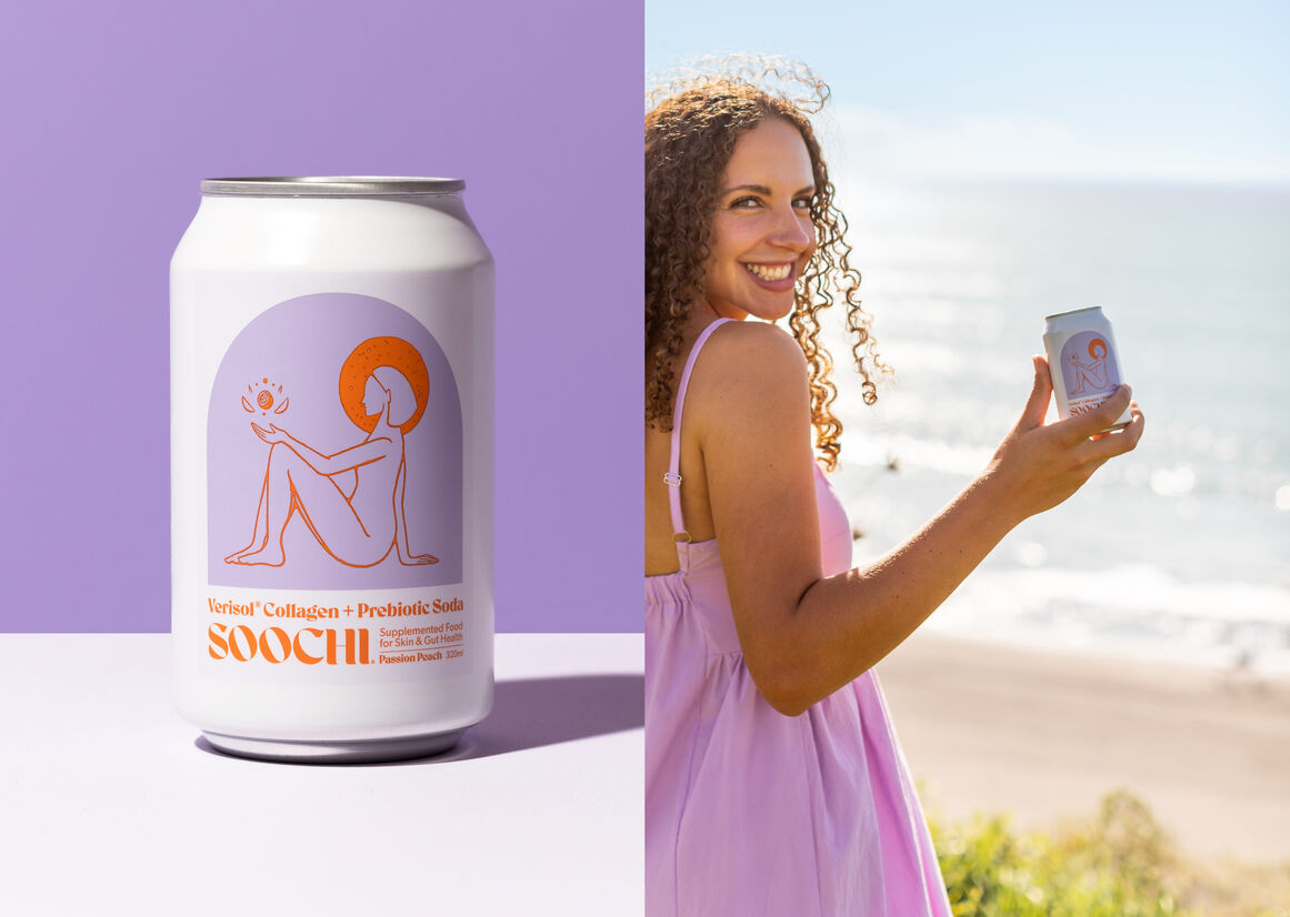
The brand name itself created a path to the colour choices. Pronounced 'Soo-chee'; 'Soochi' is derived from the Latin word 'Suci' which means juice - commonly known as the 'nectar of life'. Interpreting this into the design, the colour palette needed to communicate this idea of 'sweetness', 'elixir' and vitality, hence the design decision to work with brighter, warm palettes for the packaging and branding and contrasting the illustrations against these tones. Each colour is chosen to reflect the actual ingredients and the colours of the drink when poured. A different ‘Soochi Woman’ was created for each of the three flavours -anonymous in the sense she is ‘any woman’ but representing all women. This Soochi woman is housed inside a bright arched shape (a shape synonymous as a symbol for rebirth and fitting for the drink's skin renewal aspects), and honours the ‘fruits of wellness’ providing a visual hint to each flavour’s natural fruit ingredients.
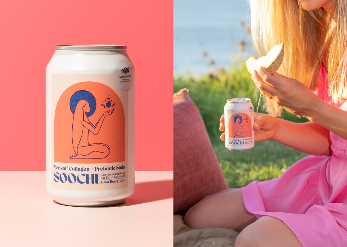
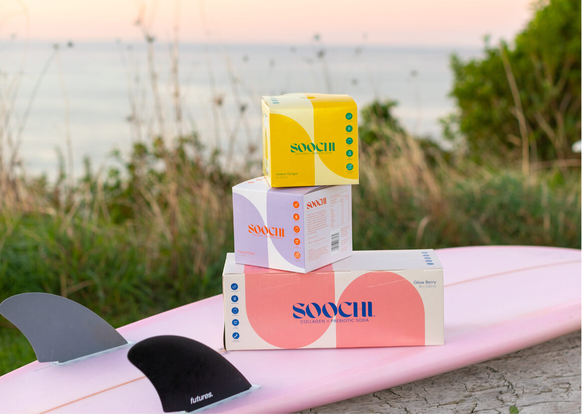
Each can uses a clear three colour palette and are easily visually distinguishable from one another, yet harmonious as a set of three. The elegant design elevates Soochi to the health and brand launch drink of choice, being used in a number of fashion events, openings and proudly displayed in cafes, boutiques, yoga studios, supermarkets and health stores around New Zealand.
Description:
Soochi drinks merge the science of nature, taste and innovation to deliver on functional benefits for the skin, body and mind. With added collagen, vitamins and prebiotics, Soochi was created to fill a gap in the market for a refreshing, yet functional supplement drink that didn’t compromise on taste.
Soochi is a unique category of beverage – it sits on the shelf space between 'food and beauty supplement', so it posed an interesting brief as an entirely new product. Unlike other canned beverages it was important to create a packaging design that didn’t follow the typical norms of fruit drinks, alcoholic mixer labels or experimental craft beer; neither adhering to the commonly used minimalist aesthetic of cosmetics. As Soochi is its own ‘drink genre’ there were many possibilities to play with and the opportunity to create a very different packaging design with a striking colour palette.
The brand name itself created a path to the colour choices. Pronounced 'Soo-chee'; 'Soochi' is derived from the Latin word 'Suci' which means juice - commonly known as the 'nectar of life'. Interpreting this into the design, the colour palette needed to communicate this idea of 'sweetness', 'elixir' and vitality, hence the design decision to work with brighter, warm palettes for the packaging and branding and contrasting the illustrations against these tones. Each colour is chosen to reflect the actual ingredients and the colours of the drink when poured. A different ‘Soochi Woman’ was created for each of the three flavours -anonymous in the sense she is ‘any woman’ but representing all women. This Soochi woman is housed inside a bright arched shape (a shape synonymous as a symbol for rebirth and fitting for the drink's skin renewal aspects), and honours the ‘fruits of wellness’ providing a visual hint to each flavour’s natural fruit ingredients.
Each can uses a clear three colour palette and are easily visually distinguishable from one another, yet harmonious as a set of three. The elegant design elevates Soochi to the health and brand launch drink of choice, being used in a number of fashion events, openings and proudly displayed in cafes, boutiques, yoga studios, supermarkets and health stores around New Zealand.