Thomas Casey, Courtney Burchell, Jason Tiller, Charlotte Lowe
Client
Pepler's
Description:
The Why
The catalyst for exploring a new brand for Pepler's was driven by insights from new ownership and market research, aimed at bridging the gap between the high quality of their products and the existing brand representation. Recognising that the product value far exceeded the brand value, the new owners paused new product development to focus on redesigning labels that would better reflect product quality. The previous design, characterised by an outdated silver fern and glossy labels, failed to resonate with customers and felt misaligned with the brand’s premium offerings.
The Idea
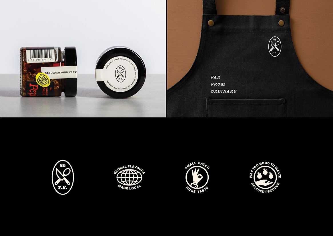
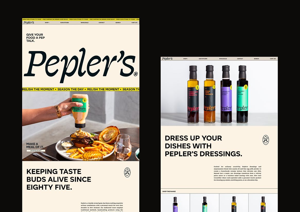
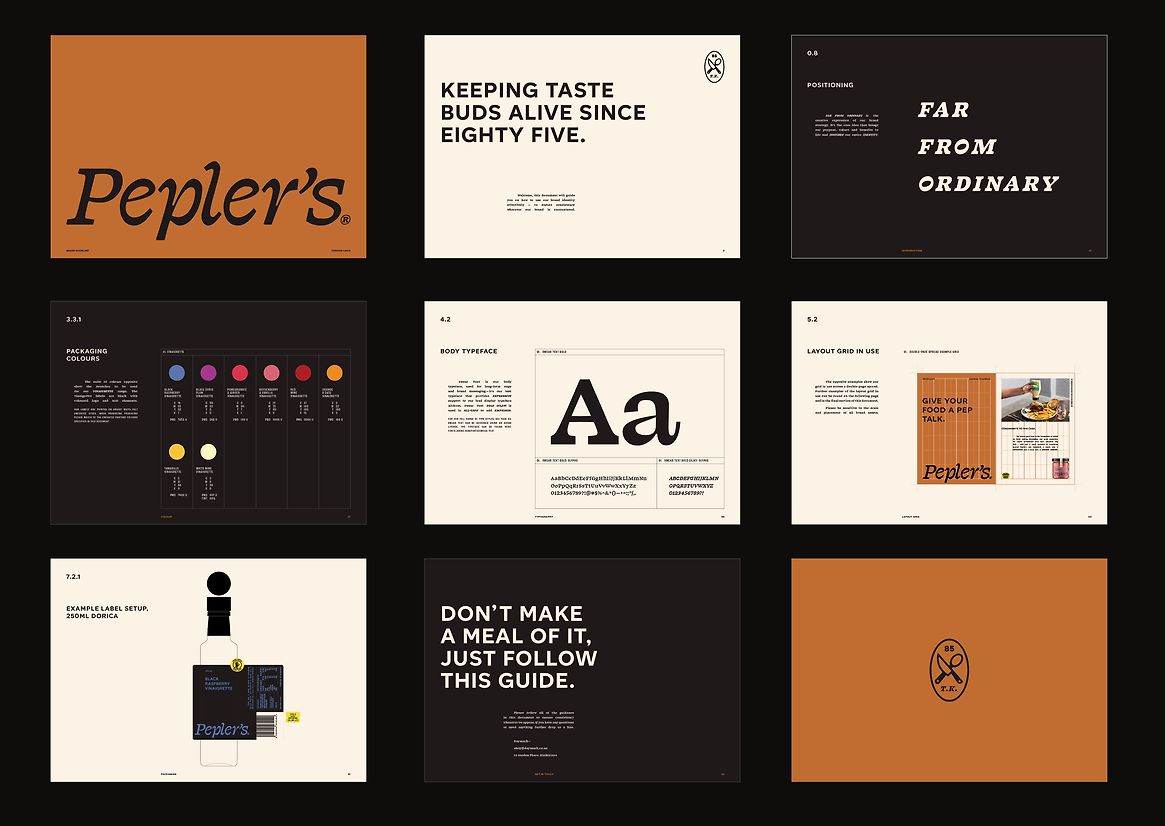
Our strategy was to rebrand Pepler's to reflect their unique, high-quality products and differentiate them from competitors. The new brand concept, "Far from Ordinary," emphasised their innovative flavour combinations and premium product offerings.
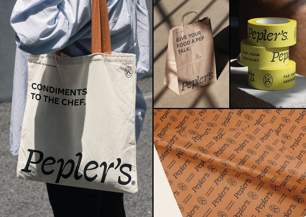
Supporting this underpinning brand idea, we introduced a more playful layer of messaging like "make a meal of it," "season the day," and "give your food a pep talk" (pep being short for Pepler's). This playful tone added an engaging and approachable dimension to the brand, with the aim of making it more memorable and resonant with customers.
The brand strategy extended beyond packaging to encompass all messaging and presentation, enhancing their professional image and reception across all customer touchpoints.
The Design
Our design blended historical elements with modern touches. The "Far from Ordinary" concept differentiated Pepler's from mainstream competitors through a unique wordmark and typography that conveyed an unexpected yet premium feel. We drew inspiration from their cookbook origins in the 1980s and the regional influence of Te Kauwhata, a location not traditionally associated with gourmet products, to emphasise their innovative offerings like pear and mustard—a truly unique flavour combination.
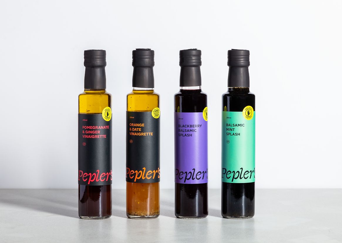
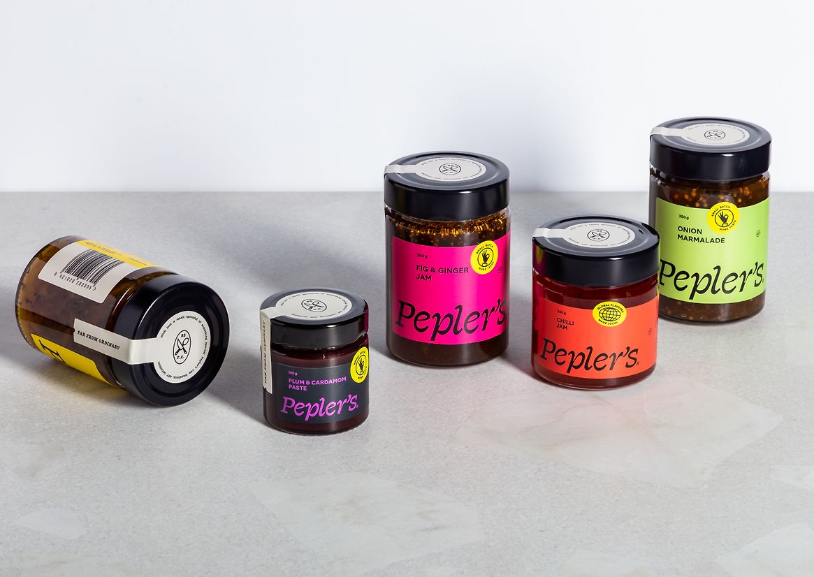
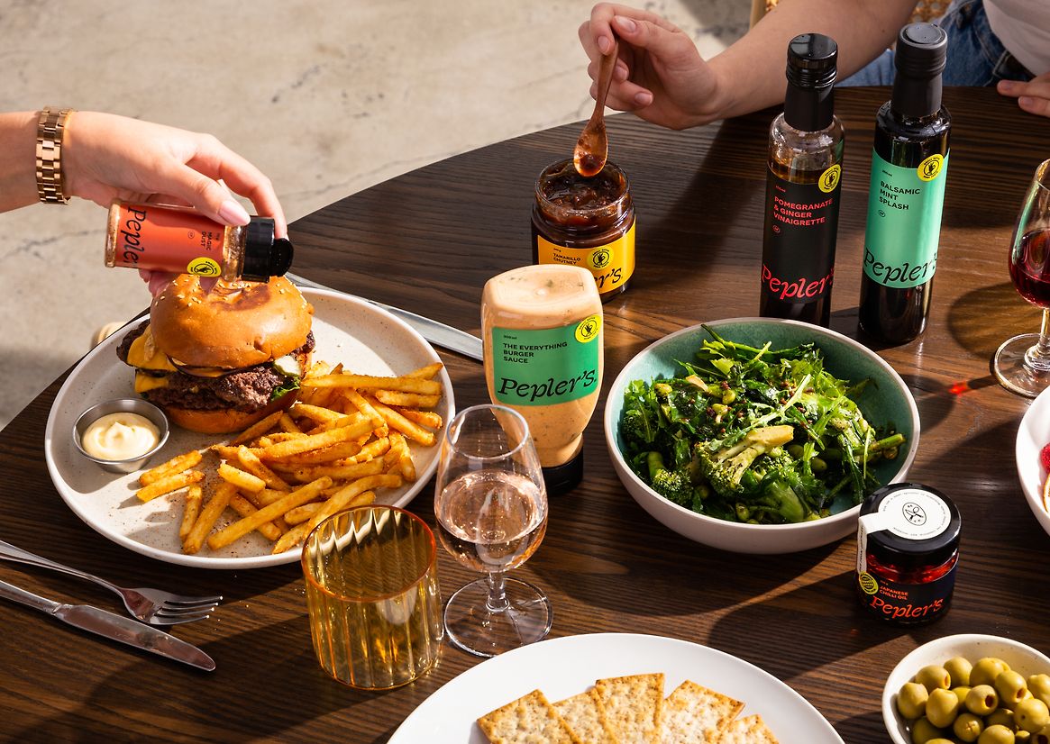
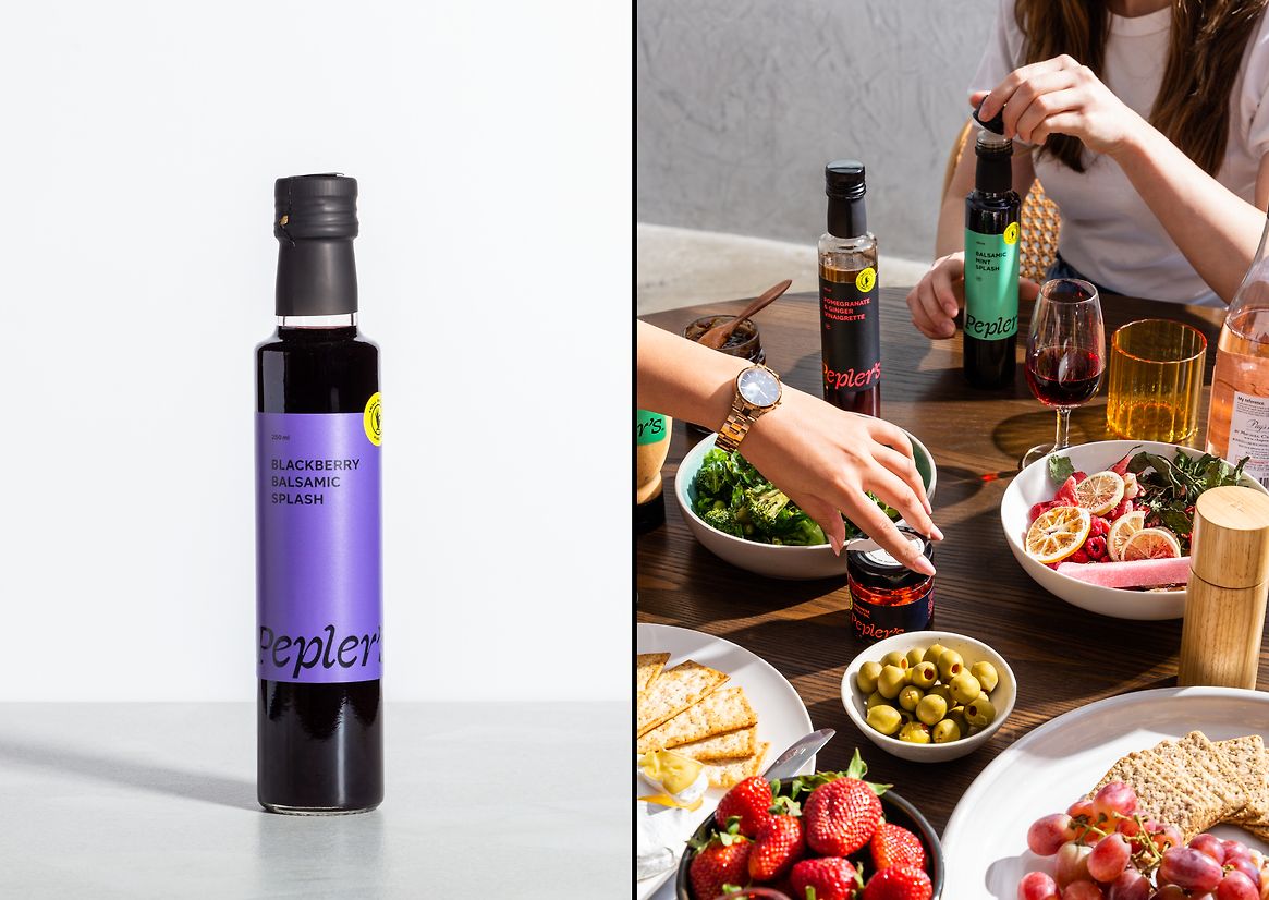
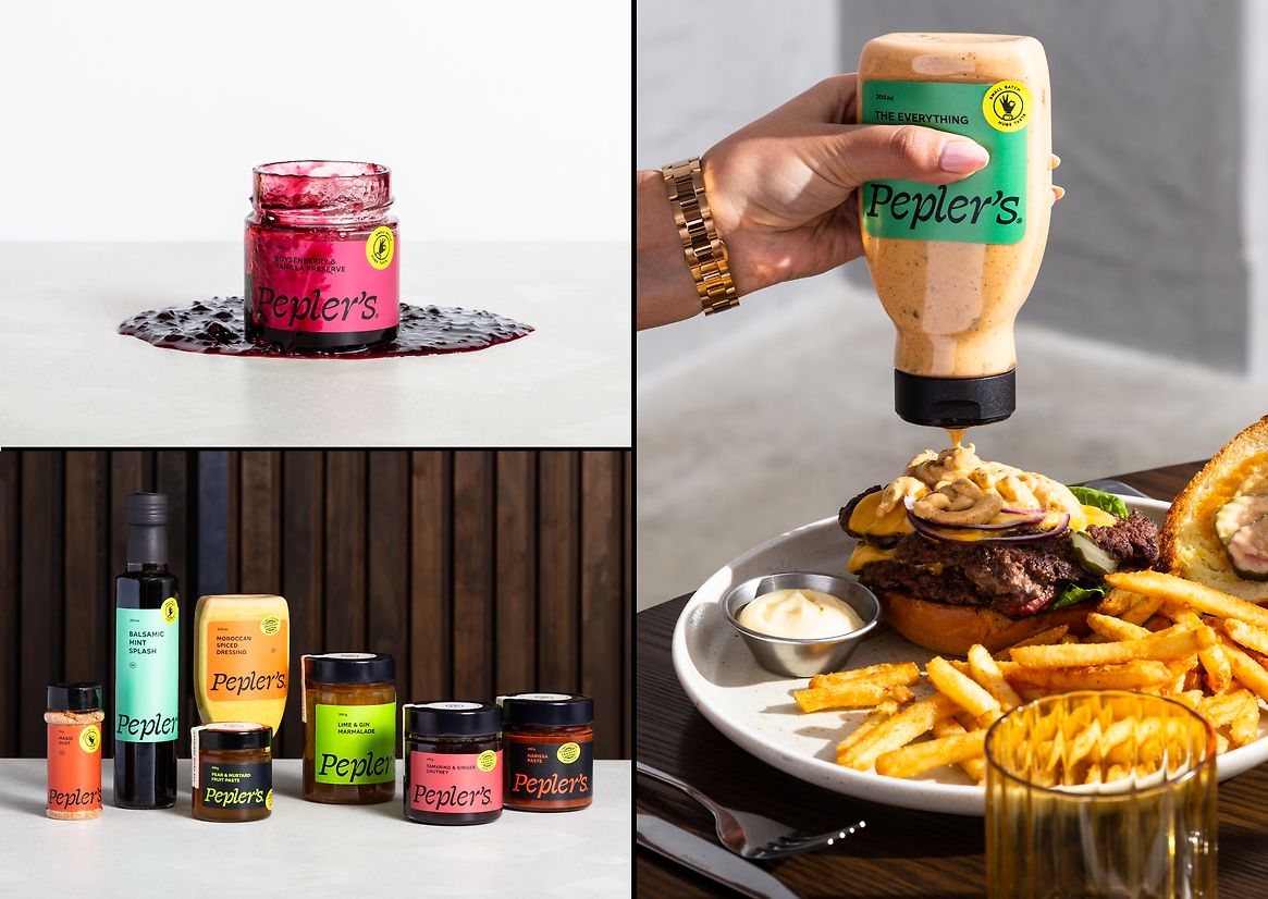
The packaging system was meticulously crafted, featuring a smaller badge on each label that highlighted unique aspects of the products. Over sixty colours were utilised across jars and bottles, each inspired by key ingredients to evoke a "yummy" feeling. We transitioned from the previous foil label stock to a tactile, wine-label paper stock that better adhered to glass and allowed for layered sticker finishes. We also moved sauces to recyclable plastic squeeze bottles based on customer feedback, and updated the jar shape from an old-fashioned hexagon to a modern circular design.
Our research into supermarket shelf differentiation resulted in a design that had super consistent logo and name placement across all ranges, significantly enhancing brand recognition.
What Elevates the Work
The rebranding project not only revitalised Pepler's identity but also demonstrated our desire to support small-town New Zealand businesses. By helping Pepler's become a sustainable, growing business, we aim to create positive knock-on effects for the local community and beyond.
The new brand has been instrumental in Pepler's growth, contributing to local economic sustainability. Since the rebrand, Pepler's has enjoyed a surge in positive customer feedback, with the fresh, modern design improving product visibility on shelves. This visibility has translated into increased sales and a surge in wholesale inquiries, affirming the brand's enhanced market position and appeal.
Description:
The Why
The catalyst for exploring a new brand for Pepler's was driven by insights from new ownership and market research, aimed at bridging the gap between the high quality of their products and the existing brand representation. Recognising that the product value far exceeded the brand value, the new owners paused new product development to focus on redesigning labels that would better reflect product quality. The previous design, characterised by an outdated silver fern and glossy labels, failed to resonate with customers and felt misaligned with the brand’s premium offerings.
The Idea
Our strategy was to rebrand Pepler's to reflect their unique, high-quality products and differentiate them from competitors. The new brand concept, "Far from Ordinary," emphasised their innovative flavour combinations and premium product offerings.
Supporting this underpinning brand idea, we introduced a more playful layer of messaging like "make a meal of it," "season the day," and "give your food a pep talk" (pep being short for Pepler's). This playful tone added an engaging and approachable dimension to the brand, with the aim of making it more memorable and resonant with customers.
The brand strategy extended beyond packaging to encompass all messaging and presentation, enhancing their professional image and reception across all customer touchpoints.
The Design
Our design blended historical elements with modern touches. The "Far from Ordinary" concept differentiated Pepler's from mainstream competitors through a unique wordmark and typography that conveyed an unexpected yet premium feel. We drew inspiration from their cookbook origins in the 1980s and the regional influence of Te Kauwhata, a location not traditionally associated with gourmet products, to emphasise their innovative offerings like pear and mustard—a truly unique flavour combination.
The packaging system was meticulously crafted, featuring a smaller badge on each label that highlighted unique aspects of the products. Over sixty colours were utilised across jars and bottles, each inspired by key ingredients to evoke a "yummy" feeling. We transitioned from the previous foil label stock to a tactile, wine-label paper stock that better adhered to glass and allowed for layered sticker finishes. We also moved sauces to recyclable plastic squeeze bottles based on customer feedback, and updated the jar shape from an old-fashioned hexagon to a modern circular design.
Our research into supermarket shelf differentiation resulted in a design that had super consistent logo and name placement across all ranges, significantly enhancing brand recognition.
What Elevates the Work
The rebranding project not only revitalised Pepler's identity but also demonstrated our desire to support small-town New Zealand businesses. By helping Pepler's become a sustainable, growing business, we aim to create positive knock-on effects for the local community and beyond.
The new brand has been instrumental in Pepler's growth, contributing to local economic sustainability. Since the rebrand, Pepler's has enjoyed a surge in positive customer feedback, with the fresh, modern design improving product visibility on shelves. This visibility has translated into increased sales and a surge in wholesale inquiries, affirming the brand's enhanced market position and appeal.