Graphic
Daylight 25 Pacific Media Network - PMN IS US
-
Pou Auaha / Creative Director
Charlie Godinet -
Pou Rautaki / Strategic Leads
Lee Lowndes, Rae-Dawn Martin
-
Ringatoi Matua / Design Directors
Billy Baxter, Renee Jacobi -
Kaituhi Matua / Copywriter Lead
Scott Moyes
-
Ngā Kaimahi / Team Members
Kyle Hickey, Phil Bingley, Tyla Rose, Olivia Walker, Gustavo Bezerra, Luke Chiaroni Clarke, Indivar Kumar, Antalya Atkinson -
Kaitautoko / Contributor
Letitia Mackenzie -
Client
Pacific Media Network
Description:
The Pacific Media Network (PMN) dates back to 1993, when its legacy radio station, 531pi, first hit the airwaves. It was created as a way to reach the ever-growing Pacific population in Aotearoa - a community with a long and traumatic history here in New Zealand.
With one in four Aucklanders now being born of Pacific descent, PMN needed to evolve with its audience in a highly competitive digital environment. The challenge was to not only rethink PMN's audience strategy and content delivery channels but to redefine the way Pacific media is shared in Aotearoa.
The idea was to redesign PMN's entire digital infrastructure, to futureproof the organisation and better serve the Pacific people of Aotearoa.
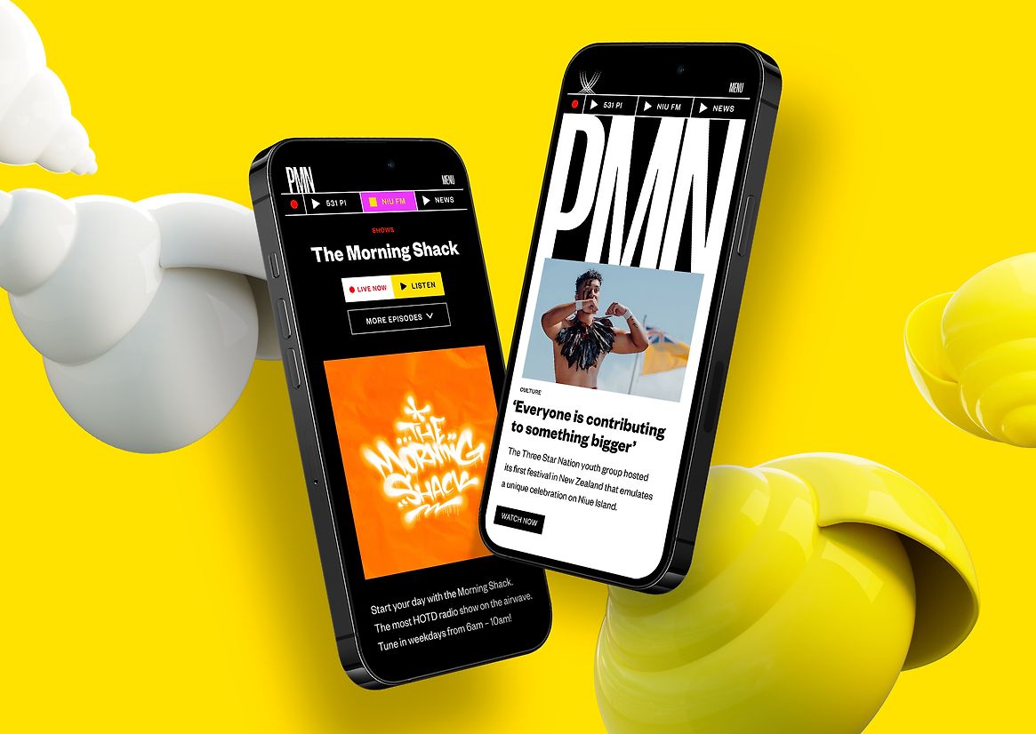
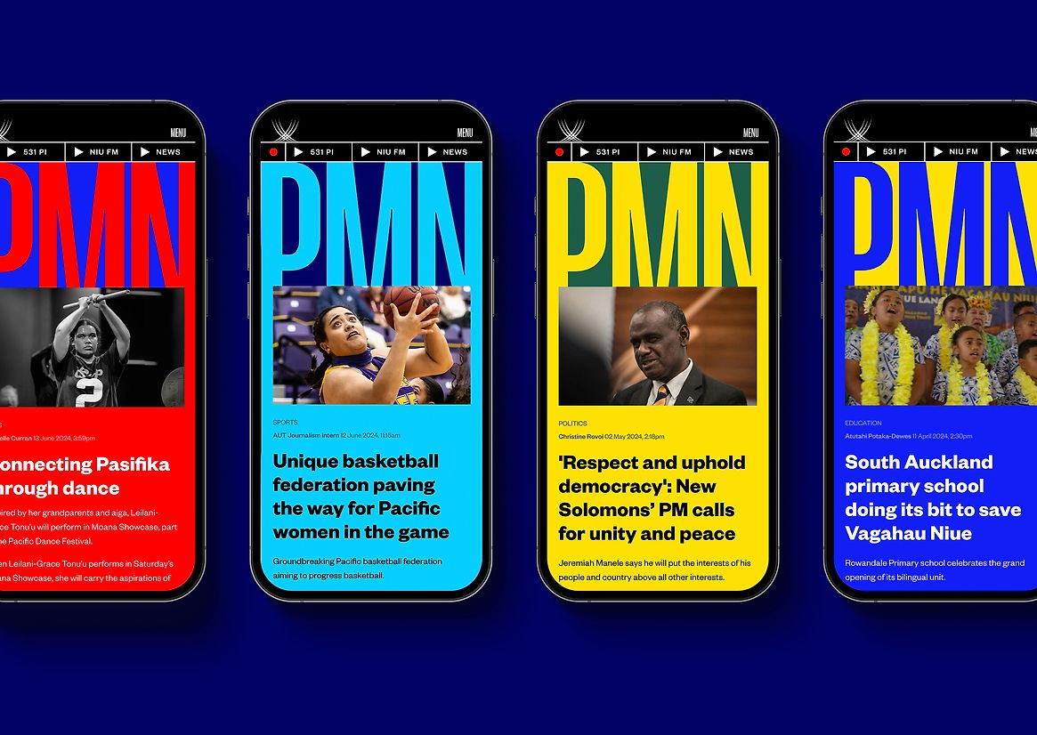
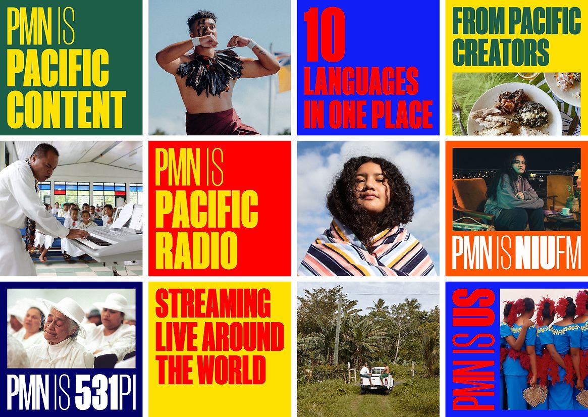
The all-new PMN.CO.NZ is a world-class, custom-built content platform that sits proudly in the modern media landscape. It’s a revitalised home of Pacific news, sports, business, health, education, entertainment, and culture - across 10 languages.
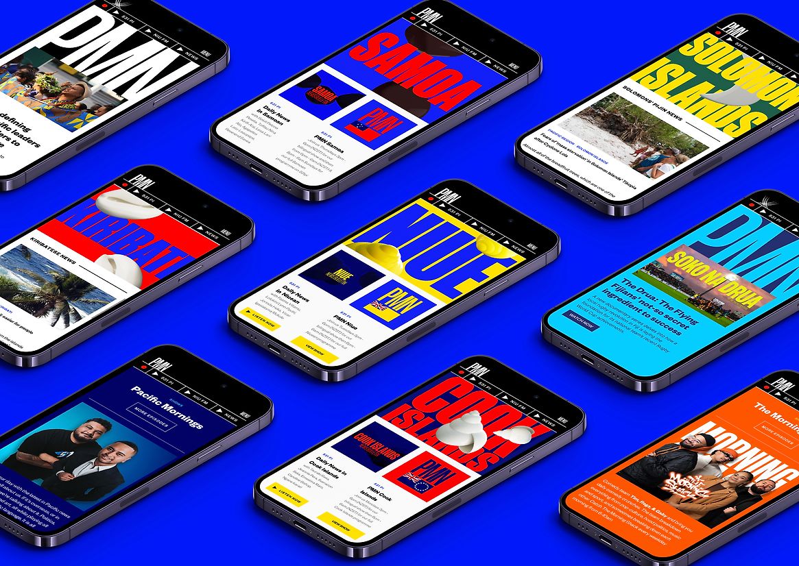
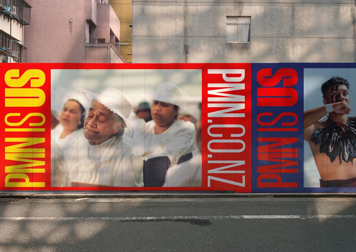
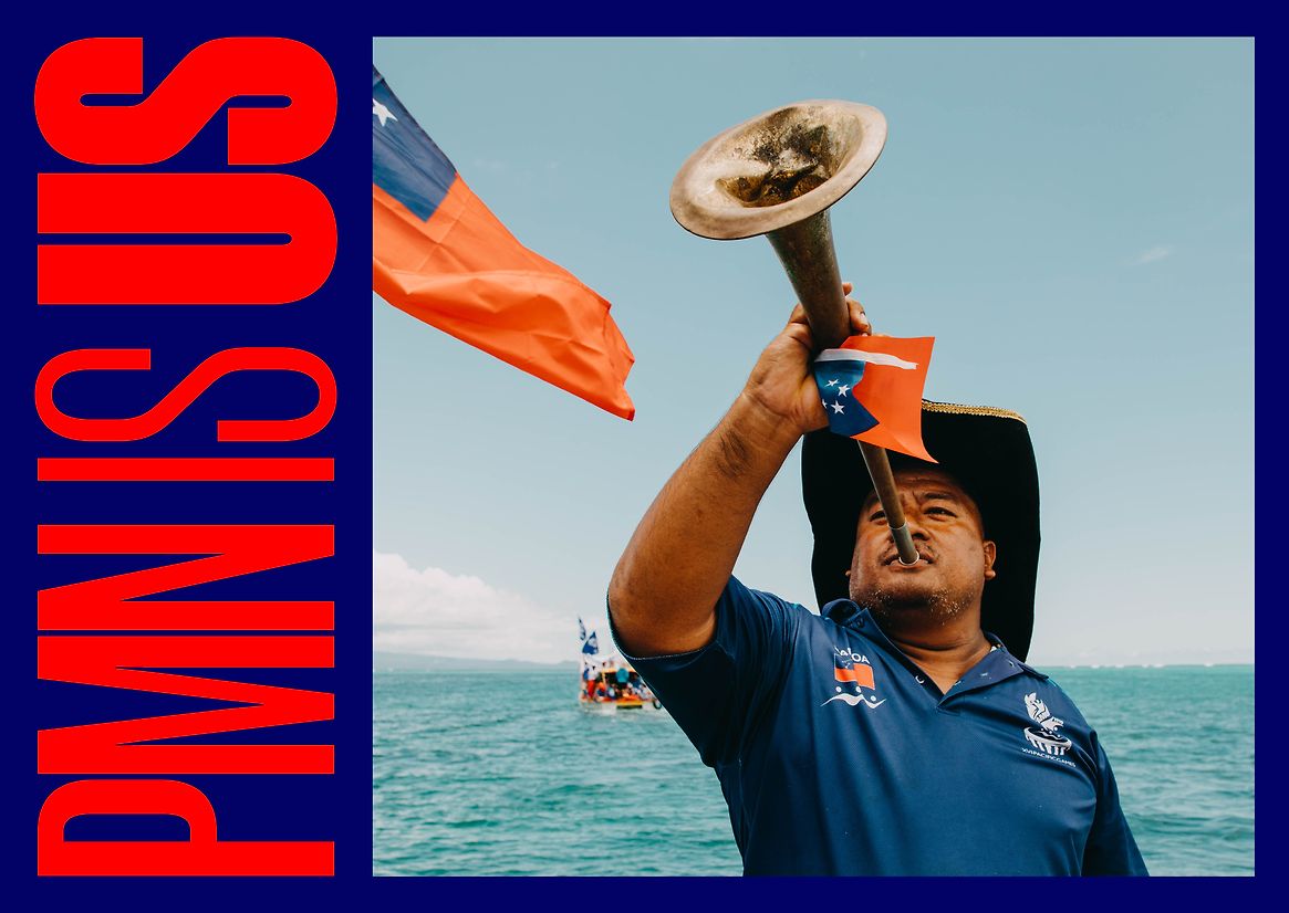
Colour plays an essential role in this transformation. It not only reflects the vibrance of the Pacific but organises its vast content output. That’s why PMN’s new home and brand identity is loud, proud, and unapologetically Pacific.
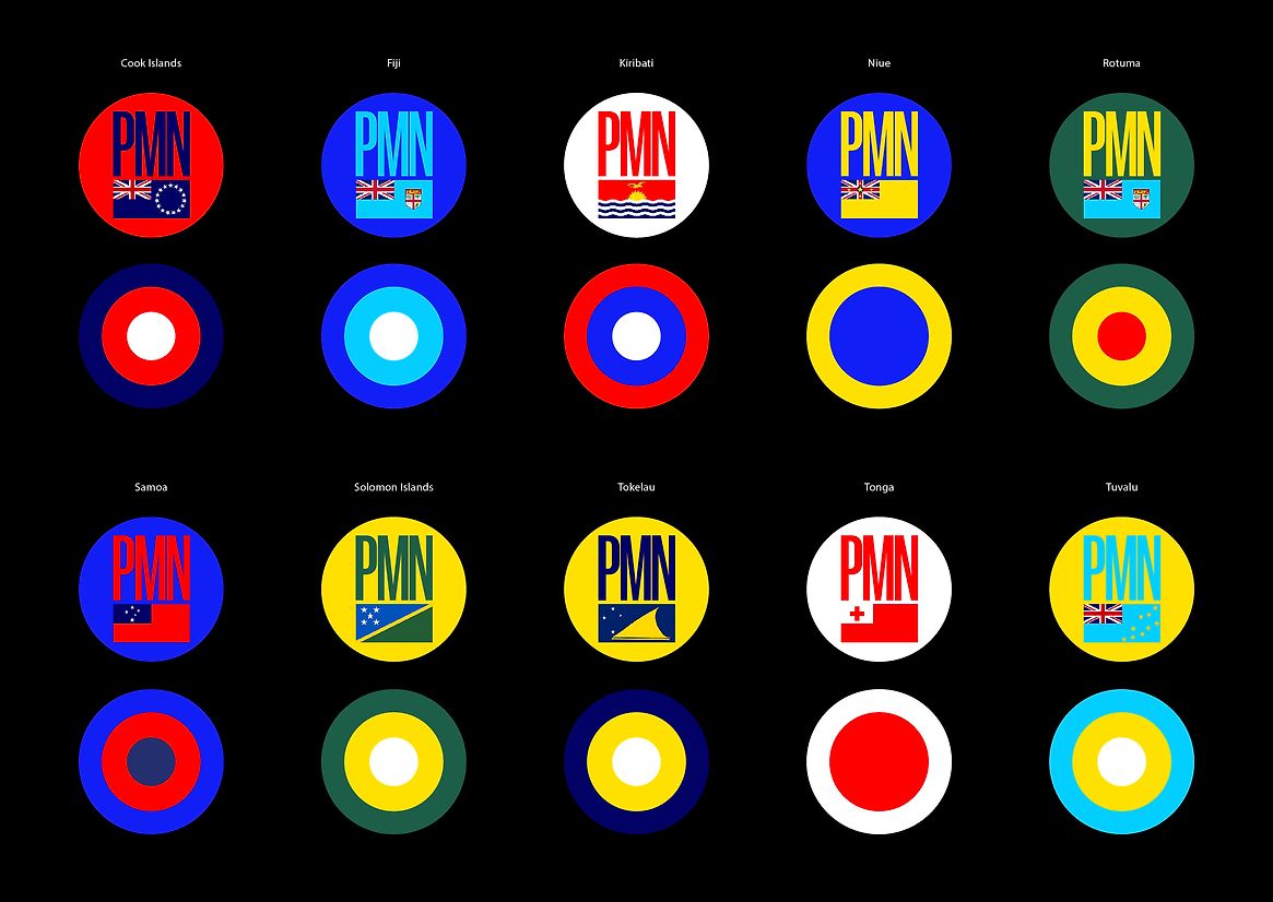
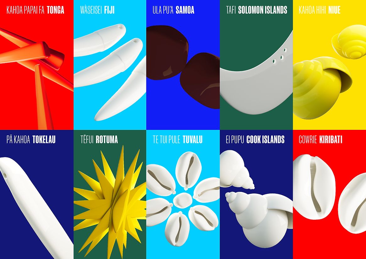
At every touchpoint, we encounter this new colour palette and design system in action. It includes rich and meaningful hues derived from national flags, localised island flora, markets, and traditional tapestries.
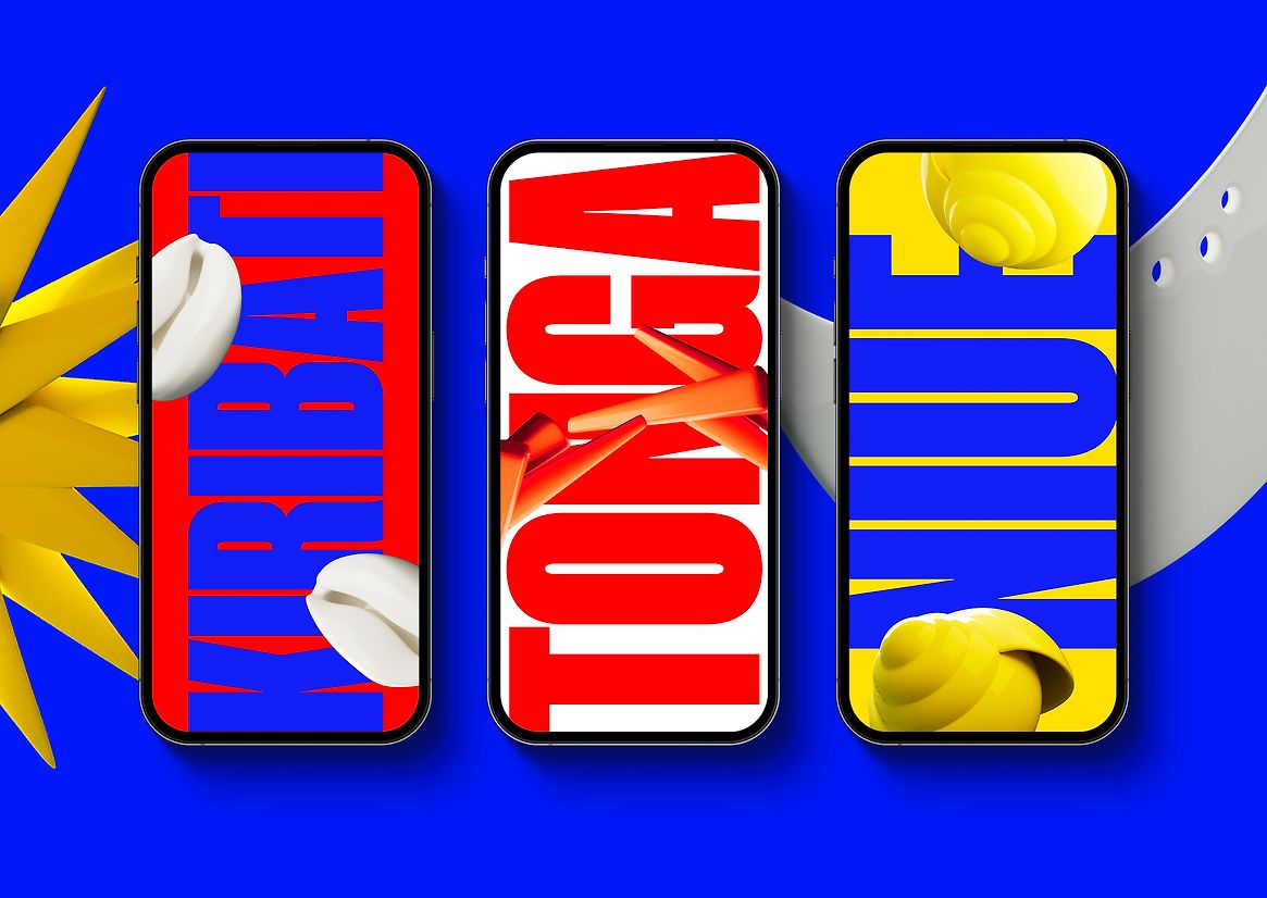
Within the website, colour coding is a key wayfinding tool for connecting our different nationalities to their specific editorial and audio-based content. To do this, we sampled the national flag colours of these countries and paired them with 3D iconography, modeled on traditional neck garlands from each individual nation. This creates an instantly recognisable signpost for these communities.
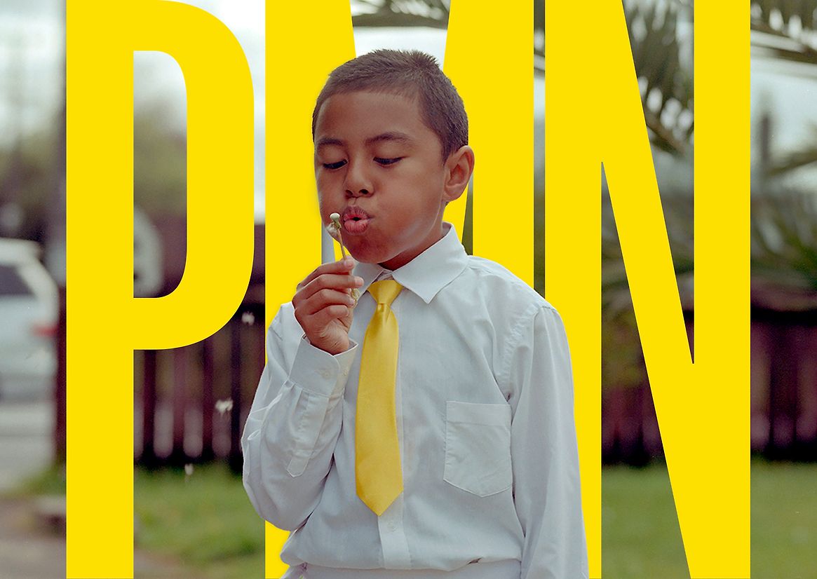
This passion for colour also extends right through into master brand communications. Whilst many of their competitors favor the journalistic traditions of black and white, PMN is all about brightness, vitality, and exuberance. Pacific flair is unmistakable, so we celebrated this with bold colour blocking. Whether that’s through proud headlines brought to life with colourful typography or as eye-catching base plates for photography. It all works together to create a true expression of contemporary Pacific life.
Our celebration of colour in this project is all about deeper engagement - a way for Pacific people to feel authentically seen and recognised in their everyday media consumption.
On the back of this, we’ve seen incredible growth in meaningful interactions with PMN. Average monthly visits have increased by 14 times*. This has translated into a phenomenal rise in digital revenue - 34 times* the amount of investment compared to the previous year. This ensures that PMN and its charitable trust have the ongoing resources to invest in quality Pacific journalism and new digital infrastructure for the future.
*14x increase in average monthly visits: 3,300 increased to 52,000
* 34x increase in digital revenue YTD: FY 2022 figures compared against YTD (Oct 2023 - June 2024)