Justin Crook, Georgie Andrews, Sam Harris, Emma Haughton, Ji Hye Lim, Michael Mason, Stephen de Vrij, Loretta Gerard, Eliot Blenkarne, Jayson Urlich
Description:
The challenge: Our client sought a strategic design partner to deliver a compelling brand identity, marketing collateral and renders to target innovative businesses and creative communities for available tenancies. The client was also ambitious about translating the offering and identity into the new development through physical communication outcomes that captured the essence of place and showcased the range of functions within the space.
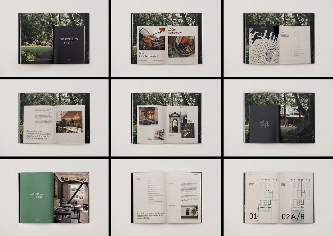
We worked with our architectural and interior design teams to deliver a holistic and cohesive response to the demand for boutique environments with a strong sense of place and identity. This included naming conventions, brand identity, marketing collateral, digital activation, signage and wayfinding, visualisations and photography, all created inhouse.
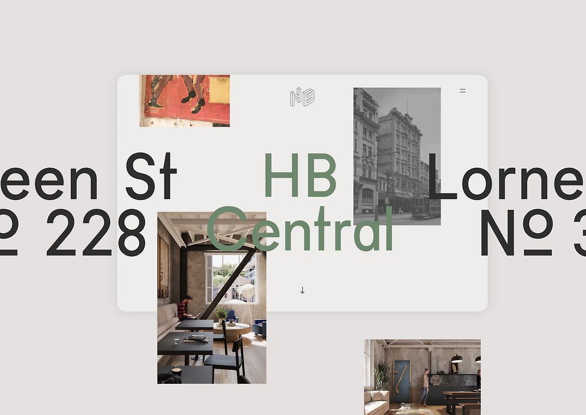
The Solution: HB Central is an authentic community offering that blends rich history and character with the latest in modern amenity to bring a new lease of life to an important part of Auckland’s CBD history. Ambitiously stitching together two of Auckland’s oldest buildings, the project offers prime retail, office and café spaces.
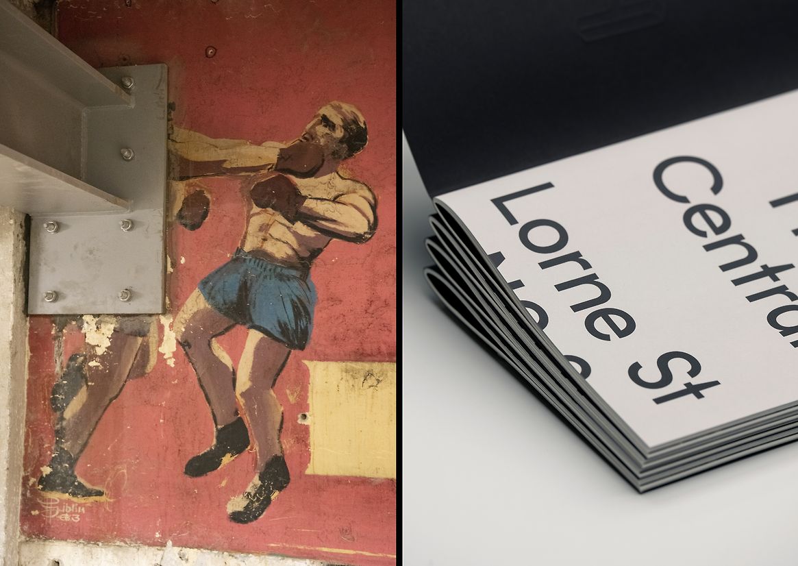
To communicate this offering, our strategic and creative response was grounded in the reinterpretation of the building’s rich history and previous functions. Established in 1880 and 1914, the original buildings of HB Central were once home to the early Bendix Hallenstein’s fashion label Hallenstein Brothers. The buildings have since served as accommodation, billiards and gaming arcade, a fast-food chain, offices and retail.
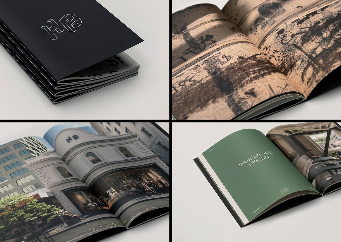
The brand strategy, naming convention and tone of voice references Auckland’s clothing industry and the material richness of the textiles traded through the early part of its life. Authentic stories of the past sit alongside a contemporary colour palette, with complimentary typefaces inspired by the forms and materiality of the building. This is communicated consistently across printed collateral, digital activation and embedded within the physical space.
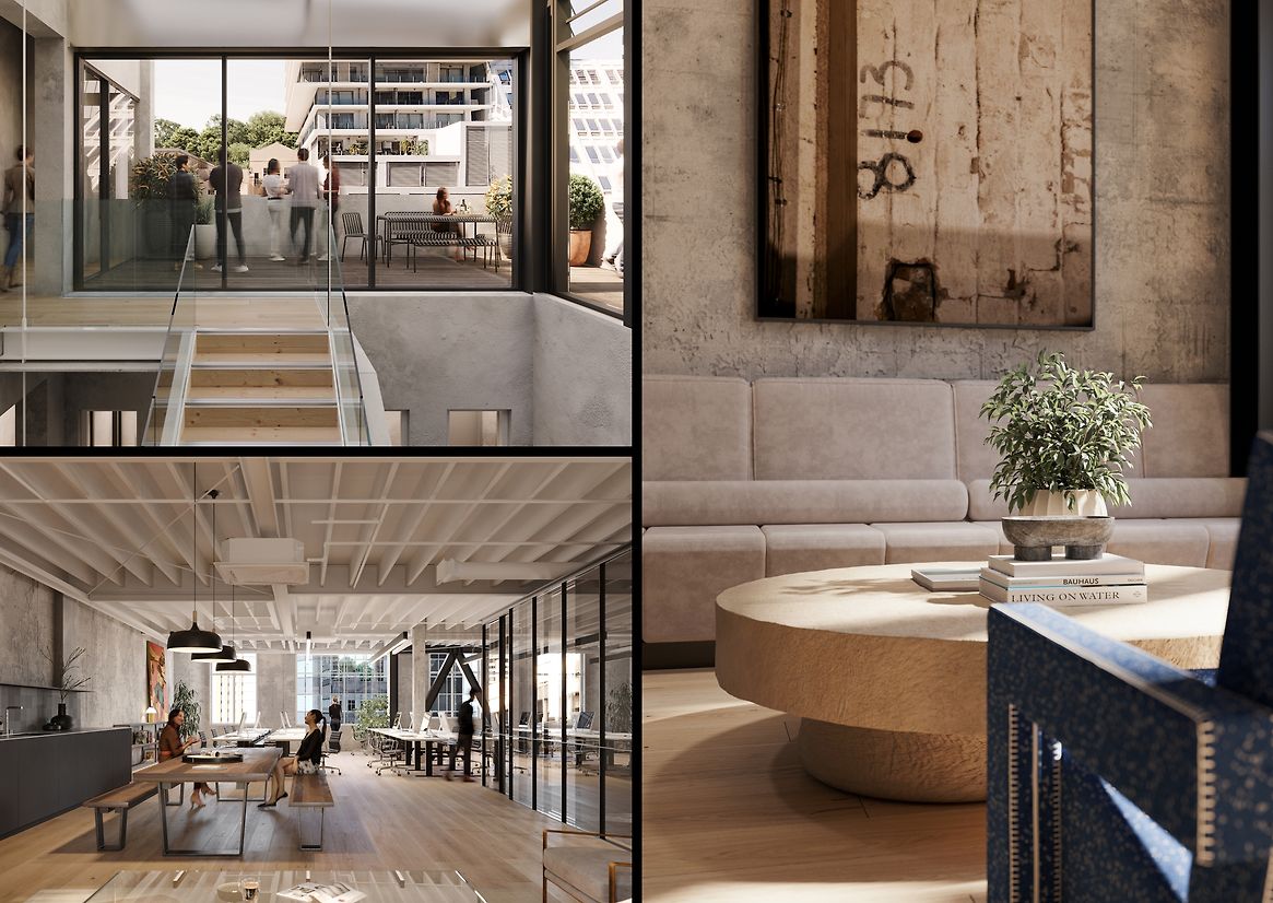
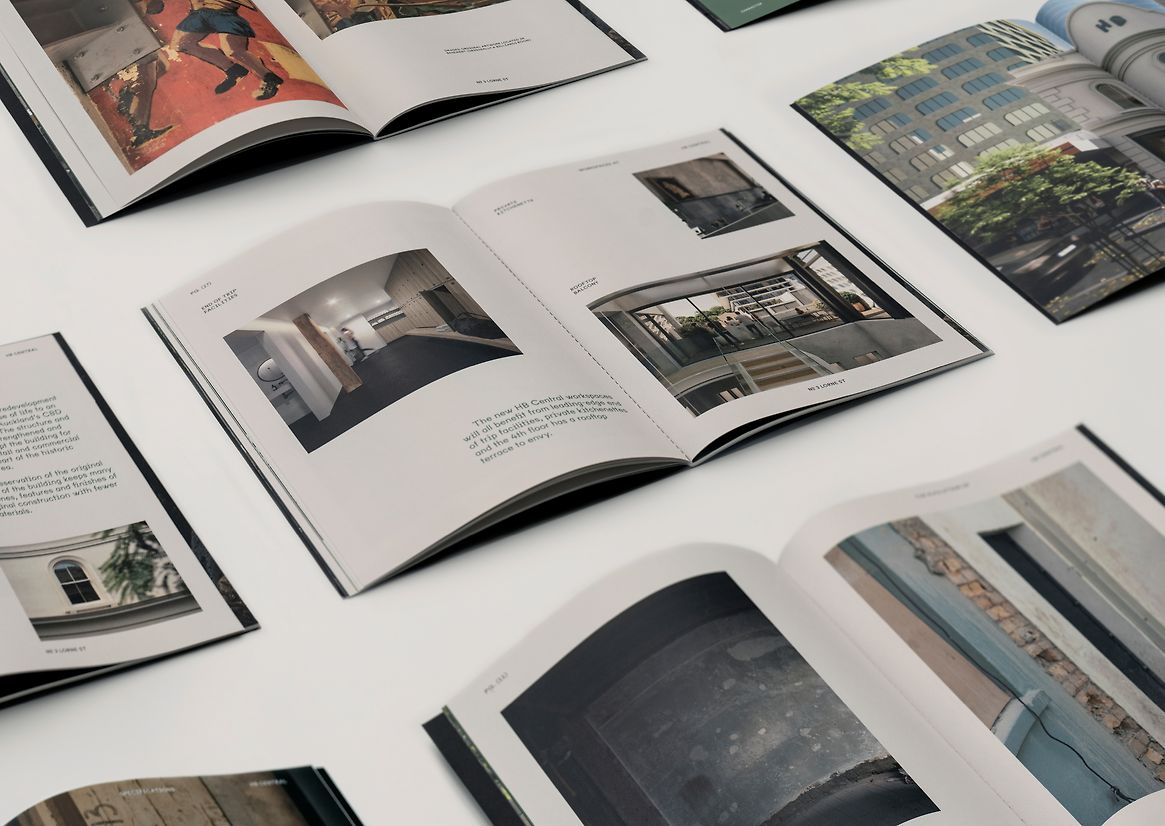
Found artwork, markings and textures have been photographed inhouse to provide the foundation of the brand and communicate the heritage of the development. These found markings were then translated into rendered images of the future spaces – framed and featured like a stamp of authenticity. Art directed and executed in collaboration with our visualisation team, these visuals communicate the potential of the available tenancies. From colour, tone, perspective and composition to interior styling, we produced a bespoke set of visual assets that capture the hearts and minds of HB Central’s target market.
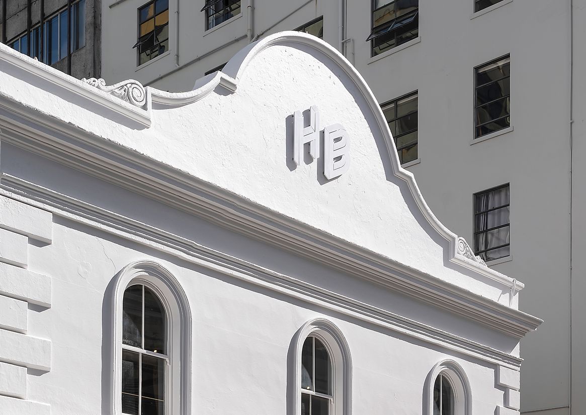
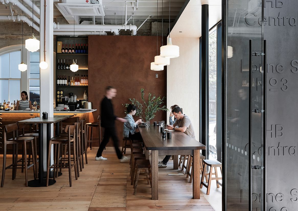
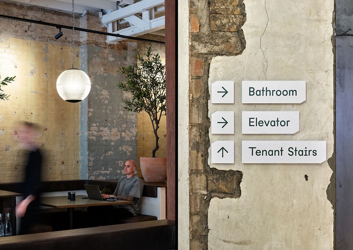
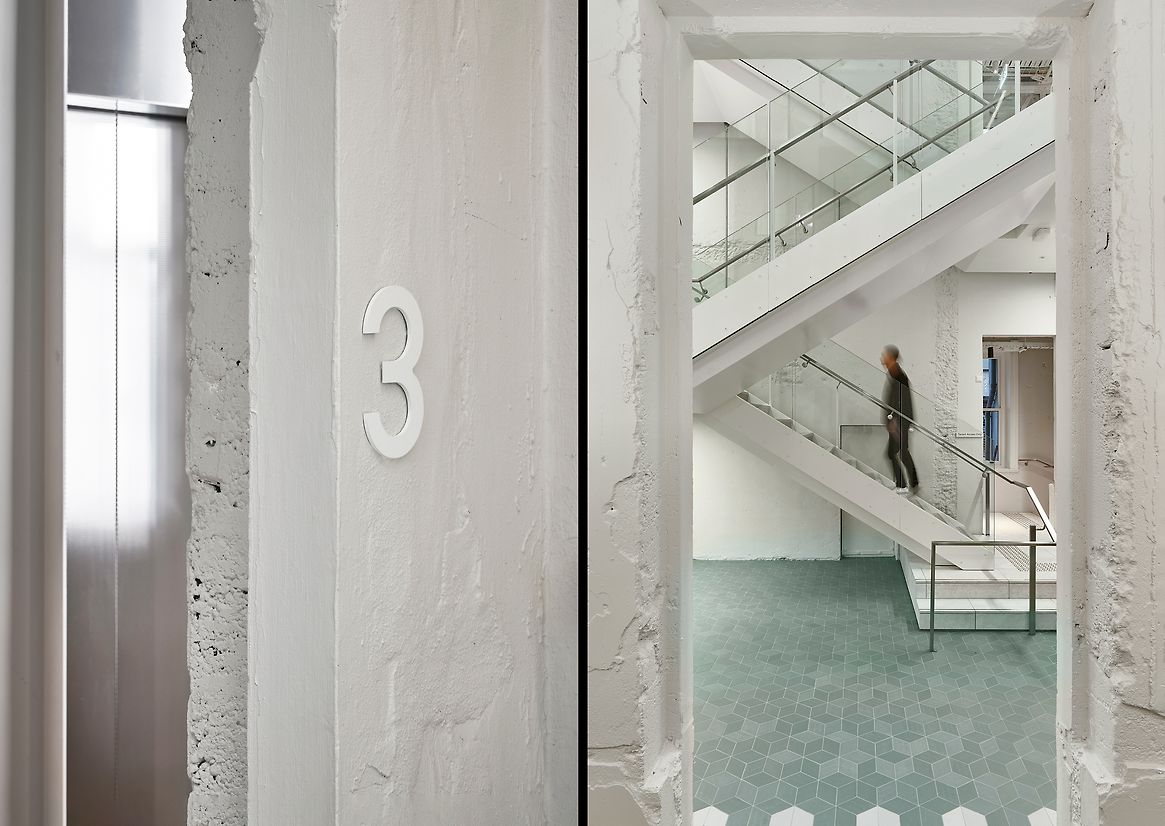
The confluence of old and new continues to be communicated through graphic interjections within the physical space. Signage and wayfinding, colour blocking and retained material finishes differentiate key functions within the space. White, green and black steel branding contrasts against the gritty materials of the building to provide key user direction and showcase building functions throughout. The central lightwell spatially translates the identity into a connected community heart with green tiles and whitewashed walls to communicate a differentiation of public and private spaces.
Spatial communication of the brand reinforces the energy that HB Central and its new community brings back to midtown Auckland in a unique celebration of the development’s rich history.
Description:
The challenge:
Our client sought a strategic design partner to deliver a compelling brand identity, marketing collateral and renders to target innovative businesses and creative communities for available tenancies. The client was also ambitious about translating the offering and identity into the new development through physical communication outcomes that captured the essence of place and showcased the range of functions within the space.
We worked with our architectural and interior design teams to deliver a holistic and cohesive response to the demand for boutique environments with a strong sense of place and identity. This included naming conventions, brand identity, marketing collateral, digital activation, signage and wayfinding, visualisations and photography, all created inhouse.
The Solution:
HB Central is an authentic community offering that blends rich history and character with the latest in modern amenity to bring a new lease of life to an important part of Auckland’s CBD history. Ambitiously stitching together two of Auckland’s oldest buildings, the project offers prime retail, office and café spaces.
To communicate this offering, our strategic and creative response was grounded in the reinterpretation of the building’s rich history and previous functions. Established in 1880 and 1914, the original buildings of HB Central were once home to the early Bendix Hallenstein’s fashion label Hallenstein Brothers. The buildings have since served as accommodation, billiards and gaming arcade, a fast-food chain, offices and retail.
The brand strategy, naming convention and tone of voice references Auckland’s clothing industry and the material richness of the textiles traded through the early part of its life. Authentic stories of the past sit alongside a contemporary colour palette, with complimentary typefaces inspired by the forms and materiality of the building. This is communicated consistently across printed collateral, digital activation and embedded within the physical space.
Found artwork, markings and textures have been photographed inhouse to provide the foundation of the brand and communicate the heritage of the development. These found markings were then translated into rendered images of the future spaces – framed and featured like a stamp of authenticity. Art directed and executed in collaboration with our visualisation team, these visuals communicate the potential of the available tenancies. From colour, tone, perspective and composition to interior styling, we produced a bespoke set of visual assets that capture the hearts and minds of HB Central’s target market.
The confluence of old and new continues to be communicated through graphic interjections within the physical space. Signage and wayfinding, colour blocking and retained material finishes differentiate key functions within the space. White, green and black steel branding contrasts against the gritty materials of the building to provide key user direction and showcase building functions throughout. The central lightwell spatially translates the identity into a connected community heart with green tiles and whitewashed walls to communicate a differentiation of public and private spaces.
Spatial communication of the brand reinforces the energy that HB Central and its new community brings back to midtown Auckland in a unique celebration of the development’s rich history.