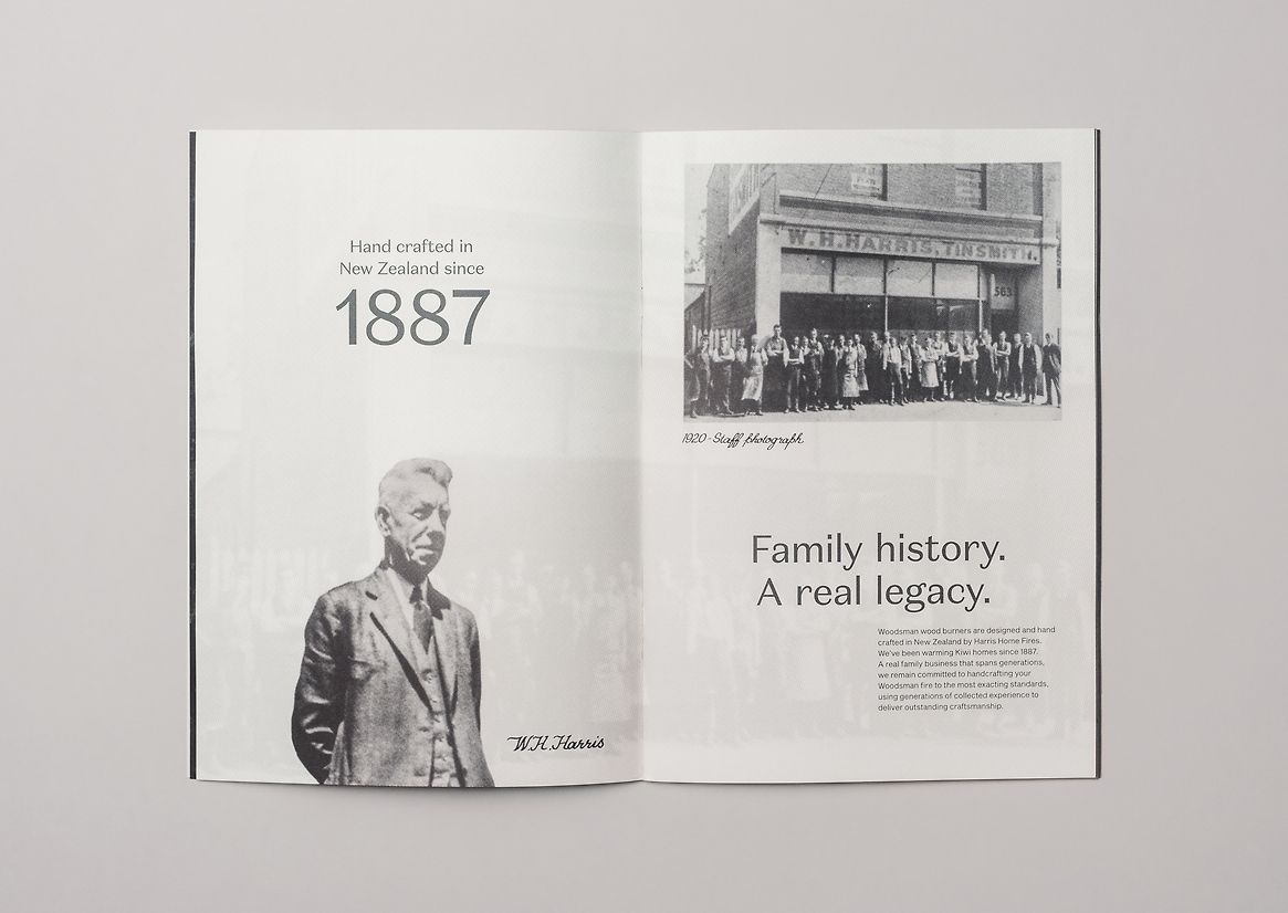
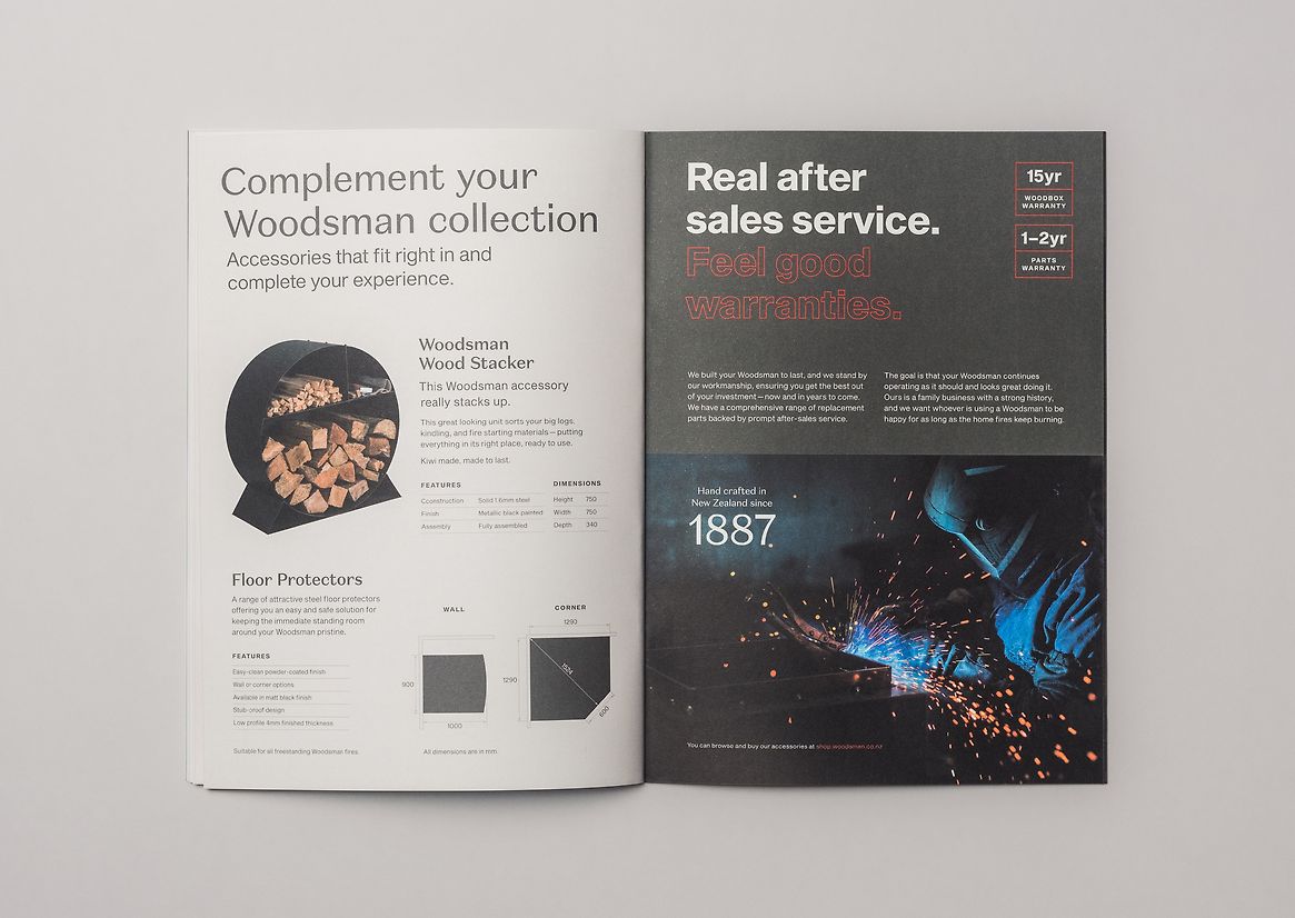
Woodsman, an iconic New Zealand brand, traces its roots back to the visionary W. H. Harris, a Christchurch tinsmith in 1887. With a rich history and enduring legacy, Woodsman has evolved into a beloved name, synonymous with excellence in the wood burner industry.
For our initial project with Woodsman, we were tasked with translating their rebranded image into the retail brochure. The client emphasised the importance of honest marketing by avoiding the industry's common practice of inflated specifications.
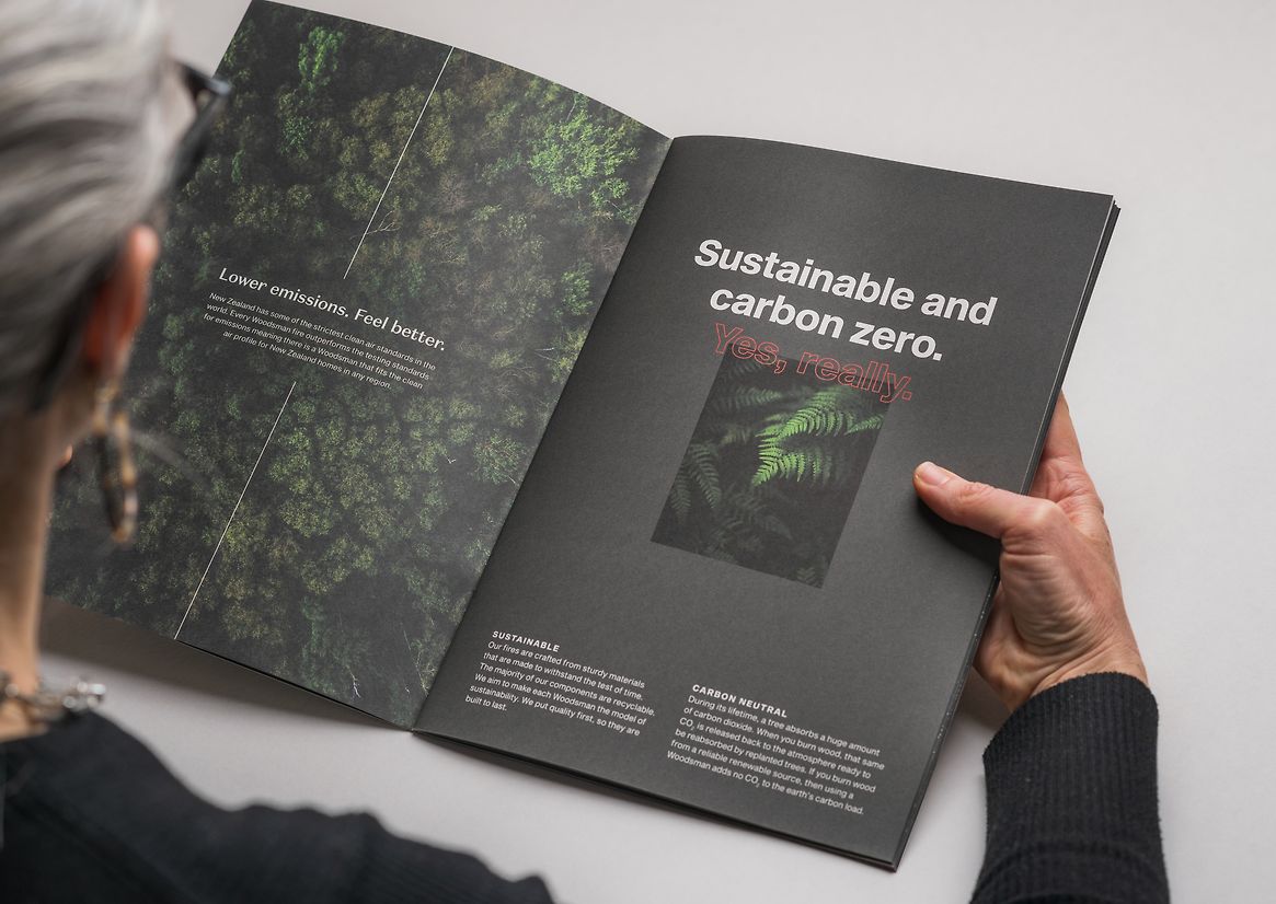
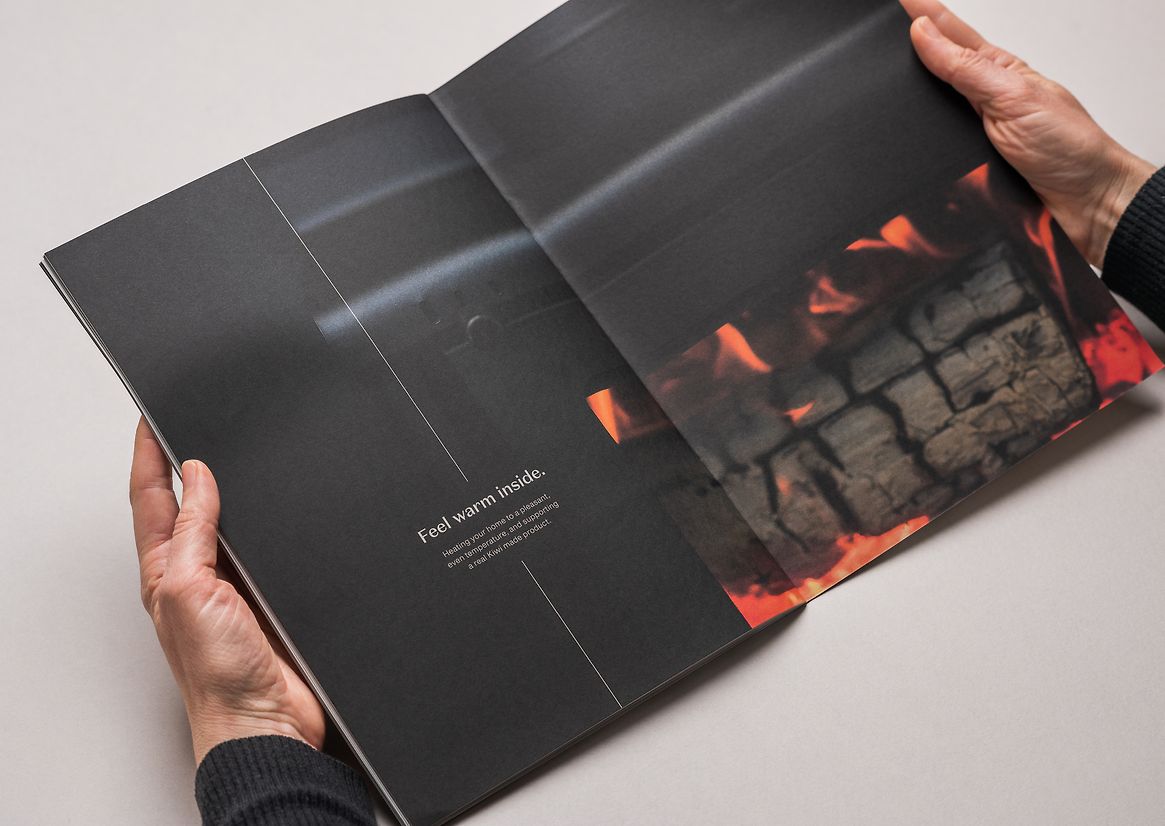
The rebranding embraced a compelling concept of duality, juxtaposing the feelings evoked by the warm feeling of a classic log burner with the real facts and figures that highlight their sustainability and cost-effectiveness as a home heating solution. This approach appeals to both the emotional and rational sensibilities of consumers.
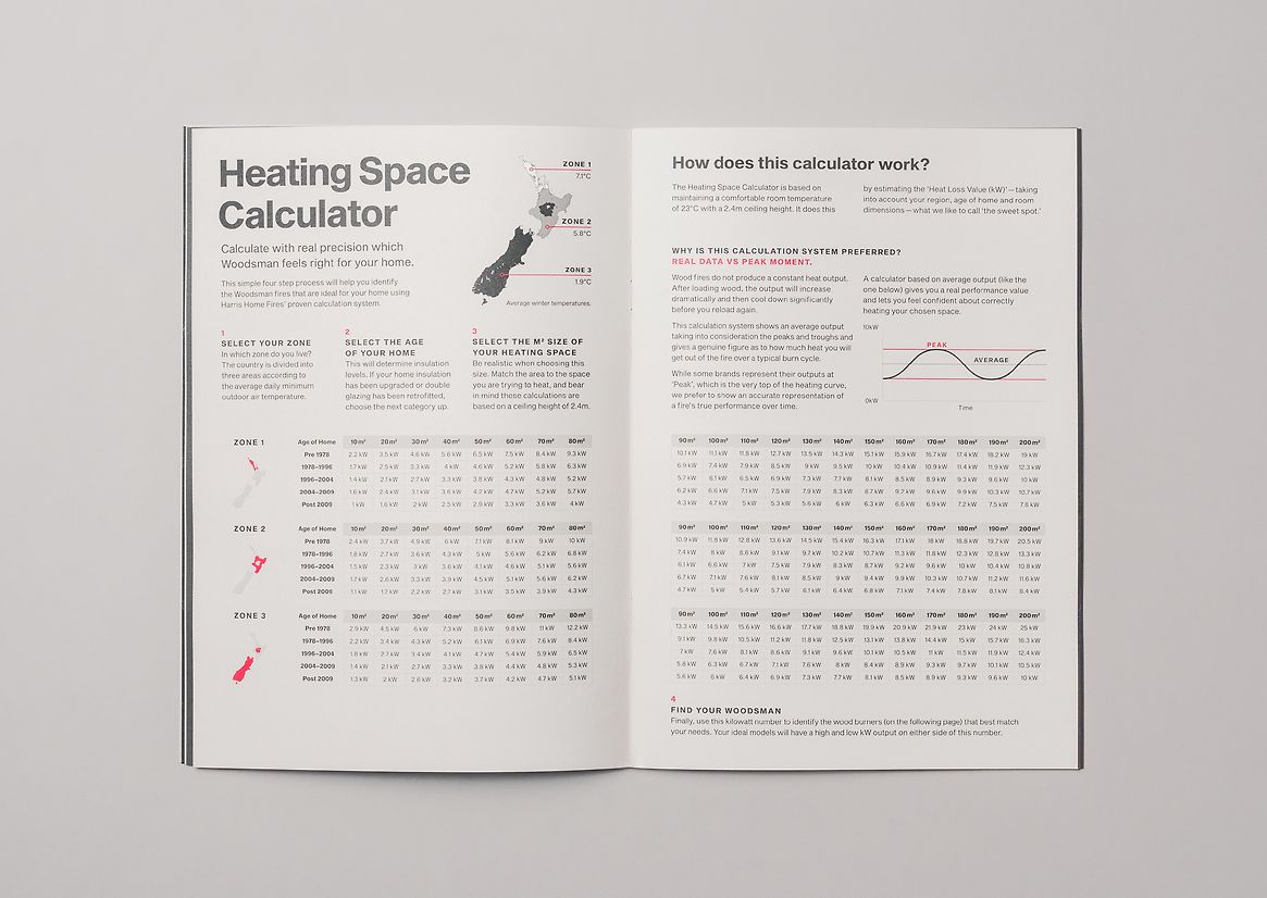
A key aspect of the client's brochure brief was the inclusion of a 'home heating calculator.' In line with the brand's commitment to honesty, avoiding inflated specifications. This transparent approach seamlessly aligned with the the ‘real’ aspect of the brand.
The ‘calculator’ raised a significant design problem given the print format. Based on scientific research carried out by Woodsman, the calculator consists of a four-step process; a matrix between the consumer’s region, the age of their home, and the area requiring heating—giving them an ideal kilowatt number to then be used to identify the corresponding range of appropriate Woodsman fires on the following pages.
The duality concept of ‘real’ and ‘feel’ can be seen throughout the brochure, using subtle plays between the two brand typefaces paired with the lights and darks in the updated colour palette, we played with the balance between the two personalities.
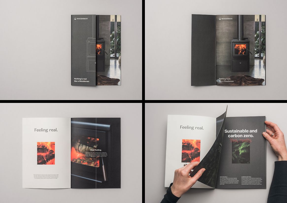
The reader is met with the first impression of a distinctive half cover, visually cutting the product image in half—showing the ‘real’ word and image treatment, unfolding to the full ‘feel’ image and headline copy.
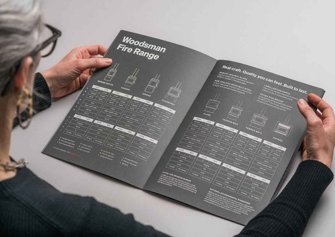
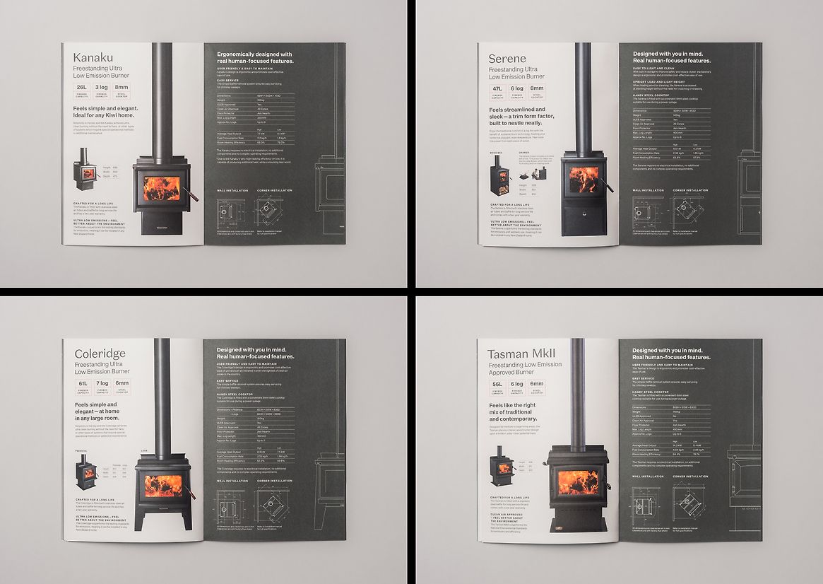
This concept extends to the product pages as well. The left pages focus on evoking emotions, showcasing features with a lighter ash background, humanist sans serif typography, and prominent product photography. Meanwhile, the right pages present fact-based specifications, adopting a dark steel colour palette, minimalistic schematic line drawings, and technical installation diagrams.
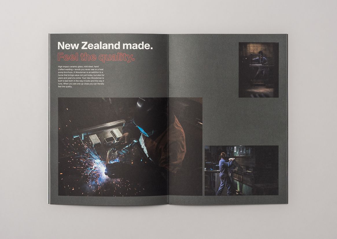
A strong brand message is introduced early in the brochure by the visually stunning photography paired with strong copy — reflective of every other brand touch-point for Woodsman.
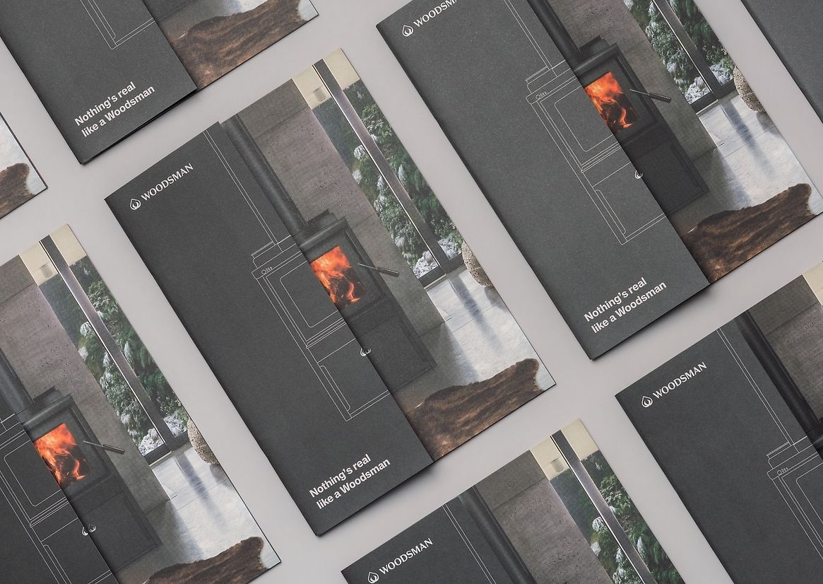
With a print run of 30,000 units, we worked closely with the print-house to strike a balance between cost effective and a luxurious print finish. The half cover and spot colours throughout helped carry the brand concept and visual consistency in a polished final brochure.
The brochure has garnered an enthusiastic response from retailers across the nation, successfully achieving the client's objective of being the go-to choice for retailers, irrespective of the brand being sold.
Description:
Woodsman, an iconic New Zealand brand, traces its roots back to the visionary W. H. Harris, a Christchurch tinsmith in 1887. With a rich history and enduring legacy, Woodsman has evolved into a beloved name, synonymous with excellence in the wood
burner industry.
For our initial project with Woodsman, we were tasked with translating their rebranded image into the retail brochure. The client emphasised the importance of honest marketing by avoiding the industry's common practice of inflated specifications.
The rebranding embraced a compelling concept of duality, juxtaposing the feelings evoked by the warm feeling of a classic log burner with the real facts and figures that highlight their sustainability and cost-effectiveness as a home heating solution. This approach appeals to both the emotional and rational sensibilities of consumers.
A key aspect of the client's brochure brief was the inclusion of a 'home heating calculator.' In line with the brand's commitment to honesty, avoiding inflated specifications. This transparent approach seamlessly aligned with the the ‘real’ aspect of the brand.
The ‘calculator’ raised a significant design problem given the print format. Based on scientific research carried out by Woodsman, the calculator consists of a four-step process; a matrix between the consumer’s region, the age of their home, and the area requiring heating—giving them an ideal kilowatt number to then be used to identify the corresponding range of appropriate Woodsman fires on the following pages.
The duality concept of ‘real’ and ‘feel’ can be seen throughout the brochure, using subtle plays between the two brand typefaces paired with the lights and darks in the updated colour palette, we played with the balance between the two personalities.
The reader is met with the first impression of a distinctive half cover, visually cutting the product image in half—showing the ‘real’ word and image treatment, unfolding to the full
‘feel’ image and headline copy.
This concept extends to the product pages as well. The left pages focus on evoking emotions, showcasing features with a lighter ash background, humanist sans serif typography, and prominent product photography. Meanwhile, the right pages present fact-based specifications, adopting a dark steel colour palette, minimalistic schematic line drawings, and technical installation diagrams.
A strong brand message is introduced early in the brochure by the visually stunning photography paired with strong copy — reflective of every other brand touch-point for
Woodsman.
With a print run of 30,000 units, we worked closely with the print-house to strike a balance between cost effective and a luxurious print finish. The half cover and spot colours throughout helped carry the brand concept and visual consistency in a polished final brochure.
The brochure has garnered an enthusiastic response from retailers across the nation, successfully achieving the client's objective of being the go-to choice for retailers, irrespective of the brand being sold.