Graphic
Extended Whānau 63 RNZ Design Team RNZ System Update
-
Ngā Kaimahi / Team Members
Tyrone Ohia, Robert Whitaker, Eva Charlton, Krista Barnaby, Jayne Joyce, Jarred Bishop, Zhenya Nagornaya, Dexter Edwards, Tom Crampin -
Kaitautoko / Contributor
Stephen Smith -
Client
RNZ
Description:
RNZ is Aotearoa’s only non-commercial public broadcast provider. As a national provider, it is mandated to serve Aotearoa and the Pacific. It has been there for throughout the highs and lows of our country. But Aotearoa continues to change and become more diverse in its make up, beliefs, opinions, values, behaviours and expectations. Because of this, there’s a continuous need for RNZ to adapt in order to reach the people of Aotearoa. Especially in the digital space. With this challenge in mind, we were approached to work with RNZ’s internal design team to explore how its identity can visually expand to better serve digital platforms.
Our approach was to lean into RNZ's trusted, non-commercial roots. We wanted to strike an economical balance by making the most of their existing assets and trying not to create too many new brand elements, which we felt would lead to 'over-branding', and get in the way of the most important thing – the stories. In our mind, this would go a long way in supporting their reputation of being a trusted news authority which doesn't have to deal with the usual commercial pressures that others have to.
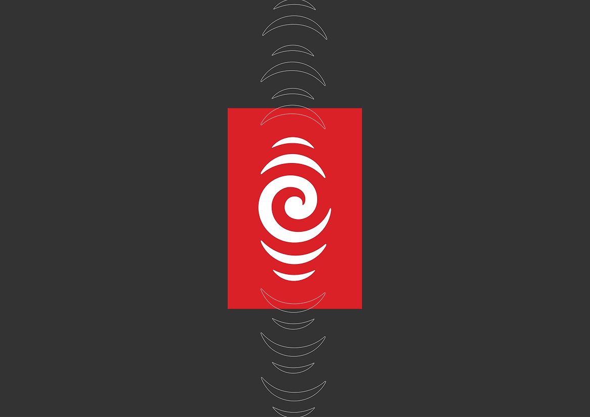
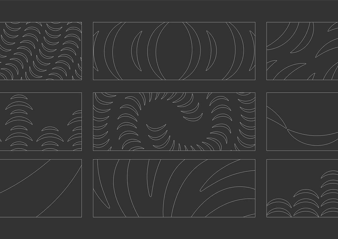
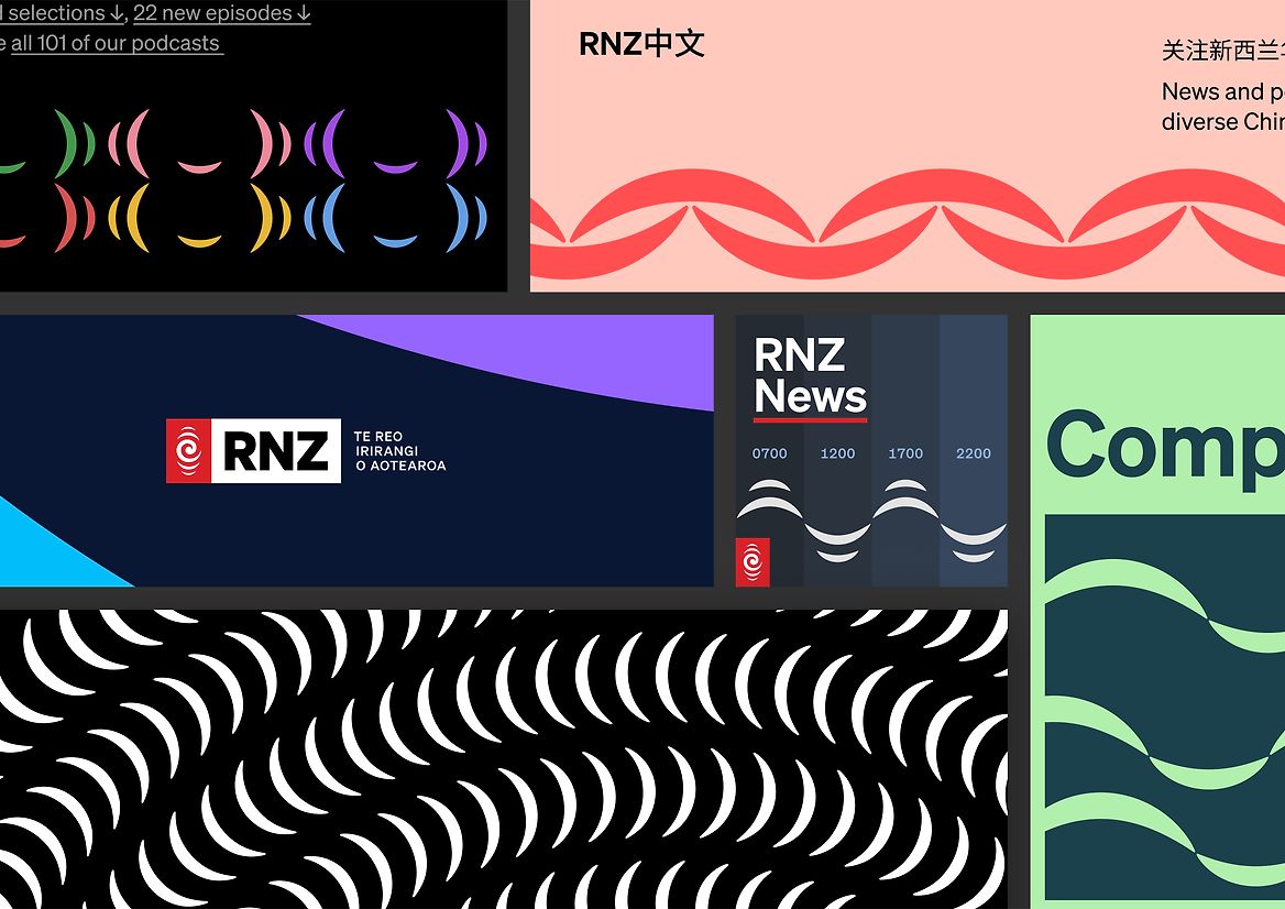
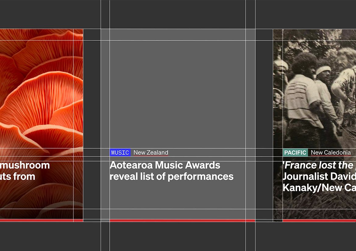
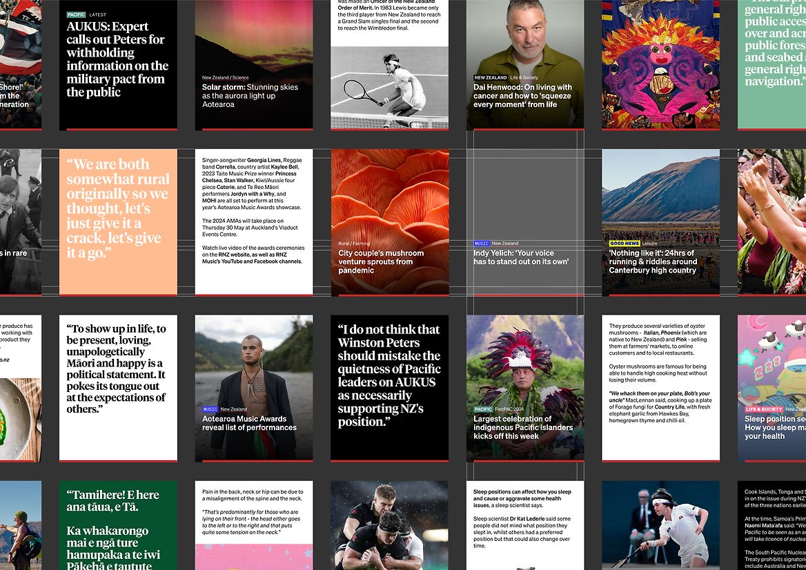
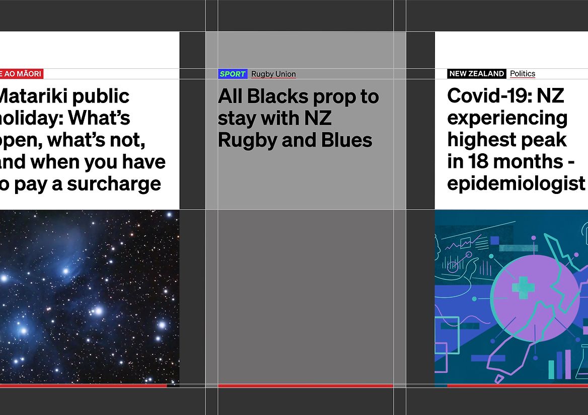
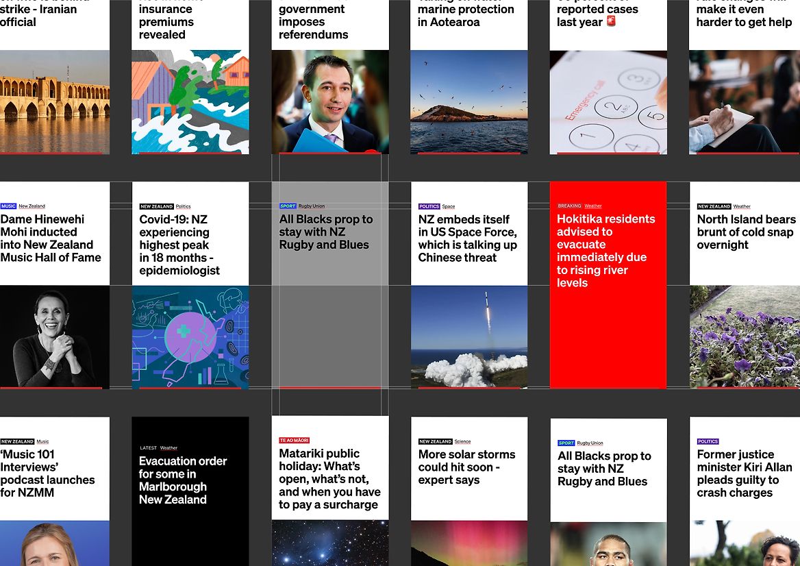
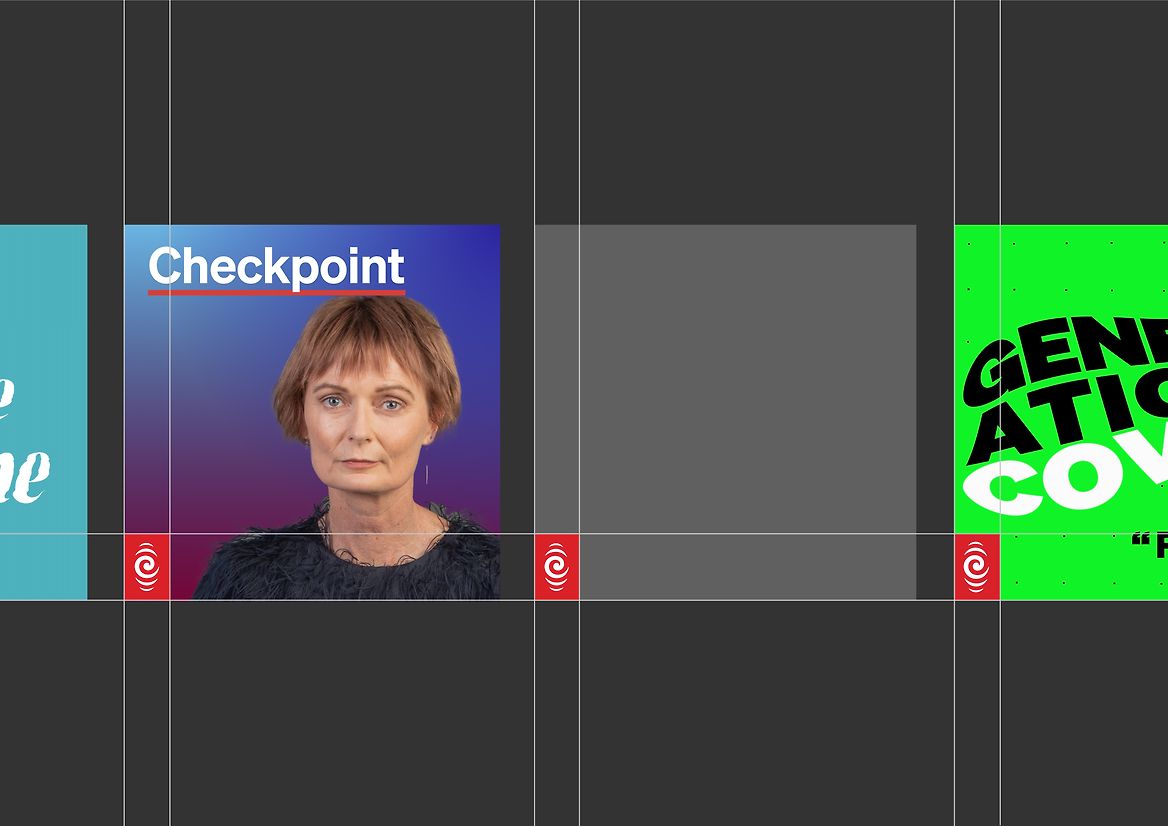
We started by zooming into the RNZ tohu, isolating the curved ripples at the top and bottom of the mark. On their own, they aren't particularly special, but if we begin to repeat them, compose with them, scale and crop them, they can form a cohesive language with endless design possibilities. We called this the resonance device. It is used sparingly, but is very handy for adding pattern, illustration or icon elements to digital banners and modules. Its universal shape appeals to many cultures, and its softness is a welcome addition to the brand.
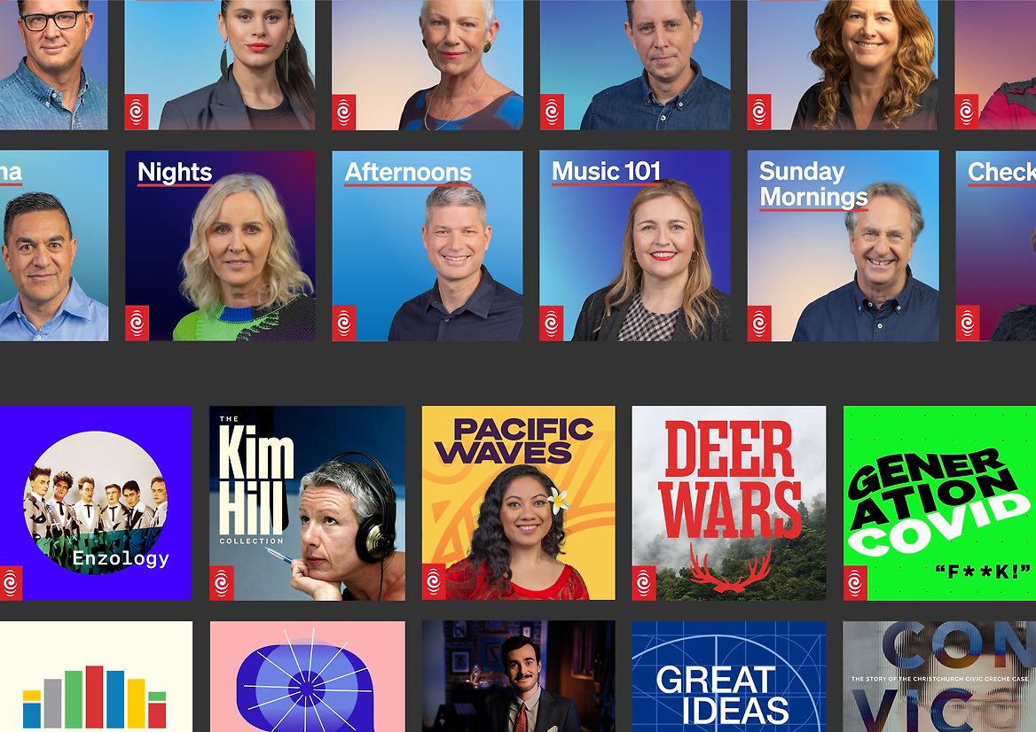
From there, we put our focus on typography and colour. We honed the typographic systems to cover the needs of their content and developed strong styles for different content while keeping it clear and accessible. We embraced RNZ's signature red, and found new ways to weave it into things like text underlining and progress bars.
Lastly, we honed layouts and templates to develop more consistent styles for different platforms. Additionally, consistent tohu badging rules were developed for all podcast and product covers, embracing the power of the red tohu in place of the full RNZ text lock-up.
All of these updates add to the trusted and reliable reputation that RNZ has built in the past, while ensuring it's ready for the future of Aotearoa.