Graphic
Colenso BBDO 79 Aroha
-
Pou Auaha / Creative Directors
Levi Slavin, Angela Watson (Managing Director)
-
Ngā Kaimahi / Team Members
Kate Smart, Hayley Pardoe, Hamish Steptoe, Luke Urqhart, Shona McCullagh, Ataahua Papa, Ashley David, Tim Wong -
Client
David Innes
Description:
An unprecedented year was the catalyst for a fresh vision for Auckland Arts Festival.
By shifting the focus to supporting a predominantly local lineup, the theme central to 2021; ‘Aroha’ became clear.
Aroha extends beyond love to connection, exchange, expression and manaakitanga. When the kupu is broken down, it reveals a deeper, more poetic insight into what Aroha means from a Māori perspective:
ARO– to turn to or to face
Ha – breath, breathing
In terms of the core values of aroha, connection holds particular importance.
Connection from a Māori perspective means connection to all things natural: connection to te taiao (the environment), connection to people, places, our atua (gods), to our tūpuna (ancestors) and our whakapapa.
Alongside the festival’s principle of unifying, uplifting and inspiring through art and shared experience, these meanings underpinned the redesign mahi undertaken.
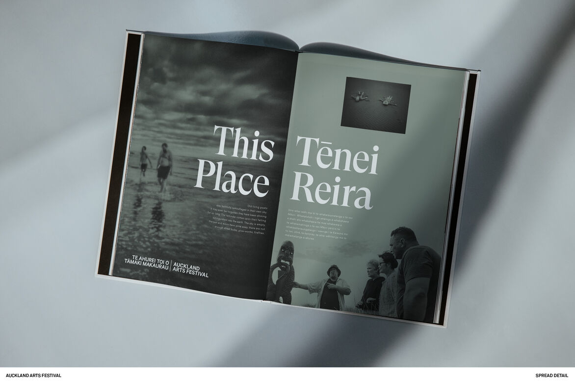
The intention of the work was to visually ground the festival in Aotearoa; specifically to ‘this land’, ‘this place’ and ‘these people’.
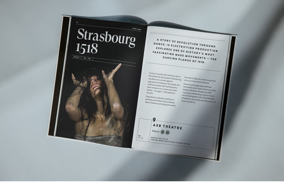
Supporting New Zealand artists with 95% of 2021’s programming by people of Aotearoa.
Kicking off a much-needed reset of festival going audience’s attitude to New Zealand work in a powerful way, balancing the programming to reflect the population of Tāmaki Makaurau, increasing participation and attendance of Māori, Pacifica and Asian audiences and making arts more accessible to more Aucklanders in a time of need for connectivity.
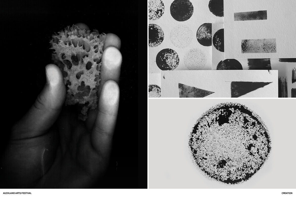
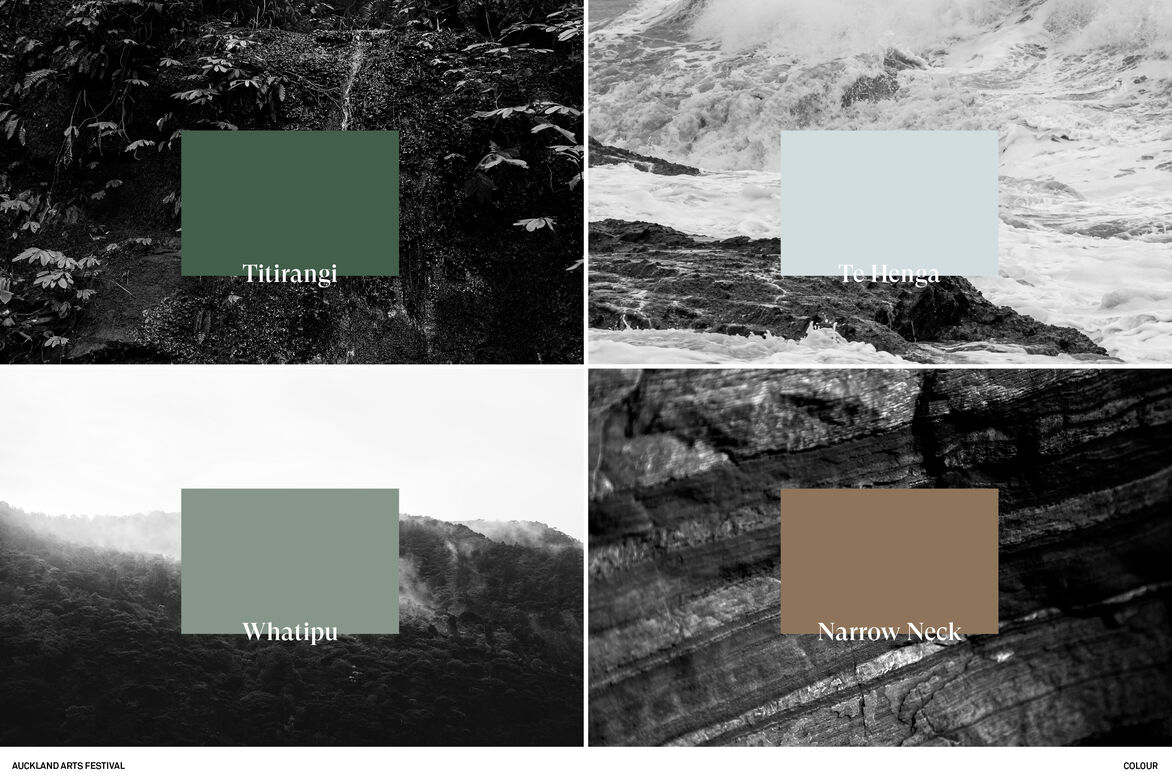
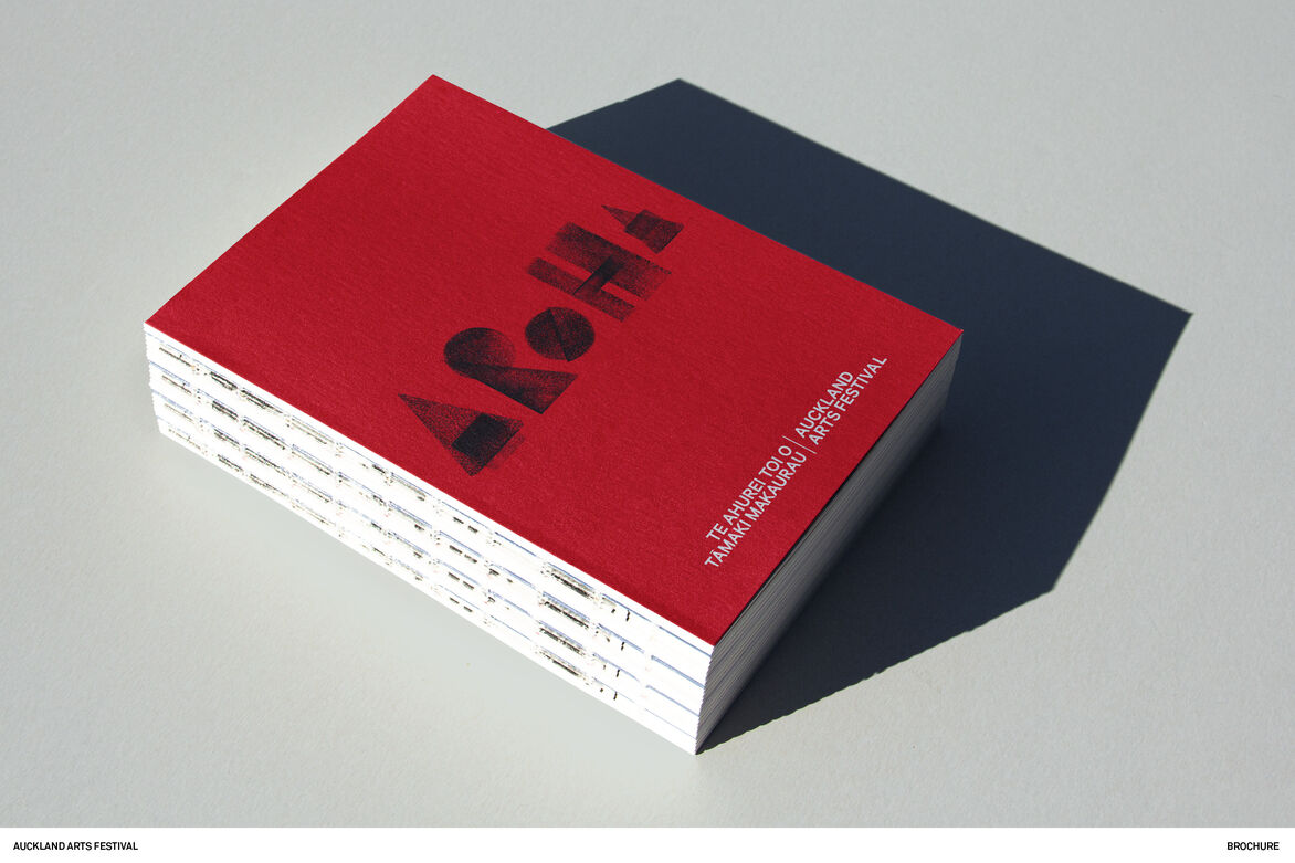
Through the kaupapa, it was clear that the 2021 had to feel of the earth. We took colour cues from Tāmaki Makaurau, representing the earth, sea and sky.
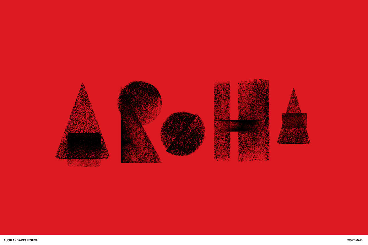
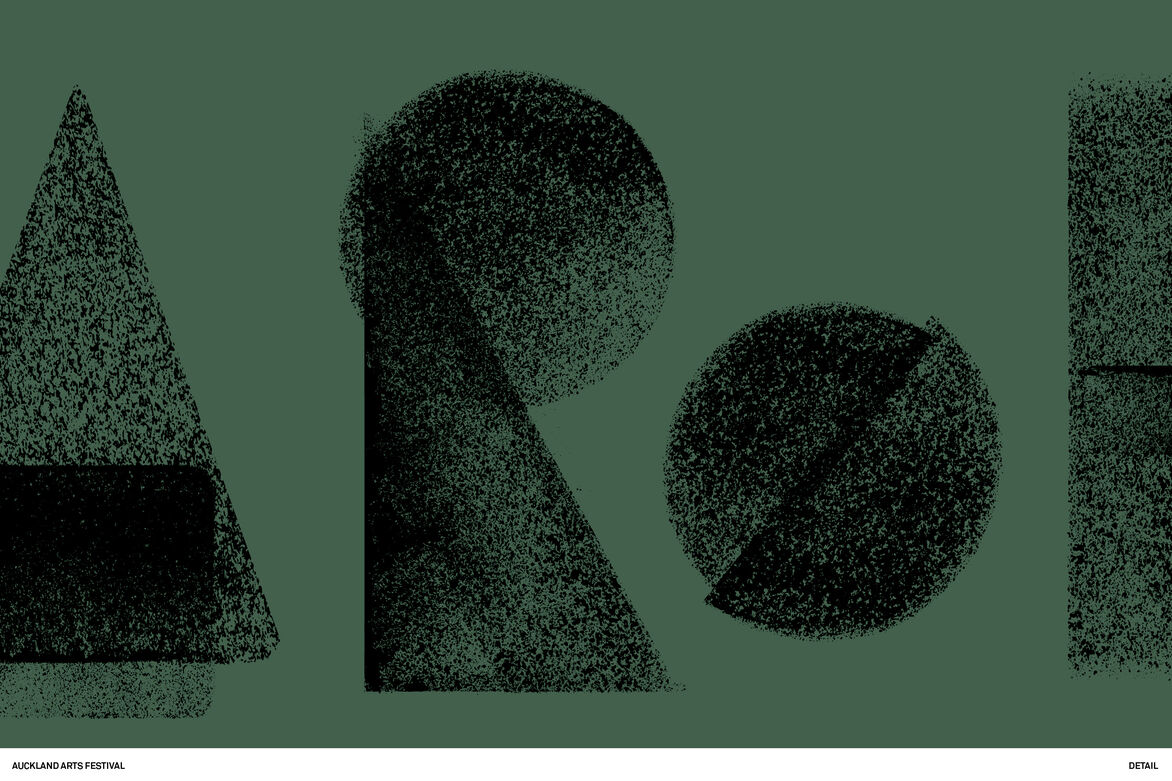
Learning the nuances of the term ‘aroha’ was powerful, and in doing so made us question the inherited letterforms of what was a spoken language. Breaking each character down to its simplest, most geometric forms allowed us to work the typography with phonetics in mind and not colonial serifs and geometry.
By working these forms with natural textures of the earth, we created a wordmark that felt inherently ‘Aotearoa’, grounding the festival and setting the intention for the future.