Digital
Springload 37 Youth Service
-
Pou Auaha / Creative Director
Dan Newman
-
Ngā Kaimahi / Team Members
Chris Barneau, Zak Brown, Gisela de la Villa, Emlyn Hughes, Ruth Hendry, Calin Dale, Juliet Brown, Stephanie Kan -
Kaitautoko / Contributor
Wrestler -
Client
Ministry of Social Development
Description:
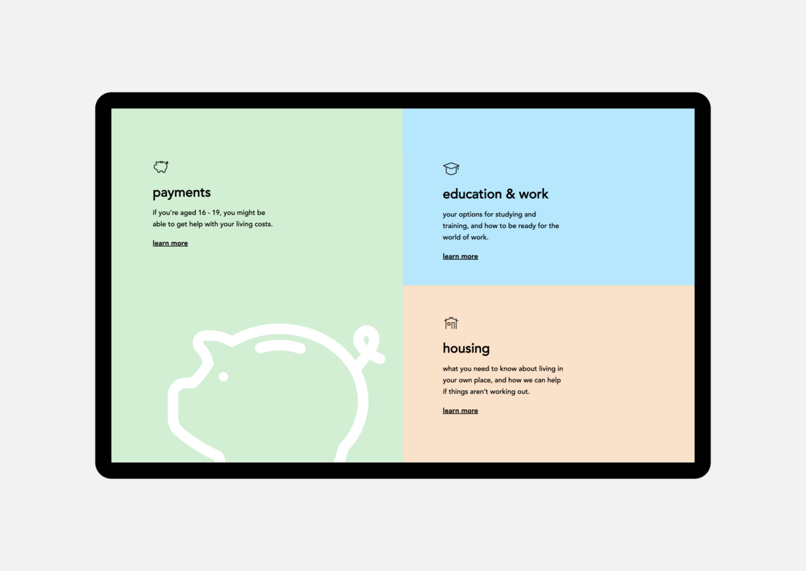
Youth Service Ratonga Taiohi is a Ministry of Social Development initiative helping New Zealand’s youth gain independence and confidence, connecting them to services and supports including Youth Benefit. Young people needed an engaging, accessible website giving clear pathways to help. MSD’s intention was to empower rangatahi and help them on the path to becoming who they want to be, through access to support.
A user-centred approach meant we needed to actively build rapport with taiohi (youth), to get detailed and honest insights. The timing for this work was the 2020 level 4 lockdown, so we had to think carefully about creating connections at this time. It was already an emotionally challenging time, and we wanted these young people to feel supported. So we trained Youth Service coaches, already working with taiohi, to carry out user testing remotely across Aotearoa. Supporting MSD to do this themselves was a great way to access insights and build on existing relationships. We implemented the user feedback and iterated our designs.
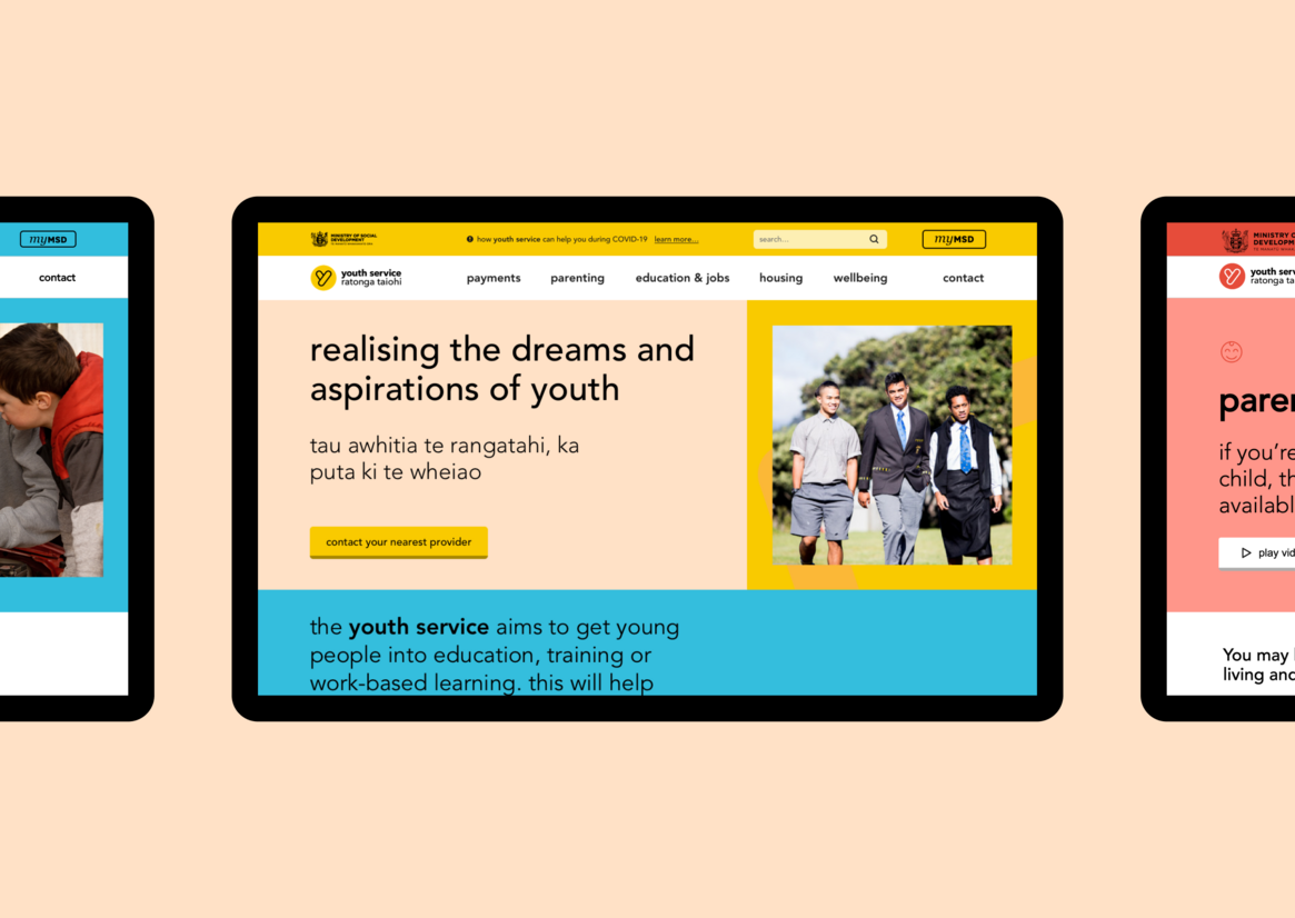
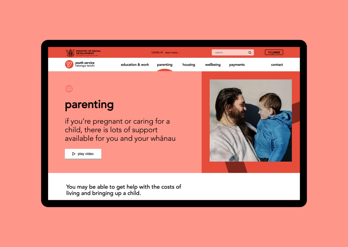
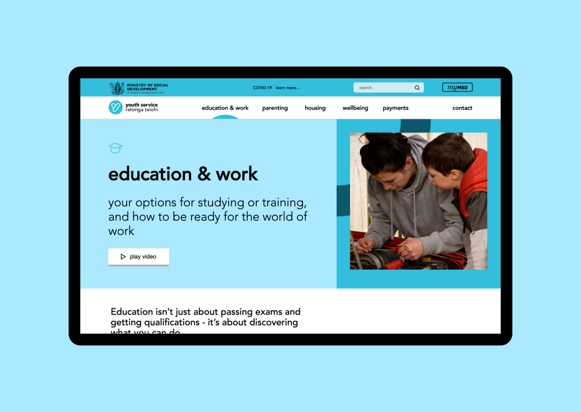
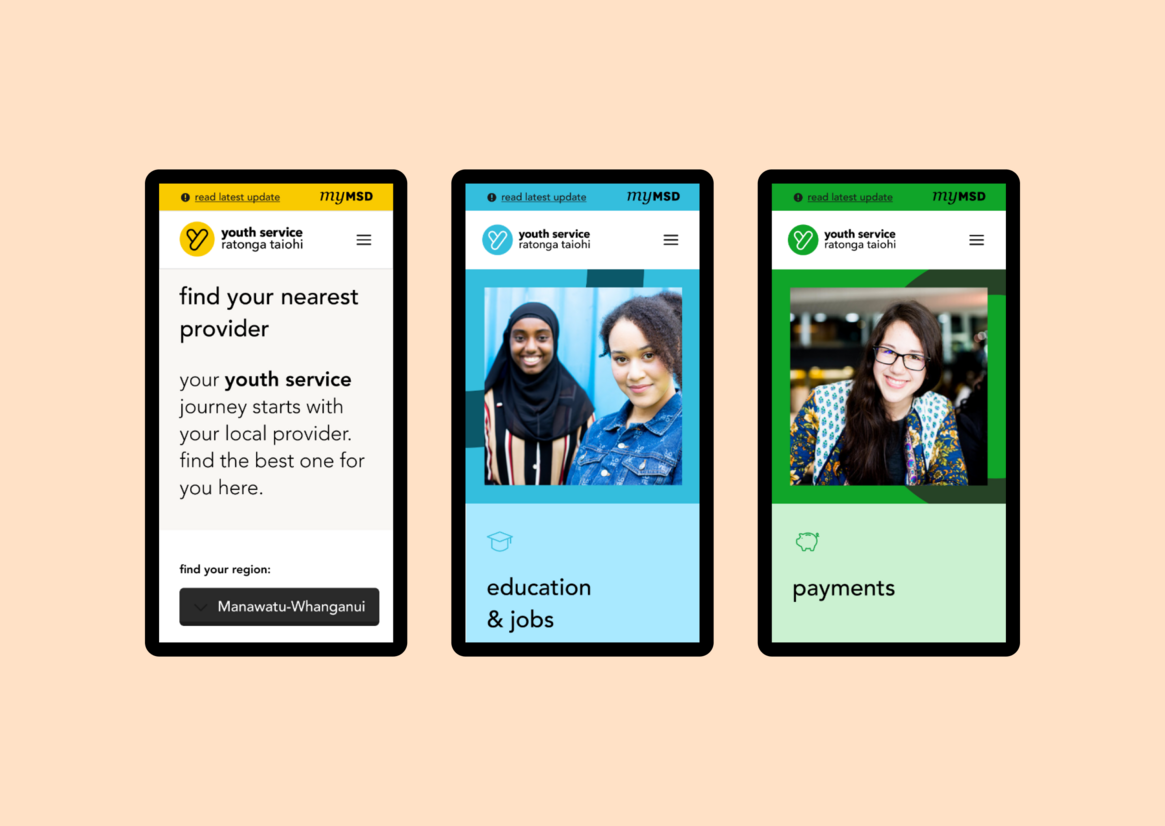
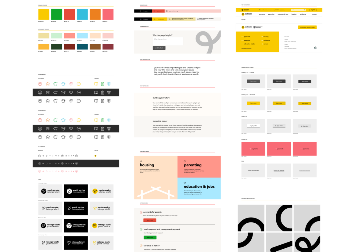
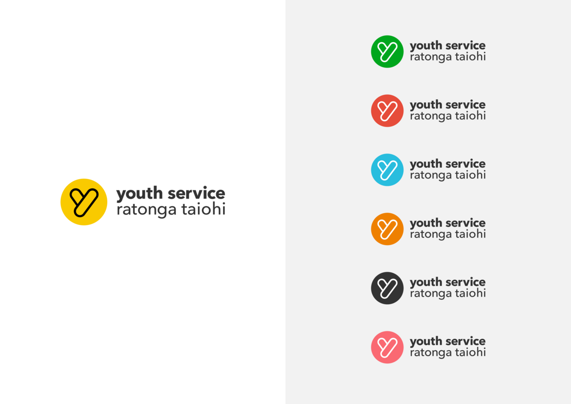
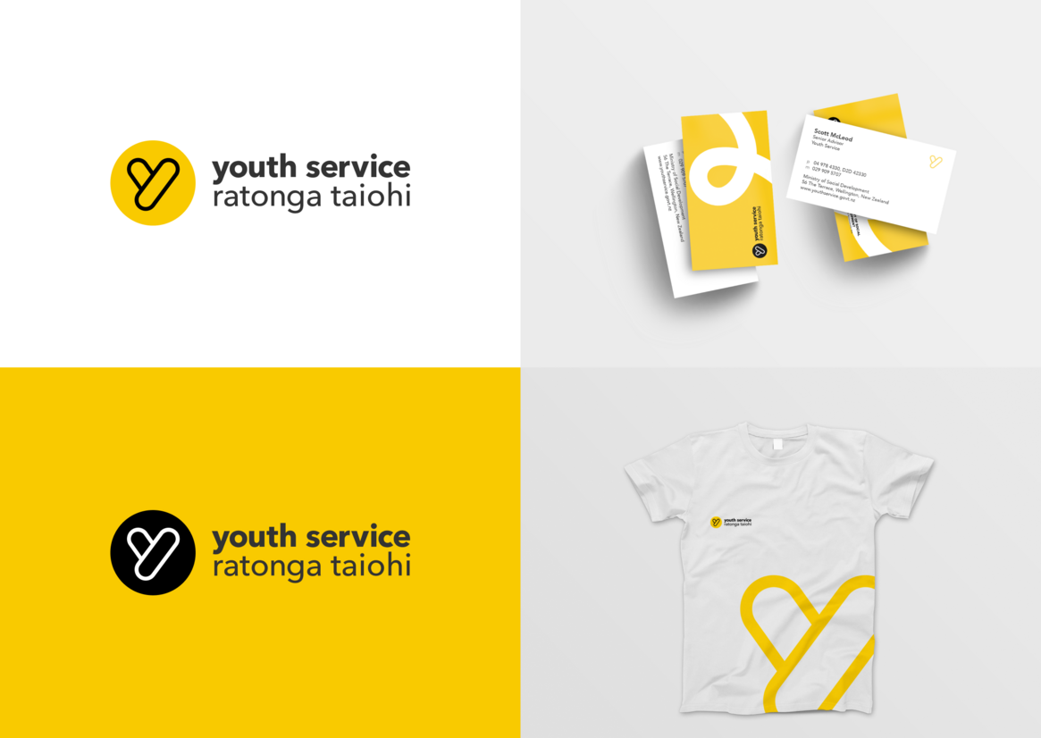
Research told us the previous brand wasn’t connecting with young people. We wanted to maintain word mark recognition, but update it to be age-appropriate. We simplified the logo while retaining its shape. The logo’s colours are now used to theme different sections of the site. The palette gives the site an optimistic, upbeat feel. Our designer created a path motif weaving through the site in the background. It gives subtle messaging about making progress and keeping on track.
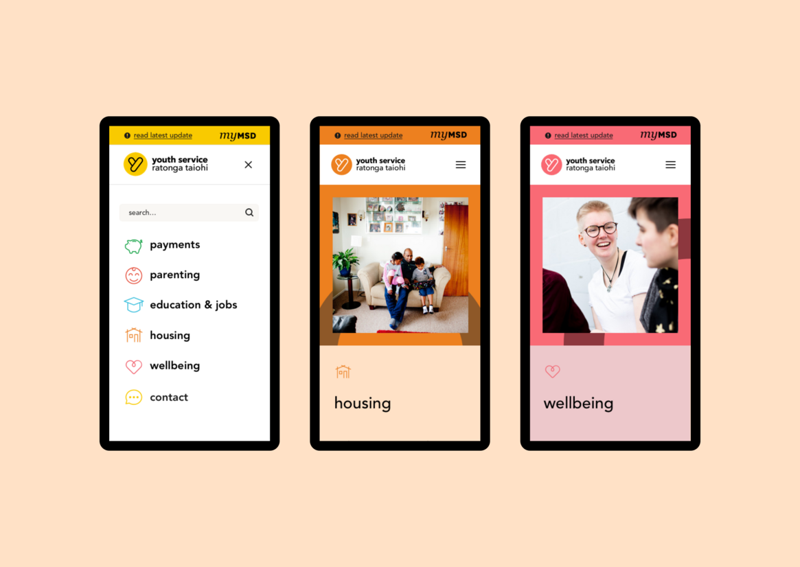
Most youth access support on their phones, so mobile-first design was a must. In testing, youth responded to images, particularly the Instagram interface. Inspired by this aesthetic, we made images square, kept them free from overlapping, and made all text as short as possible.
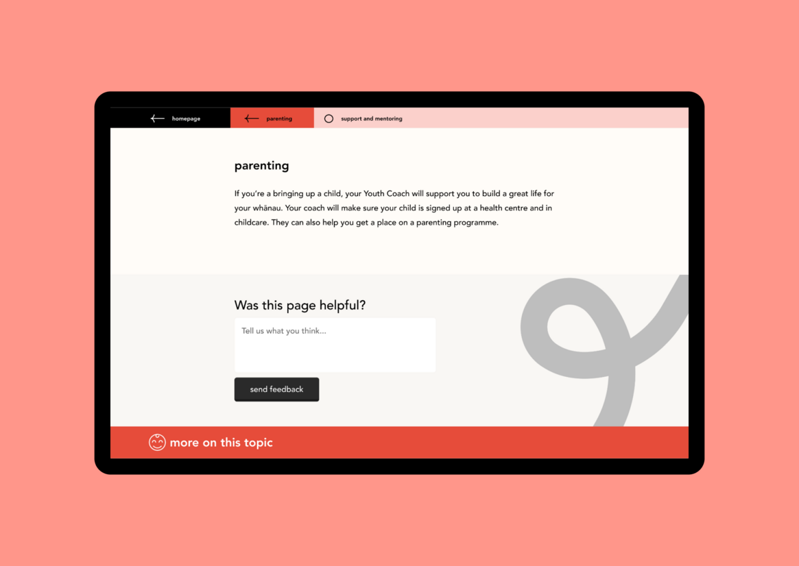
In testing we also learnt young people wanted more snappy, informal language. We provided content recommendations to reduce copy and make the tone clear, non-judgmental, and friendly. One powerful way to say the website was for youth, and make an engaging space for them, was to style all content in the same way they communicate with each other on social messaging every day: with lowercase text only. This simple mechanism is a powerful connector for the audience of this site and says, ‘this site is for you, not for adults’.
We also used non-text content with videos created by Wrestler, so young people could see themselves and their experiences reflected. Transcripts beneath each video ensure they meet government accessibility standards.
“From the start of the project, Springload were engaged and showed a real passion to create a website that would help our rangatahi” (Scott McLeod, Business Owner)
“Springload worked to understand the needs of our vulnerable users, and designed a creative solution that works for our users, under the most challenging conditions (COVID-19). We couldn’t ask for more” (Suzie Tingley, Manager, Digital Communications)