Digital
RNZ Product RNZ Summer 2020
-
Pou Auaha / Creative Director
Robert Whitaker
-
Ringatoi Matua / Design Director
Jarred Bishop
-
Ngā Kaimahi / Team Members
Jayne Joyce, Vinay Ranchhod, Vimal Jobanputra, Tuterangiwhaitiri Pleydell, Emma McGahan, Ischtar Toomey, Cara Hill -
Kaitautoko / Contributor
Pinky Fang -
Client
RNZ
Description:
“Give us a break.” That was the brief.
RNZ is Aotearoa’s most trusted news source. 2020 was a year like no other and millions turned to RNZ for thorough, fair and accurate reporting during the pandemic, Christchurch terror trial and general election. But summer was approaching and we all needed a break.
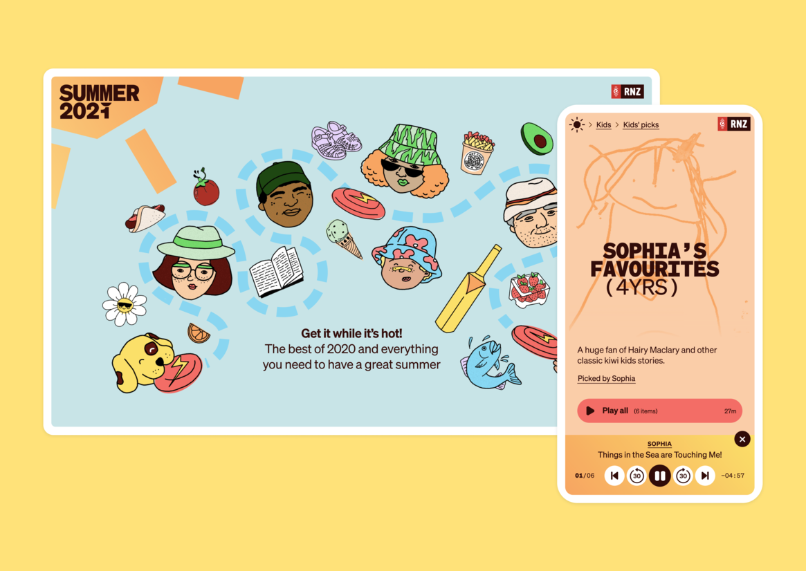
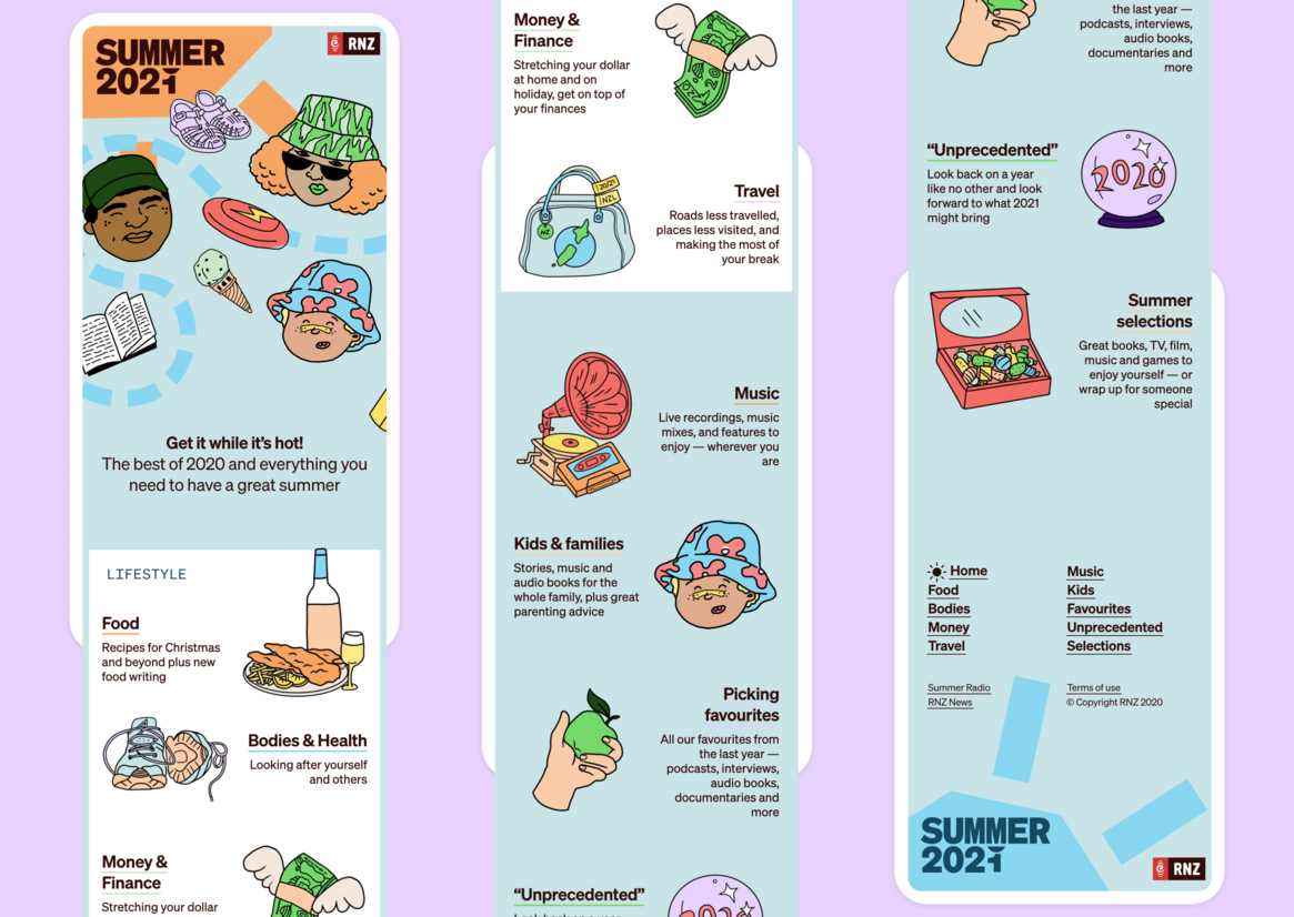
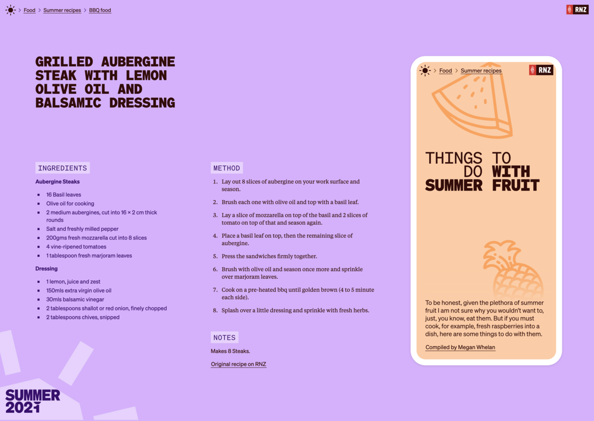
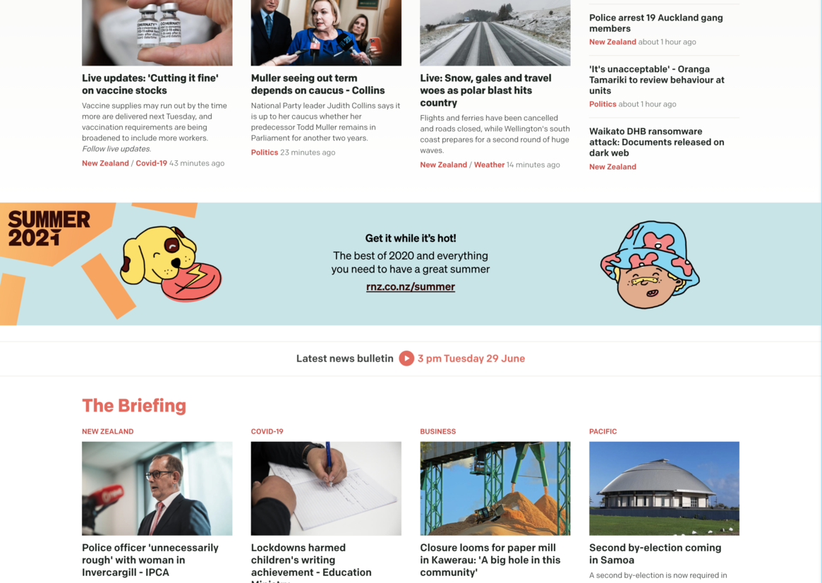
The response was Summer 2020: a dedicated digital summer magazine that could bring together all the best of 2020, fresh long-reads and recommendations, audio books, interviews and stories for all ages.
This idea of “a break” helped us work together to define the audience and — just as importantly — their context. We thought about people planning their holidays and celebrations, holidaymakers relaxing at the beach or bach, families on long drives and essential workers on their mid-shift breaks. When you’re on a break — however long — you reach for whatever device you have to hand so it needed to work great on everything.
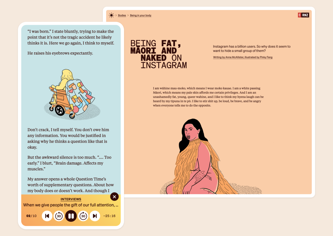
Like a print magazine summer edition, RNZ imagined it sitting on the the coffee table in the crib or break room or stuffed in the glovebox of the car — being dipped into over and over. We needed to find ways to bring together audio, video and written features, it needed to be well organised but offer a touch of serendipitous discovery.
It needed to feel light and fresh and not at all news-y but it also needed to be part of the RNZ family, like a fun cousin you see every summer.
So, “a break” also meant a break from convention for RNZ.
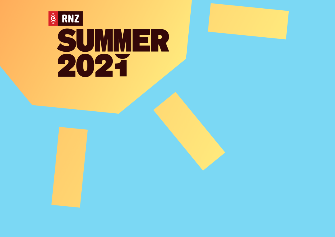
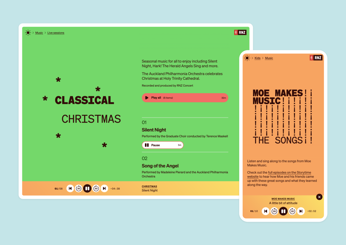
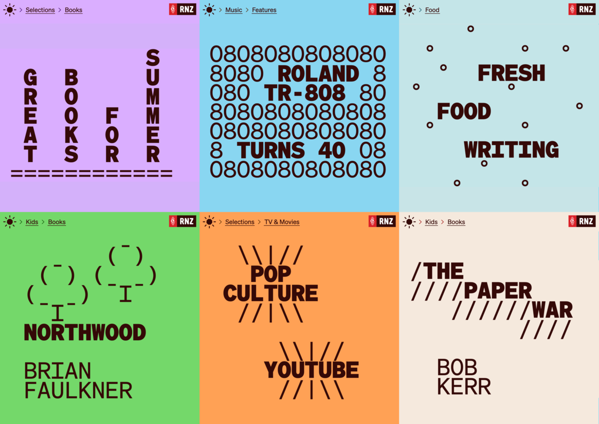
We designed a mobile-first website focused on a great reading, listening and watching experience. We dressed the site in vibrant, summery colour palette and fresh typography that was just quirky enough to feel like a magazine without compromising the more serious and reflective content.
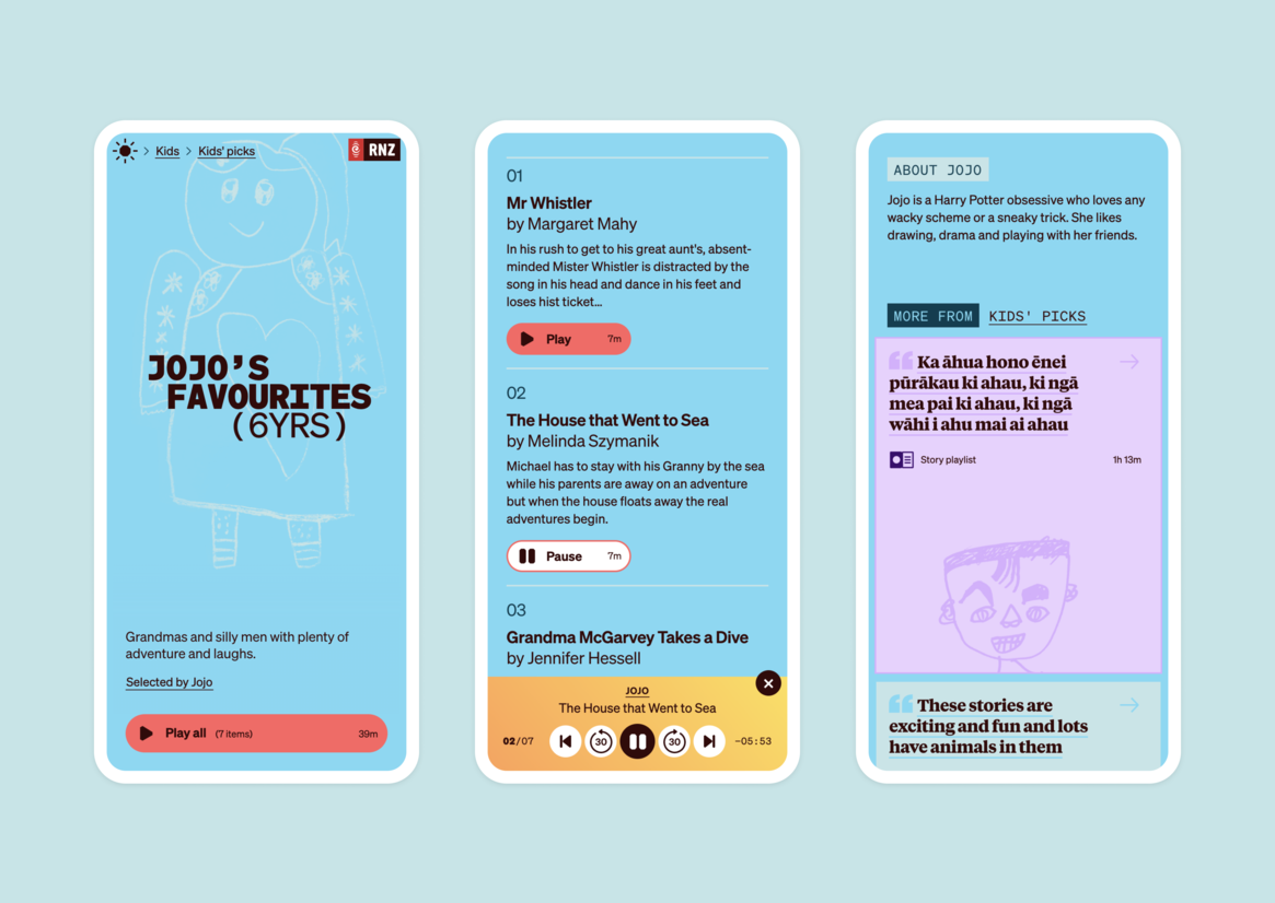
RNZ is all about sound, so we poured effort into delivering a friendly and powerful audio player to make every interview, kids story and live recording sound great.
We paid particular attention to accessibility and usability, as RNZ is for everyone. We built for older devices, different levels of ability and users’ context — after all who doesn’t enjoy a good read in the bright sunshine.
The heart of the content design was carefully typeset page titles in a monospace font in two weights supported by a variety of colour themes. This let us design unique ASCII-like graphic titles and adjust the look and feel for each of the more than 150 pages of the site. As a final touch we put the titles in motion, inspired by the spin of the odometer as you rack up the kms on your summer road-trip.
Other little touches like the kids’ self portraits on their playlists, home page and section illustrations and the animated sun logo add even more fun and tell the truth of the design — that it was break from the news, life and convention for the audience, RNZ and the designers alike.