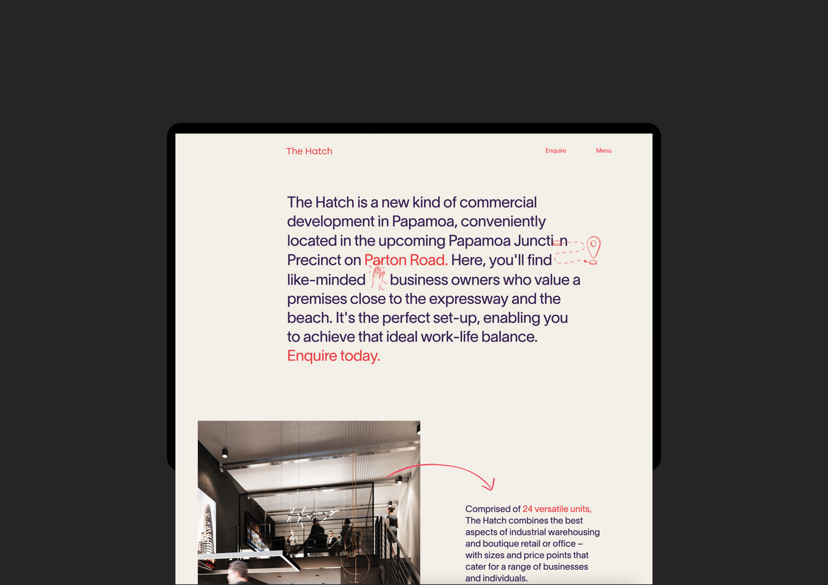
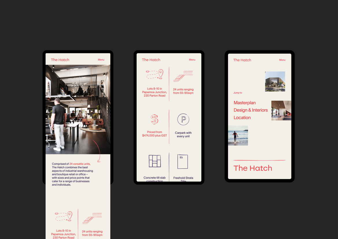
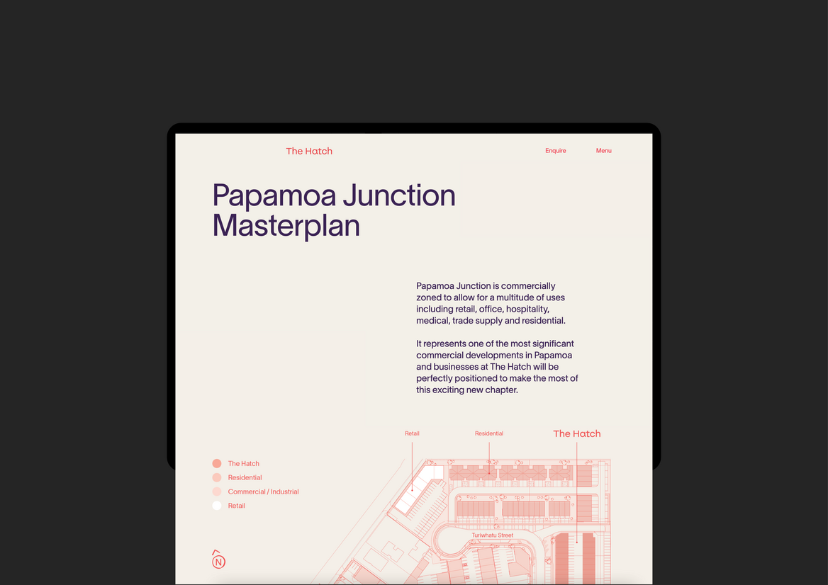
The Hatch is a development of 24 versatile commercial units that combine the best aspects of industrial warehousing and boutique retail. It is located in the upcoming Papamoa Junction, a mixed-use precinct comprised of commercial, industrial and medium-density residential. It is the first development of its kind in the Bay of Plenty region, and a timely response to a surge in population and investment in Papamoa.
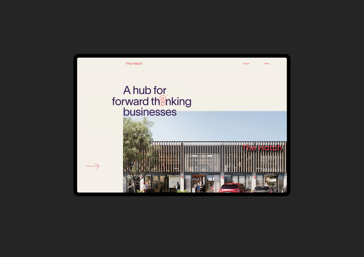
We were tasked with creating a brand and website that captured the essence of the development and the unique quality of the spaces. We have positioned the Hatch as ‘A hub for forward-thinking businesses’ where innovative business owners can achieve that ideal work-life balance offered by the coastal location.
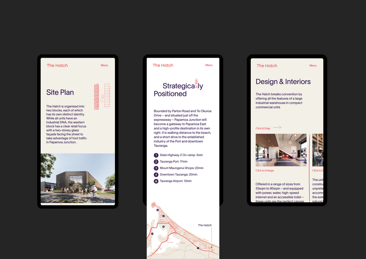
From a visual perspective, we have designed a contemporary brand that utilises a bright colour palette, modern sans-serif fonts, hand drawn animations and a quirky logo. The hand-drawn elements draw attention to important features, make a dry product feel more human, and speak to the creative energy of conception – trying things out, sketching out thought processes and throwing around ideas to see what sticks. The CGIs – also done in-house – allude to the sorts of boutique tenants we felt represented the spirit of the brand: a yoga studio, a pottery studio, an architecture studio and a surfboard manufacturer.
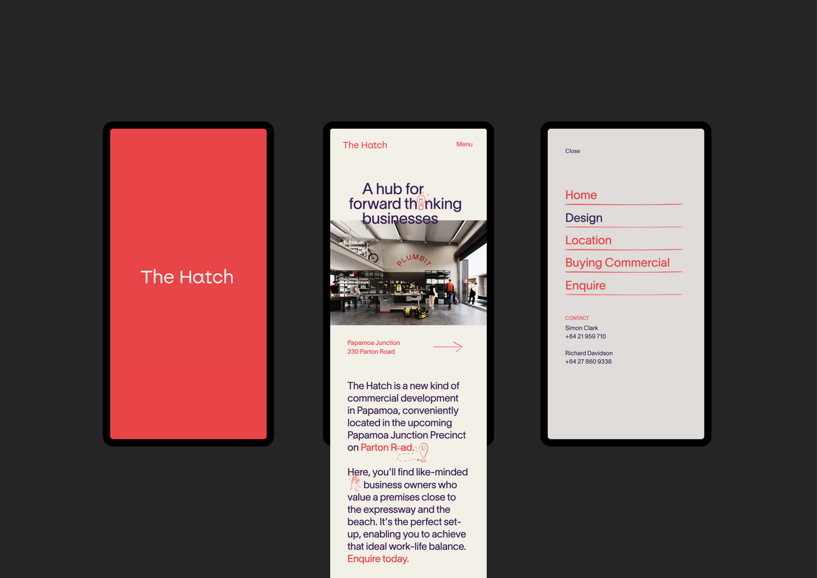
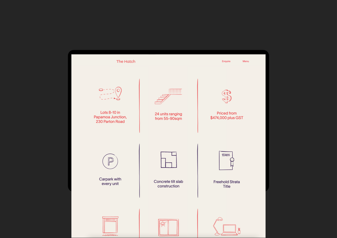
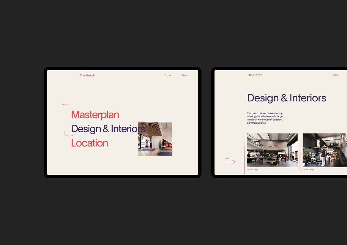
Within the website, we have used animations and interactions to engage and elevate the user experience. We designed an animated loading screen to ensure the initial message ‘The future of work in work in Papamoa’, brand red and the logo are delivered without any distraction. Elements animate in as the user scrolls through the site, guiding the user’s eye to specific content. Illustrations are used to point out important bits of information, integrate text with image and break content up into engaging info-bytes. On the Design & Interiors page, we break up the vertical scroll with horizontally-oriented content. The diversity of movement gives an energy to the site that reinforces the brand values of innovation, creativity and ‘doing things differently’.
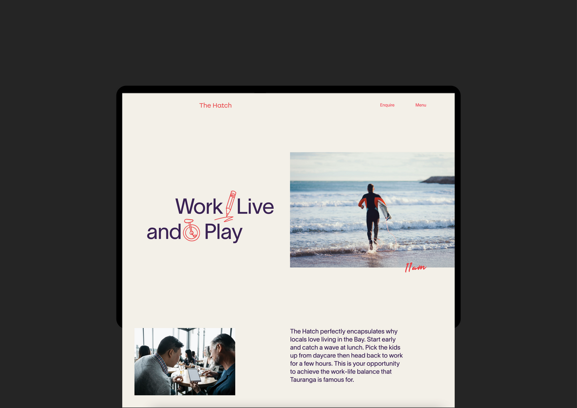
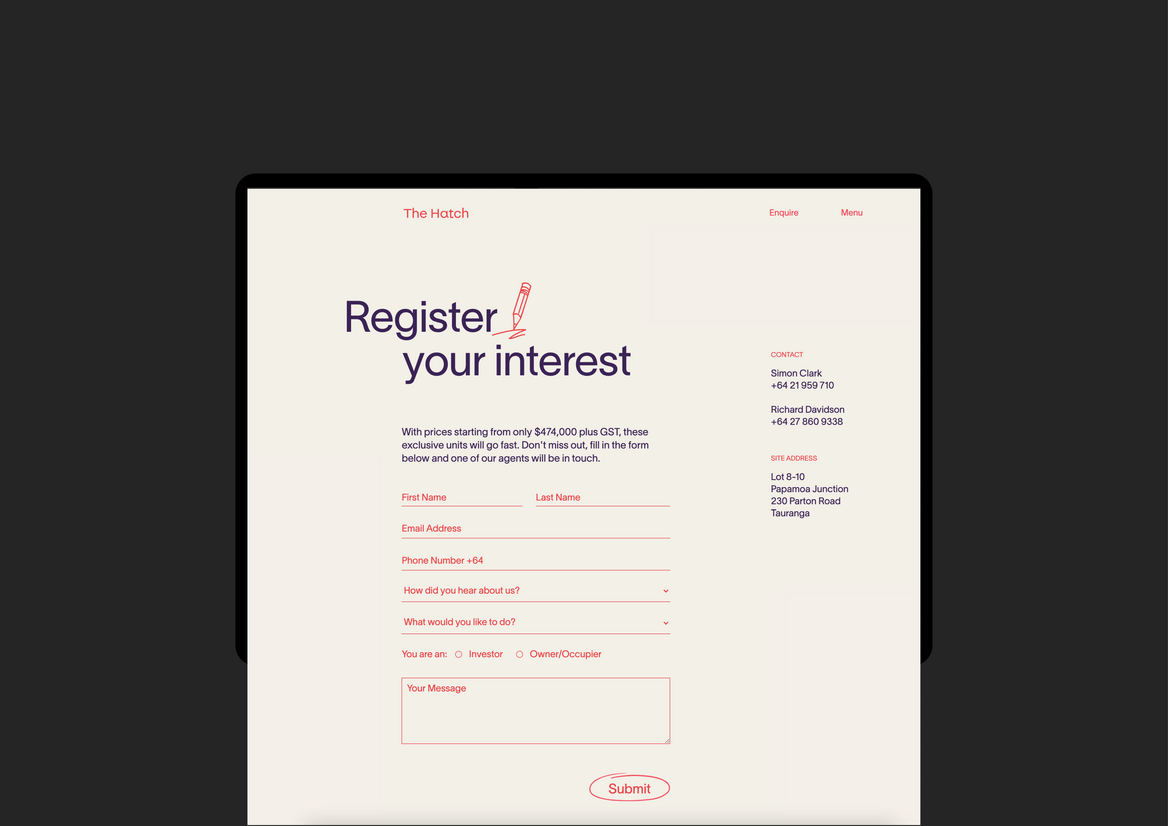
We have used copy written in the second person to speak directly to users: “It’s the perfect setup, enabling you to achieve that ideal work-life balance”. Punchy calls to action like “Jump to…” and “Drop us a line” grab the user’s attention with their directness and colloquial nature. Lifestyle photography is intimate and relatable. The message is strong: here is a unique opportunity to invest in a novel workspace that will unlock your business’s potential, but also give you a great coastal live-work-play lifestyle.
The Hatch website is successful in its holistic execution. It is simple, functional and to-the-point but also full of personality and energy like the building it represents. Navigation is intuitive; important content is easily accessed; copy is succinct and informative. It is well-coded and art-directed so all its many flourishes support the brand positioning and messaging without overpowering the content. It looks great on all screens and all motion and animations have been kept when reflowing to tablet and mobile.
Description:
The Hatch is a development of 24 versatile commercial units that combine the best aspects of industrial warehousing and boutique retail. It is located in the upcoming Papamoa Junction, a mixed-use precinct comprised of commercial, industrial and medium-density residential. It is the first development of its kind in the Bay of Plenty region, and a timely response to a surge in population and investment in Papamoa.
We were tasked with creating a brand and website that captured the essence of the development and the unique quality of the spaces. We have positioned the Hatch as ‘A hub for forward-thinking businesses’ where innovative business owners can achieve that ideal work-life balance offered by the coastal location.
From a visual perspective, we have designed a contemporary brand that utilises a bright colour palette, modern sans-serif fonts, hand drawn animations and a quirky logo. The hand-drawn elements draw attention to important features, make a dry product feel more human, and speak to the creative energy of conception – trying things out, sketching out thought processes and throwing around ideas to see what sticks. The CGIs – also done in-house – allude to the sorts of boutique tenants we felt represented the spirit of the brand: a yoga studio, a pottery studio, an architecture studio and a surfboard manufacturer.
Within the website, we have used animations and interactions to engage and elevate the user experience. We designed an animated loading screen to ensure the initial message ‘The future of work in work in Papamoa’, brand red and the logo are delivered without any distraction. Elements animate in as the user scrolls through the site, guiding the user’s eye to specific content. Illustrations are used to point out important bits of information, integrate text with image and break content up into engaging info-bytes. On the Design & Interiors page, we break up the vertical scroll with horizontally-oriented content. The diversity of movement gives an energy to the site that reinforces the brand values of innovation, creativity and ‘doing things differently’.
We have used copy written in the second person to speak directly to users: “It’s the perfect setup, enabling you to achieve that ideal work-life balance”. Punchy calls to action like “Jump to…” and “Drop us a line” grab the user’s attention with their directness and colloquial nature. Lifestyle photography is intimate and relatable. The message is strong: here is a unique opportunity to invest in a novel workspace that will unlock your business’s potential, but also give you a great coastal live-work-play lifestyle.
The Hatch website is successful in its holistic execution. It is simple, functional and to-the-point but also full of personality and energy like the building it represents. Navigation is intuitive; important content is easily accessed; copy is succinct and informative. It is well-coded and art-directed so all its many flourishes support the brand positioning and messaging without overpowering the content. It looks great on all screens and all motion and animations have been kept when reflowing to tablet and mobile.