Digital
Inklab 16 Alquemy
-
Pou Auaha / Creative Director
Colin Haining
-
Kaituhi Matua / Copywriter Lead
Sydney Oakman
-
Ngā Kaimahi / Team Members
Alicia Constantine, Nico Koegelenberg, Sean Butler -
Kaitautoko / Contributor
Jarryd Sinclair -
Client
Alquemy
Description:
Turning uncertainty into opportunity through industrial design, the Alquemy team sees possibility in everything. Conceptualising products for the modern home, their work is layered with insights, strategic thinking and experimentation. The visual identity and website were developed in tandem to distil the notion of ‘alchemy’, reflecting the team’s ability to transform raw ideas into refined products and brand experiences.
Hindered by limiting definitions of industrial design, Alquemy’s role in the foundational branding process was often undervalued by clients and the market. While their portfolio was strong, their previous website failed to capture the clarity, confidence, and cohesion needed to showcase their value.
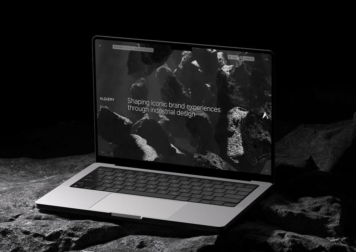
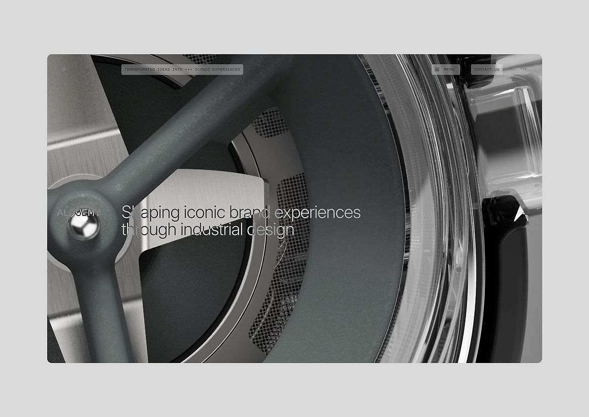
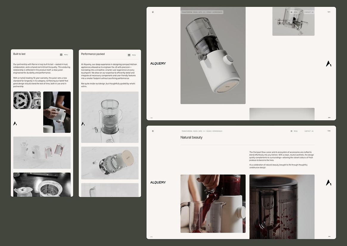
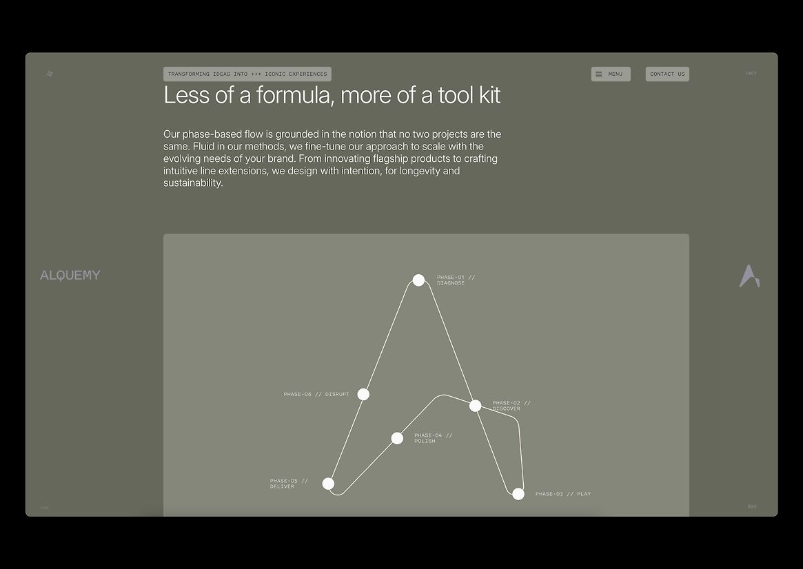
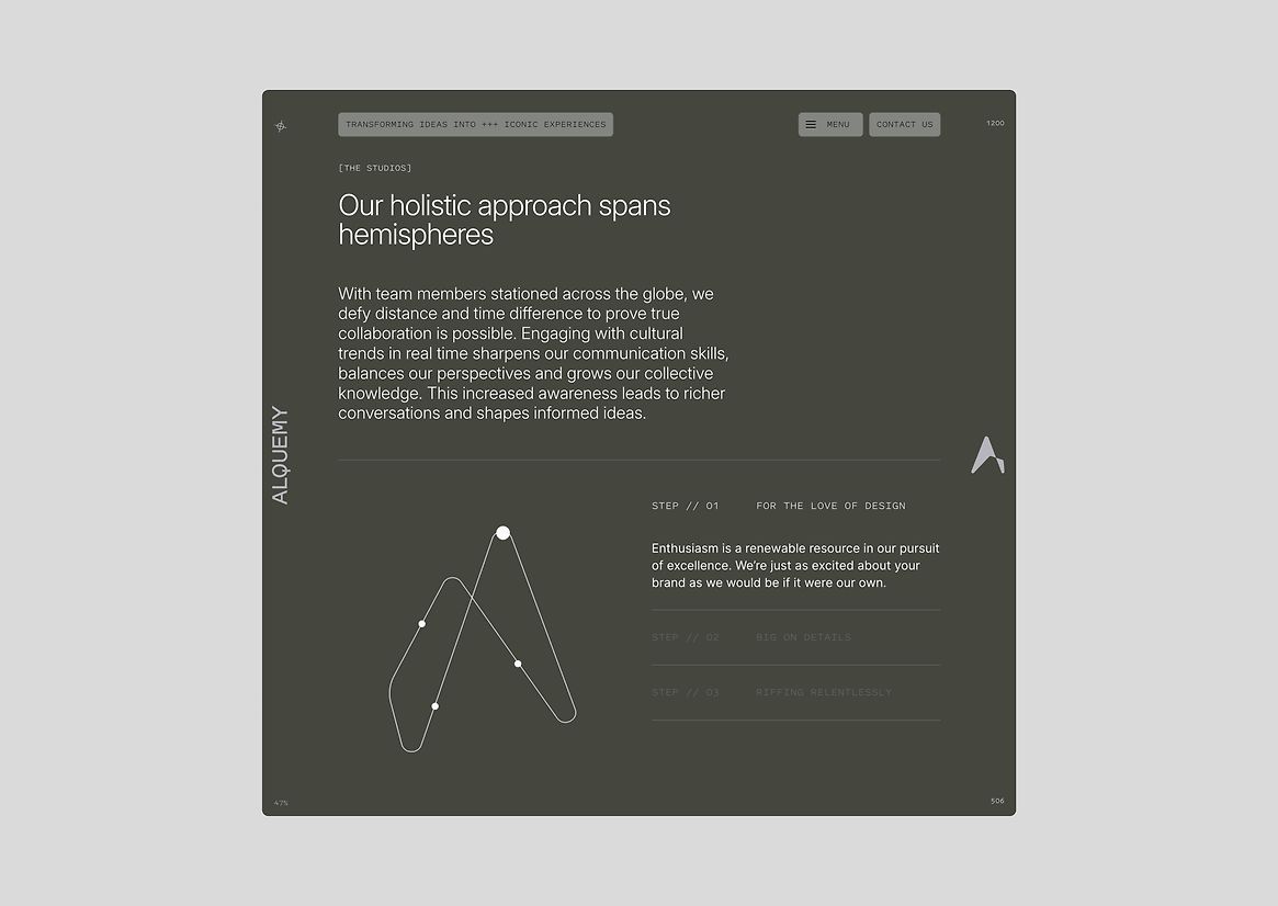
The new website establishes a sophisticated digital environment that invites users to engage with Alquemy’s work in a way that feels both approachable and expert. Its layered design reflects the complexity behind Alquemy’s process without overwhelming visitors, offering a balance between technical detail and creative storytelling.
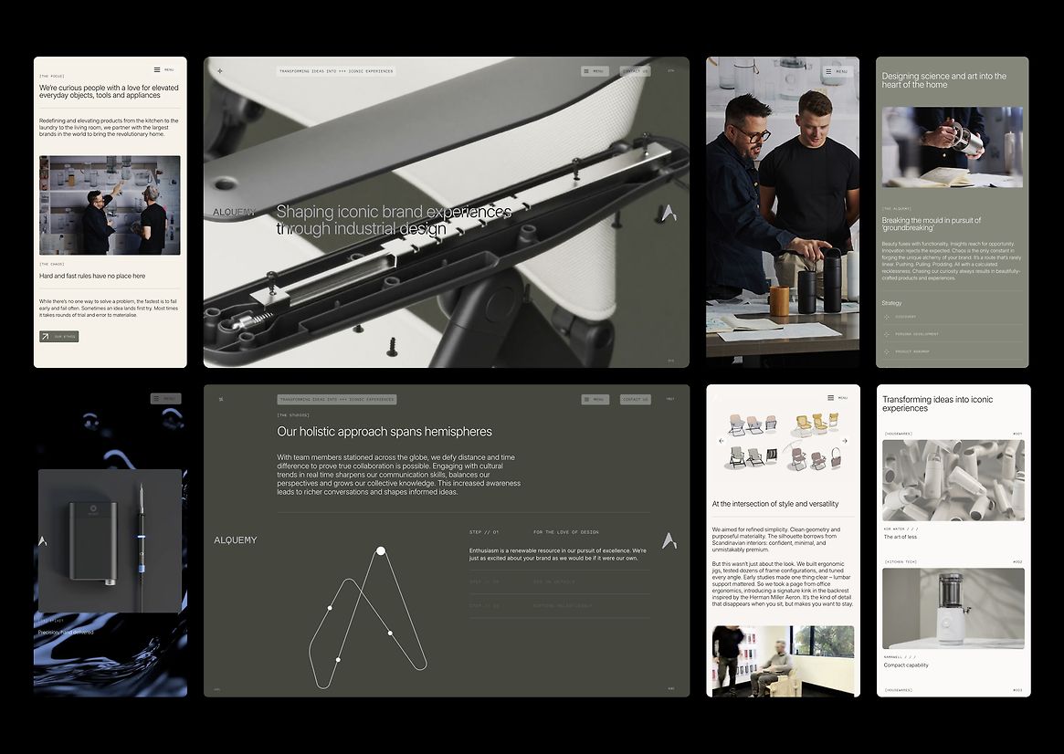
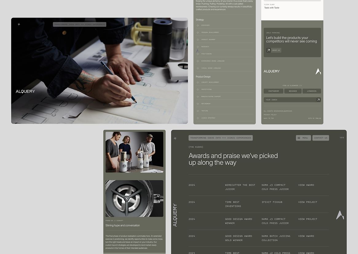
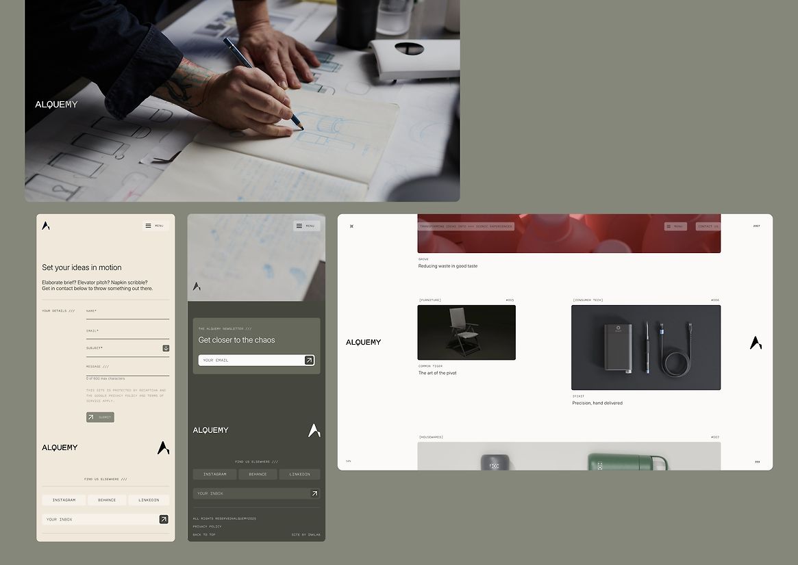
Interactivity plays a central role in guiding users through the site with clean, spacious layouts that support diverse user journeys and enable each target audience to find relevant information with ease. From the initial loading sequence, which evolves from sketch to fully rendered logo, to subtle hover animations, every interaction is crafted to reinforce Alquemy’s identity as a thoughtful and innovative partner. These moments of motion and transition provide cues to the brand’s ethos of transformation and craftsmanship, encouraging users to explore more deeply.
Messaging maintains a modern yet inviting tone, encouraging visitors to linger, discover, and ultimately connect. Rounded edges on UI components soften the interface while mirroring the bespoke letterforms in the logo, creating a unified visual language. Monospaced fonts used for technical specifications give a nod to precision and engineering, distinguishing detailed content without sacrificing readability. The colour scheme combines deep, moody tones with warm accents and textured backgrounds, grounding the site in a tactile realism that contrasts with overly clinical industry norms.
Contrasted against polished renders and concept sketches, studio photography offers an intimate, behind-the-scenes view, capturing the team’s human touch and involvement throughout the process with images of workshops and stakeholder engagement activities. The integration of video content enriches storytelling and demonstrates capabilities beyond static imagery.
Together, these elements embody Alquemy’s commitment to thoughtful design, technical excellence, and meaningful collaboration. The site serves as a strategic business tool, with content and features optimised to attract qualified leads by clearly communicating Alquemy’s value proposition. It stands as a versatile platform ready to evolve alongside the company, supporting future growth and continued leadership within the industrial design field.