HuffPost had been working alongside ProPublica’s data team to unearth a true picture of the damage that the Trump administration had done to the collection of data across its many arms. Through climate change, the pandemic, poverty, science, food policy, and the census; this government had cut a deliberate swathe — converting, concealing, and abandoning the collection of data.
We wanted to bring to life how the manipulation of information can disrupt public understanding and discussion around key issues, sowing chaos and confusion. In the leadup to the 2020 US Elections our goal was to create something that would help cut through the noise, deeply engaging HuffPost’s audience on this important series of topics.
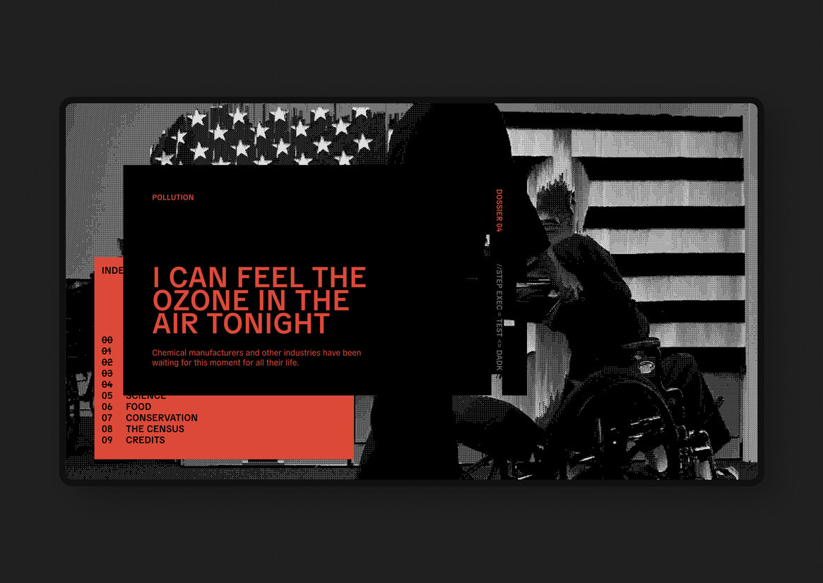
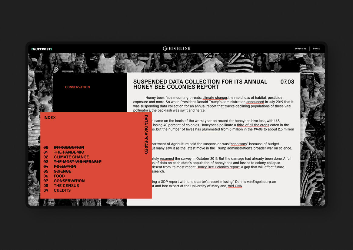
There are two main ideas behind the look and feel of Data Disappeared. ‘Visual Information Decay’ and ‘Outdated Technology’. Both of these creative territories helped guide our art direction.
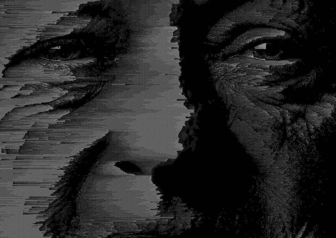
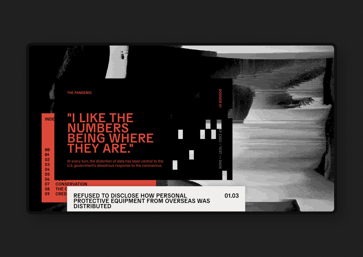
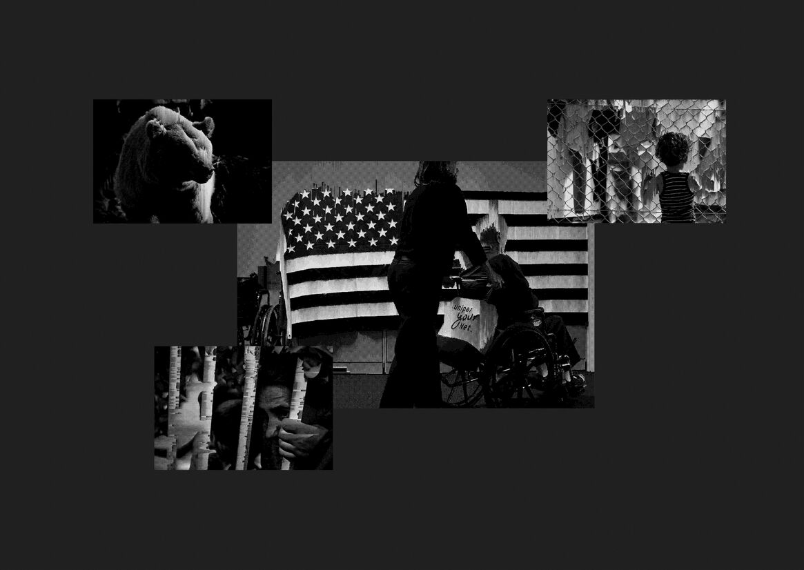
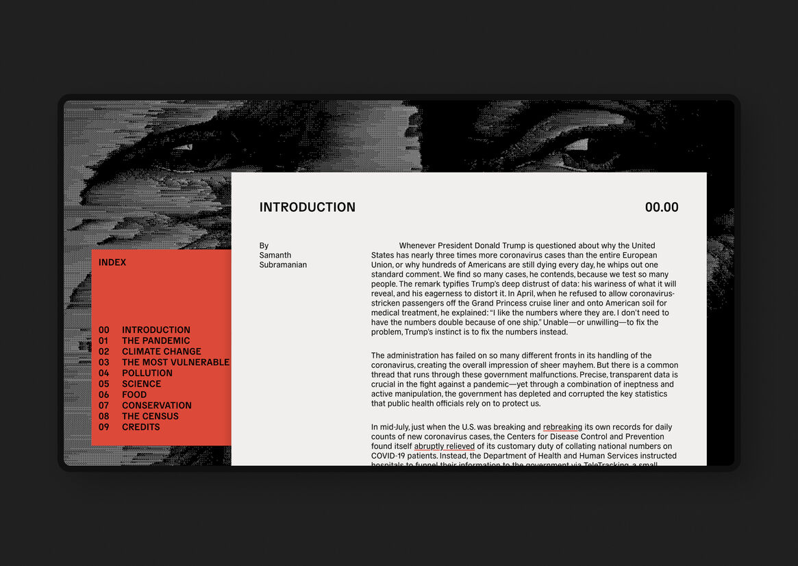
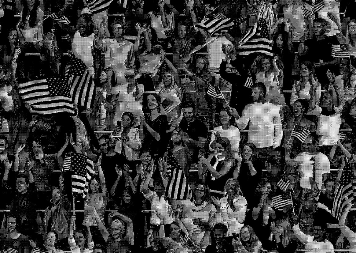
Throughout the site, the visual backgrounds are images which have been destroyed and distorted, they have a sense of unstable ‘truth’ to them. Using WebGL allowed us to replicate a digital glitch transition which is driven by the reader’s scrolling.
The image glitch in the background is a clever piece of programming that takes chunks of photo data and randomly deletes lines of code. At the same time it copies data from the next image in the sequence and adds that code back into the original photo as you scroll and in real time. It’s a dynamic effect that connects the reader directly with the reading experience and gives each version of the site its own unique visual footprint.
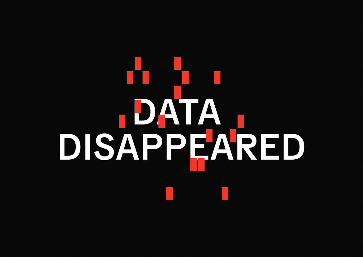
During our research we came across data punch cards from the 1970’s that are still in active use by the US government. We converted each section’s title into a data punch card pattern and used these as a visual motif across the eight core topics.
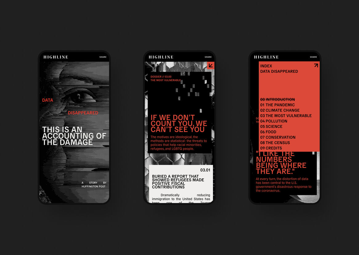
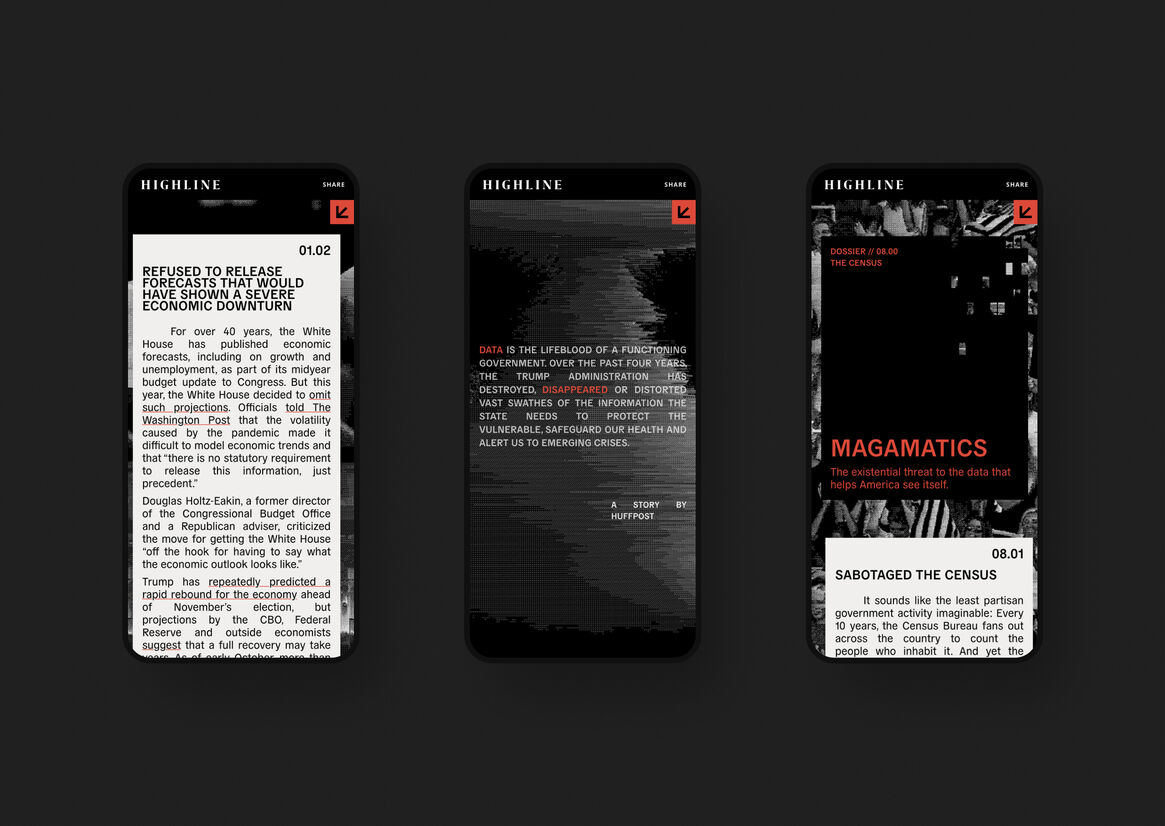
We identified early on that this project had a potentially complex structure – an extended introduction leading into eight chapters which each contained 2 - 4 unique articles. With such a large amount of copy we were concerned that it would be a fragmented reading experience. We made the decision to keep all the chapters on a single page but ensure the chapter index was always visible, allowing readers to easily jump to the subject that interested them most.
Finding the balance between content and visual effect without taking away from either is challenging with a site that is so reliant on this volume of words. When we started we explored many ways to show the visual decay of information, including a beautiful prototype that literally shredded each article as it reached the top of the page, by injecting HTML into the WebGL environment. As we progressed the creative and the design we found that effect detracted from the reading experience. Finding the perfect balance between visual effect and long form reading is always challenging - but worthwhile.
Description:
HuffPost had been working alongside ProPublica’s data team to unearth a true picture of the damage that the Trump administration had done to the collection of data across its many arms. Through climate change, the pandemic, poverty, science, food policy, and the census; this government had cut a deliberate swathe — converting, concealing, and abandoning the collection of data.
We wanted to bring to life how the manipulation of information can disrupt public understanding and discussion around key issues, sowing chaos and confusion. In the leadup to the 2020 US Elections our goal was to create something that would help cut through the noise, deeply engaging HuffPost’s audience on this important series of topics.
There are two main ideas behind the look and feel of Data Disappeared. ‘Visual Information Decay’ and ‘Outdated Technology’. Both of these creative territories helped guide our art direction.
Throughout the site, the visual backgrounds are images which have been destroyed and distorted, they have a sense of unstable ‘truth’ to them. Using WebGL allowed us to replicate a digital glitch transition which is driven by the reader’s scrolling.
The image glitch in the background is a clever piece of programming that takes chunks of photo data and randomly deletes lines of code. At the same time it copies data from the next image in the sequence and adds that code back into the original photo as you scroll and in real time. It’s a dynamic effect that connects the reader directly with the reading experience and gives each version of the site its own unique visual footprint.
During our research we came across data punch cards from the 1970’s that are still in active use by the US government. We converted each section’s title into a data punch card pattern and used these as a visual motif across the eight core topics.
We identified early on that this project had a potentially complex structure – an extended introduction leading into eight chapters which each contained 2 - 4 unique articles. With such a large amount of copy we were concerned that it would be a fragmented reading experience. We made the decision to keep all the chapters on a single page but ensure the chapter index was always visible, allowing readers to easily jump to the subject that interested them most.
Finding the balance between content and visual effect without taking away from either is challenging with a site that is so reliant on this volume of words. When we started we explored many ways to show the visual decay of information, including a beautiful prototype that literally shredded each article as it reached the top of the page, by injecting HTML into the WebGL environment. As we progressed the creative and the design we found that effect detracted from the reading experience. Finding the perfect balance between visual effect and long form reading is always challenging - but worthwhile.