Digital
Alt Group 159 Cactuslab 13 Good Sh*t Soda
-
Pou Auaha / Creative Director
Dean Poole -
Pou Rautaki / Strategic Lead
Ben Corban
-
Ringatoi Matua / Design Directors
Tim Gomez, Rei Konza
-
Ngā Kaimahi / Team Members
Dean Poole, Tim Gomez, Rei Konza, Mike Harding, Rochelle Ivanson, Hamish Clark, Jungie Choi -
Client
Poptimist
Description:
Is it possible to lead with a brand experience for an e-commerce site?
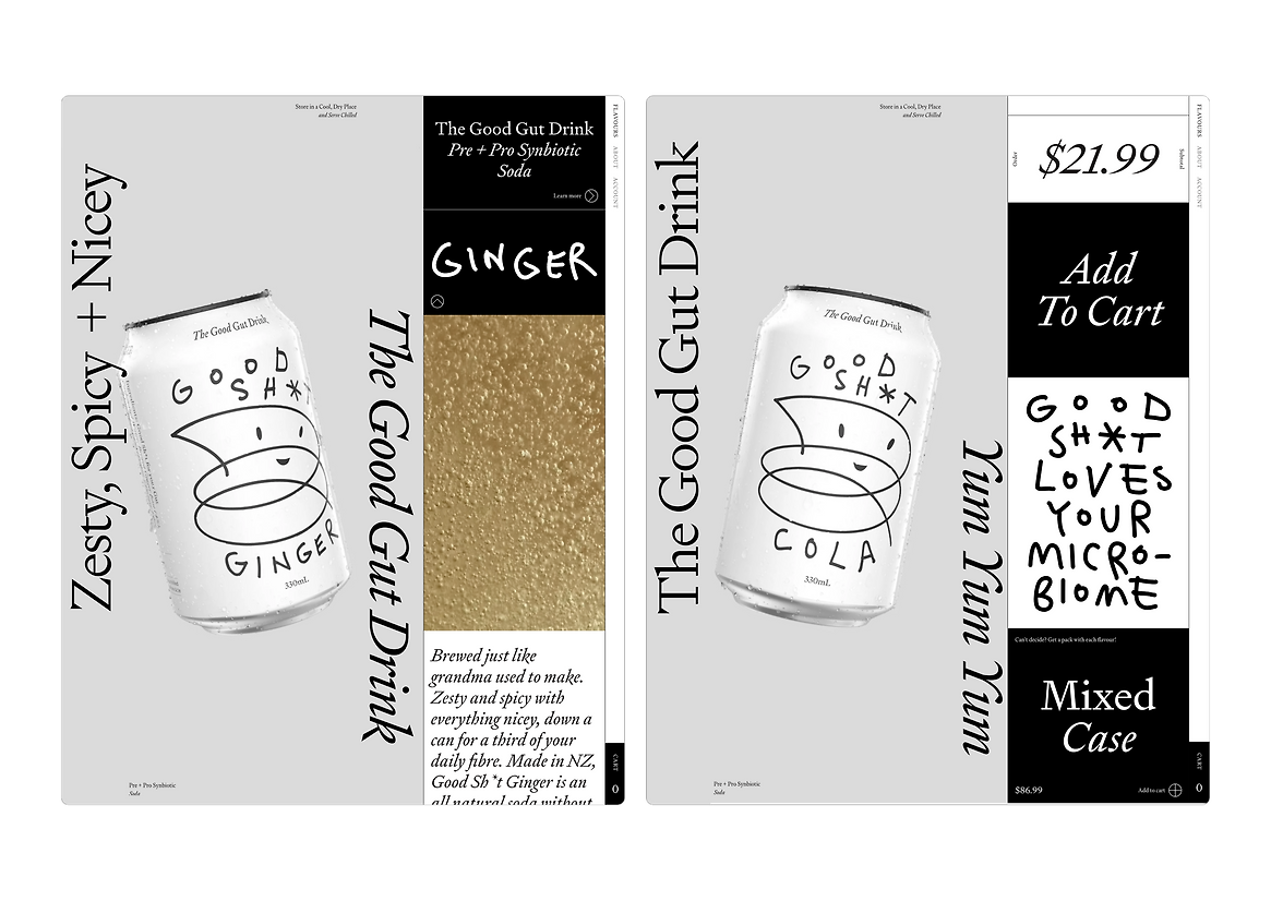
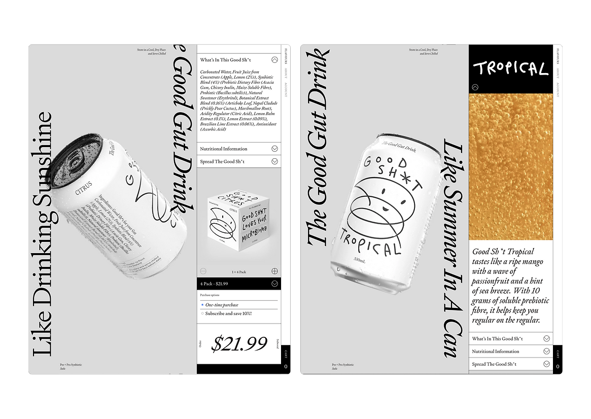
Good Sh*t is the world’s first Pre + Pro Synbiotic Drink. Simply put, it has a tonne of active bacteria that’s good for your gut and 39% of your daily fibre—food for all that gut bacteria.
By its nature, this product is a disruptor and the brand embodies this. How could this attitudinal brand be translated into an online store?
How do we build customer confidence in a new product that nobody has taste tested or seen?
The purpose of the website is two fold—project the brand and act as an online store.
Allow the users to interrogate the product, showing off the cans and its contents. And make it interactive, in constant motion to provide moments of delight.
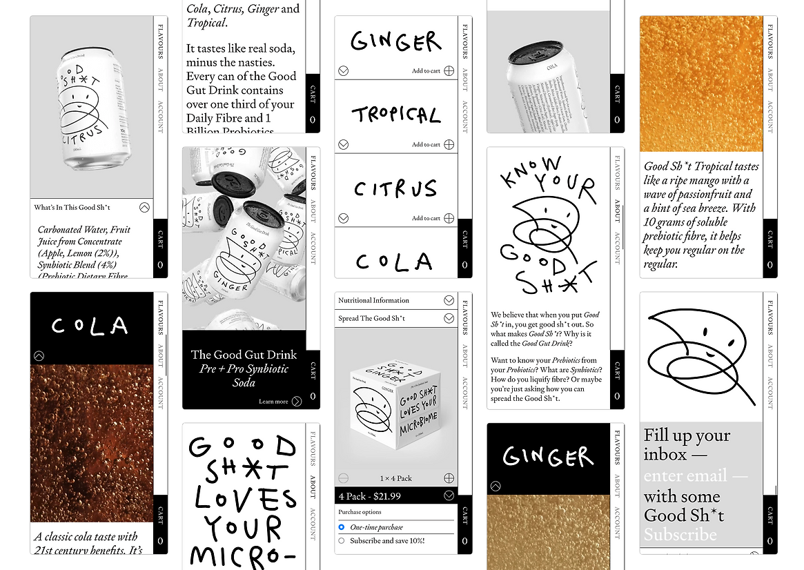
Structurally, the site is straight forward: four flavours of soda with an about page and account creation (for subscriptions).
Maintaining the same experience in desktop and mobile was paramount. A “side-car” design approach was utilised where the primary content would stay in a confined single column. This allows us to pull interactive elements out of the primary column for larger screens giving them more interest.
For example, can animations that are tied to scroll or the hero video.
In a market saturated with every colour imaginable, the black and white colour palette is a critical part of the brand’s differentiation.
On the website, this meant pushing the graphic design to be impactful and eye catching without relying on the immediacy and vibrancy of colour.
A rigid grid system was employed to create contrast with the hand-drawn elements. This provided a methodical element that offset the playfulness of the handwriting and illustrations overall, providing the brand with a feeling of light heartedness and irreverence.
The appearance of colour is constrained to videos of the different product flavours. Highlighting and amplifying the unique consistency and property of the liquid itself.
The typeface, Signifier, and our bespoke Good Sh*t handwriting are used in contrast. Signifier gives the brand a serious, authoritative tone while the handwriting provides authenticity and a sense of flippant joy.
The combination evokes serious science—but also science that doesn’t take itself too seriously.
The goal was to stand out from the crowd—for the brand to be as different and impactful on the outside as the benefits of the drink are on the inside.
Judge's comments:
This was a tight little package with no fluff. They used the medium effectively to enhance the brand, incorporating thoughtful touches with the right amount of restraint to reflect the brand best. It’s hard to make B&W so full of character and this website nails it.