Digital
Springload 37 Youth Service
-
Pou Auaha / Creative Director
Dan Newman
-
Ngā Kaimahi / Team Members
Chris Barneau, Zak Brown, Gisela de la Villa, Emlyn Hughes, Ruth Hendry, Calin Dale, Juliet Brown, Stephanie Kan -
Kaitautoko / Contributor
Wrestler -
Client
Ministry of Social Development
Description:
Youth Service Ratonga Taiohi is a Ministry of Social Development (MSD) initiative that helps Aotearoa New Zealand’s youth gain independence and confidence by connecting them to the support and services they’re entitled to, including the youth benefit. MSD needed a refreshed, modern website that would appeal to young people, and also give the service providers information they need.
We applied our human-centred approach to evolve the brand, make the site appealing, useful, and usable for both the young people and the service providers using it.
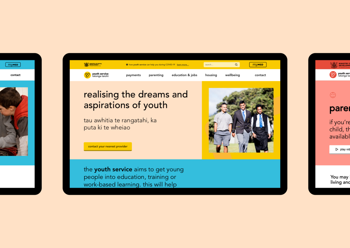
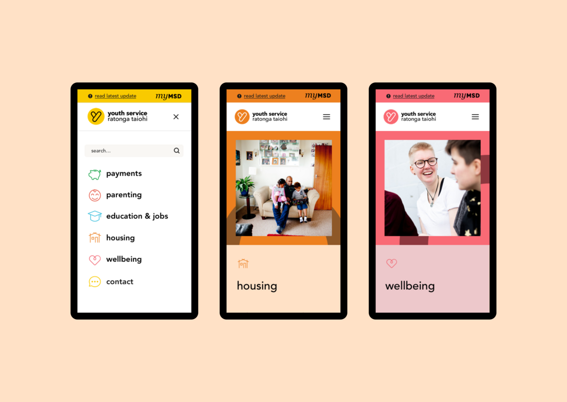
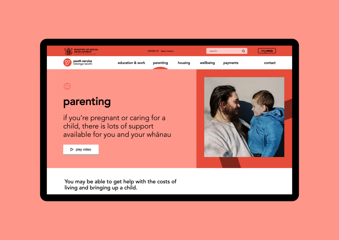
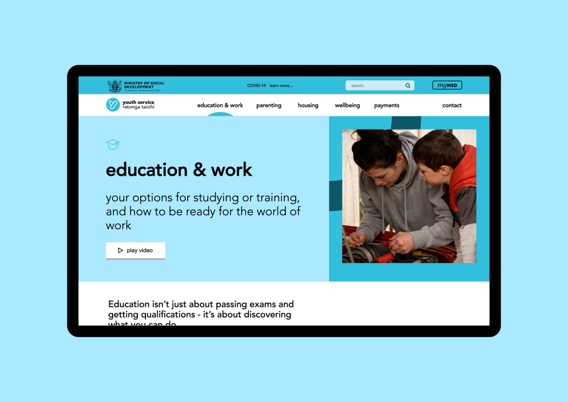
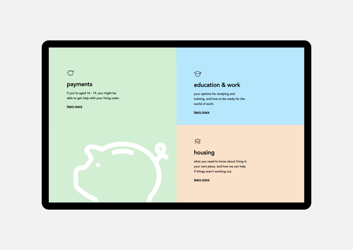
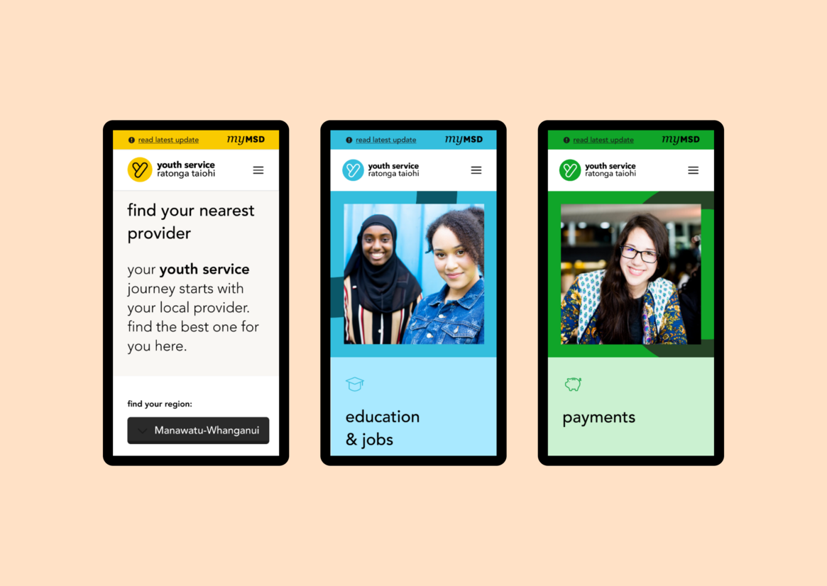
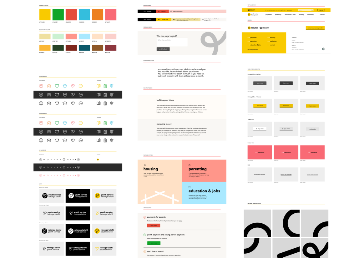
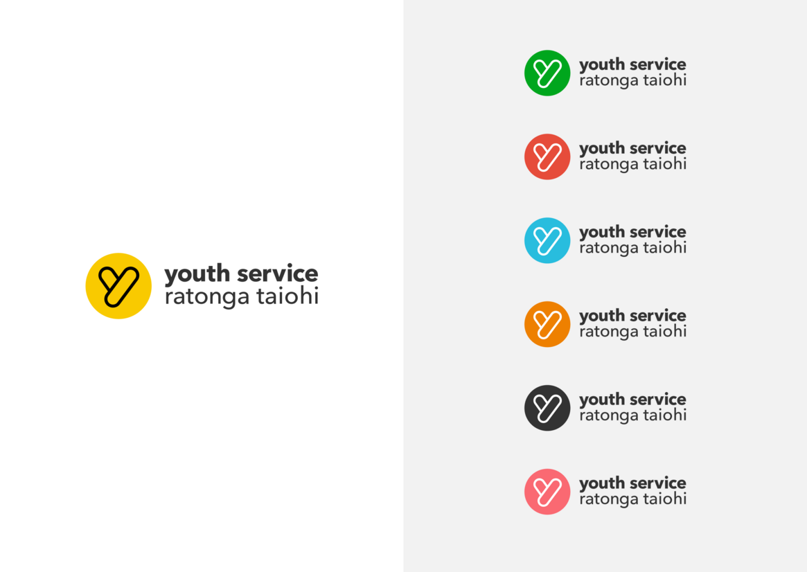
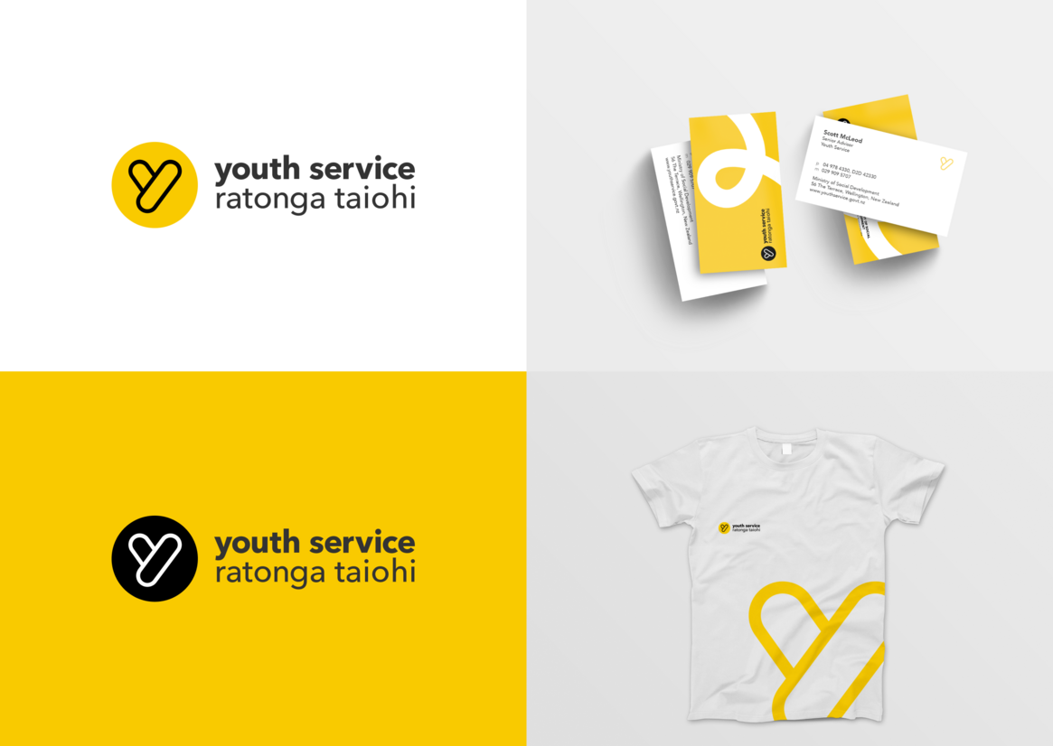
We wanted to keep the essence of the brand while updating it to feel empowering and professional to young people on a journey to figuring out the next step in their lives. We pared the logo down to a single ‘Y’ that retains the original bubble-like shape. The logo’s original colours now theme different sections of the site — like pink for mental health and orange for housing. The colours give the site an optimistic, upbeat feel.
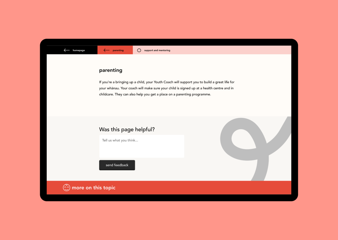
Youth Service’s goal is to help young people get on the path to becoming who they want to be. Our visual designer created a path motif that weaves through the site, in the background. It gives the subtle message of progress and keeping on track.
The project had a tight timeframe and budget, and a lot of it was done during 2020’s nationwide lockdown. We needed to do user testing with young people who use the site, but we didn’t have time to develop the rapport needed for them to trust us and give honest insights. So we trained Youth Services’ coaches, who already work directly with the young people, to carry out user testing across the country. Supporting MSD to do the user testing themselves was a great way to fast-track it, while still getting quality insights.
We knew that most young people would be looking at the site on their phones, so we designed with mobile at the forefront of our minds. In user testing, young people really responded to images, and mentioned Instagram as the website style they liked the most. Inspired by Instagram’s aesthetic, we made the images square, kept them free from any overlapping, and made all the text as short as possible.
The site has two key user groups — young people looking for support, and support services themselves. Each group has different needs, so we made two independent sites that look like one, using Silverstripe’s subsites module.
This allows us to host the different content under two separate domains, while using the same code and components for both. The youth-related content is discoverable by search engines, while the services-related content is hidden — so it doesn’t interfere with search engine rankings and young people don’t get sent to pages that aren’t useful for them.
With its modern, mobile-friendly design, and clear content, it’s now easy to find information and services on the Youth Service site.