Digital
NV Interactive 44 ChristchurchNZ.com | Igniting Bold Ambition for Ōtautahi Christchurch
-
Pou Auaha / Creative Director
Nicola Holmes
-
Ringatoi Matua / Design Directors
Mark Delaney, Thomas Johnson, Glen Honeybone
-
Ngā Kaimahi / Team Members
Matt Pickering, Jon Whitehead, Sumeera Dawood, Daniel O'Connor, Nadia Maclaren, Kaushi Vijayakumar -
Client
ChristchurchNZ

Description:
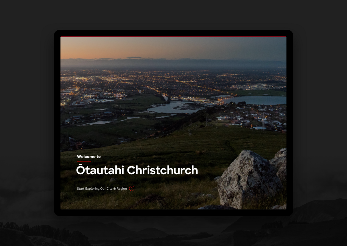
After the earthquakes in 2010 and 2011, Christchurch was synonymous with being an earthquake city, and economic agency ChristchurchNZ was tasked with re-defining and shaping the sentiment of the city as it regained its footing.
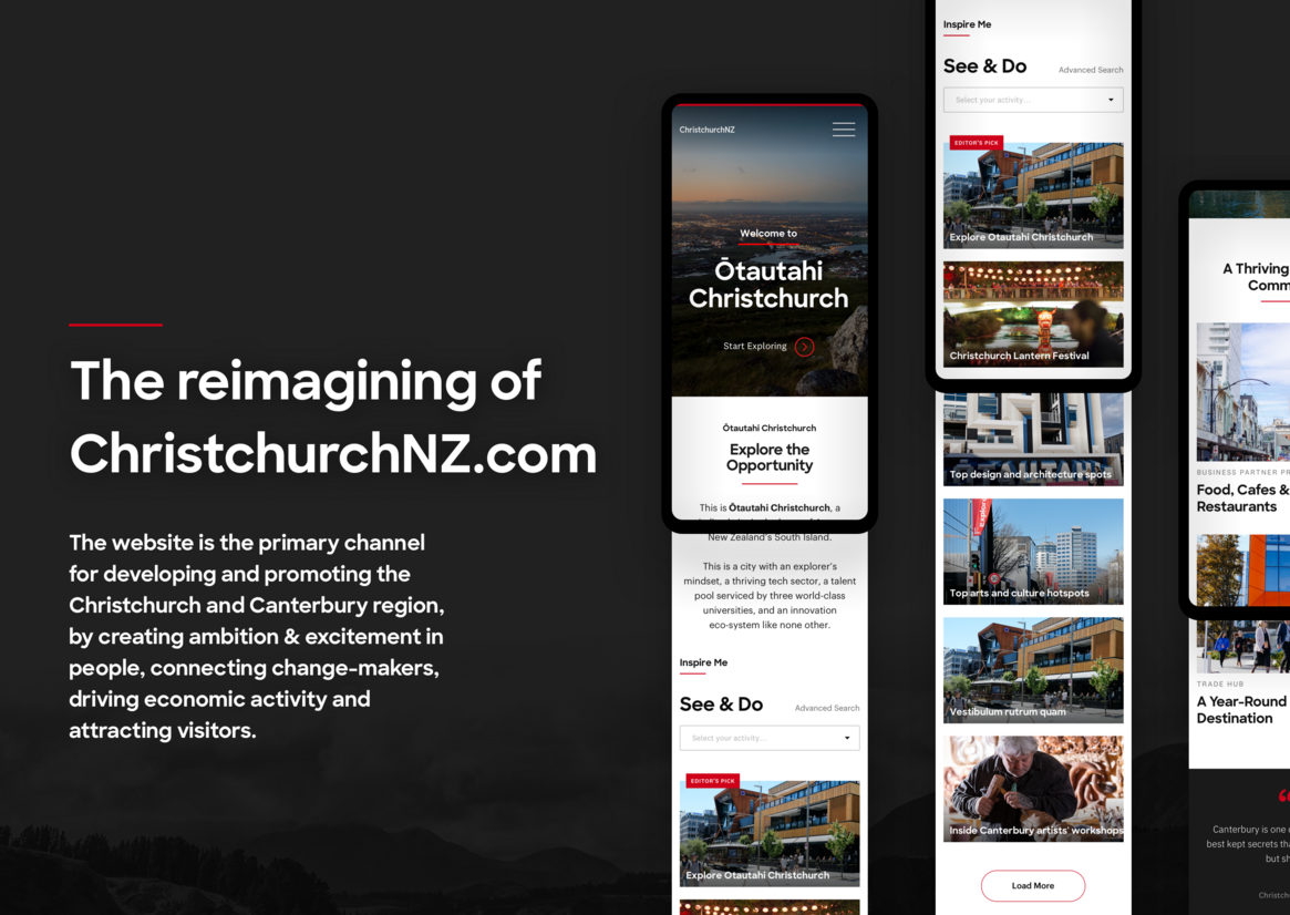
Ten years on, ChristchurchNZ’s mandate is to develop and promote the beautiful region, through igniting bold ambition & excitement in its people, connecting change-makers, driving economic activity, and attracting visitors to Christchurch and Canterbury.
This is done through embracing a narrative of exploration, a central tenet of ChristchurchNZ’s mission. In Christchurch, the spirit of exploration is part of its residents’ DNA: they are hardwired to challenge the status quo, to imagine and discover what’s next – especially in light of all they’ve overcome.
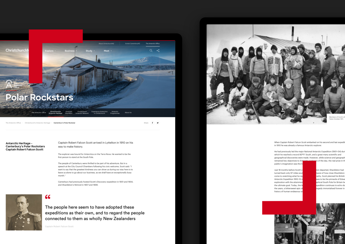
The reimagined ChristchurchNZ.com website is the primary channel for enhancing the region’s growing reputation as a basecamp for exploration.
On one level, the project required the consolidation over 15 separate digital channels into a single cohesive presence catering to all aspects of ChristchurchNZ’s diverse audiences. This mandated a comprehensive UX-led process underpinned by the theme of exploration, which framed our strategic and creative approach in delivering a future-focused foundational digital platform.
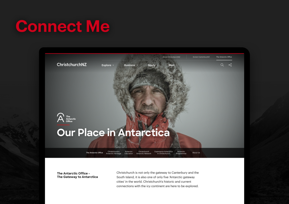
The reimagined site needed to serve broader business objectives in order that Christchurch and Canterbury wasn't just seen as just a tourism destination, but as a dynamic hub that attracts and provides opportunity for lifestyle, entrepreneurial development, tertiary education and conference hosting, all the while celebrating its role as both the Antarctic gateway and the cinematic backdrop to many successful films.
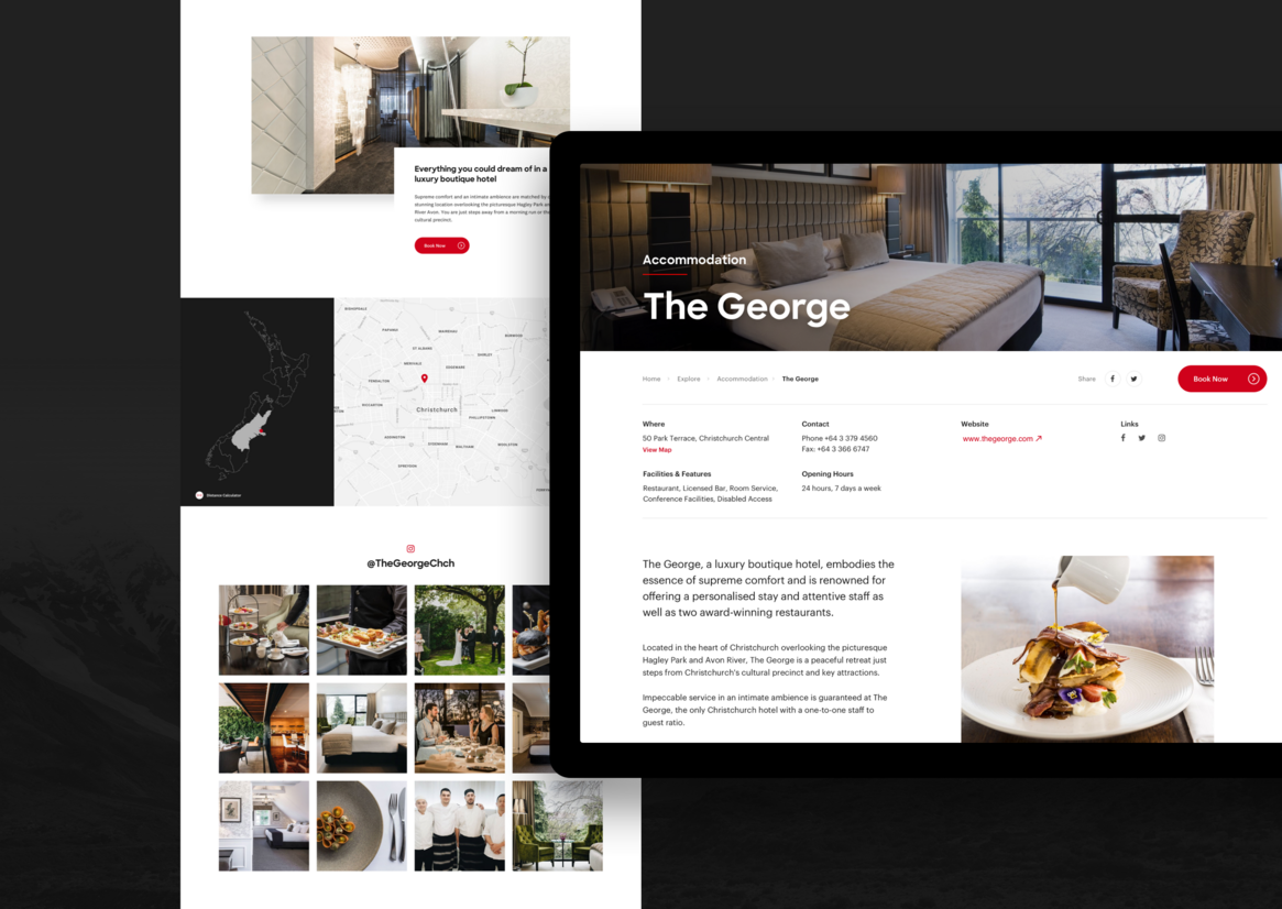
Creatively, the visual design needed to be both uncluttered and quietly confident, guiding the user and sparking interest. The use of typography and colour throughout the site is balanced with emotive imagery, utilising the established brand palette to indicate importance of information hierarchy and clear calls to action.
It was also critical that the site presented a consistent & intuitive navigation scheme, catering to its many audiences.
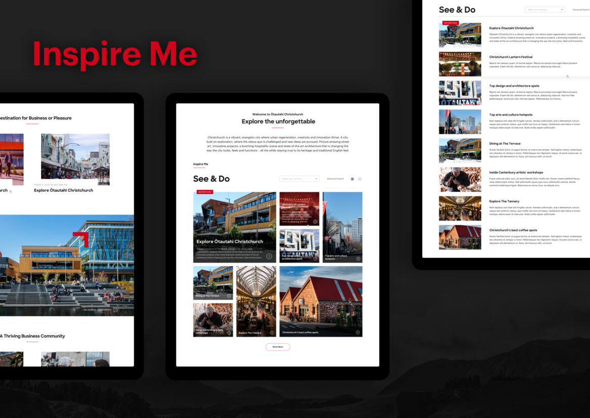
We also designed key features to act as conduits for exploration. The inspiration filter, See & Do, was conceived as a central exploration device, and guides users to content relevant to their needs, with powerful photography paired with emotive editorial content.
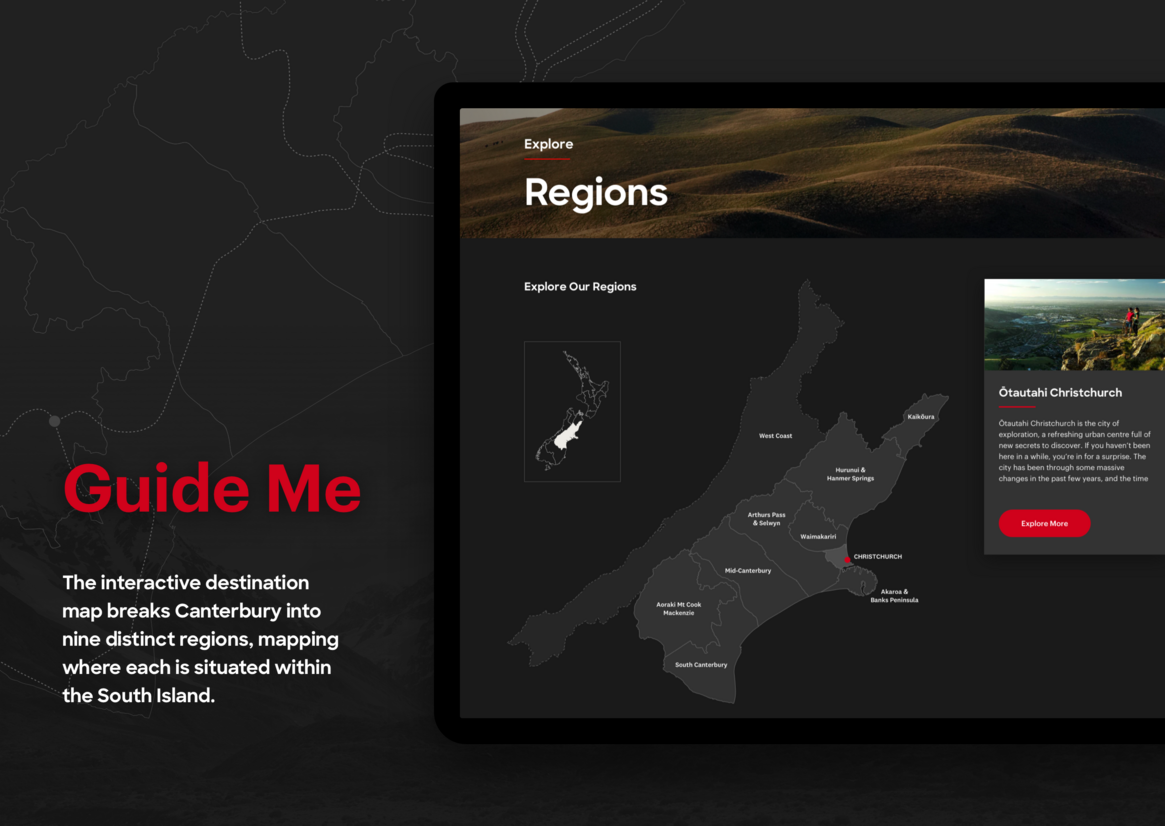
The interactive destination map breaks Canterbury into nine distinct regions, mapping where each is situated within the South Island, while the integrated destination picker enables users to gain insights and suggestions to all that can be seen and experienced throughout Christchurch and Canterbury.
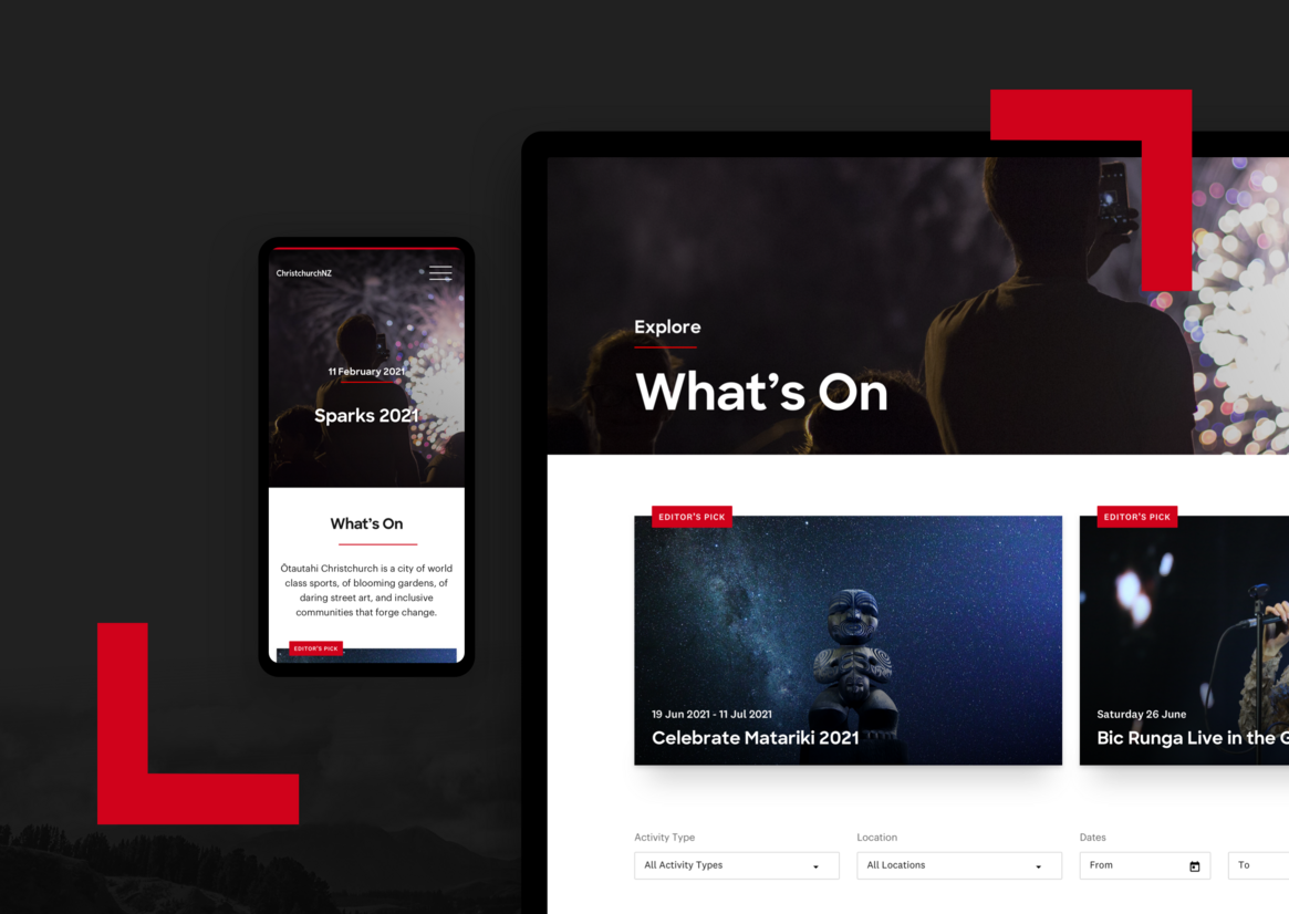
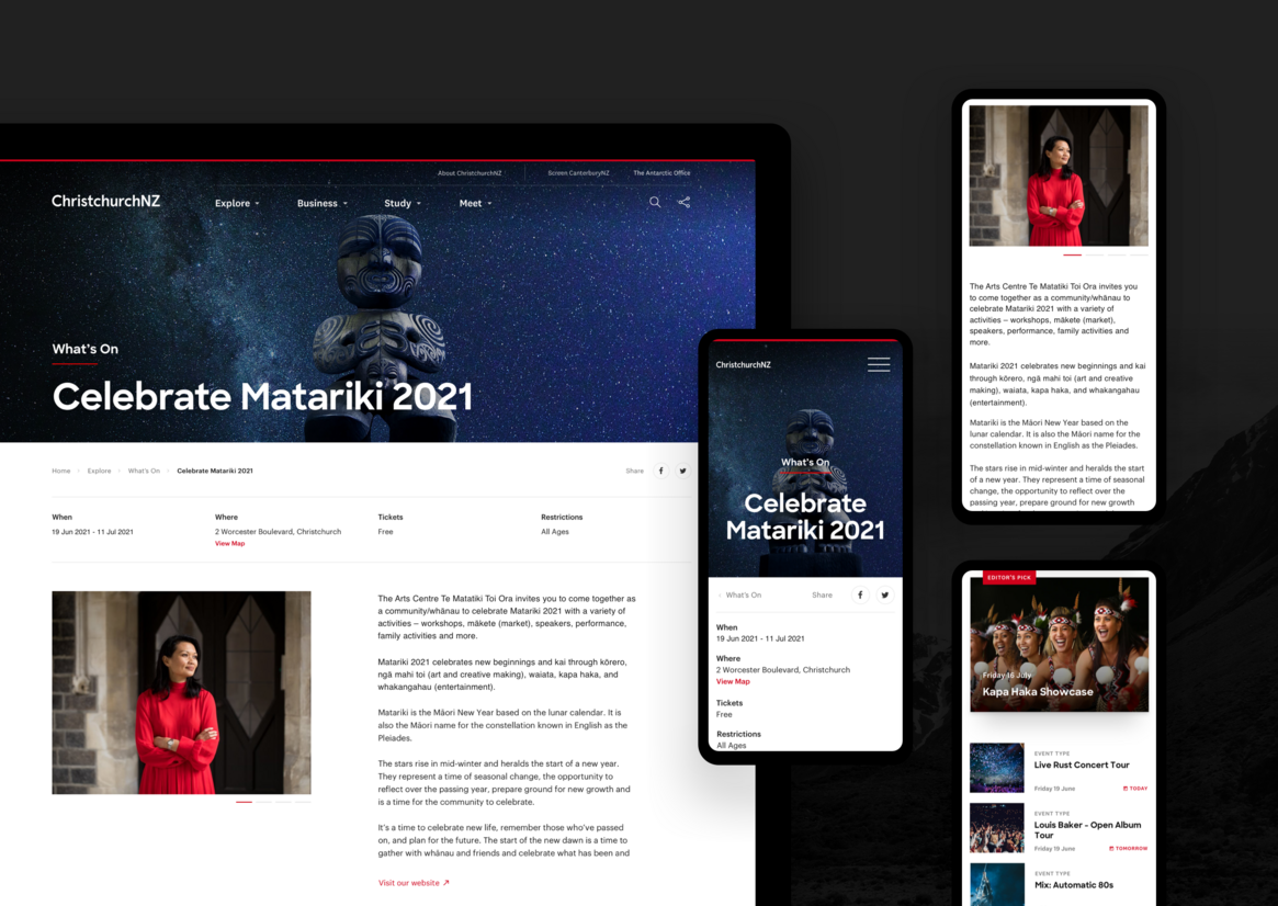
Time specific information and curated “insider” content allows users to find experiences and resources based on their interest and location preferences – regardless of whether they want to explore, live, study, meet, film, or do business here.
There is no doubt that the new ChristchurchNZ website has a critical role to play in building Ōtautahi Christchurch’s strong reputation as a basecamp for exploration. Averaging over 125,000 unique users with session times of over 4 minutes since its launch in February 2020, its well on its way to doing so.