Digital
Neu21 / Osynlig NZ Pixel Fusion AcademyEX - Introducing the new youniversity
-
Ngā Kaimahi / Team Members
Pablo Dunovits, Charles Hlavac, Manish Shaw -
Kaitautoko / Contributors
Fiona Webby, Juampa Proverbio, Ana Ivanovic-Tongue, Andrew Dent, Andrey Sukhomlinov, Tessa Tripp, and the rest of the academyEX team -
Client
academyEX
Description:
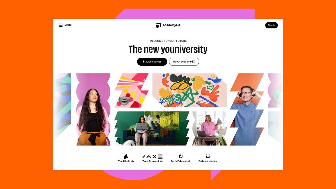
When Frances Valentine and the team tapped our shoulders to embark on a mission to help them reinvent tertiary education in New Zealand, how could we say no? Having worked alongside each other on multiple initiatives over the last five years that have helped create impactful futures, we were excited to bring this new piece of their vision to life.
As part of a grand 25-year vision to foster a culture of growth mindset in NZ, inspire you to never stop learning and provide alternative ways to access quality education through different stages of your life, academyEX was born. With this new brand, there was now a bigger opportunity than ever to communicate this bold vision.
How might we bring together this community of learners in one place where learning is done at your own pace, where you find inspiration and support to leap with confidence into our constantly changing world?
Together with the wider team we then used our unique UX Sprints process over the next 10 weeks to continuously deliver quality outcomes for the project. We imagined, defined and designed each part of the new user journey, blending operational flows, brand, UX and marketing messaging with user testing to help academyEX relaunch itself into the market with valuable, validated solutions for their customers.
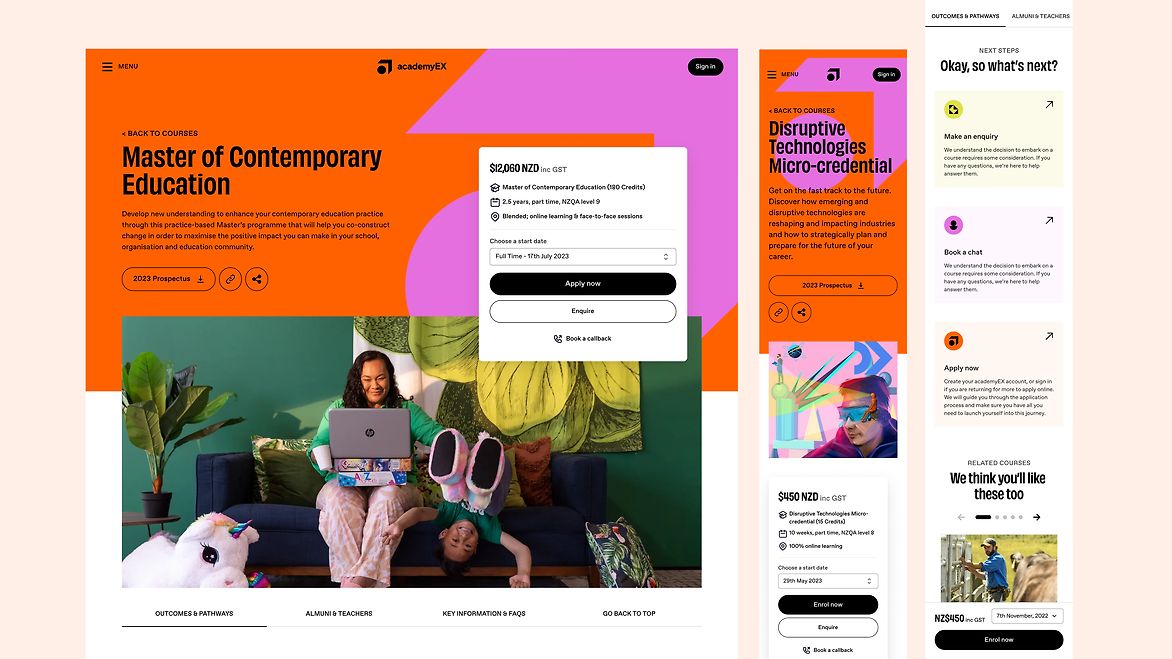
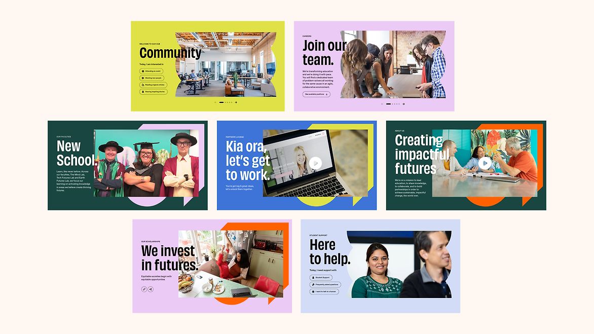
In close collaboration with the academyEX team and our partners Pixel Fusion, we reimagined the user experience for educational institutions, helping students find the right learning pathway for them, making enrolment as easy as a few clicks and bringing the people of this learning community closer together.
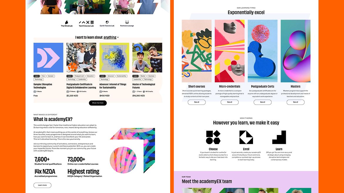
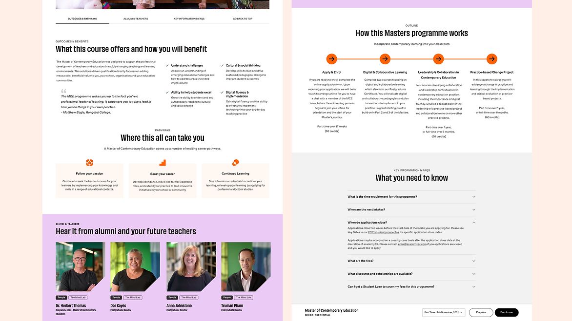
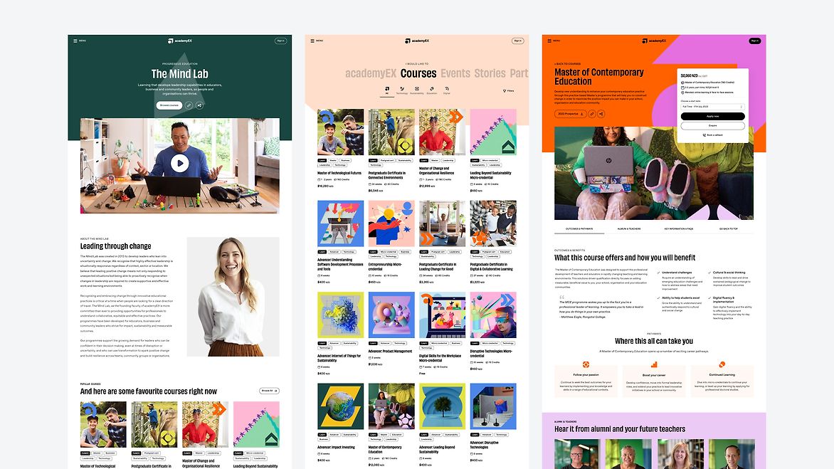
To increase the ROI and allow academyEX to deliver faster with consistent quality across their digital platforms we used a foundational sprint to build the academyEX Design System. This is a branded, robust, & expansive library of digital building blocks that are designed to be easily modified, responsive, user-friendly and accessible, ensuring seamless use across web, mobile and learning management platforms.
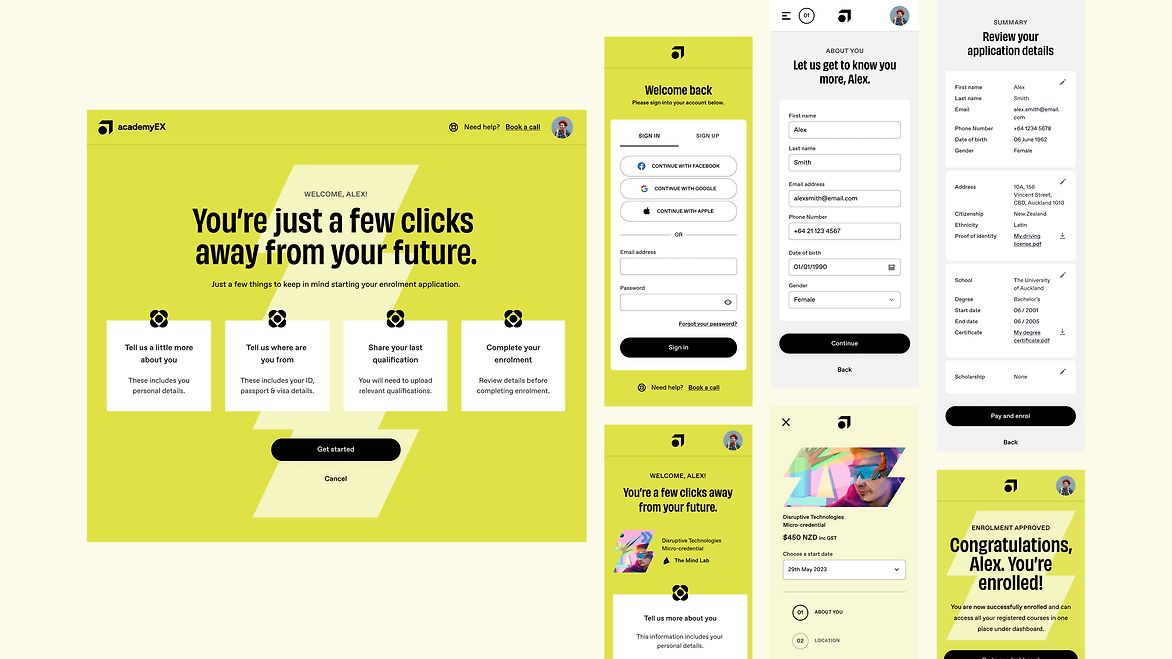
Reimagining the enrolment flow was crucial to meet the needs of new and returning students to academyEX continuously expanding learning catalogue.
Through rigorous user testing, we were able to streamline the process, making it faster and more convenient for students to sign up and start learning. It allows for one-click account creation and easy payment options like Apple Pay, integrates with various data sources to ensure accurate and up-to-date information, and provides a smooth user experience that guides students through the enrolment process step by step. The new enrolment flow plays a critical role in increasing student conversion, engagement and satisfaction.
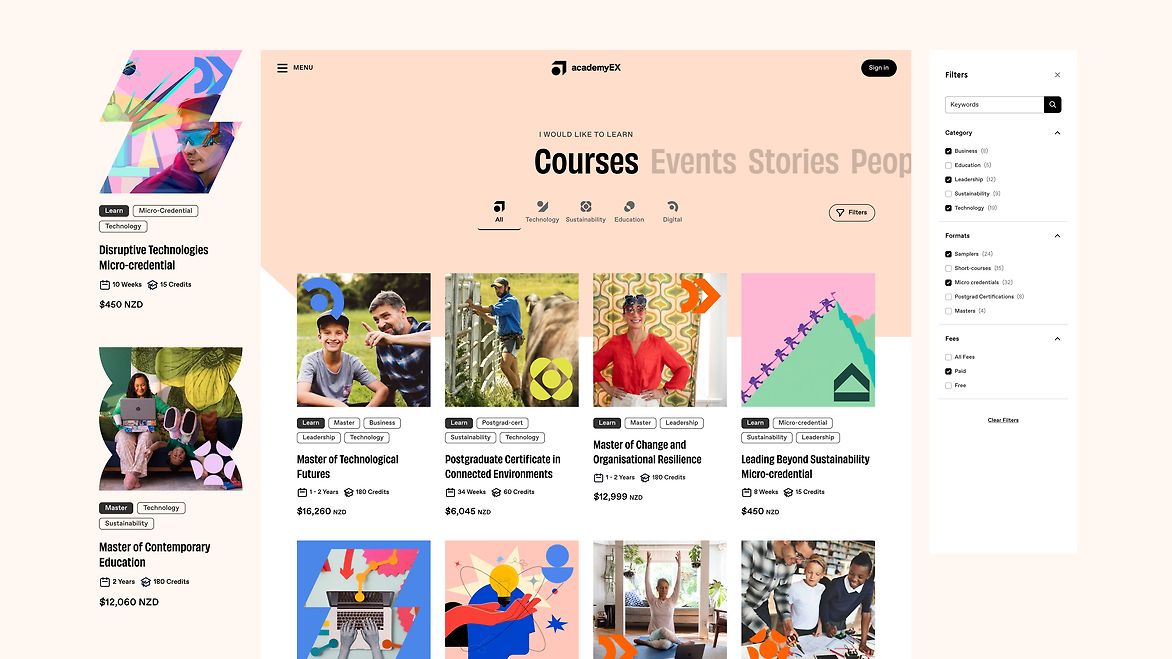
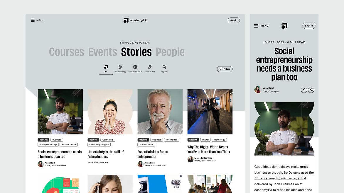
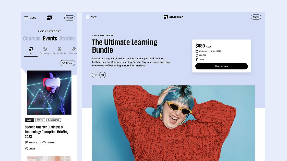
The new design includes a simplified navigation and browsing experience with humanised categorisation and improved search and filter functionality. Learners can now easily explore the different learning options that suit their particular lifestyle and preferred way of learning. This redesign not only improves the user experience but also supports academyEX in presenting their courses, events and community stories in a new flexible and engaging way.
Welcome to the new youniversity.