Digital
Madeknown 15 CORDE
-
Pou Auaha / Creative Directors
Josh Thompson, Phillip Sunderland
-
Ngā Kaimahi / Team Members
Joel Reed, Liam Barrett-Rogers, Josiah Rees, Madeline Laffey -
Kaitautoko / Contributors
Izaac Reed, Petra Mingneau -
Client
CORDE

Description:
CORDE is a large horizontal infrastructure company operating across the South Island of New Zealand, previously trading with three names - each representing a specialist division.
Initially tasked with tidying up the current websites, we dove deeper, undertaking a lengthly brand review, workshops and extensive research for the brand discovery. What surfaced in our collaborative workshops was that rather than an individual update of the separate divisions, a whole new name and united brand was necessary. We sought to bring much needed clarity and unity – a cohesive identity to stand strong in the marketplace and to wear proudly as one team, CORDE.
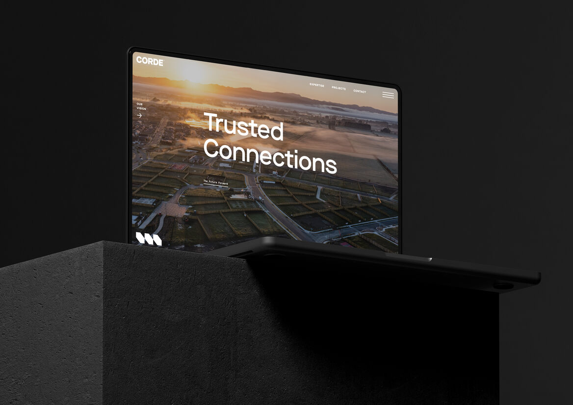
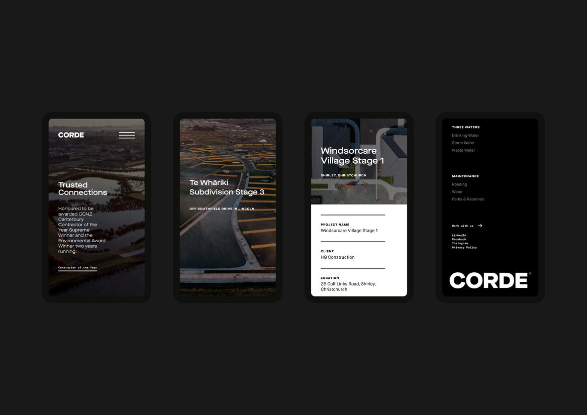
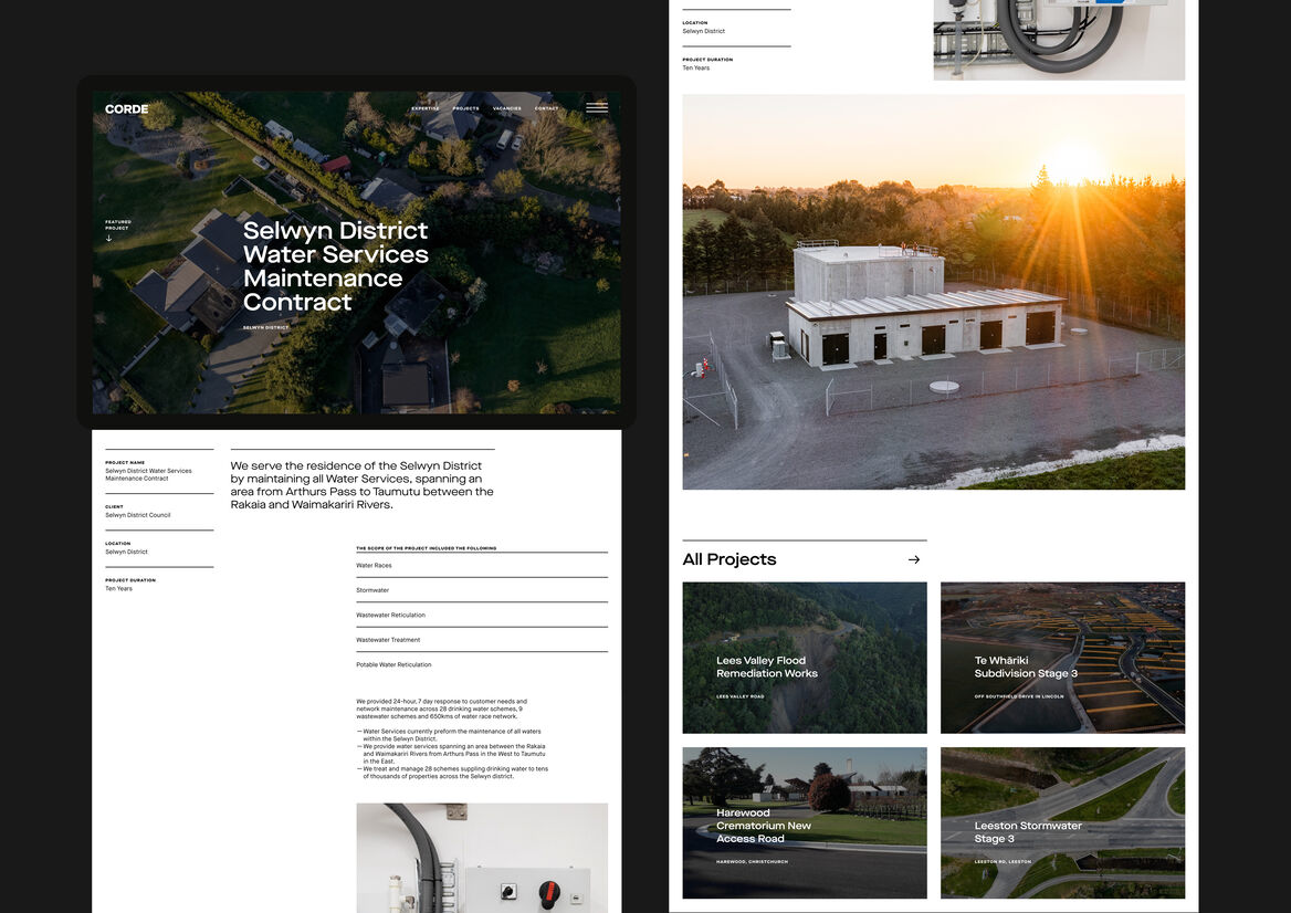
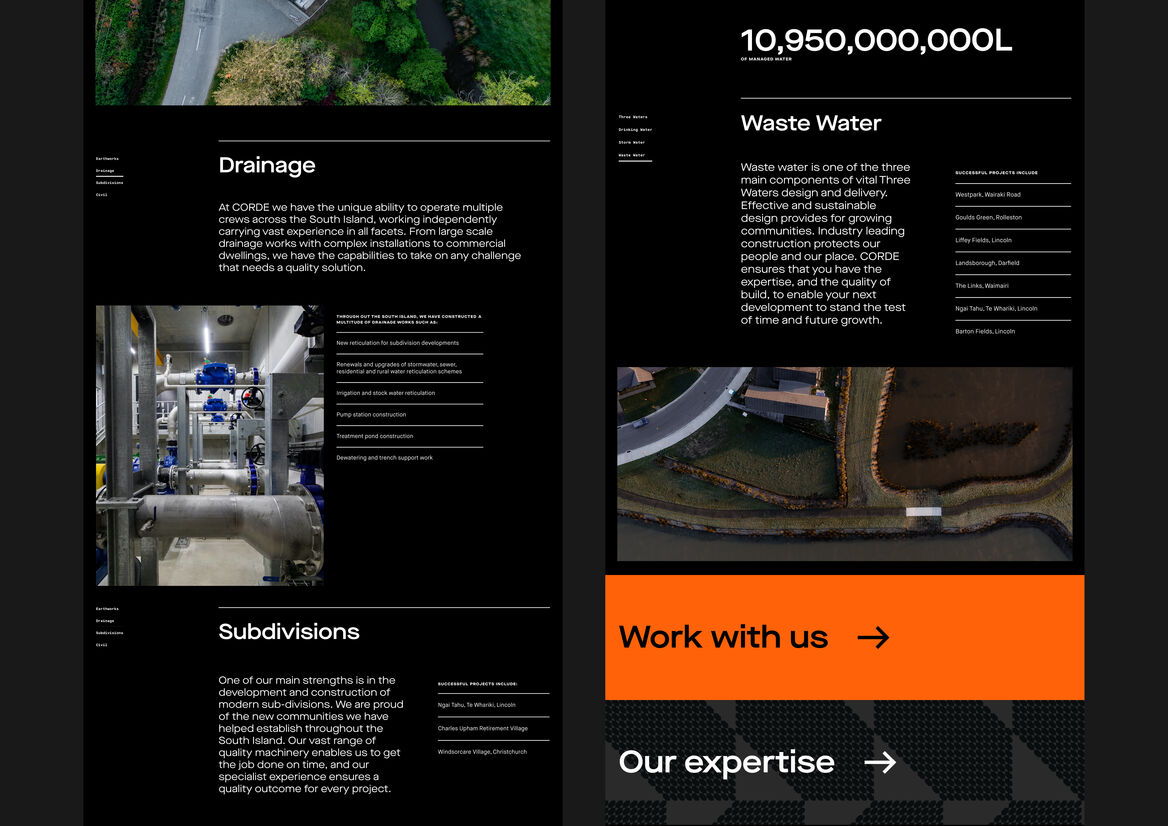
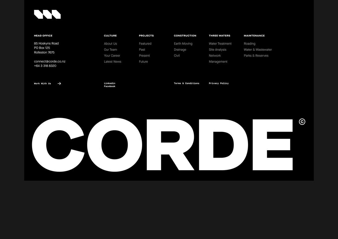
Previous websites were crowded with work in progress imagery - holes in the ground, construction mess and lots of machinery. We were able to refocus the visual mood to reflect the finished product - the future outcomes for clients and their customers. A monochromatic colour palette includes a flash of hi-vis orange. The platform of black and white champions the photography.
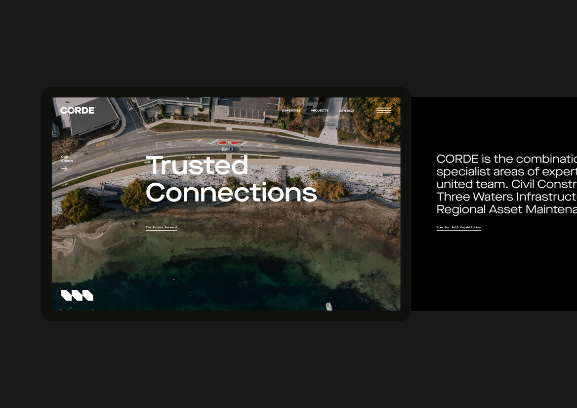
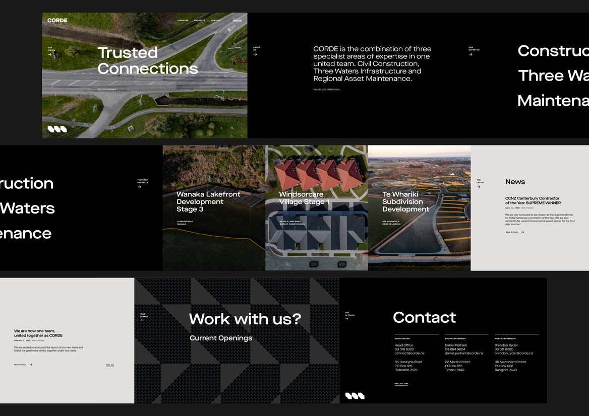
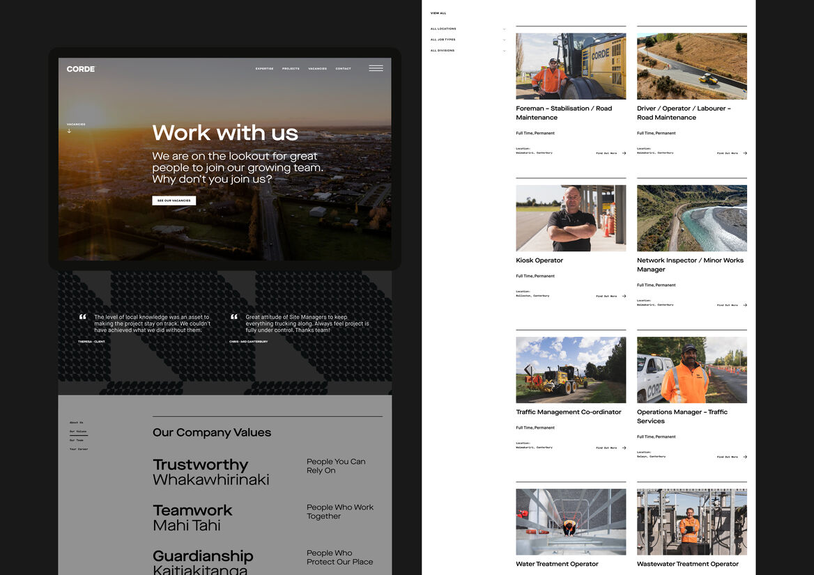
A key direction for the website was, well, a sideways direction - horizontal infrastructure called for a horizontal scrolling experience. Utilising engaging motion and a horizontal scroll nods to their expertise. This has been set apart for the home page, allowing the rest of the extensive content to flow freely along an underlying grid. A mega menu houses the overarching sections, allowing emotive photography be the hero as you interact.
The identity translates as big, gutsy and no-nonsense - which balances with a refined technicality and structured layouts throughout the site. It’s a dynamic system that flexes and adjusts to the available context and space. Project case studies display technical detail and imagery within grids in linear motion.
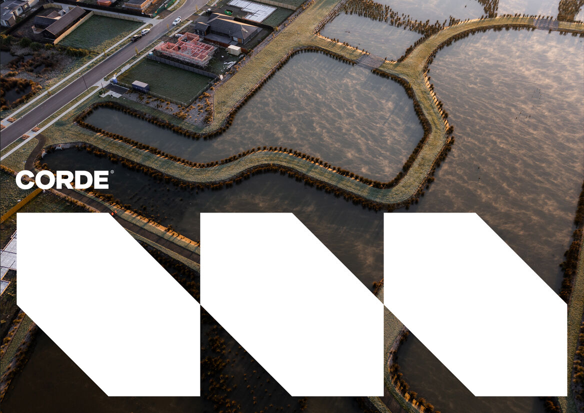
Extended typography juxtoposed with monotype sits between the refinement of intentional, sustainable, engineered design and the robust, capable strength of the product CORDE delivers. The three-strand mark is the visual anchor, an easily recognisable symbol at any scale, including a raranga pattern that displays the depth of their history and experience.
An adaptable job listings system allows CORDE to upload jobs and pull from a media library of imagery within specified category divisions. Alongside some key marketing strategies, we have grown the workforce applicants exponentially over a short period of time.
Allowing time, exploring all possibilities, and the willingness of the client to trust us to do what they had never done before, enabled a successful, collaborative result.