Digital
Journey 20 NZ Ski | Web
-
Pou Auaha / Creative Director
Dane Tatana
-
Ringatoi Matua / Design Director
Eilish Out-O'Reilly
-
Ngā Kaimahi / Team Members
Dario Salut, David Huai, Hitesh Chaudhari, Tim Turner, Johnson Rajamani, Rushabh Master, Dov Tombs -
Client
NZ Ski
Description:
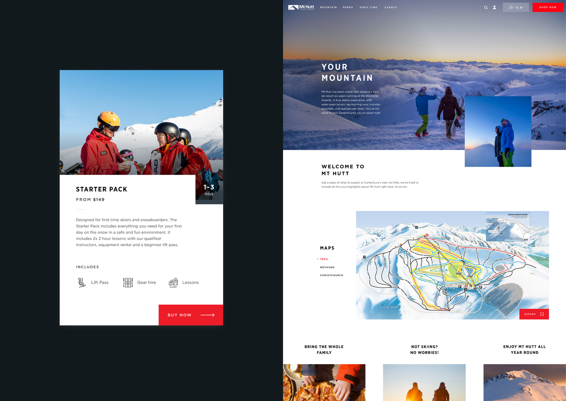
Te Waipounamu, Aotearoa is a winter paradise, home to some of the world’s most renown ski fields. Three of the nation’s best ski fields and resorts – Coronet Peak, Mt Hutt and The Remarkables, attract thousands of tourists every year.
Ski resorts are a reasonably complex product proposition. There are various types of passes, transport options, and packages. It’s a multifaceted thing to sell, and organising your time can be a confusing experience on ski sites all across the globe.
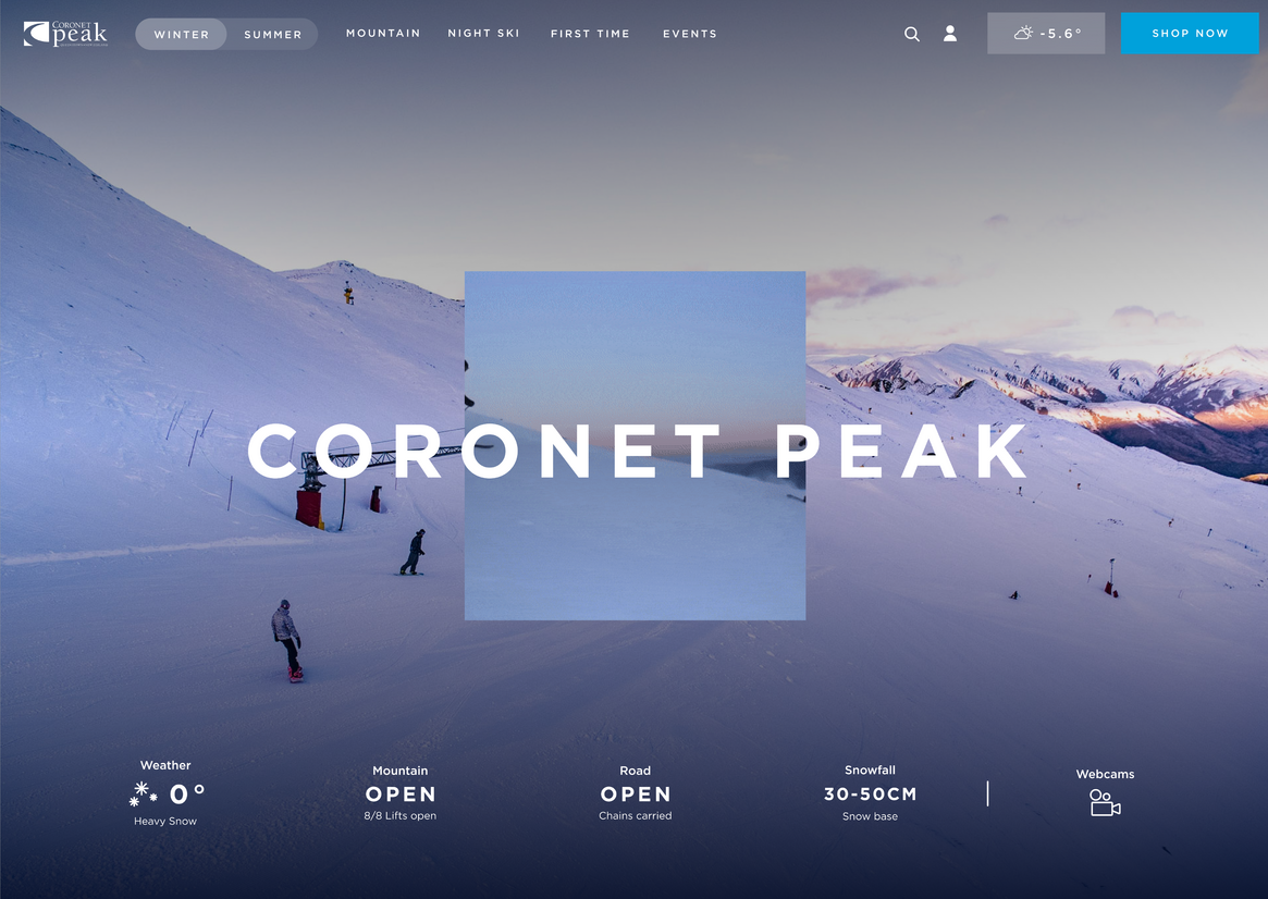
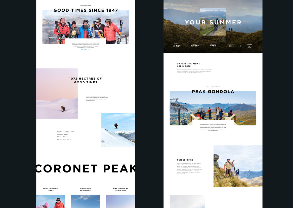
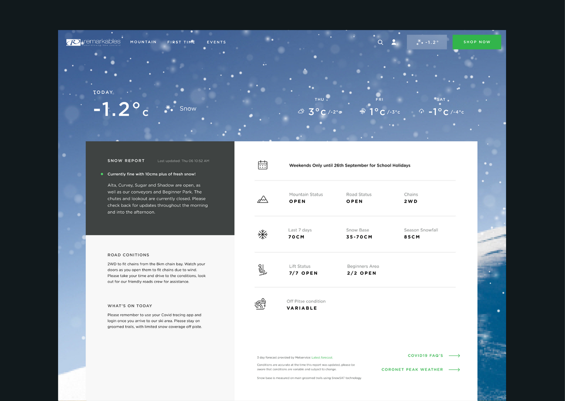
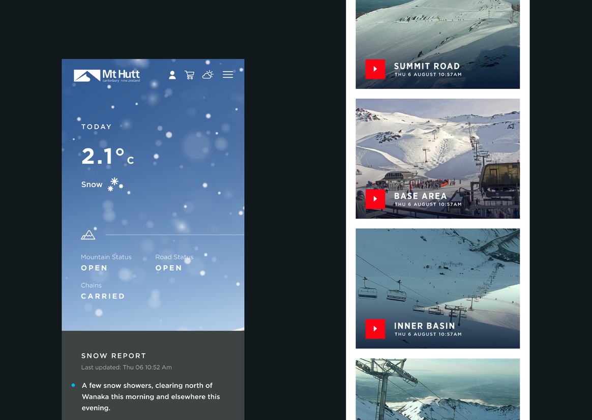
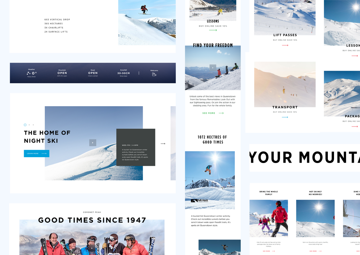
For the websites, they play a duel role in both promoting the destination and benefits (the facilities and food and beverage options), but also the role of the functional, information hub for the mountains such as what the weather is like and the level of snow.
It was critical that the three ski fields (owned by NZ Ski) positioned themselves as a forward-thinking, lively, fresh brand and their websites reflected a world-class, easy, and informative digital service with unmatched, end-to-end CX.
In order empathise with the NZ SKi audience to create the best platform, we needed to first live the journey ourselves from the moment of consideration to execution. By sending a strategy team down to the ski fields, we fully immersed ourselves in the ski experience, secret shopping our way through every moment of the journey. Consideration, booking, getting to the slopes, passes, ordering food, getting on the ski lifts, through to relaxing in the spa after a fantastic day on the mountain.
To facilitate this, everything was observed, recorded, documented and filmed, with data underpinning everything in the form of a customer journey feedback tool, a series of physical buttons with happy to sad emojis which took sentiment feedback from across every part of the journey.
That allowed the team to see a map of where the CX was good and where it needed improvement. Discovering that people were extremely happy at the resort, we then knew we needed to match that experience across the online properties. We also needed to refresh the brochure side of the resort destination sites and freshen up the brand.
After the team’s research phase concluded, we then launched a full website design project. We ran design sprints with NZ Ski which consisted of finding out and documenting personas, defining their challenges, wire framing the solution, testing it, and then validating it, all in 5 days. It was a very condensed, collaborative process which was a key step in the mission.
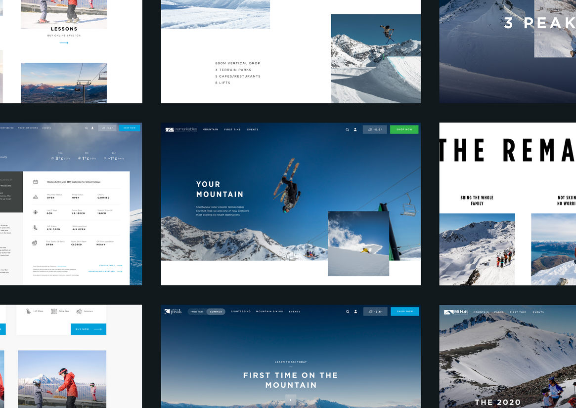
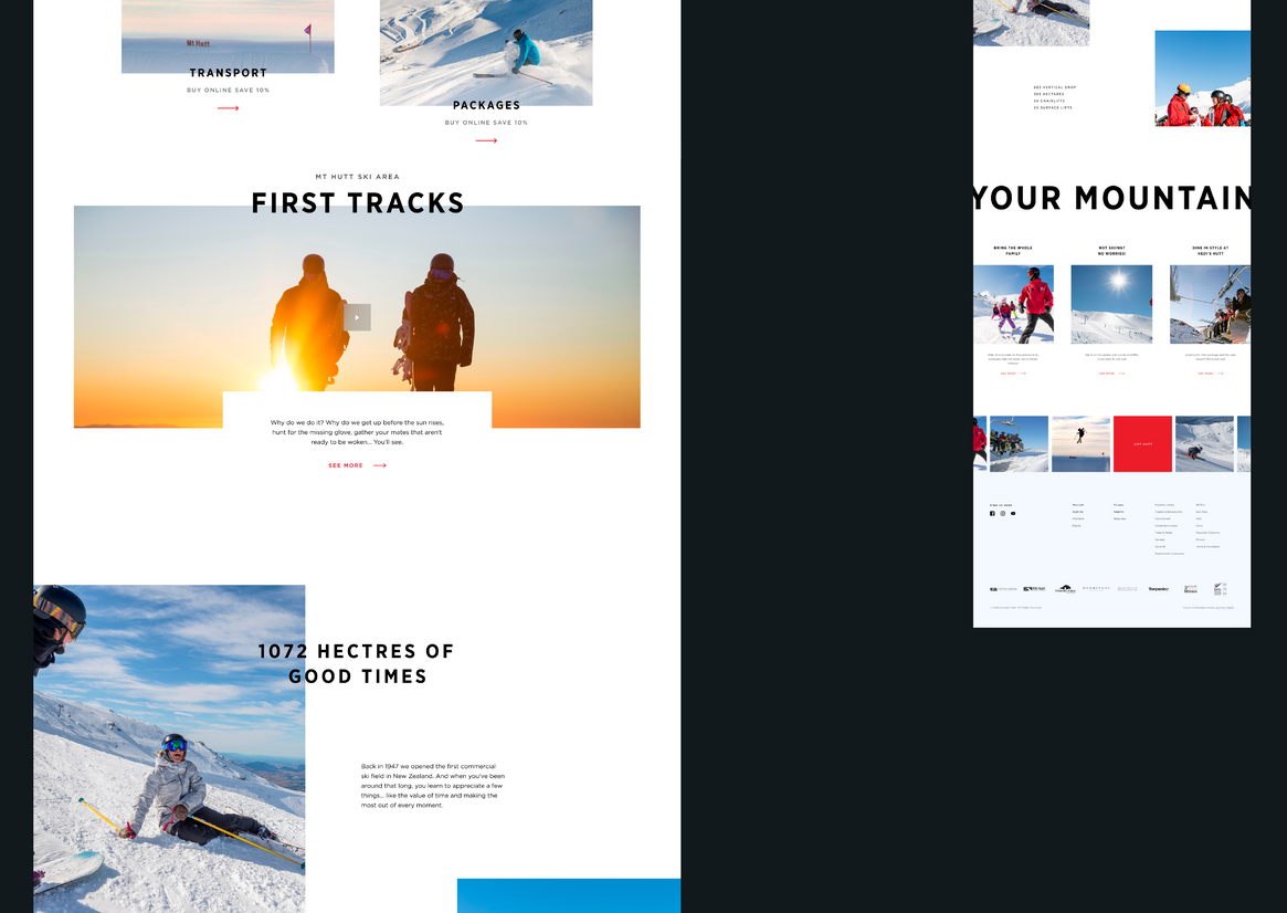
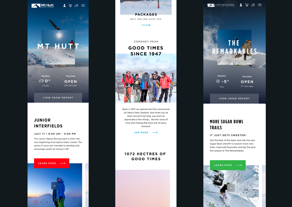
We made sure that all three mountains had their own look and feel but still fitted together design wise.
Getting the site up and running in time for an early bird campaign for the start of the winter season saw the website’s busiest sales period, along with NZ Ski experiencing their second busiest day on record for people on the mountains.
NZ Ski saw a steady uptake in conversion rates, achieved brand differentiation and positioning through a revamped look and feel, and enhanced and elevated the customer experience for their guests.
Judge's comments:
This site has the ability to combine both an emotional feeling that drives you to go to the mountain, combined with functionality and utility that keeps you using it. It is unique to see such a high level of effort and craft in this sector.