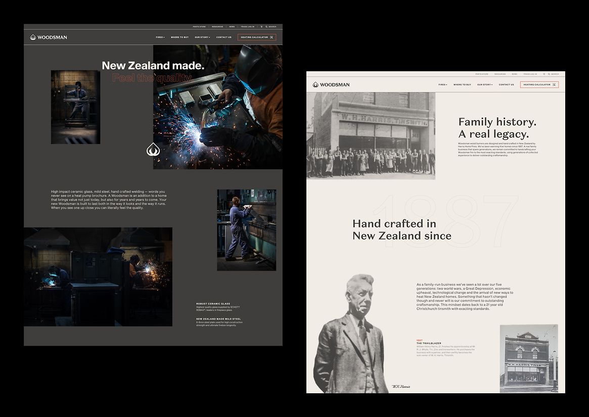
Woodsman, an iconic New Zealand brand, traces its roots back to the visionary W. H. Harris, a Christchurch tinsmith in 1887. With a rich history and enduring legacy, Woodsman has evolved into a beloved name, synonymous with excellence in the wood burner industry.
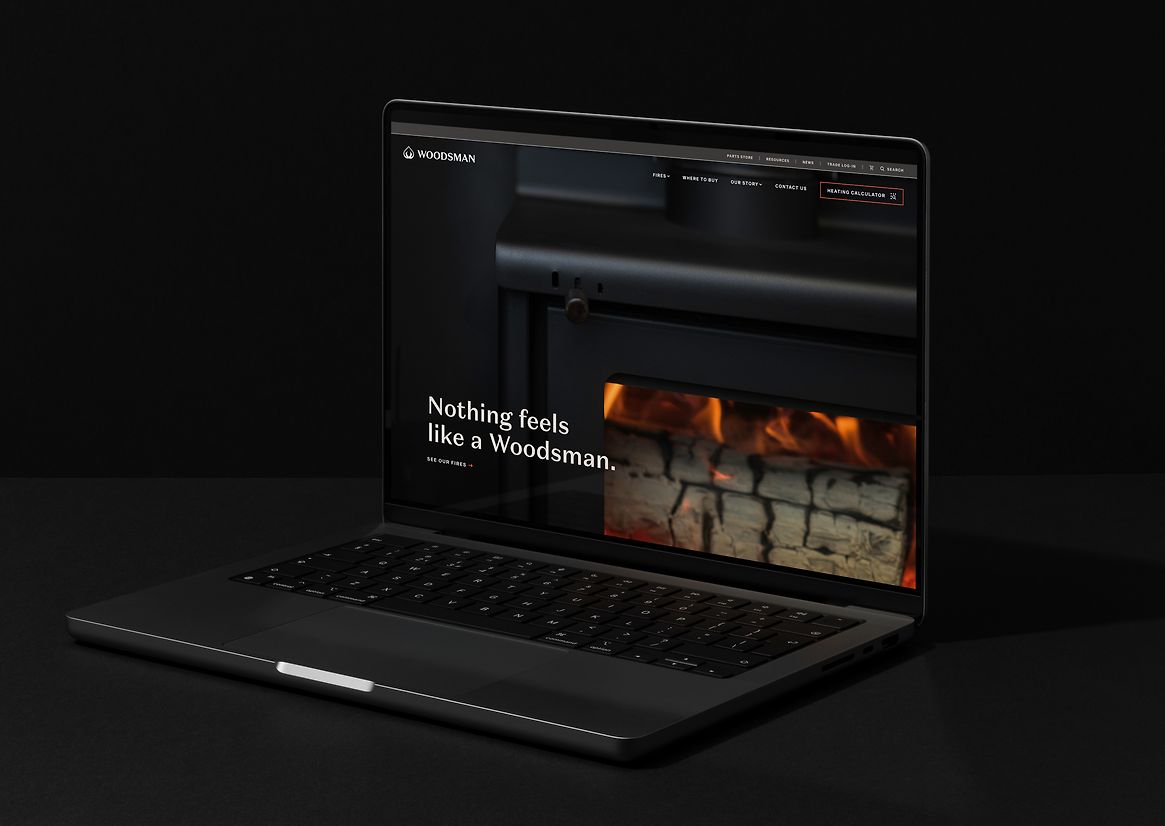
Building upon our continuous rebranding efforts for Woodsman, we undertook a comprehensive revamp of their website. The objective was not only to align it with the updated visual identity but also to enhance the user experience significantly. The result is a cutting-edge website that serves as an industry-wide tool for retailers, regardless of the brand they sell.
The rebranding embraced a compelling concept of duality, juxtaposing the feelings evoked by the warm feeling of a classic log burner with the real facts and figures that highlight their sustainability and cost-effectiveness as a home heating solution. This approach appeals to both the emotional and rational sensibilities of consumers.
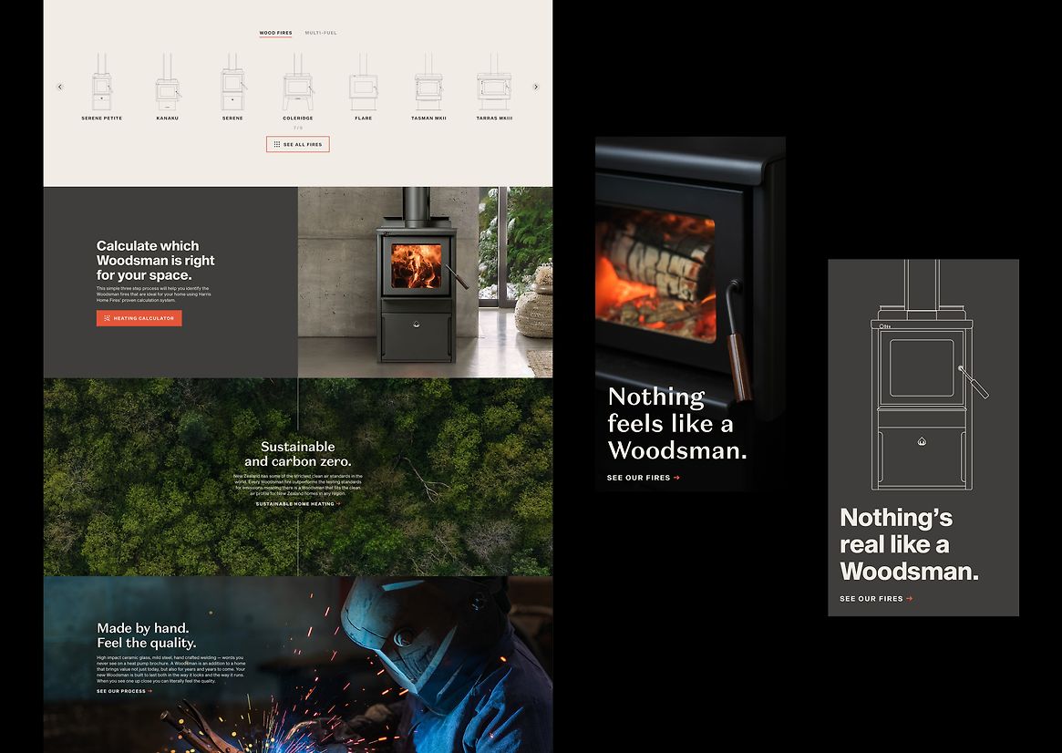
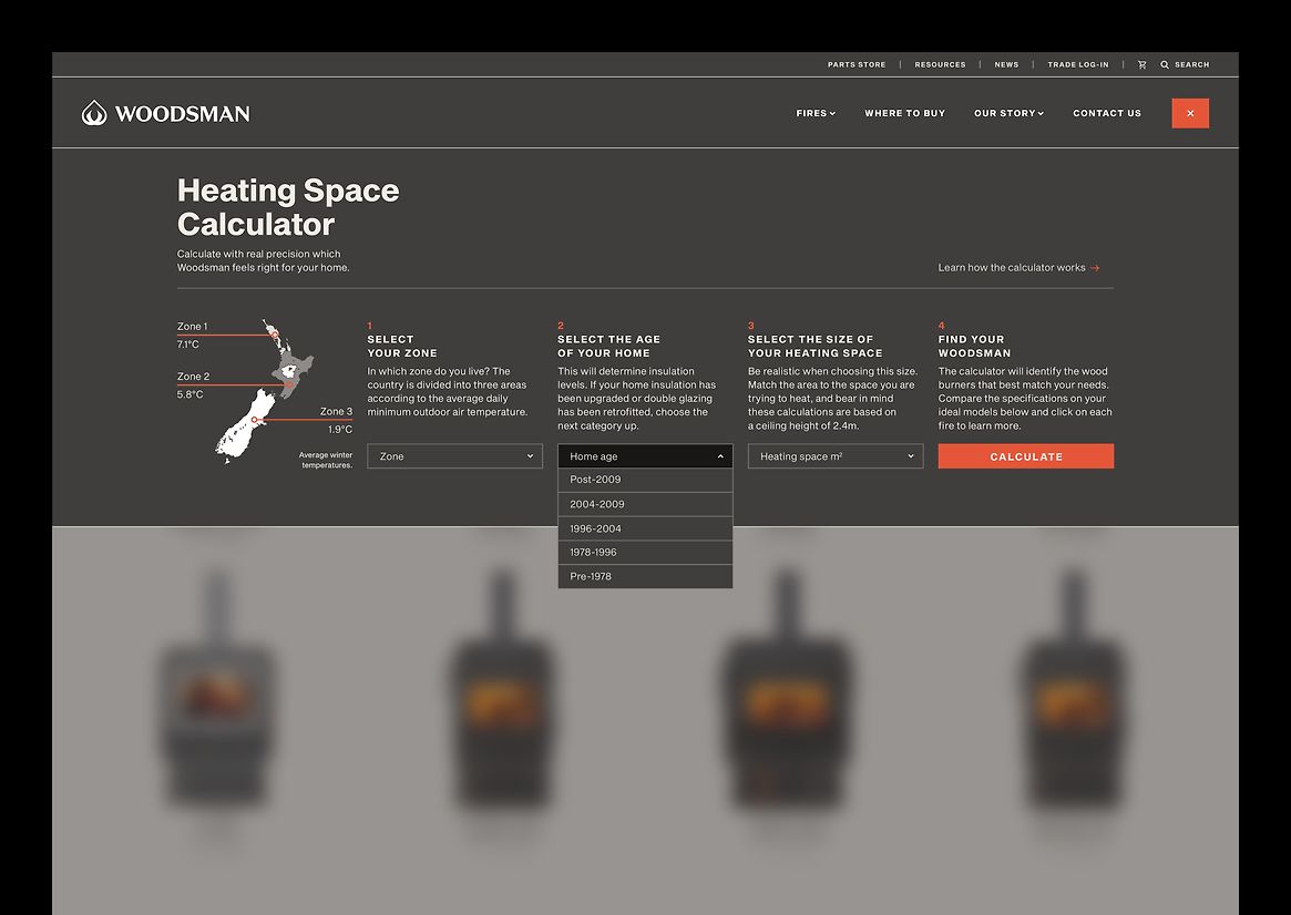
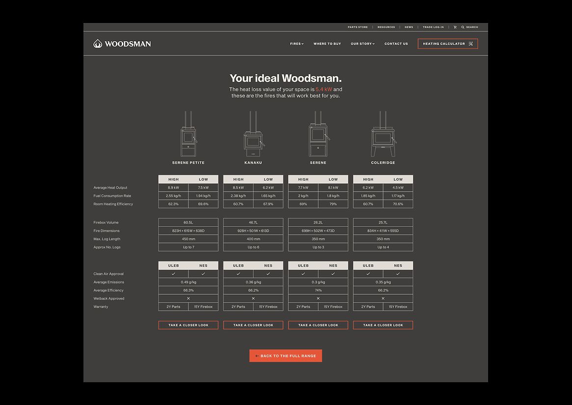
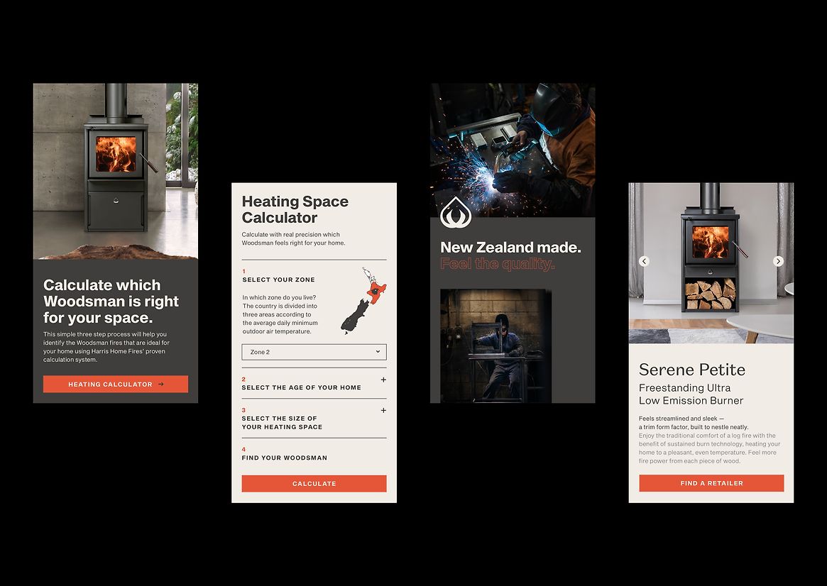
A key aspect of the client's brief was the inclusion of a 'home heating calculator.' In line with the brand's commitment to honesty, it was crucial to avoid the industry's common practice of inflated specifications. This transparent approach seamlessly aligned with the the ‘real’ aspect of the brand.
Easily accessible from any page of the website, the Woodsman calculator is a user-friendly tool backed by scientific research. Through a simple four-step process, users input their region, home age, and heating area. The calculator then provides them with their optimal kilowatt number and a range of suitable Woodsman fires to meet their specific needs.
The concept of duality is seamlessly integrated across the website, employing subtle interplay between the two brand typefaces and leveraging the contrasting lights and darks of the updated colour palette. Through this harmonious balance, we artfully capture the essence of the brand's dual personalities, creating a captivating visual experience for users.
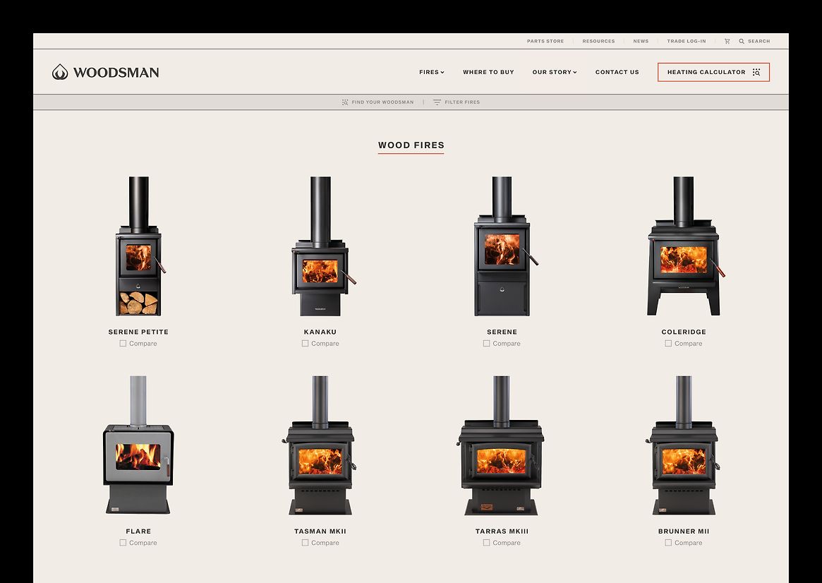
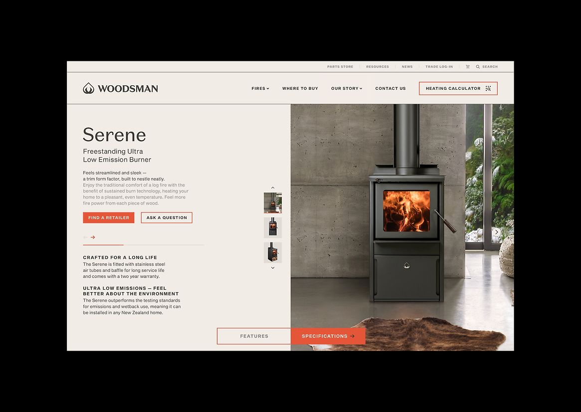
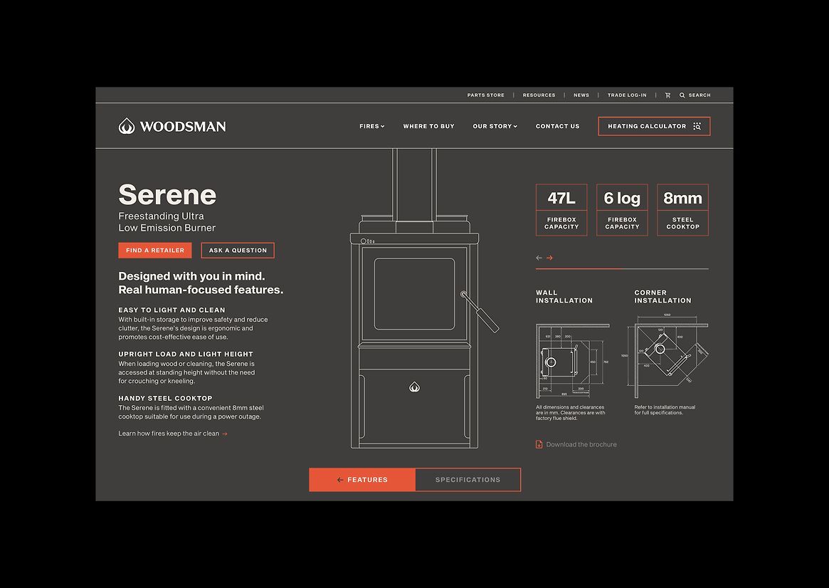
The essence of this concept comes to life on the product pages, where a delightful dichotomy exists between the feeling-oriented features side and the fact-based specifications side. The features side exudes warmth and emotion, adorned with lighter ash background colours, expressive humanist sans serif typography, and captivating photographic images. In contrast, the specifications side embraces a sleek and technical aesthetic, utilising a dark steel colour palette, minimalist neogrotesque typography, and precise line drawings and diagrams for technical installation.
The use of micro-interactions and smooth animations help bridge the changes between the ‘real’ and ‘feel’ elements throughout the site.
A strong brand message is woven throughout the entire site, combining visually stunning brand photography with impactful copy, reflecting every other brand touchpoint for Woodsman. To meet specific digital marketing needs, we created three distinct landing pages, each tailored to deliver exceptional user experiences.
The success of this project can be attributed to the strong trust established between us and our client, which empowered us to challenge the norms of an industry often resistant to change. The website has received positive reviews from both consumers and retail staff, affirming its positive impact.
Description:
Woodsman, an iconic New Zealand brand, traces its roots back to the visionary W. H. Harris, a Christchurch tinsmith in 1887. With a rich history and enduring legacy, Woodsman has evolved into a beloved name, synonymous with excellence in the wood
burner industry.
Building upon our continuous rebranding efforts for Woodsman, we undertook a comprehensive revamp of their website. The objective was not only to align it with the updated visual identity but also to enhance the user experience significantly. The result is a cutting-edge website that serves as an industry-wide tool for retailers, regardless of the brand they sell.
The rebranding embraced a compelling concept of duality, juxtaposing the feelings evoked by the warm feeling of a classic log burner with the real facts and figures that highlight their sustainability and cost-effectiveness as a home heating solution. This approach appeals to both the emotional and rational sensibilities of consumers.
A key aspect of the client's brief was the inclusion of a 'home heating calculator.' In line with the brand's commitment to honesty, it was crucial to avoid the industry's common practice of inflated specifications. This transparent approach seamlessly aligned with the the ‘real’ aspect of the brand.
Easily accessible from any page of the website, the Woodsman calculator is a user-friendly tool backed by scientific research. Through a simple four-step process, users input their region, home age, and heating area. The calculator then provides them with their optimal kilowatt number and a range of suitable Woodsman fires to meet their specific needs.
The concept of duality is seamlessly integrated across the website, employing subtle interplay between the two brand typefaces and leveraging the contrasting lights and darks of the updated colour palette. Through this harmonious balance, we artfully capture the essence of the brand's dual personalities, creating a captivating visual experience for users.
The essence of this concept comes to life on the product pages, where a delightful dichotomy exists between the feeling-oriented features side and the fact-based specifications side. The features side exudes warmth and emotion, adorned with lighter ash background colours, expressive humanist sans serif typography, and captivating photographic images. In contrast, the specifications side embraces a sleek and technical
aesthetic, utilising a dark steel colour palette, minimalist neogrotesque typography, and precise line drawings and diagrams for technical installation.
The use of micro-interactions and smooth animations help bridge the changes between the ‘real’ and ‘feel’ elements throughout the site.
A strong brand message is woven throughout the entire site, combining visually stunning brand photography with impactful copy, reflecting every other brand touchpoint for Woodsman. To meet specific digital marketing needs, we created three distinct landing pages, each tailored to deliver exceptional user experiences.
The success of this project can be attributed to the strong trust established between us and our client, which empowered us to challenge the norms of an industry often resistant to change. The website has received positive reviews from both consumers and retail staff, affirming its positive impact.