MitoQ wanted to forge an entirely new wellness category of “Cellular Health”, where consumers build their own health on the deepest of foundations, their individual cells. The critical story of the science behind MitoQ had the potential to be overwhelming in its complexity. We took the opportunity to imagine how storytelling could play a pivotal role in e-commerce. Putting the story of life and vitality at the heart of the site.
We collaborated closely with MitoQ and their brand agency Born Ugly to reimagine the MitoQ digital experience from the ground up.
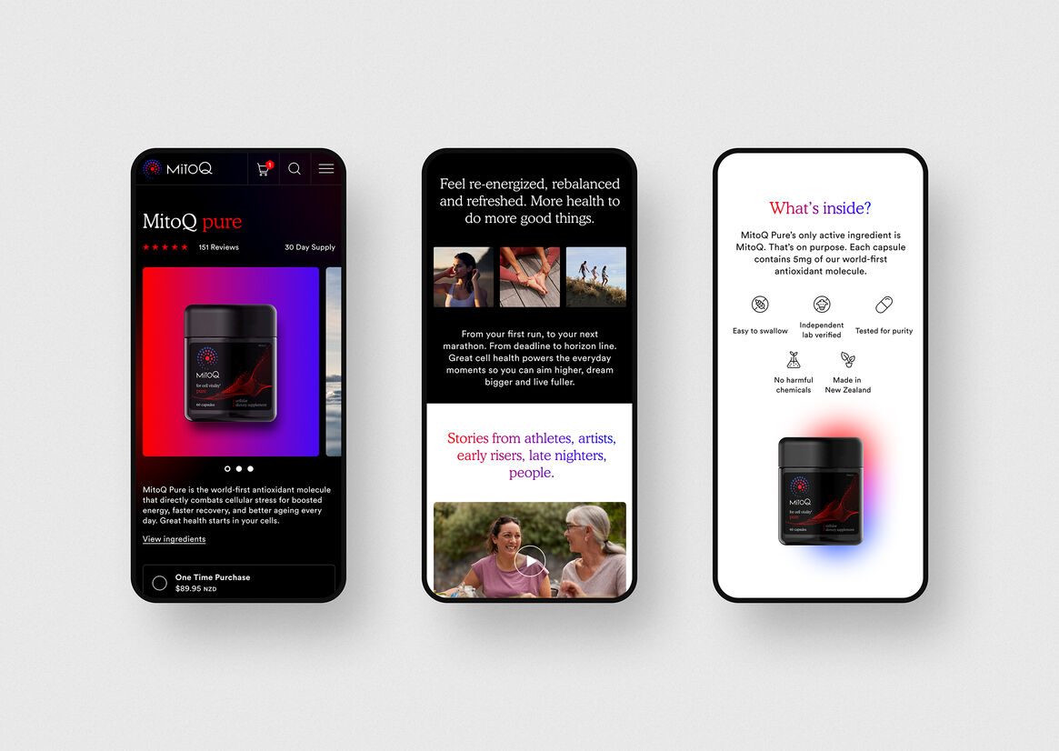
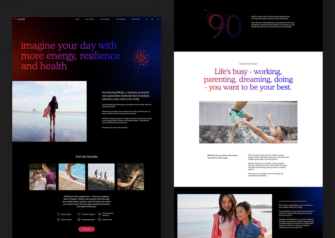
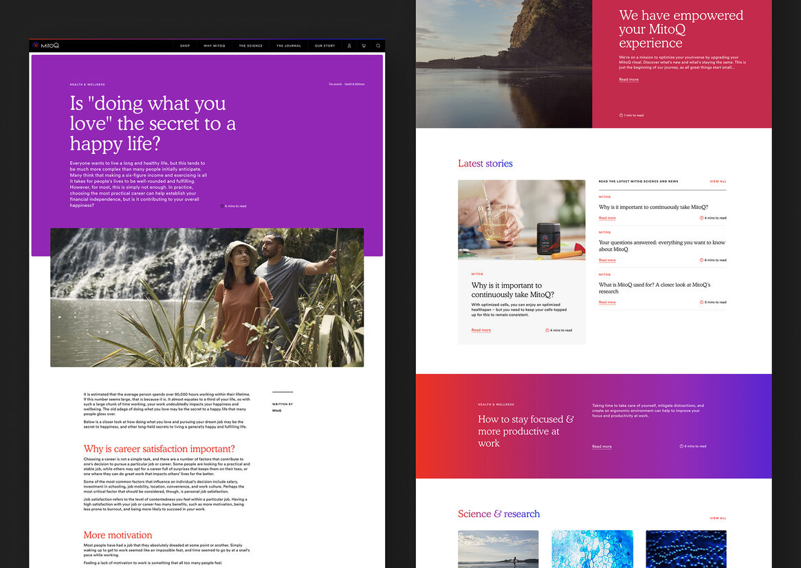
We wanted to show the product woven into all aspects of everyday moments across a variety of people, young and old. It was important that we showed real impact with real people, rather than communicate just the brilliant science and internal story of the product. In the photography we looked for moments of connection between people, or contemplative moments where you feel that potential for greatness in your day.
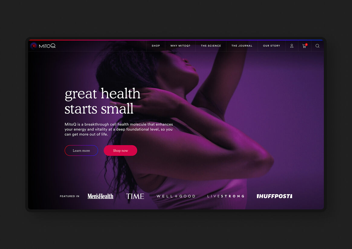
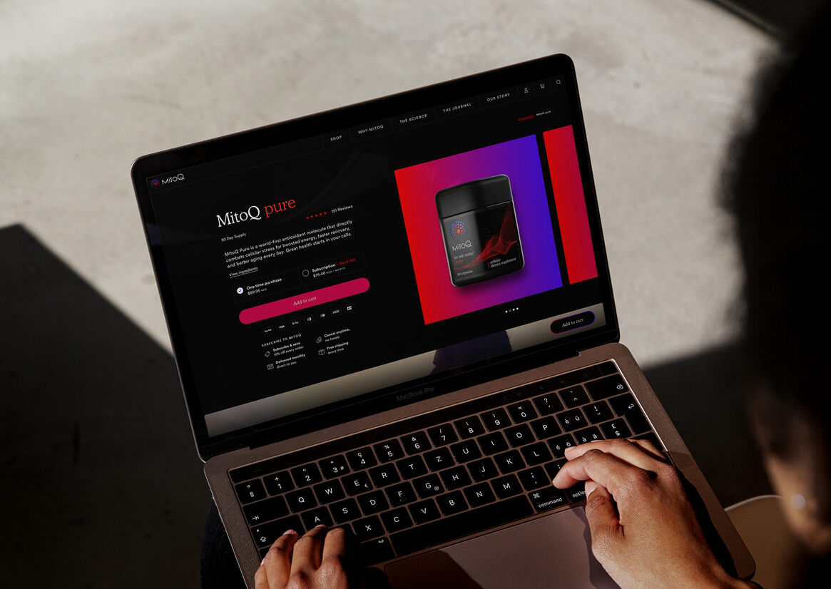
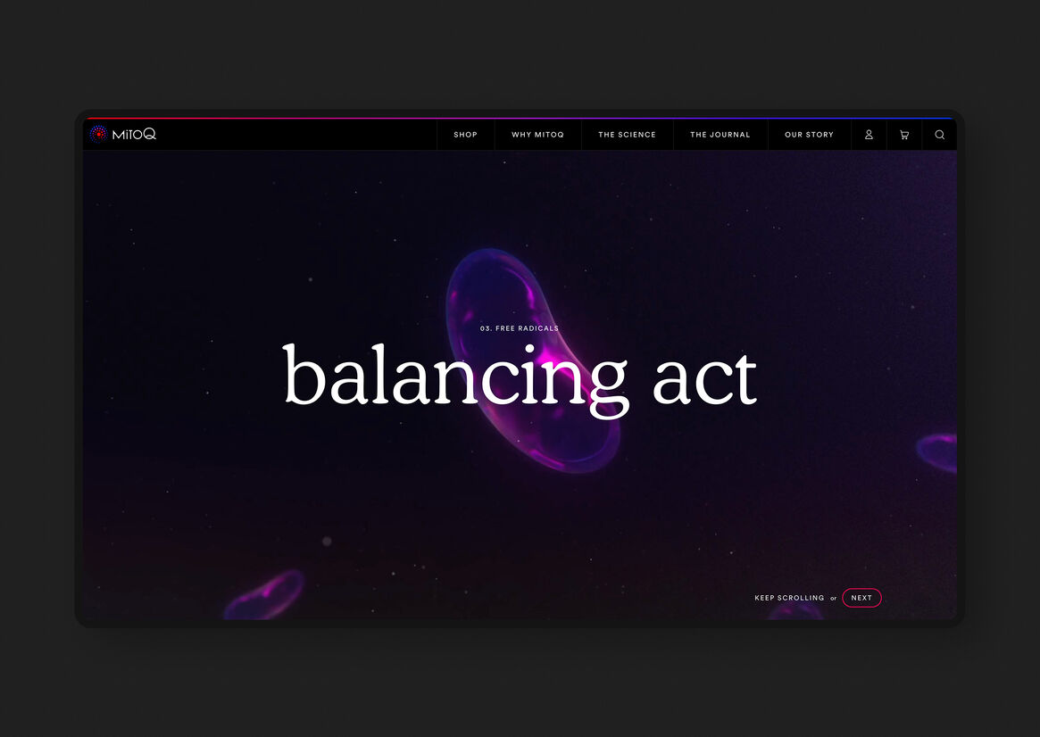
The brand work had established the language of blues and reds - where blue was the base state of your body’s cells, red was the excitement of the MitoQ molecule, and purple is the energy cascading from one to the other. We expressed this story in multiple moments throughout the site, from the backgrounds of key pages, where the red and blue slowly swirl into each other, to the CTA button rollovers, where those colours radiate outwards as you hover.
In the site’s design direction we looked to balance premium cues of black interspersed with pops of colour and gradients, balanced out with sections of clean white for an easy reading experience. We established the following design pillars to guide our decisions throughout:
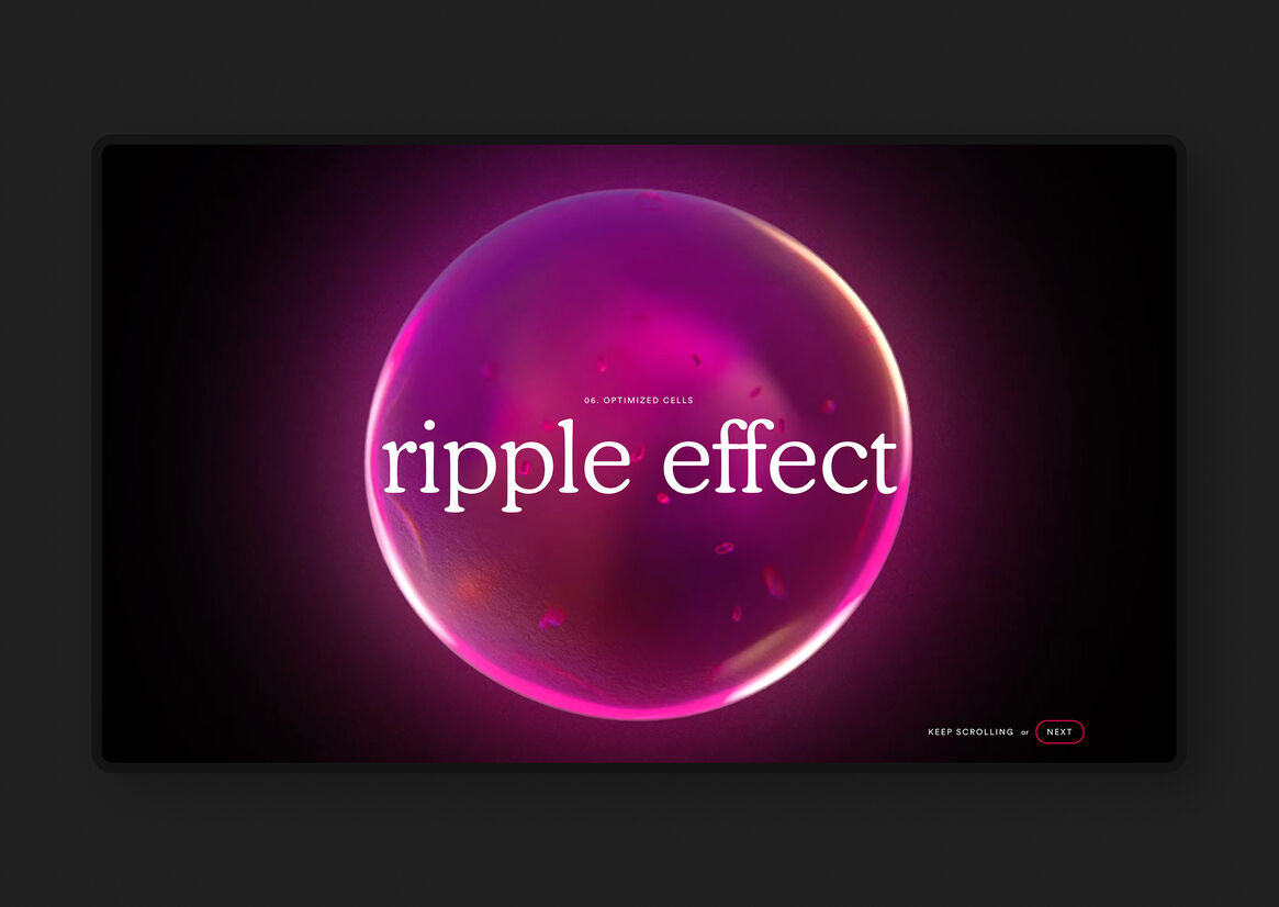
Immersive digital storytelling - there’s nothing more powerful than a story. We aimed to express both the external stories (what MitoQ does for your life) and internal (how it achieves it inside of you).
Branded experience - looking for opportunities to convey the brand in every macro and micro moment, from the big splash of the Homepage through to how a button moves as you submit a form.
Clear, intuitive browsing and buying - IA and UX that aligns with the trusted, clear knowledge of the brand, keeping visitors moving forwards through the site in a logical, intuitive way. Simple, clear integrated ecommerce that makes purchasing a pleasure.
Trusted and authentic - MitoQ had spent decades building their strong scientific credentials and global customer trust. Our design had to convey trustworthiness and authenticity right from the get-go, and this had to be deeply embedded throughout the entire site.
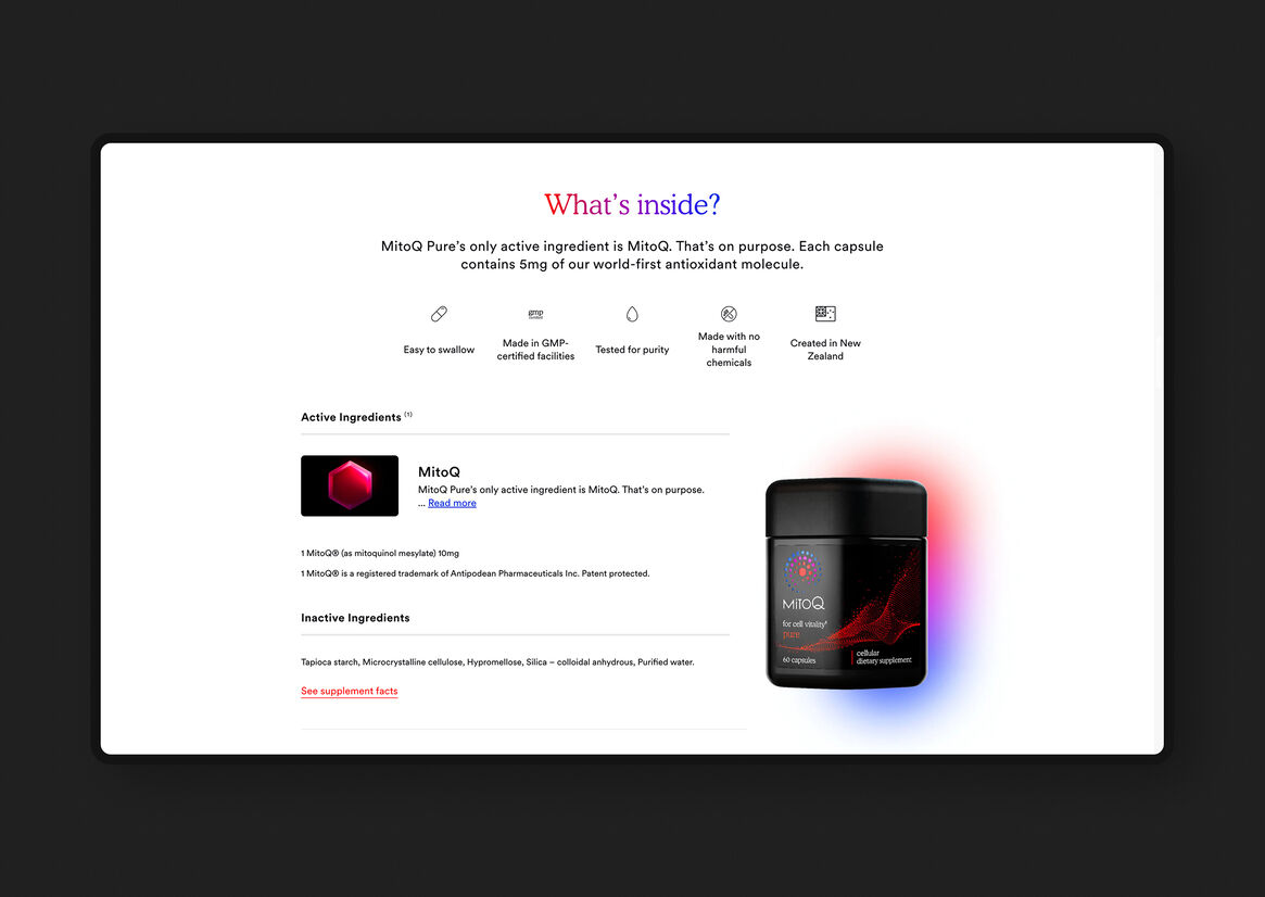
Scientific but accessible - MitoQ is extensively backed by scientific trials, we wanted to show information simply and not obfuscate.
Communicating MitoQ’s brand story of energy and positivity radiating outwards in a ripple effect from the individual to the wider community was a core aim for us, and we wanted the entire site to have this feeling in the way it looks and feels.


Description:
MitoQ wanted to forge an entirely new wellness category of “Cellular Health”, where consumers build their own health on the deepest of foundations, their individual cells. The critical story of the science behind MitoQ had the potential to be overwhelming in its complexity. We took the opportunity to imagine how storytelling could play a pivotal role in e-commerce. Putting the story of life and vitality at the heart of the site.
We collaborated closely with MitoQ and their brand agency Born Ugly to reimagine the MitoQ digital experience from the ground up.
We wanted to show the product woven into all aspects of everyday moments across a variety of people, young and old. It was important that we showed real impact with real people, rather than communicate just the brilliant science and internal story of the product. In the photography we looked for moments of connection between people, or contemplative moments where you feel that potential for greatness in your day.
The brand work had established the language of blues and reds - where blue was the base state of your body’s cells, red was the excitement of the MitoQ molecule, and purple is the energy cascading from one to the other. We expressed this story in multiple moments throughout the site, from the backgrounds of key pages, where the red and blue slowly swirl into each other, to the CTA button rollovers, where those colours radiate outwards as you hover.
In the site’s design direction we looked to balance premium cues of black interspersed with pops of colour and gradients, balanced out with sections of clean white for an easy reading experience. We established the following design pillars to guide our decisions throughout:
Immersive digital storytelling - there’s nothing more powerful than a story. We aimed to express both the external stories (what MitoQ does for your life) and internal (how it achieves it inside of you).
Branded experience - looking for opportunities to convey the brand in every macro and micro moment, from the big splash of the Homepage through to how a button moves as you submit a form.
Clear, intuitive browsing and buying - IA and UX that aligns with the trusted, clear knowledge of the brand, keeping visitors moving forwards through the site in a logical, intuitive way. Simple, clear integrated ecommerce that makes purchasing a pleasure.
Trusted and authentic - MitoQ had spent decades building their strong scientific credentials and global customer trust. Our design had to convey trustworthiness and authenticity right from the get-go, and this had to be deeply embedded throughout the entire site.
Scientific but accessible - MitoQ is extensively backed by scientific trials, we wanted to show information simply and not obfuscate.
Communicating MitoQ’s brand story of energy and positivity radiating outwards in a ripple effect from the individual to the wider community was a core aim for us, and we wanted the entire site to have this feeling in the way it looks and feels.