Digital
Dynamo6 2 A new digital identity for Hamilton City Council
-
Pou Auaha / Creative Director
Andrew Rozen
-
Ringatoi Matua / Design Directors
Suzanne Lustig, Bastiaan van Druten
-
Ngā Kaimahi / Team Members
Geoff Hinton, Curtis Yeatman, Mark Brawn, Gavyn Jones, Mike Harris, Darin Gillies, Brooke Barnes -
Client
Liam Blackwell
Description:
The complexity of what Council does is staggering, they’re responsible for keeping Kirikiriroa running and thriving into the future, impacting people’s lives on a daily basis.
Drivers for the website redevelopment project were centred on a legacy system on its last legs, a digital experience that no longer made sense in the modern digital world, and a brand that no longer reflected its voice. We needed to craft a website, from the ground up, that would become the nexus of seamless customer interactions as Council’s new digital front counter.
Early discussions with Council revealed how far removed the brand being showcased to Hamiltonians was from their current vision - one which is vibrant, connected, diverse, and representative of an organisation geared to improving the wellbeing of its city.
Cue the hurdle… the existing brand guidelines were in play and far reaching, from building and vehicle signage through to email signatures and letterheads - in essence, untouchable. A digital component was missing though and this angle opened the door to a digital brand evolution so that at least the digital front counter was in tune.
With our brand design partners, Head & Tail, we moved through an exploration phase with Council to visually stress test their fresh brand vision and ensure we were playing within necessary constraints.
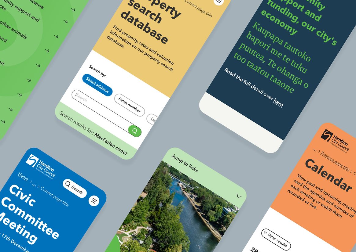
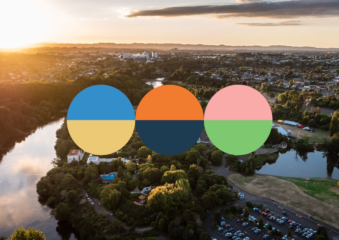
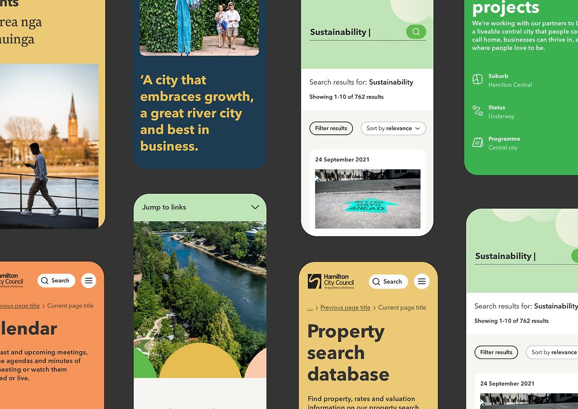
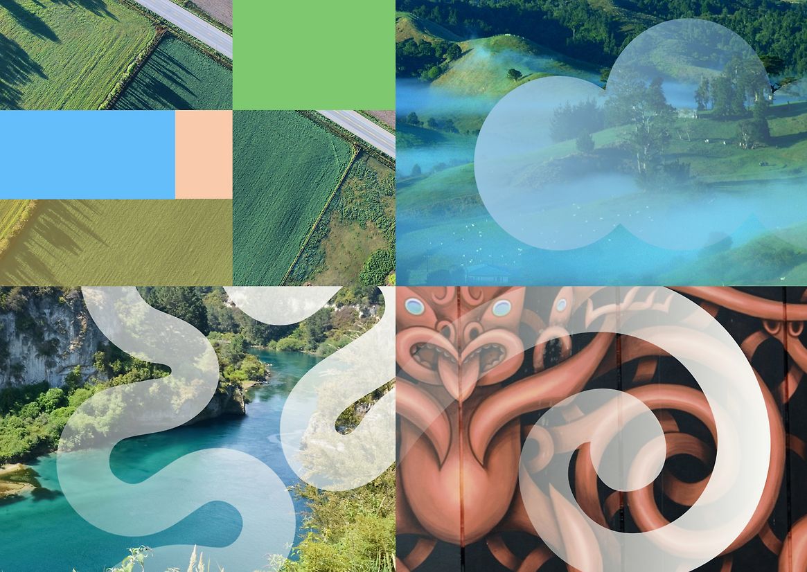
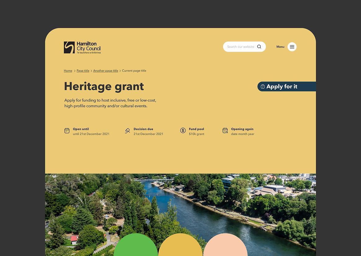
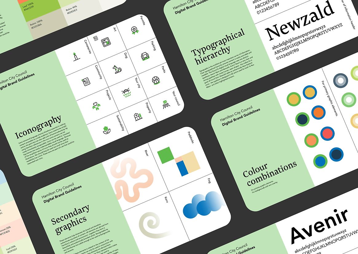
The delivery of Council’s fresh new digital identity saw a huge focus on colour. The existing palette was constrained, rules were set for combinations that were anchored by one of their two traditional brand colours, and support added through one or more of their funkier secondary colours - creating a relatable palette that was still modern, friendly, and vibrant.
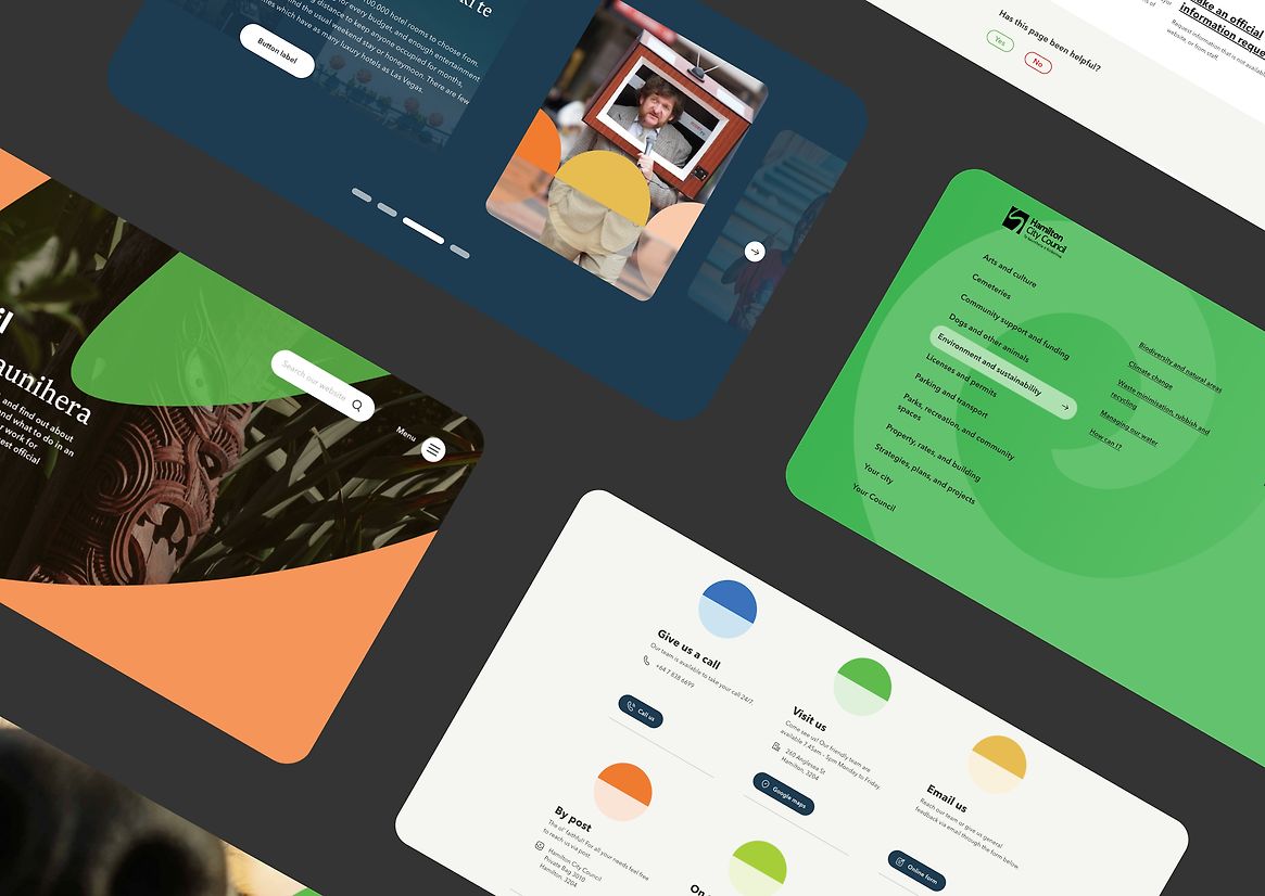
Typography moved from that expected at the turn of the century to something which now sat on par with any leading digital brand - an authentically Kiwi font (Newzald) was introduced for te reo inclusion.
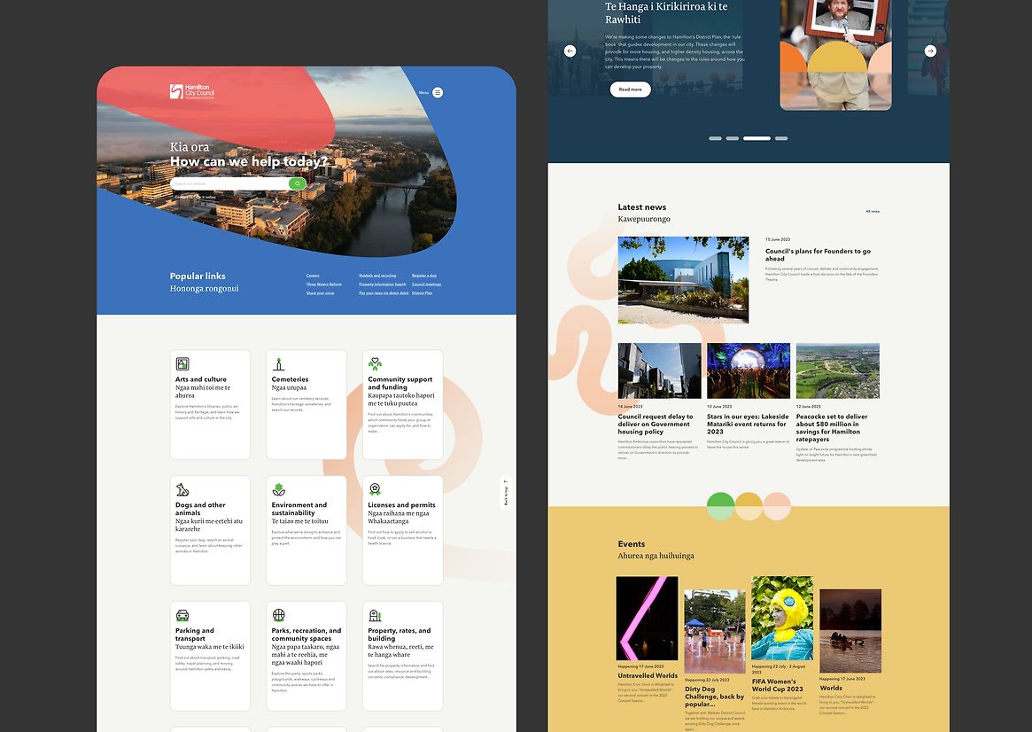
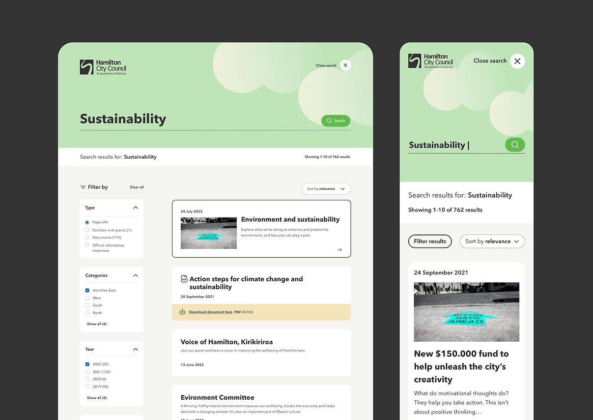
The age-old ‘too much content and pages’ was resolved through clever UX - user research insight as well as modern design principles and patterns did wonders there. Yet it was the introduction of on page supporting graphics that added a new layer of personality. Accompanying the refreshed core river motif were graphics special to Kirikiriroa - from the Fairfield bridge and nearby Paddocks to the more traditional Koru and winter Fog - connecting users to content in a uniquely branded way.
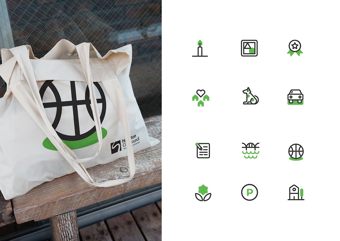
Custom iconography, considerate of Hamilton’s diverse population, contributed to the website’s accessibility push to WCAG 2.1 AA - transcending language barriers on core navigation pages by using a language that everyone spoke.
Interactive components didn’t miss out on the fun either, grounded by a responsive grid system, a detailed blueprint was put into place that considered their various states - aesthetically considerate, these elements added a human touch to the digital identity.
Yes, it’s the sum of all parts, but the new digital identity really did lift the intuitive user experience and development wizardry of Council’s shiny, fast, and secure new website to a whole new level.