Digital
Dynamo6 2 Head and Tail Our brand discovery and design implementation
-
Pou Auaha / Creative Director
Andrew Rozen
-
Ringatoi Matua / Design Directors
Suzanne Lustig, Bastiaan van Druten
-
Ngā Kaimahi / Team Members
Peter O’Halloran, Mike Harris, Gavyn Jones -
Kaitautoko / Contributors
Mark Brawn, Igor Matich

Description:
Our company was born in the cloud, the early years focussed on cloud infrastructure services. Yet across an 8 year history the shape of the company had changed. Our digital experience and software development teams had really come into full strength.
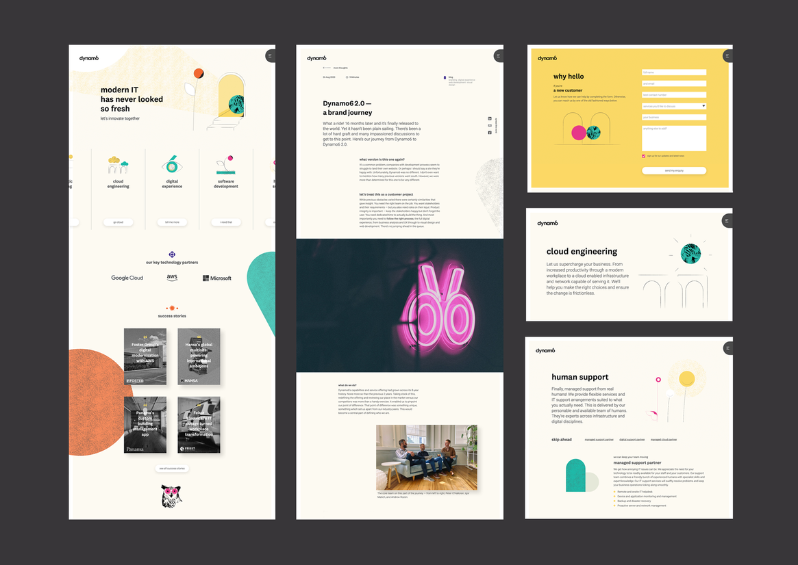
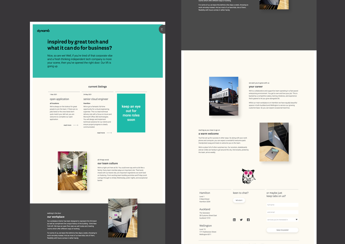
We had two parts of the business which complimented each other nicely and created a unique point of difference versus competitors. Our challenge, ahead of the new website, was a rebranding exercise which talked to that. This process enabled us to define who we are and what we do. A unique brand personality was born.
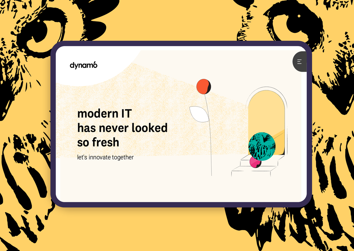
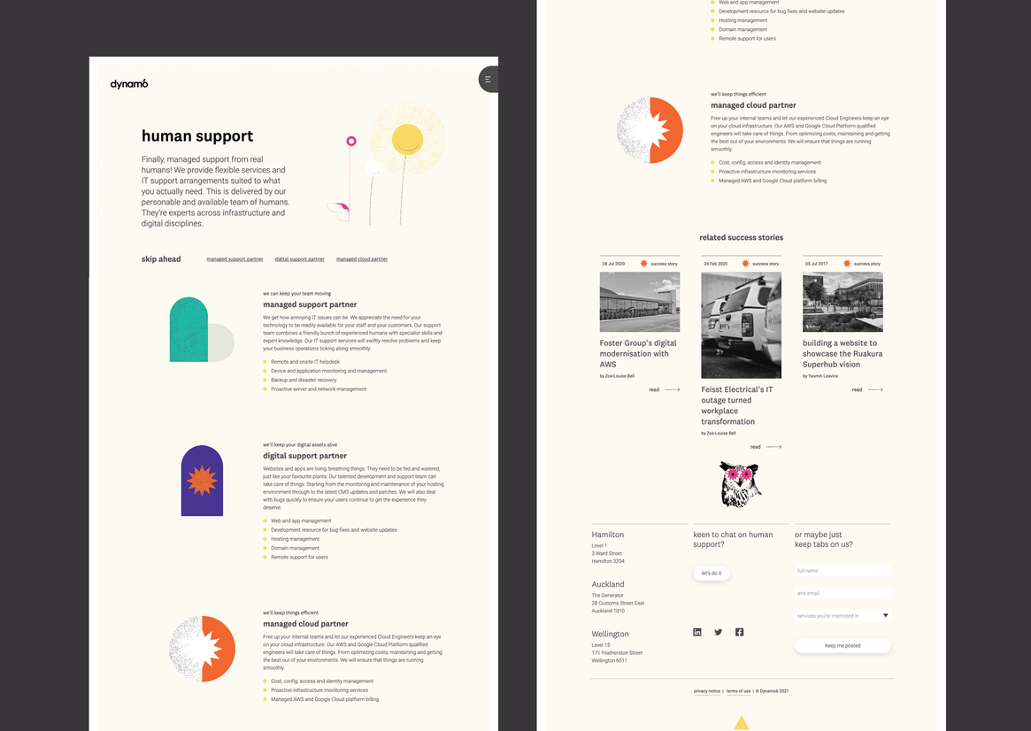
Cloud infrastructure is inherently intangible. We needed to enlist a graphical style to give it some spice and physicality as well as do justice to the digital experience and software development side. Graphic modernism was starting to hit the right notes - but it needed a bit more to bring our personality to life.
We moodboarded different interpretations of graphic modernism and mixed them with companyisms that were important to us. This step helped us nail our final thoughts on colours, logos, typography, and photography. A creative brief was forming.
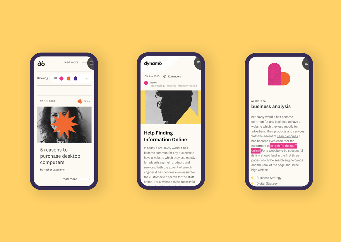
In today’s age, the UX bar is set high. A website should not only work the way users expect, it should give them exactly what they need, so they walk away feeling good about the experience. We decided not to test our existing website, we were dealing with a new beast entirely.
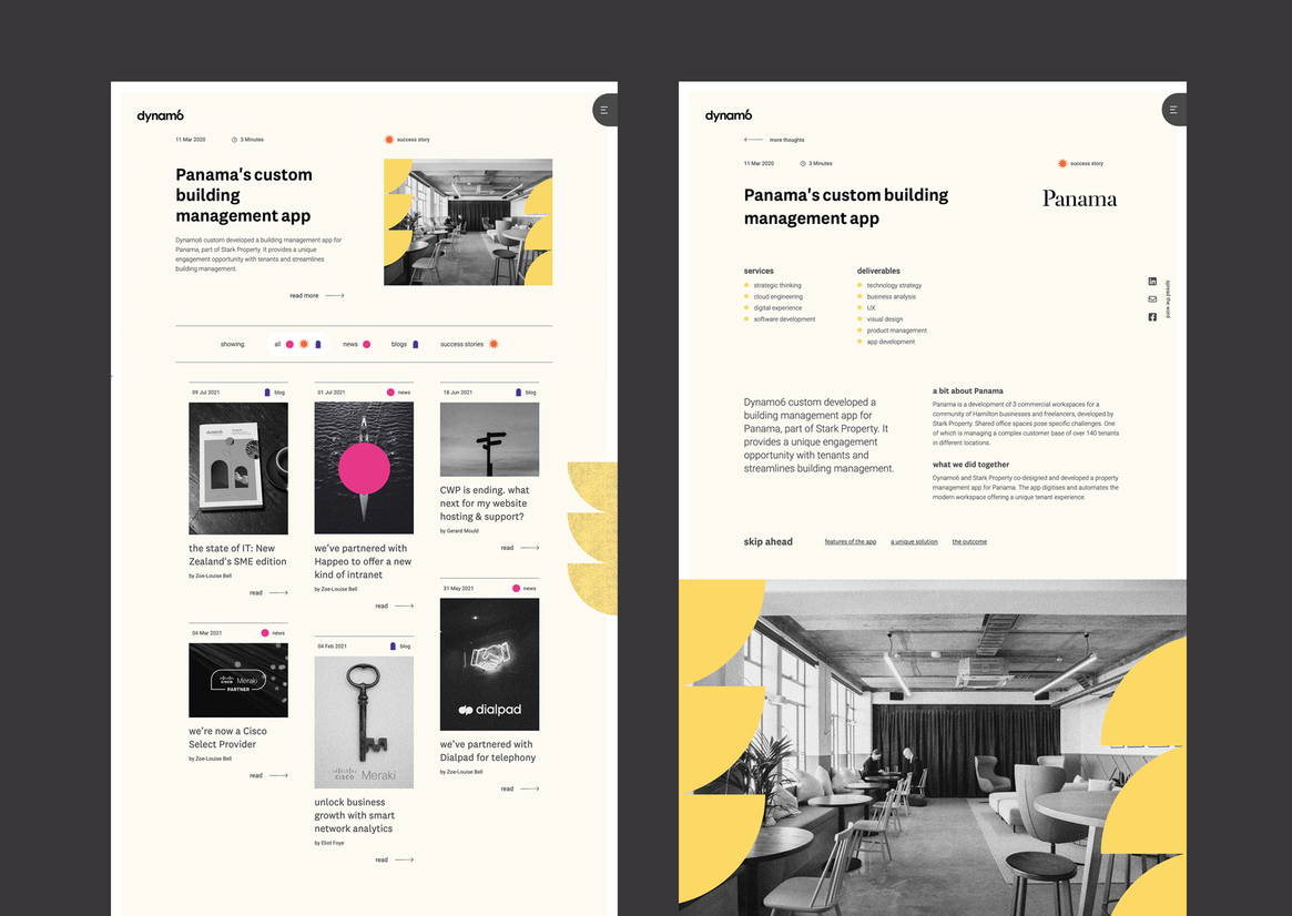
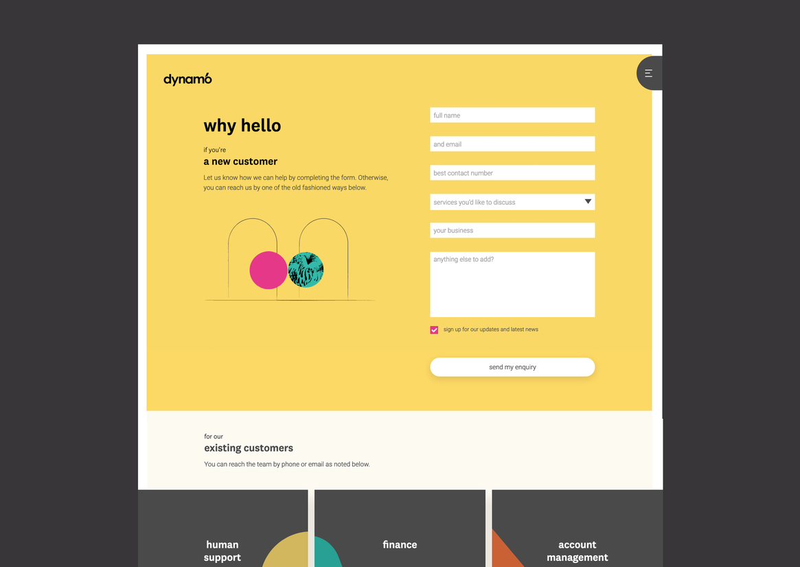
The new website was about the brand experience as much as it was about what our customers needed. We understood their customer journey with us and that gave us a collective design target to work to. With their flow clear we were able to complete the IA and navigation. We were also able to write tailored copy from our brand persona.
We completed competitive benchmarking against our competitors. We considered industry conventions and assessed what was and wasn’t working. Where inspiration was drawn, we emulated or evolved it in our prototyping. Inspiration for prototyping extended to other industries where best practice had been celebrated and awarded too.
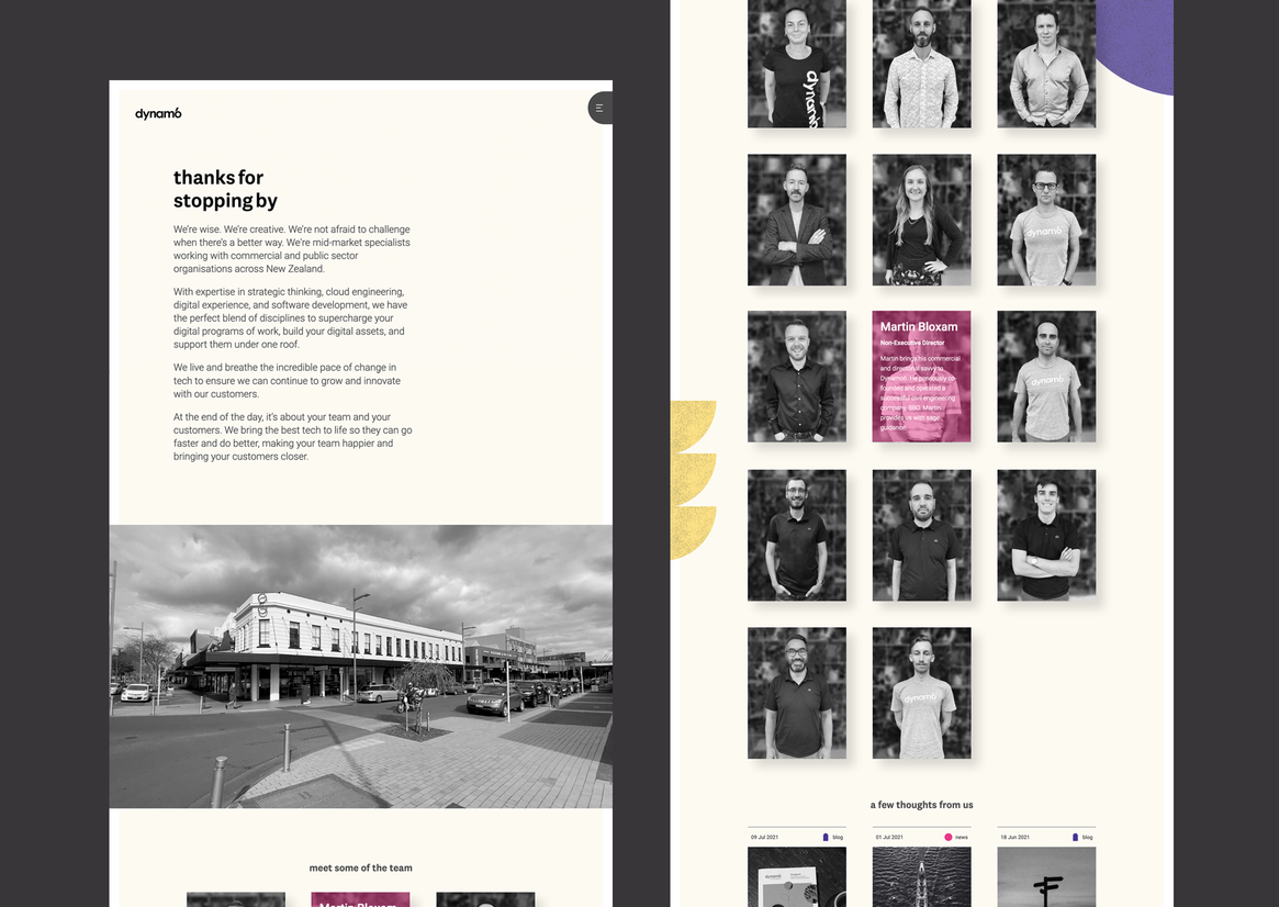
With the creative brief complete we reached out to a design duo to help us with the art direction, illustration, animation, and delivery. They took our early work and evolved it to create a visual language that made the overall website unique but could also be extended throughout our brand.
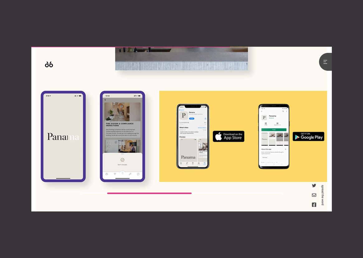
Our new website was built on Silverstripe CMS and hosted on GCP. The developers loved the frontend challenge of the interactions and animations. A mix of JavaScript animations alongside handcrafted pure CSS animation kept movements crisp and load times quick. Focus was put on ensuring movement and interaction melded with the playful style of graphic modernism.
Our challenge throughout this project was in ensuring the rebrand did each service area justice while celebrating their collection as a differentiator for Dynamo6. We also wanted to give our customers the experience they deserved and wanted. The website is certainly a testament to that having been achieved.