Digital
DNA 79 DNA Kiwibank Digital experience.
-
Ringatoi Matua / Design Directors
Anais Ardid, Anna-Marie Antipas
-
Ngā Kaimahi / Team Members
Haley Smith, Naomi Hadfield, Joanne Maguire, Josh Burt -
Kaitautoko / Contributors
Helen Player - Kiwibank, Thoughtfull Design, Ira, Jodi Williams, Tristan Marler, Springload - Development, Simon Hofmann, Alex Beeden -
Client
Kiwibank

Description:
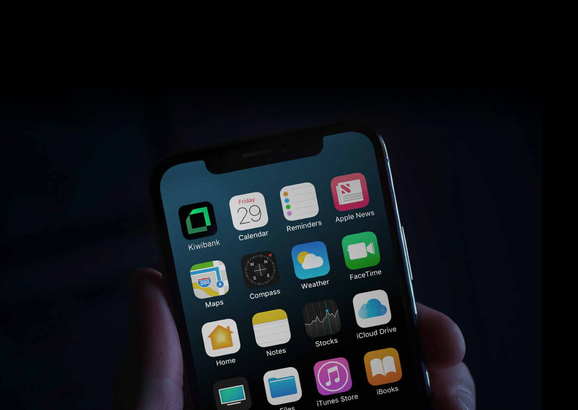
Kiwibank is the largest New Zealand owned bank who are repositioning to attract and retain a new progressive type of customer – through a brand-led transformation across culture, product and technology.
The brand strategy 'enabling Kiwi to thrive' and refreshed identity are inspired by the Harakeke plant - the Te Ao Māori metaphor of a thriving community. The center shoots are the rito – the new, growing generation, our future with the surrounding outer leaves representing knowledge and wisdom - the nurturing parents and grandparents.
The identity is formed from a two-coloured abstract Harakeke leaf that folds its way around to frame the name of the bank, supported by three Tohu (symbols) that express the attributes of a thriving community.
The design challenge was to powerfully and authentically express the new brand strategy and identity system through Kiwibank’s digital front door as part of a system that connects all touchpoints of the bank and injects a freshness and modernity into each.
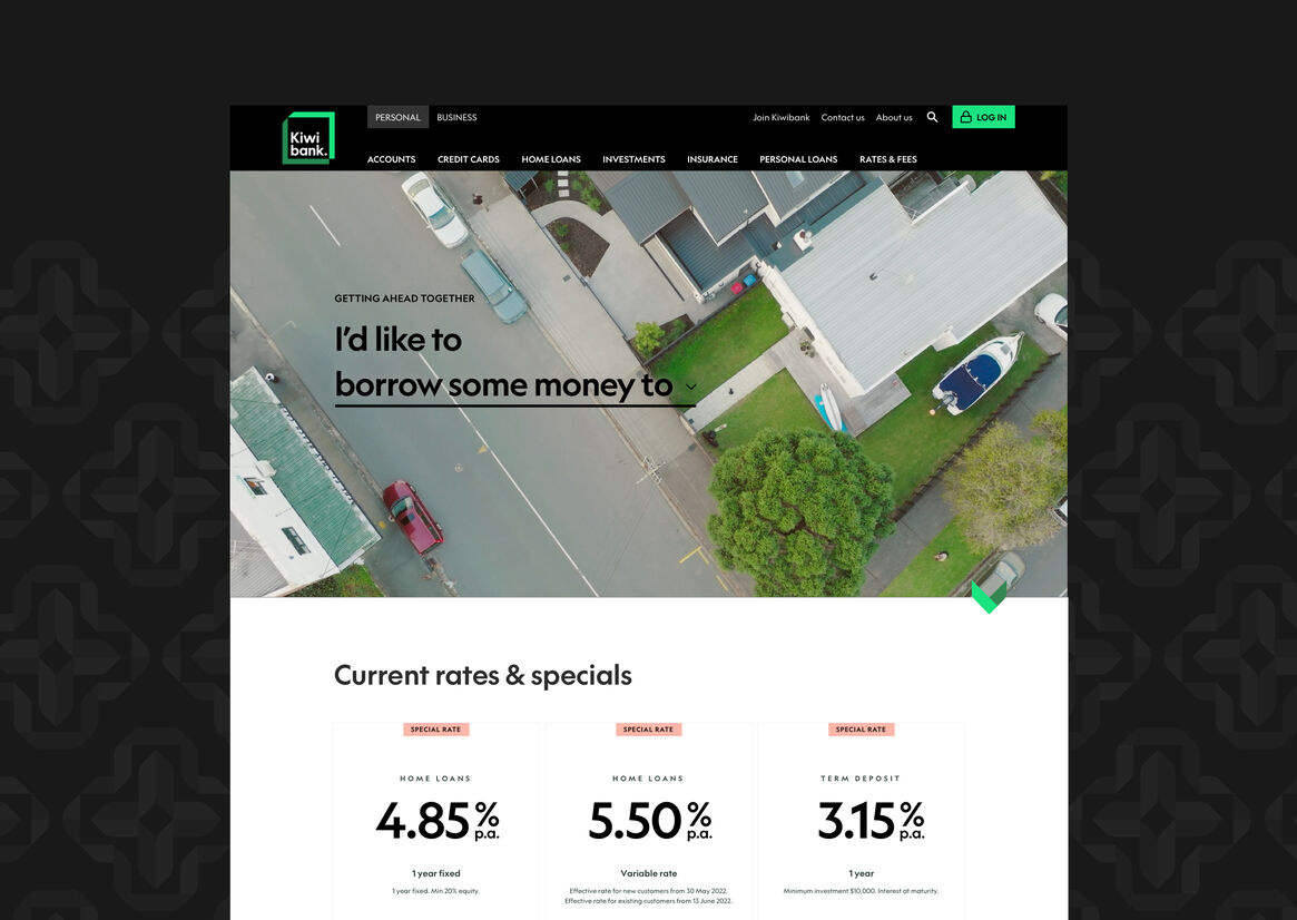
Putting people over products.
Delivering on this progressive brand strategy required a digital experience that would empower customers to self-determine how Kiwibank could assist them to realise their ambitions.
Research highlighted that the product-centric focus and financial vernacular within many banking sites meant there was often a gap between customers reading the information and understanding it.
From the ground up, a core design principle was for the experience to support key customer decisions with information that is relevant to their needs.
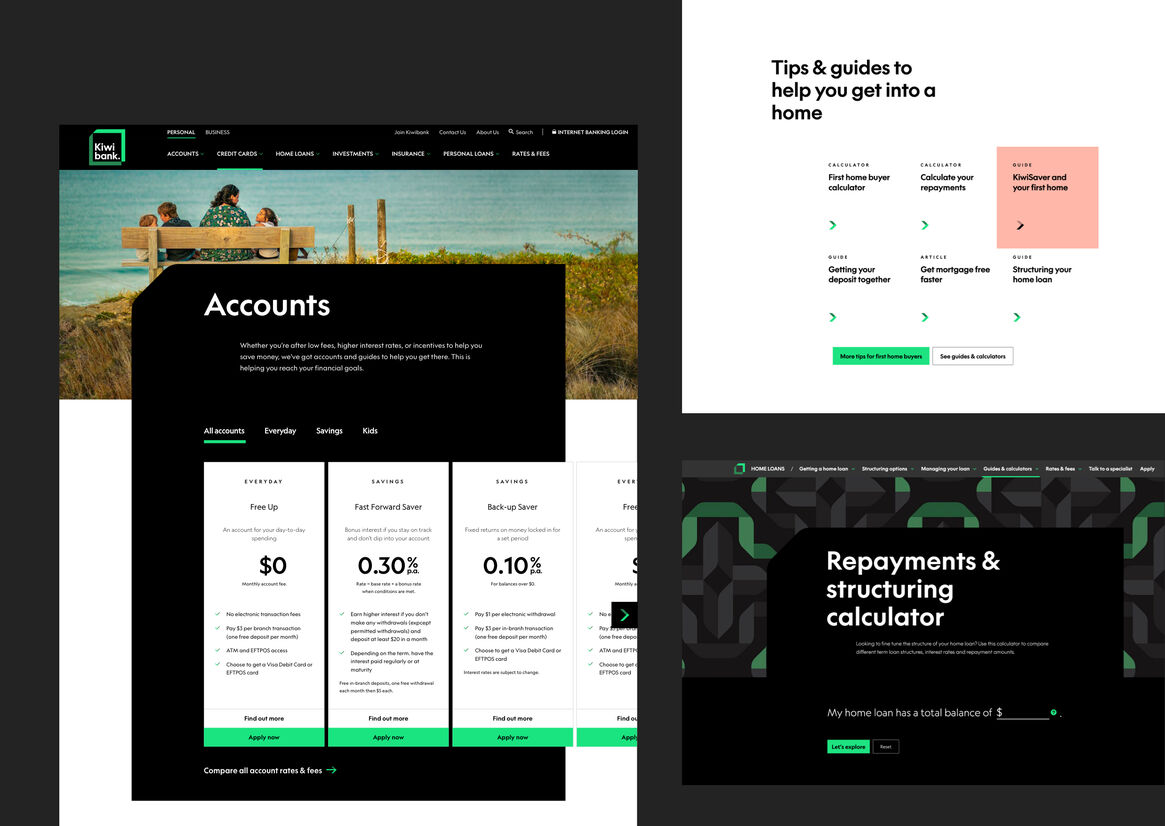
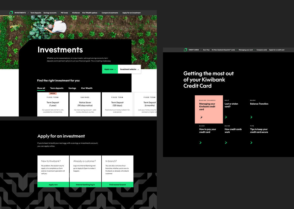
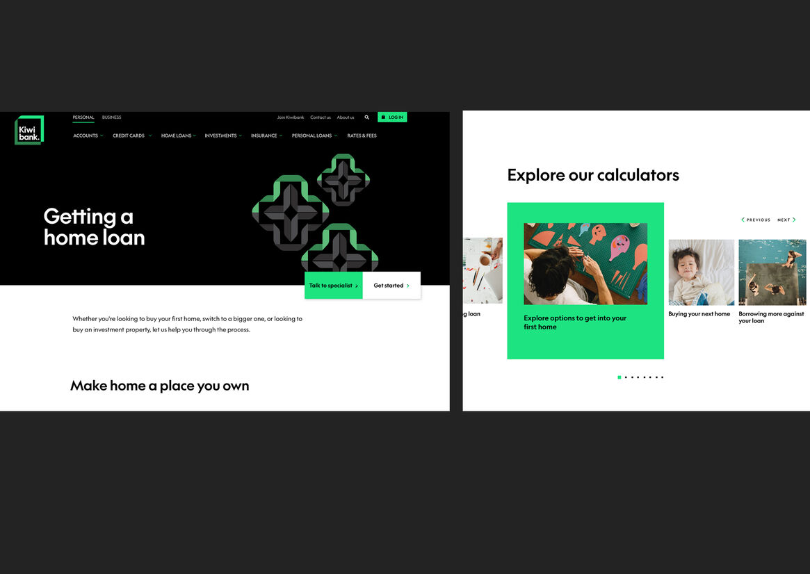
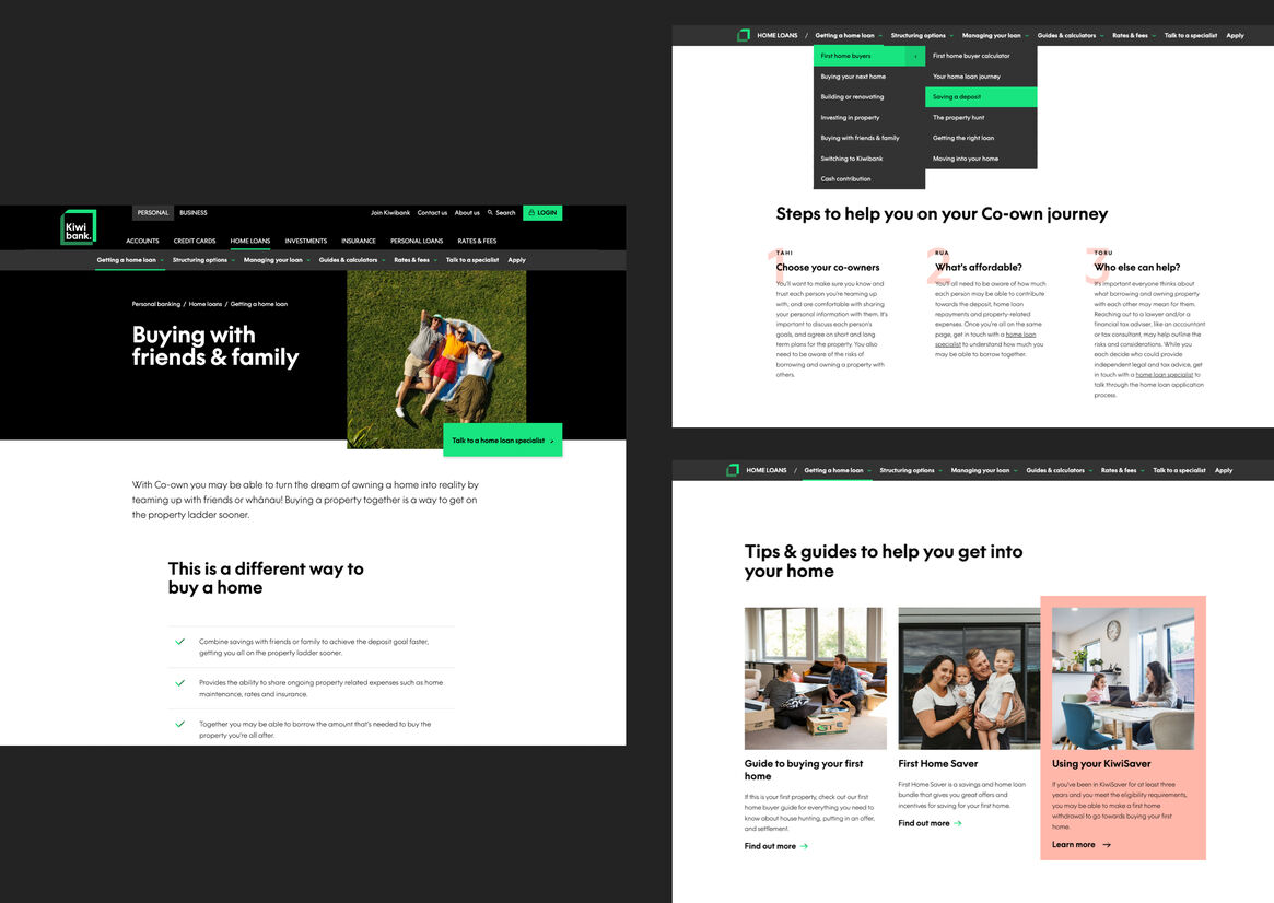
A navigation system that enables more effective journeys.
The navigation was overhauled to ensure users can move in and out of the detail without losing sight of where they are and avoid dead-ends throughout their journeys.
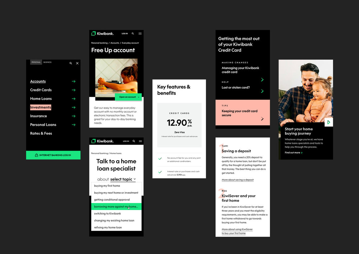
An interface that mirrors a conversation.
To shift how customers interact with the bank, natural language is at the forefront of the experience, which invites customers to share their goals and specific context.
As the user shares more through their journey, the platform surfaces the most relevant product options and action-steps that enable users to understand and best achieve their goals.
A deliberate shift in narrative from banking terminology to a simpler every-day language aids content comprehension.
Experiences that allow product comparisons.
Landing pages have been restructured to highlight the differences between products side-by-side and clarify the customers best options within their context.
Human-centered with a conversion focus.
The digital experience is designed around user mindsets and motivations, whilst sticky call-to-actions and next-step guidance provide clear way-finders for customers to transact with confidence.
Creating a contemporary digital experience.
To stress-test the new brand design within a digital environment, we rapidly prototyped solutions in context, taking into consideration usability, flexibility, accessibility and functionality.
Through an iterative process, a layered hierarchy of content, colour and subtle animations were designed to effectively guide users and create a more immersive experience.
Application of the Tohu within each section was carefully considered, ensuring relevance and integrity of these assets were factored throughout.
carefully considered, ensuring relevance and integrity of these assets were factored throughout.