Digital
AKQA The Reserve Bank Of New Zealand - New Website
-
Ringatoi Matua / Design Director
Nel Johnson
-
Ngā Kaimahi / Team Members
Praveen Marulaiah, Gitesh Shah, Laura Wilson, Matt Townsend, Janine Johnston, Frazer Cameron, Jack Spektor, Murray Allen, Melanie Bell, Keir Jakich, Asha Mohan, Mike Child, Siobhon Joe, James Hindle -
Client
The Reserve Bank Of New Zealand – Te Pūtea Ma


Description:
The website of Te Pūtea Matua, The Reserve Bank Of New Zealand, plays a key role in enabling the wellbeing and prosperity of all New Zealanders. It is an incredibly important digital resource, delivering critical, time-sensitive updates about monetary policy, financial stability, inflation rates and regulation of our banks and financial institutions.
Driven by their obligation to honour Te Tiriti o Waitangi and their purpose to enable the wellbeing and prosperity of all New Zealanders, RBNZ’s website had to not only serve niche audiences in the financial markets, but to provide a more valued, meaningful touchpoint for the rest of us, the people, businesses and communities of Aotearoa.
To inform this strategic redesign, we dug deep into the needs and pains of the various diverse audiences previously underserved, such as Māori, people living with disability and broader audiences with low financial literacy, to identify wide-ranging opportunity areas and ways to solve for all users. This ultimately helped define a set of all-important design principles which guided the design and build of the new site.
As part of its renewed purpose, RBNZ had developed a new visual brand, the first brand redesign in the RBNZ’s 88 year history. It was imperative that we brought this to life authentically and with the appropriate care and respect, as befitting our country’s most primary financial institution and its diverse audiences.
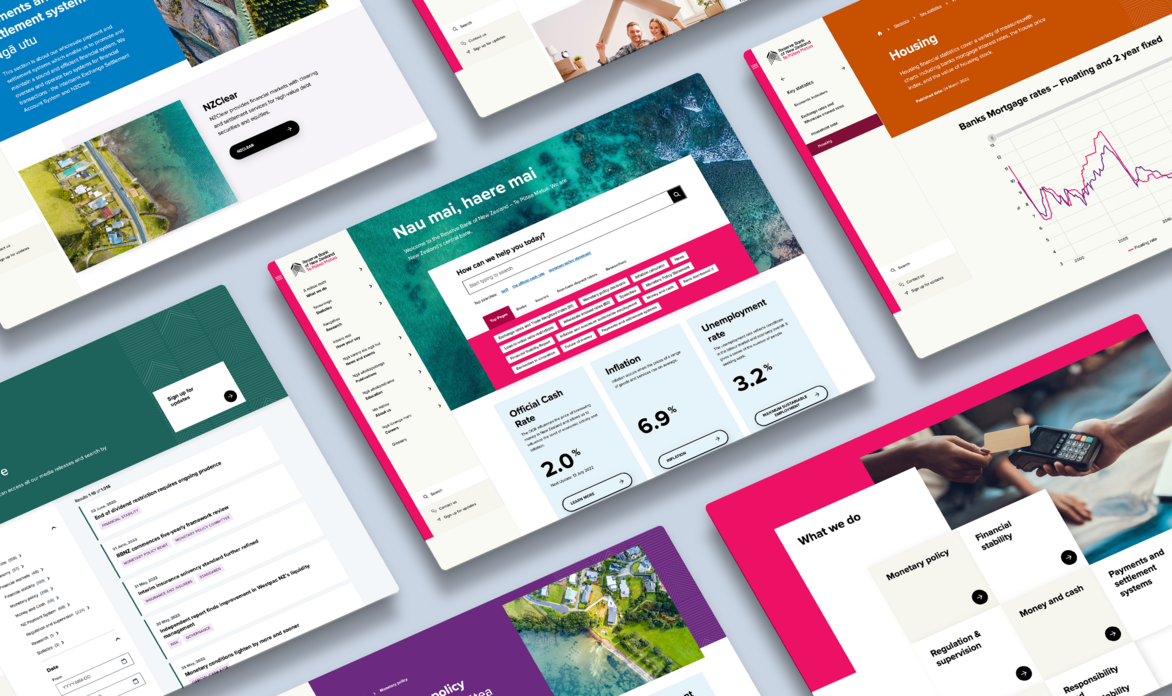
The new website instantly appeals to wider audiences because it takes cues not-only from the other central banks, but also from the brands and services that show up in our daily lives, the premium retailers and the streaming platforms.
The homepage instantly grabs attention with its bold use of colour and beautiful, engaging imagery that captures our people and place. This is framed by a clean, vibrant user interface that instantly welcomes and engages users from all backgrounds.
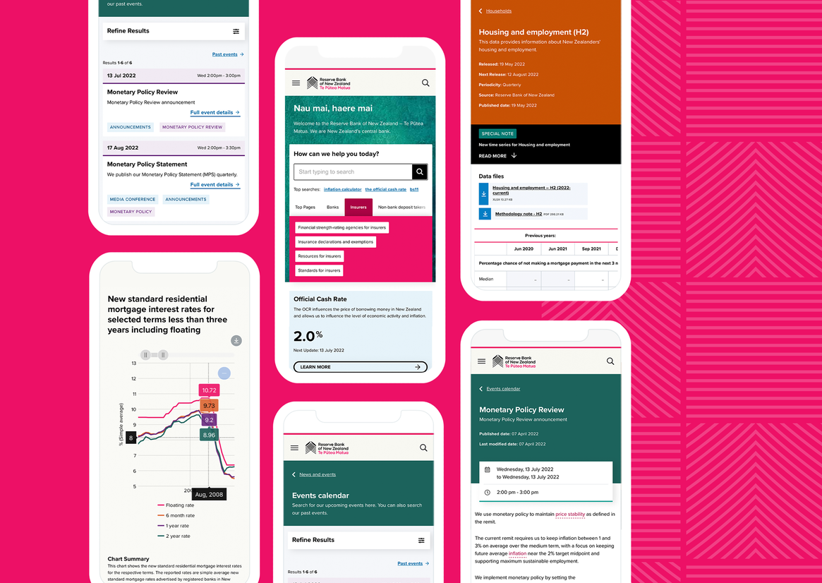
The site features a completely redesigned Coveo-based search experience to enable rapid information retrieval, whilst a new information architecture, designed around common needs rather than internal departments, is also a critical part of getting audiences to important information quickly.
Site sections are logically structured, content pages are concise, well laid-out and are now much easier to consume due to the focus we placed on the use of smart, simple, everyday language.
Common tasks are now front-and-centre, delivered through a dynamic ‘pathfinder’ tool, one of the many design patterns adopted as part of our design approach which is underpinned by the Government Design System. The site also adheres to the NZ Government web and accessibility standards.
Statistical content and datasets were also given a complete makeover through a new AmCharts integration which allows all users at any level of financial literacy to visually manipulate the data.
Impact:
The new website has been live for a little over a month but already we’re seeing really positive change. Pages/Session and Average Session Duration are both indicating 40-50% improvement in engagement for the new website over the same period 2021.