Orcon’s central brand promise is the merging of business and consumer life online. Delivering on this promise with a sleek new Mobile App involved a coordinated effort between our design team and Orcon’s own technology department.
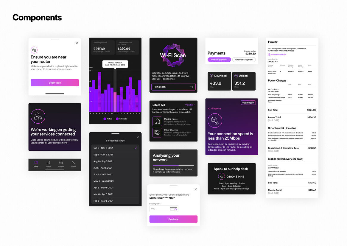
Every lifestyle is unique, and we wanted customers to feel in total control of their internet plan, and in real-time. Allowing consumers to customise connections, speeds, account features and support plans were essential requirements, but we also wanted to convey the premium brand experience in every touch and in the way the app loads and moves.
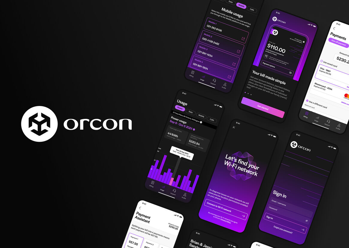
The mobile app is your digital concierge for your Orcon, your smart assistant that can monitor usage, diagnose Wi-fi issues, track your billing, and connect with the support team. We wanted to convey a sense of intelligence and low touch, as if the app is responding to your needs instinctively and instantaneously.
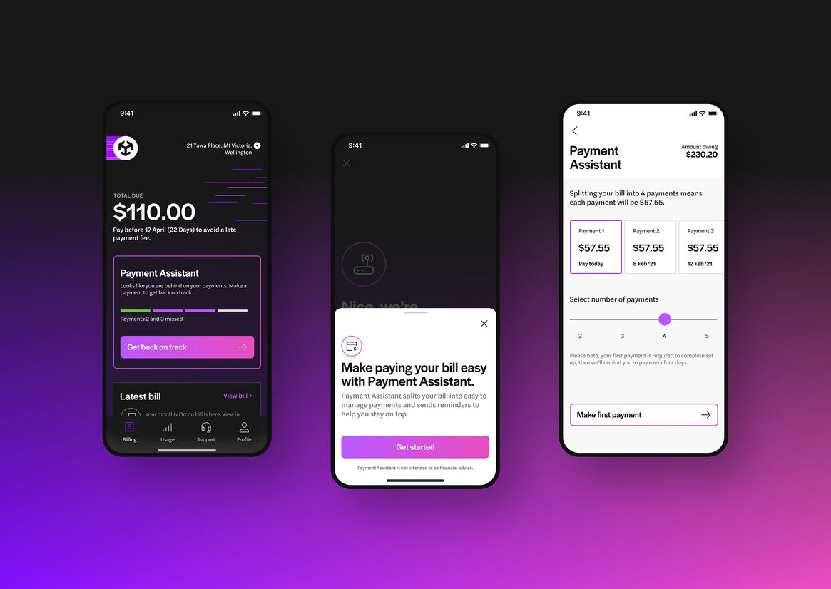
This is most evident in the new billing section, where we use AI to monitor usage and proactively suggest the best value plan for users, which they can then switch to at the press of a button.
Orcon has evolved to offer internet, mobile, landline and power through a single account. The app is designed to feel like a central hub to these services that together empower your home and work life, which are more inseparable than ever.
The notifications, iconography, and design language are all intended to reinforce this sense of a powerful, smart, friendly digital assistant that is your universal control for your digital lifestyle.
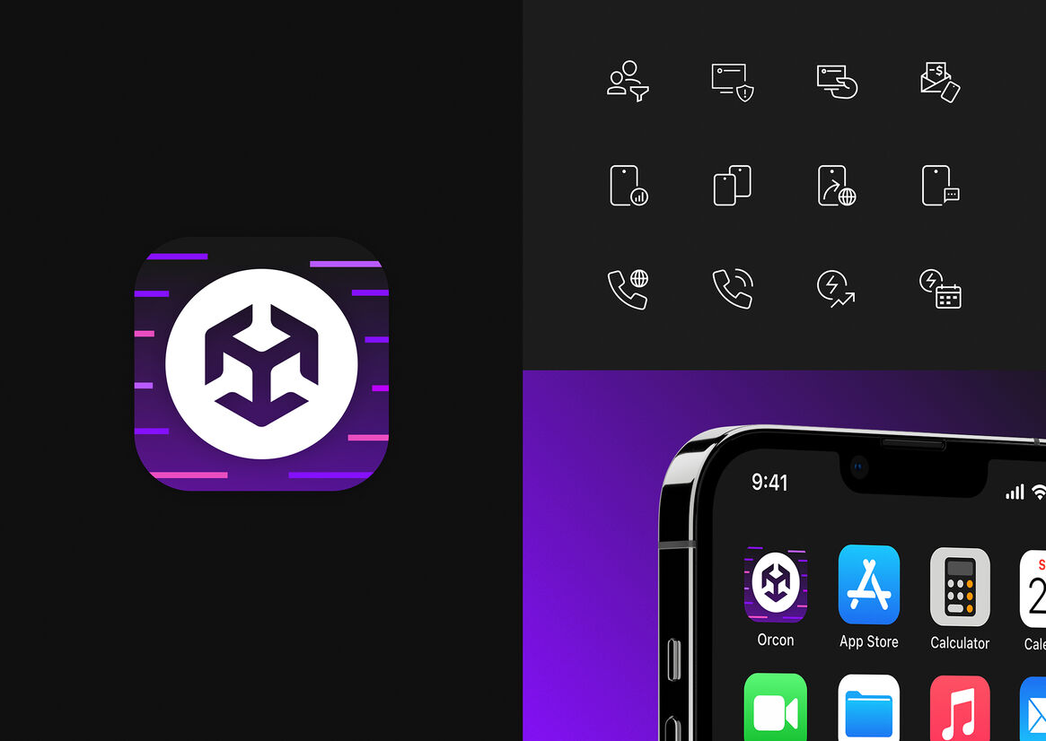
The vibrant energy lines in various shapes are a recurrent theme throughout the Orcon brand, conveying the way digital wraps into our lives, enabling us to do incredible things by exchanging information and creativity with the world and people around us.
We looked to match these shapes and textures with the different functionality throughout the app and bring it to life through branded microinteractions and background elements but also in key UI details, e.g. the way your internet usage is filling up within your current plan.


Description:
Orcon’s central brand promise is the merging of business and consumer life online. Delivering on this promise with a sleek new Mobile App involved a coordinated effort between our design team and Orcon’s own technology department.
Every lifestyle is unique, and we wanted customers to feel in total control of their internet plan, and in real-time. Allowing consumers to customise connections, speeds, account features and support plans were essential requirements, but we also wanted to convey the premium brand experience in every touch and in the way the app loads and moves.
The mobile app is your digital concierge for your Orcon, your smart assistant that can monitor usage, diagnose Wi-fi issues, track your billing, and connect with the support team. We wanted to convey a sense of intelligence and low touch, as if the app is responding to your needs instinctively and instantaneously.
This is most evident in the new billing section, where we use AI to monitor usage and proactively suggest the best value plan for users, which they can then switch to at the press of a button.
Orcon has evolved to offer internet, mobile, landline and power through a single account. The app is designed to feel like a central hub to these services that together empower your home and work life, which are more inseparable than ever.
The notifications, iconography, and design language are all intended to reinforce this sense of a powerful, smart, friendly digital assistant that is your universal control for your digital lifestyle.
The vibrant energy lines in various shapes are a recurrent theme throughout the Orcon brand, conveying the way digital wraps into our lives, enabling us to do incredible things by exchanging information and creativity with the world and people around us.
We looked to match these shapes and textures with the different functionality throughout the app and bring it to life through branded microinteractions and background elements but also in key UI details, e.g. the way your internet usage is filling up within your current plan.