Eva Vermandel, Stephanie Specht, Ana Helder, Jess Sowersby
Client
Klim Type Foundry
Description:
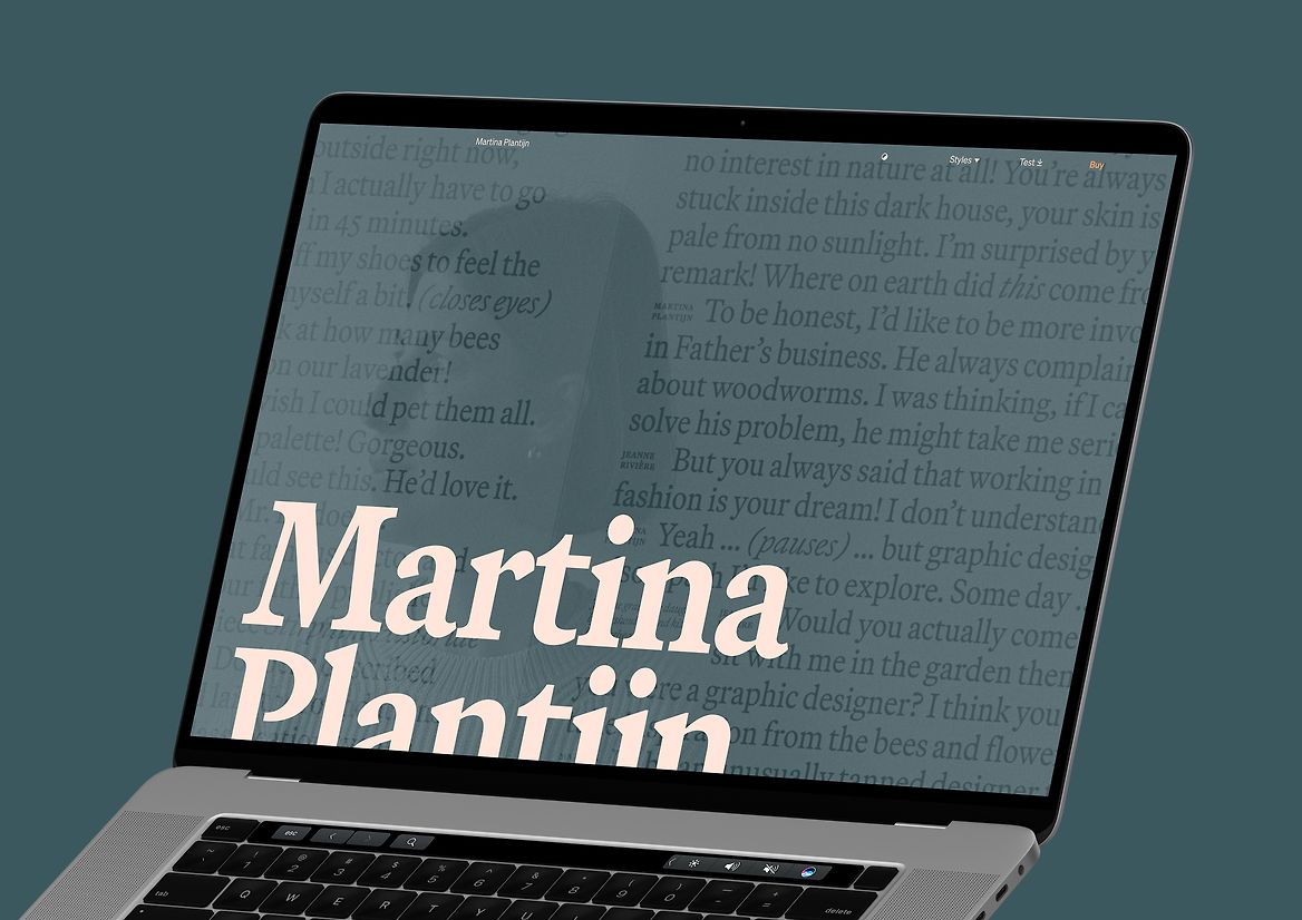
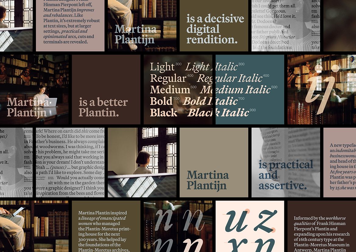
Martina Plantijn is a new typeface by Kris Sowersby, informed by the workhorse qualities of Frank Hinman Pierpont’s 1913 Plantin typeface, which drew from 16th century type at the legendary Plantin-Moretus publishing house in Antwerp, dating from the Renaissance and Baroque periods.
Plantin has long been my favourite utilitarian no-fuss serif and Kris Sowersby’s new rendition is the one I’ve been waiting for. I was fortunate to work with early beta versions before it was even named. Through ongoing conversations with Kris about time, place, history, and present relating to type, and further reading into the history of Plantin-Moretus, I proposed naming it after an indomitable yet overlooked 17th century author and businesswoman who happened to become head of the largest printing business in the world.
Martina Plantin was printer and publisher Christophe Plantin’s daughter and wife of his apprentice, Jan Moretus. At five years old she was proofing texts in her father’s printshop—by 25 she was running it. Martina inspired a lineage of strong, emancipated women who managed the Plantin-Moretus printing house for the next 300 years. As Kris emphasises in his typically brilliant essay on the font’s design process, Martina “helped lay the foundations of the Plantin-Moretus archives, embodying the true definition of curator.”
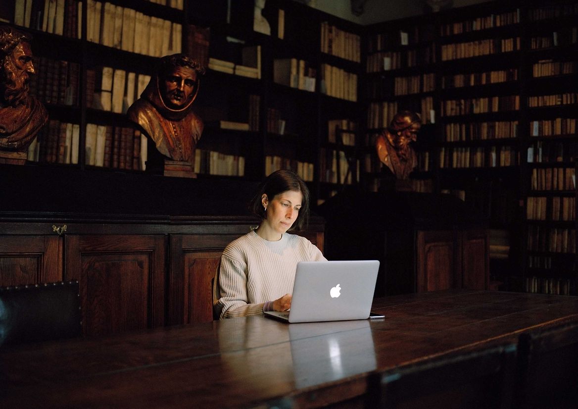
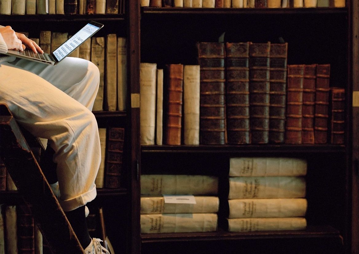
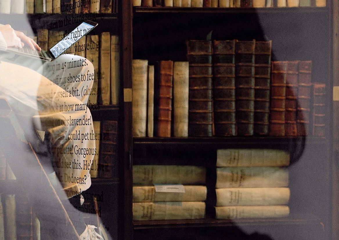
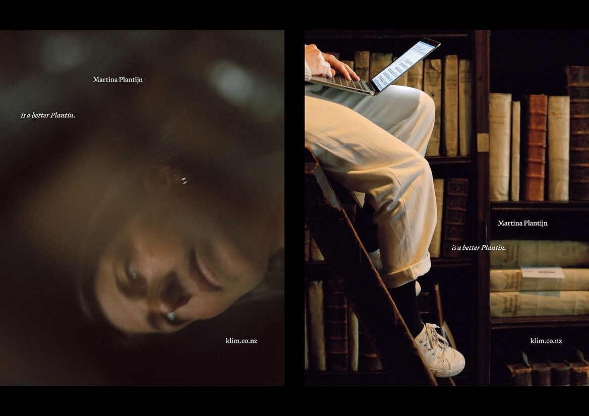
The campaign creative direction is, like I hope most of our projects are, deceptively simple. On one level it’s just documentation of a font in use: Antwerp-based graphic designer Stephanie Specht working with the typeface on a laptop. But the broader idea for the shoot was to collapse time and space, as an embodiment of what contemporary type design is, a simultaneity of past and present. And in so doing, to create a type campaign that didn’t look like a type campaign.
This was one of those projects where a seemingly impossible idea (“what if we could shoot in the actual Museum Plantin-Moretus in Belgium?”) actually worked because I just phoned them up and asked.
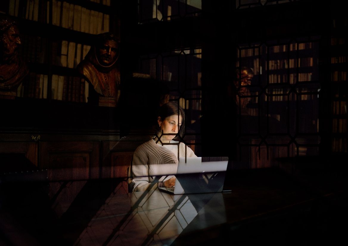
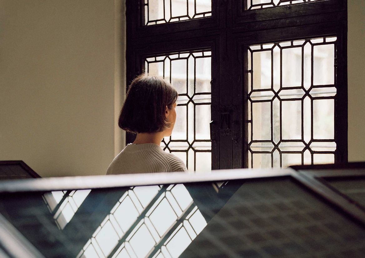
I commissioned Belgian photographer Eva Vermandel to document a day with Stephanie at the museum. Thanks to Eva’s diplomatic negotiation skills, we gained rare access to otherwise off-limits areas of the Plantin-Moretus grote bibliotheek (Great Library) and Printing Works.
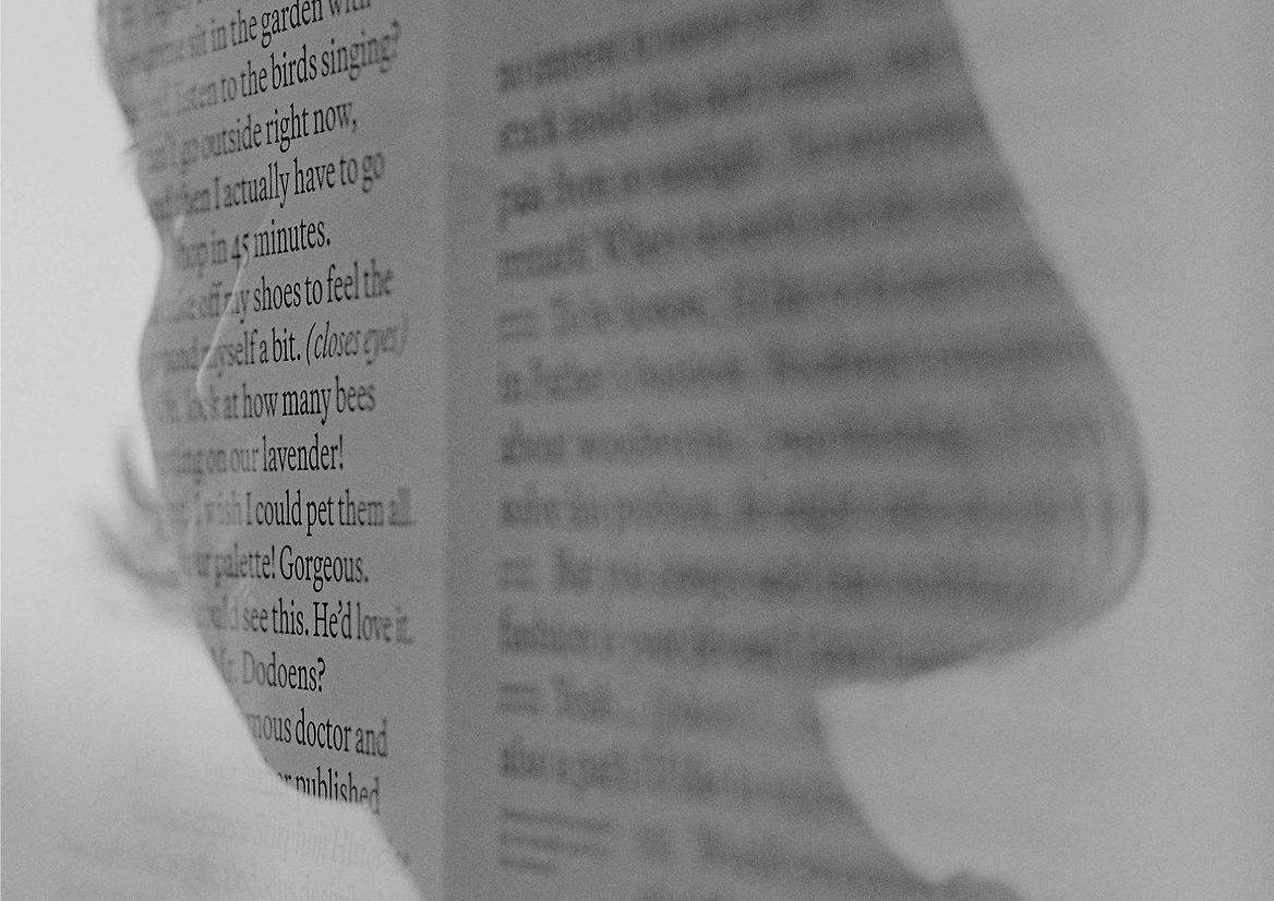
Stephanie took on an unusual commission that was hard to describe: to be photographed while exploring the museum, and to work on what I loosely defined as a “typographic composition” of some kind, to be featured in the photography in some way. In one of many serendipitous moments throughout the campaign process, it turned out that she’d already worked with the museum for a design residency which, by sheer coincidence, had resulted in a project researching Martina’s mother, Jeanne Rivière. This informed the evocative speculative dialogue between Martina and Jeanne that Stephanie wrote and typeset, which Eva then beautifully superimposed in-camera as double exposures on medium format film.
Further sustaining the echoes and reverberations between past and present, an atmospheric piece by Argentinian electronic musician Ana Helder accompanies the slow-fade photomontage videos launched on social media and the web.
Description:
Martina Plantijn is a new typeface by Kris Sowersby, informed by the workhorse qualities of Frank Hinman Pierpont’s 1913 Plantin typeface, which drew from 16th century type at the legendary Plantin-Moretus publishing house in Antwerp, dating from the Renaissance and Baroque periods.
Plantin has long been my favourite utilitarian no-fuss serif and Kris Sowersby’s new rendition is the one I’ve been waiting for. I was fortunate to work with early beta versions before it was even named. Through ongoing conversations with Kris about time, place, history, and present relating to type, and further reading into the history of Plantin-Moretus, I proposed naming it after an indomitable yet overlooked 17th century author and businesswoman who happened to become head of the largest printing business in the world.
Martina Plantin was printer and publisher Christophe Plantin’s daughter and wife of his apprentice, Jan Moretus. At five years old she was proofing texts in her father’s printshop—by 25 she was running it. Martina inspired a lineage of strong, emancipated women who managed the Plantin-Moretus printing house for the next 300 years. As Kris emphasises in his typically brilliant essay on the font’s design process, Martina “helped lay the foundations of the Plantin-Moretus archives, embodying the true definition of curator.”
The campaign creative direction is, like I hope most of our projects are, deceptively simple. On one level it’s just documentation of a font in use: Antwerp-based graphic designer Stephanie Specht working with the typeface on a laptop. But the broader idea for the shoot was to collapse time and space, as an embodiment of what contemporary type design is, a simultaneity of past and present. And in so doing, to create a type campaign that didn’t look like a type campaign.
This was one of those projects where a seemingly impossible idea (“what if we could shoot in the actual Museum Plantin-Moretus in Belgium?”) actually worked because I just phoned them up and asked.
I commissioned Belgian photographer Eva Vermandel to document a day with Stephanie at the museum. Thanks to Eva’s diplomatic negotiation skills, we gained rare access to otherwise off-limits areas of the Plantin-Moretus grote bibliotheek (Great Library) and Printing Works.
Stephanie took on an unusual commission that was hard to describe: to be photographed while exploring the museum, and to work on what I loosely defined as a “typographic composition” of some kind, to be featured in the photography in some way. In one of many serendipitous moments throughout the campaign process, it turned out that she’d already worked with the museum for a design residency which, by sheer coincidence, had resulted in a project researching Martina’s mother, Jeanne Rivière. This informed the evocative speculative dialogue between Martina and Jeanne that Stephanie wrote and typeset, which Eva then beautifully superimposed in-camera as double exposures on medium format film.
Further sustaining the echoes and reverberations between past and present, an atmospheric piece by Argentinian electronic musician Ana Helder accompanies the slow-fade photomontage videos launched on social media and the web.