Toitanga
AUT Art + Design Te Roopu Waiora (TRW)
-
Te Kapa Tauira / Student Team
Kiarna Michie, Junjira Sanguanrachasab, Nolwazi Mpofu, Casey Strickland, Nina Geng -
Kaitautoko / Contributor
Robert Pouwhare -
Kaiako / Lecturers
Tatiana Tavares, Marcos Mortensen Steagall
-
School
AUT Art + Design


Description:
Te Roopu Waiora (TRW) is a local NGO based in Manukau, New Zealand, and provides unique Kaupapa Māori health support services to Māori with disabilities. The organisations' primary goal was to increase funding to support their community by encouraging businesses to seek advice and indigenous professional knowledge about healthcare support and accessibility through workshop sessions. Te Roopu Waiora's existing Te Tohu Whakawaiora project includes 3 NCEA credited modules about indigenous disability health support. It is about creating a sense of independence for Māori concerning the decisions made surrounding disability healthcare and addressing the inequities within the community.
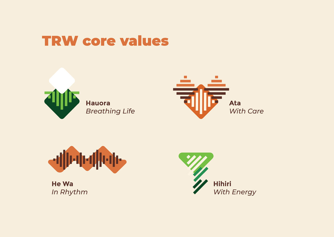
A design strategy aimed to transition Te Roopu Waiora' brand from a non-profit to a leading social enterprise model. A team of designers conducted a community-oriented social design project in collaboration with TRW to deliver a new brand identity. The new strategic communication design project needed to reflect the Kaupapa and community culture at TRW and the core values of Atā – with care, He Wā – in rhythm, Hihiri – with energy, and Hauora – Breathing life.
TRW's original brand (and expanded through the new designs) included the use of Māori design elements, specifically the koru, to reflect TRW's values and identity. The koru (Māori for loop) gets its shape from the unravelling of a fern frond and represents growth, new beginnings, strength, and peace.
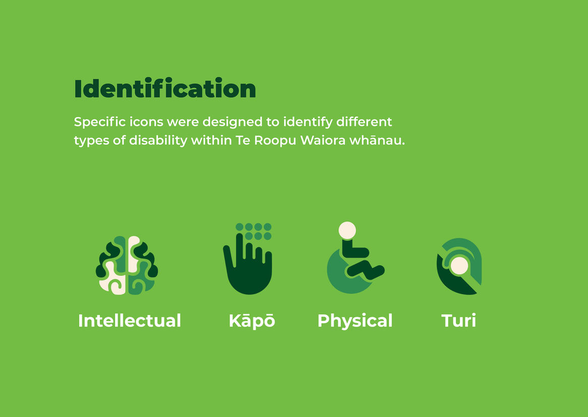
Colour palette reflected Māori cultural and historical significance. We used shades of green to communicate and resemble nature's qualities and connect the koru logo motifs with approachability, resilience, health, and trust. The design also included shades of orange and brown to encourage a sense of action, stability, strength, creativity, and warmth that are intrinsic qualities of TRW. The use of these colours within Te Ao Māori derives from natural resources like pounamu (jade greenstone) and Kokowai (ochre pigment) to decorate waka and Marae. Using TRW four core values, we generated visual language composed of graphic elements inspired by 'Raranga,' the traditional Māori practice of flax weaving. The idea of weaving/ intertwining inspired the designed icons, and it represents these values as it gives a sense of connection to TRW.
The significance of this project in an educational/design context resides in students/designers acknowledging and respecting the Treaty of Waitangi. We strived to design to benefit our local communities, especially those made invisible and marginalised within society. This social design project took a human-centred approach whereby the community co-designed appropriate solutions to their needs. We followed specific protocols (Kaupapa and Tikanga Māori), consulted stakeholders and clients, and received support from cultural advisors throughout the process to ensure that the design uplifted TRW values and did not misrepresent Māori culture. The outcomes produced included: a new brand identity system, informative brochure, posters, and a website that allowed businesses to book workshops with TRW. These items are in the process of development and are scheduled for implementation soon.