Auranga Residential Estates (ARE) is a boutique real estate agency operating exclusively for, and within, the masterplanned community of Auranga in Drury.
Auranga was founded on our client’s four ‘pillars for a better city’: Economy (the joy of generosity); Sociology (the security of belonging); Ecology (the goodness in creation); and Anthropology (the dignity in serving). These foundations allow a place to become so much more than a development or subdivision; they seed a better way of living.
Our clients wanted ARE to reframe the typical transactional real estate experience by putting people over profit. Together, we envisioned ARE as the navigator, concierge, custodian and storyteller of this community with a shared brand DNA based on the pillars.
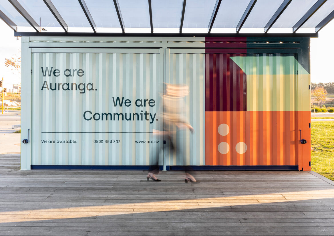
Carefully considered use of colour was crucial to help signal ARE as a disruptor in the market. An extensive palette is used across a master pattern and four sub-patterns, each of which represents a pillar: Economy, where opposing shapes represent a positive tension in coming together to transact; Sociology, where intersecting shapes represent communities forming something greater than the sum of its parts; Ecology, where horizontal layers represent the relationship of earth, sky and water; and Anthropology, where a bridge celebrates foundation and connection.
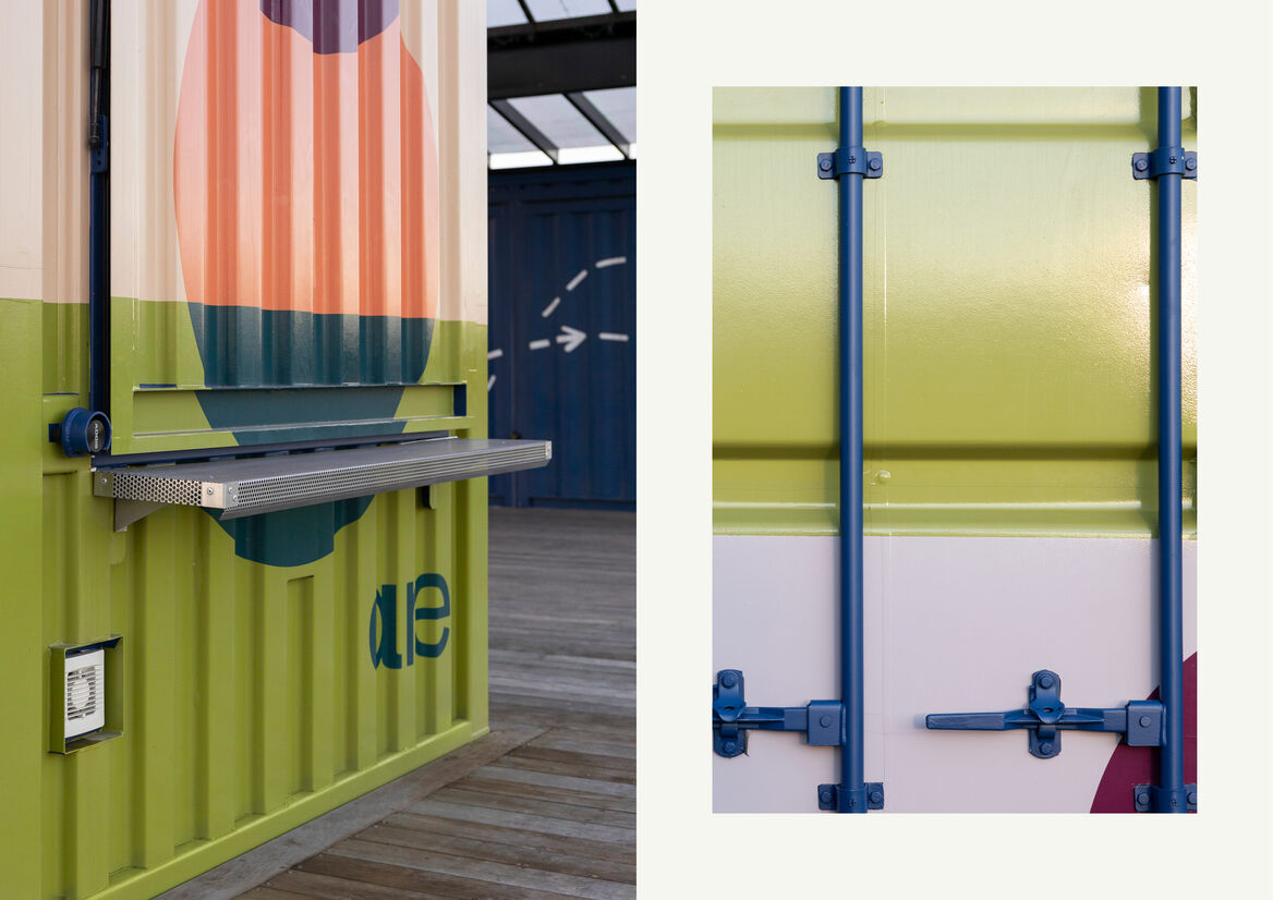
The broad colour palette – formed from ten master colours and supporting tints, is representative of the diverse community of Auranga and ARE’s vital role in bringing cohesion to it. The success of the palette is in how it translates this metaphor: bringing together a combination of unorthodox colours, unexpected in real estate, and imbuing them with character and meaning. The resulting visual language is flexible and adaptive across multiple different spatial and environmental graphics.
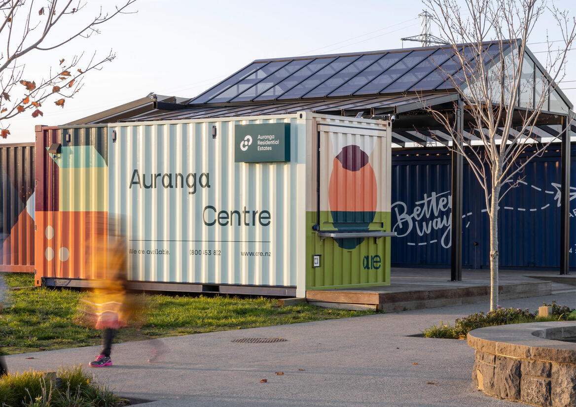
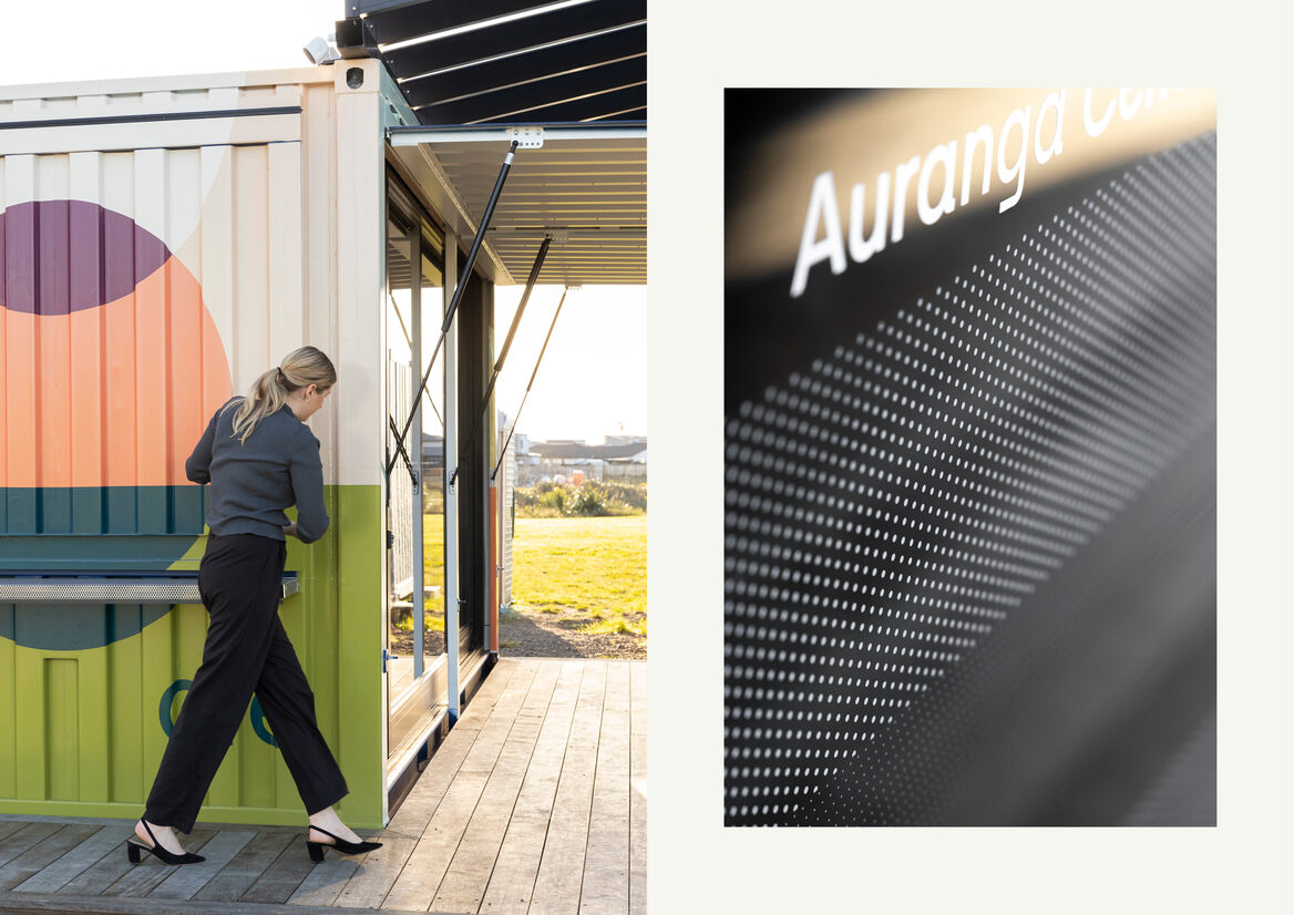
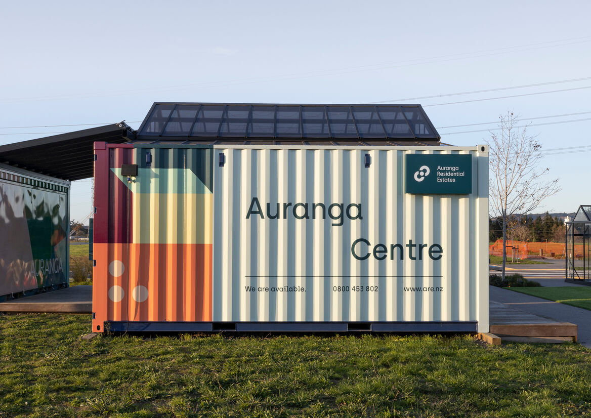
ARE will have a “whole of life” relationship with purchasers – from their first point of contact through purchase, settlement, moving in, integrating into the community and eventually resale – so it is fitting that the local base for ARE, the Auranga Centre, is located in the heart of Village Square opposite BetterWay café. The brightly wrapped 20FT container is the perfect embodiment of the brand - friendly, eccentric, humble – with the strapline ‘We are Auranga. We are Community’.
The master brand pattern has been applied across three sides of the exterior, while the Sociology pattern has been used on the end facing the village square where it serves as a visual introduction to the pillars. The real world manifestation of the patterns gives new dimensions – both literally and figuratively – to the ARE brand, making the Auranga Centre a billboard, workplace, display suite and layered symbol for how ARE is intrinsically linked with this special community.
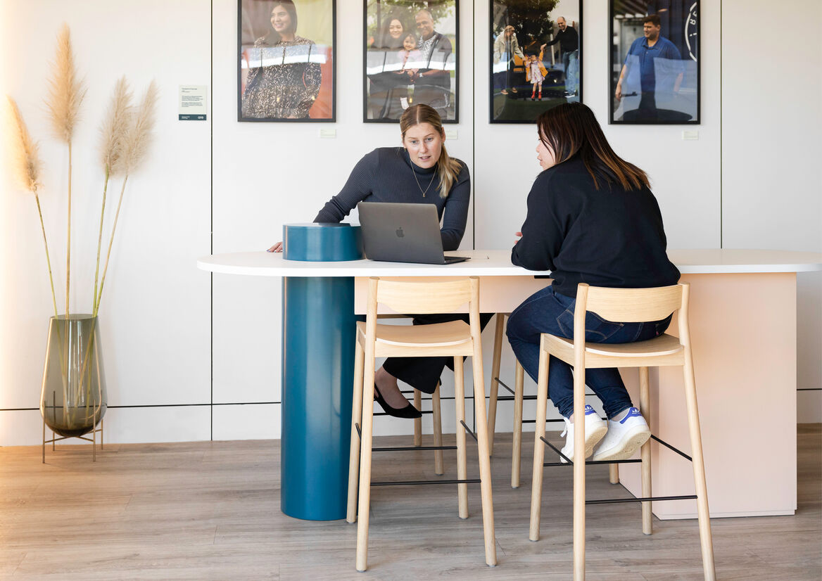
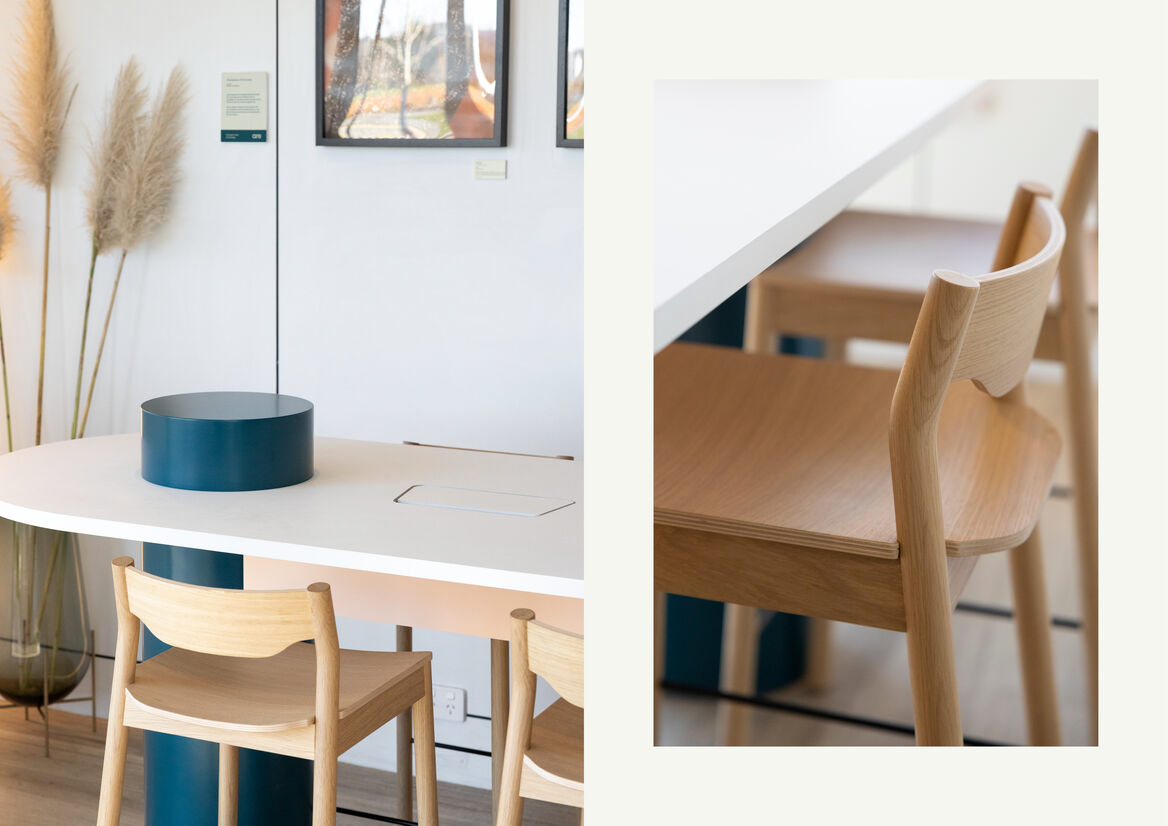
Juxtaposing the colourful exterior is a pared back, gallery-style interior where each element in this compact space has been carefully selected to represent a pillar. As the functional hub of the centre, the bespoke, pill-shaped table represents Anthropology. Its design is a balance of form and function and a spatial expression of the brand colours and patterns.

Description:
Auranga Residential Estates (ARE) is a boutique real estate agency operating exclusively for, and within, the masterplanned community of Auranga in Drury.
Auranga was founded on our client’s four ‘pillars for a better city’: Economy (the joy of generosity); Sociology (the security of belonging); Ecology (the goodness in creation); and Anthropology (the dignity in serving). These foundations allow a place to become so much more than a development or subdivision; they seed a better way of living.
Our clients wanted ARE to reframe the typical transactional real estate experience by putting people over profit. Together, we envisioned ARE as the navigator, concierge, custodian and storyteller of this community with a shared brand DNA based on the pillars.
Carefully considered use of colour was crucial to help signal ARE as a disruptor in the market. An extensive palette is used across a master pattern and four sub-patterns, each of which represents a pillar: Economy, where opposing shapes represent a positive tension in coming together to transact; Sociology, where intersecting shapes represent communities forming something greater than the sum of its parts; Ecology, where horizontal layers represent the relationship of earth, sky and water; and Anthropology, where a bridge celebrates foundation and connection.
The broad colour palette – formed from ten master colours and supporting tints, is representative of the diverse community of Auranga and ARE’s vital role in bringing cohesion to it. The success of the palette is in how it translates this metaphor: bringing together a combination of unorthodox colours, unexpected in real estate, and imbuing them with character and meaning. The resulting visual language is flexible and adaptive across multiple different spatial and environmental graphics.
ARE will have a “whole of life” relationship with purchasers – from their first point of contact through purchase, settlement, moving in, integrating into the community and eventually resale – so it is fitting that the local base for ARE, the Auranga Centre, is located in the heart of Village Square opposite BetterWay café. The brightly wrapped 20FT container is the perfect embodiment of the brand - friendly, eccentric, humble – with the strapline ‘We are Auranga. We are Community’.
The master brand pattern has been applied across three sides of the exterior, while the Sociology pattern has been used on the end facing the village square where it serves as a visual introduction to the pillars. The real world manifestation of the patterns gives new dimensions – both literally and figuratively – to the ARE brand, making the Auranga Centre a billboard, workplace, display suite and layered symbol for how ARE is intrinsically linked with this special community.
Juxtaposing the colourful exterior is a pared back, gallery-style interior where each element in this compact space has been carefully selected to represent a pillar. As the functional hub of the centre, the bespoke, pill-shaped table represents Anthropology. Its design is a balance of form and function and a spatial expression of the brand colours and patterns.