Coca to Cash is a response to the 2021 ISTD brief ‘Putting Things in Order’, which tasked participants to ‘Look for lesser-known methods and obscure ways people have put things in order. This could be the things they own and the things that surround them or it could be how they categorise in a social or ideological form’.
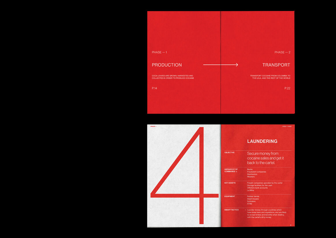
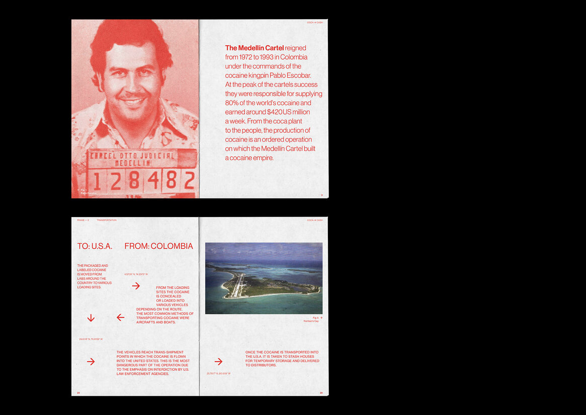
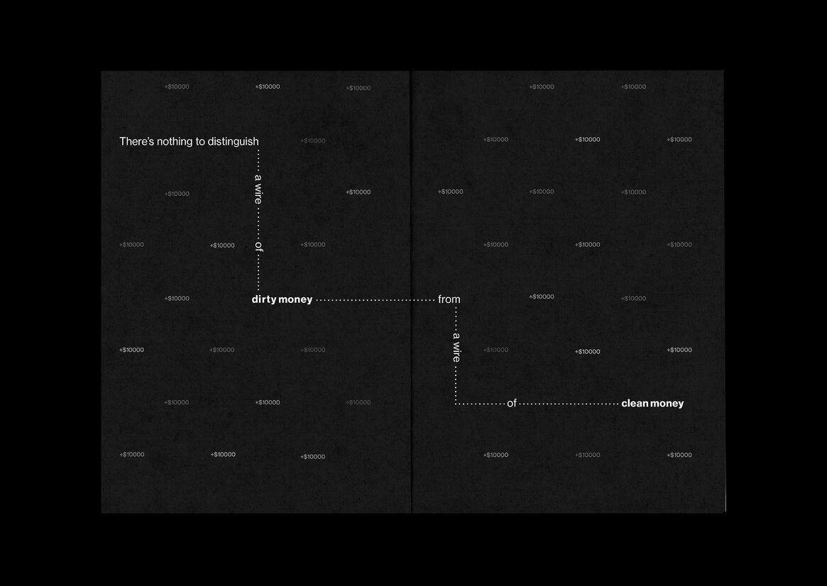
The publication Coca to Cash is about the production of cocaine which is an ordered and hierarchical operation, on which the Medellín Cartel built a cocaine empire. The operation is broken down into five chapters of which each chapter covers one ‘phase’. The five chapters are production, transportation, distribution, laundering and reinvestment – which capture the full cycled production that the cartel controlled.
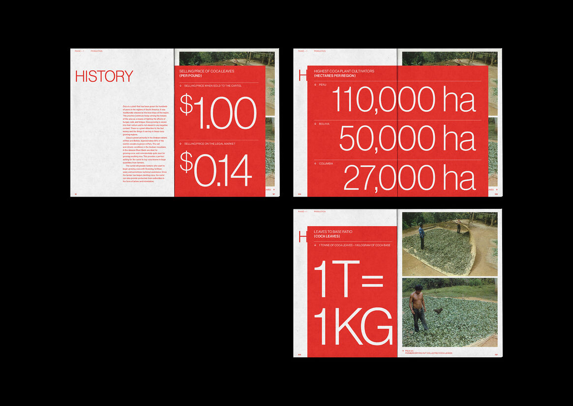
After sorting through many relevant books, podcasts and public DEA court documents, I had sourced a lot of information which provided me with many statistics, quotes and ordered steps to illustrate through expressive typography and infographics. These expressive spreads balance out the text-heavy pages in this publication, which creates a consistent pace throughout.
I’ve designed this book to fit a minimalist, contemporary modernist aesthetic. The tone of voice is report-like yet has a strong narrative that gives insight into each phase of the operation. The use of red as the main colour softens the text-heavy book, and also nods to the sinister associations of the cartel. Coca to Cash takes a uniquely fresh approach to this historical subject, which is often portrayed in a grungy and cliche way. Sticking to my modernist design, I chose the clean typeface Neue Haas Grotesk. This typeface has ideal letterforms and numbers for illustrating the cartel's operation. A consistent grid has been used, which works for the report-like aesthetic and creates a clean and consistent look. The use of rules when referencing numerical figures creates a visual system that is cohesive throughout my book.
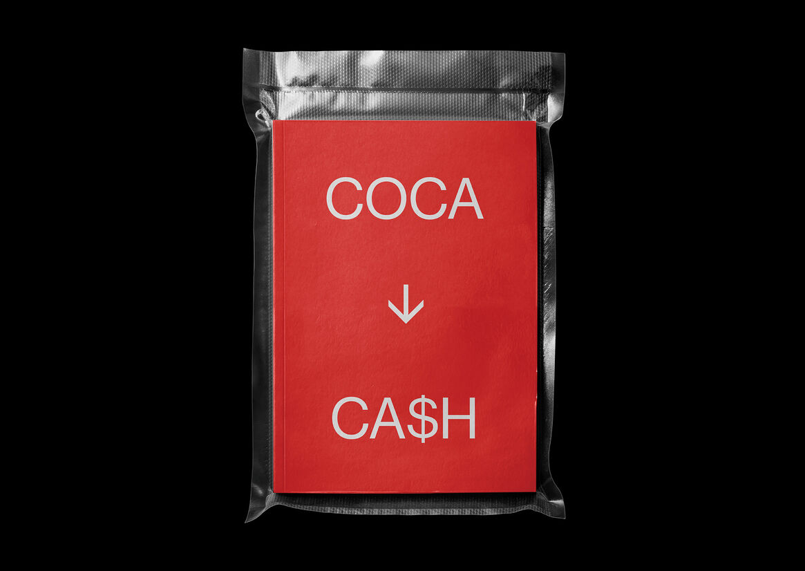
Tip-ins and a concertina spread engage the reader with the publication and creates a tactile experience that brings life to the large infographics. The book is hard covered with exposed red stitching on the spine and is vacuum sealed before opening, which alludes to a brick of cocaine.
Description:
Coca to Cash is a response to the 2021 ISTD brief ‘Putting Things in Order’, which tasked participants to ‘Look for lesser-known methods and obscure ways people have put things in order. This could be the things they own and the things that surround them or it could be how they categorise in a social or ideological form’.
The publication Coca to Cash is about the production of cocaine which is an ordered and hierarchical operation, on which the Medellín Cartel built a cocaine empire. The operation is broken down into five chapters of which each chapter covers one ‘phase’. The five chapters are production, transportation, distribution, laundering and reinvestment – which capture the full cycled production that the cartel controlled.
After sorting through many relevant books, podcasts and public DEA court documents, I had sourced a lot of information which provided me with many statistics, quotes and ordered steps to illustrate through expressive typography and infographics. These expressive spreads balance out the text-heavy pages in this publication, which creates a consistent pace throughout.
I’ve designed this book to fit a minimalist, contemporary modernist aesthetic. The tone of voice is report-like yet has a strong narrative that gives insight into each phase of the operation. The use of red as the main colour softens the text-heavy book, and also nods to the sinister associations of the cartel. Coca to Cash takes a uniquely fresh approach to this historical subject, which is often portrayed in a grungy and cliche way.
Sticking to my modernist design, I chose the clean typeface Neue Haas Grotesk. This typeface has ideal letterforms and numbers for illustrating the cartel's operation. A consistent grid has been used, which works for the report-like aesthetic and creates a clean and consistent look. The use of rules when referencing numerical figures creates a visual system that is cohesive throughout my book.
Tip-ins and a concertina spread engage the reader with the publication and creates a tactile experience that brings life to the large infographics. The book is hard covered with exposed red stitching on the spine and is vacuum sealed before opening, which alludes to a brick of cocaine.