"The book ’20 Fonts that changed the world’, is an editorial project which traces a selection of historically relevant and popularly commercialised fonts. They are categorised by the vernacular of typesetting technologies which influenced their production and use. It reflects on a series of fonts which have been adapted throughout history. Some of them have been given a new contextual value in each instance of technological revival. These categories are Classic, Modern and Contemporary. The use of negative space and black and white throughout the book is to accentuate the forms of the letters and their use in context.
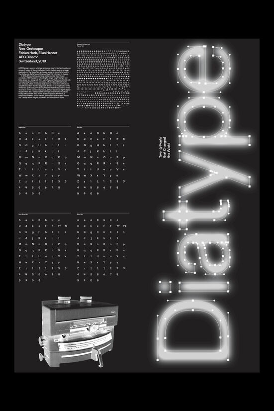
For the final contemporary font I chose to use ‘Diatype’ (2020) by Swiss font foundry ABC Dinamo. The typeface traces the mediums of typographic production that came before digitalisation of fonts. ‘Designing Programmes’ (1964) by Karl Gerstner used mid-century ‘Diatype’ phototypesetting machine to influence the detailed proportions of Berthold’s Akzidenz Grotesk (1898) and adapt it into modern technology. Designer Fabian Harb, as part of a University project, began to adapt Gerstner’s proportional typographic experiments into a digital revival. Diatype has a warm yet contemporary form compared to many ‘Neo-Grotesque’ fonts. The specimen for Diatype works as a poster and a dust jacket for the book, it’s lamination lending towards ideas light and reflection. Used throughout the book, graphic and layout elements depict the historical and contemporary adaptation of classic and modern modes of typographic production such as moveable type, phototypesetting and digital typography. Diatype’s extended glyph set includes Open Type Features which allows for alternative character sets. It is suited for a contemporary context because of its versatility across a huge family that is dynamic in style and utility. Dinamo offers digital tools for font production to allow designers to explore the full interpolation of different style axis that can contrast the form from italicised, thin too bold and more recently proportional to mono. "


Description:
"The book ’20 Fonts that changed the world’, is an editorial project which traces a selection of historically relevant and popularly commercialised fonts. They are categorised by the vernacular of typesetting technologies which influenced their production and use. It reflects on a series of fonts which have been adapted throughout history. Some of them have been given a new contextual value in each instance of technological revival. These categories are Classic, Modern and Contemporary. The use of negative space and black and white throughout the book is to accentuate the forms of the letters and their use in context.
For the final contemporary font I chose to use ‘Diatype’ (2020) by Swiss font foundry ABC Dinamo. The typeface traces the mediums of typographic production that came before digitalisation of fonts. ‘Designing Programmes’ (1964) by Karl Gerstner used mid-century ‘Diatype’ phototypesetting machine to influence the detailed proportions of Berthold’s Akzidenz Grotesk (1898) and adapt it into modern technology. Designer Fabian Harb, as part of a University project, began to adapt Gerstner’s proportional typographic experiments into a digital revival. Diatype has a warm yet contemporary form compared to many ‘Neo-Grotesque’ fonts. The specimen for Diatype works as a poster and a dust jacket for the book, it’s lamination lending towards ideas light and reflection. Used throughout the book, graphic and layout elements depict the historical and contemporary adaptation of classic and modern modes of typographic production such as moveable type, phototypesetting and digital typography. Diatype’s extended glyph set includes Open Type Features which allows for alternative character sets. It is suited for a contemporary context because of its versatility across a huge family that is dynamic in style and utility. Dinamo offers digital tools for font production to allow designers to explore the full interpolation of different style axis that can contrast the form from italicised, thin too bold and more recently proportional to mono. "