Graphic
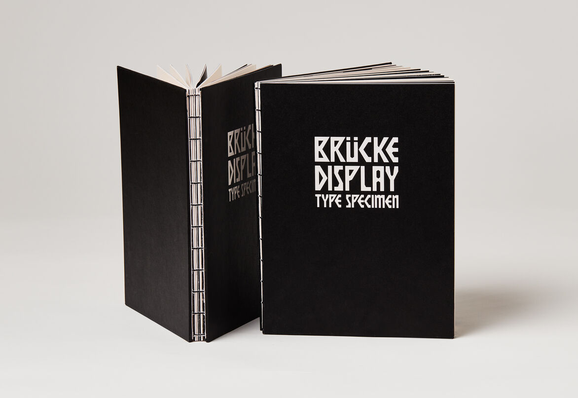
Ashleigh Sun Brücke Display
-
Tauira / Student
Ashleigh Sun -
Kaiako / Lecturers
George Hajian, Meighan Ellis
-
School
AUT Art + Design
Description:
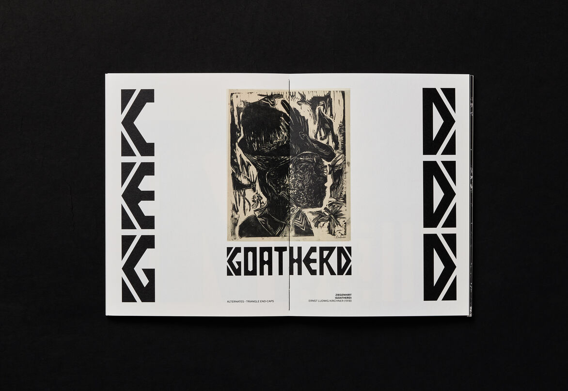
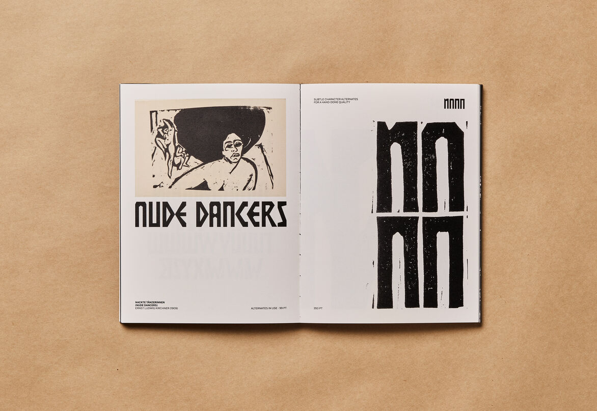
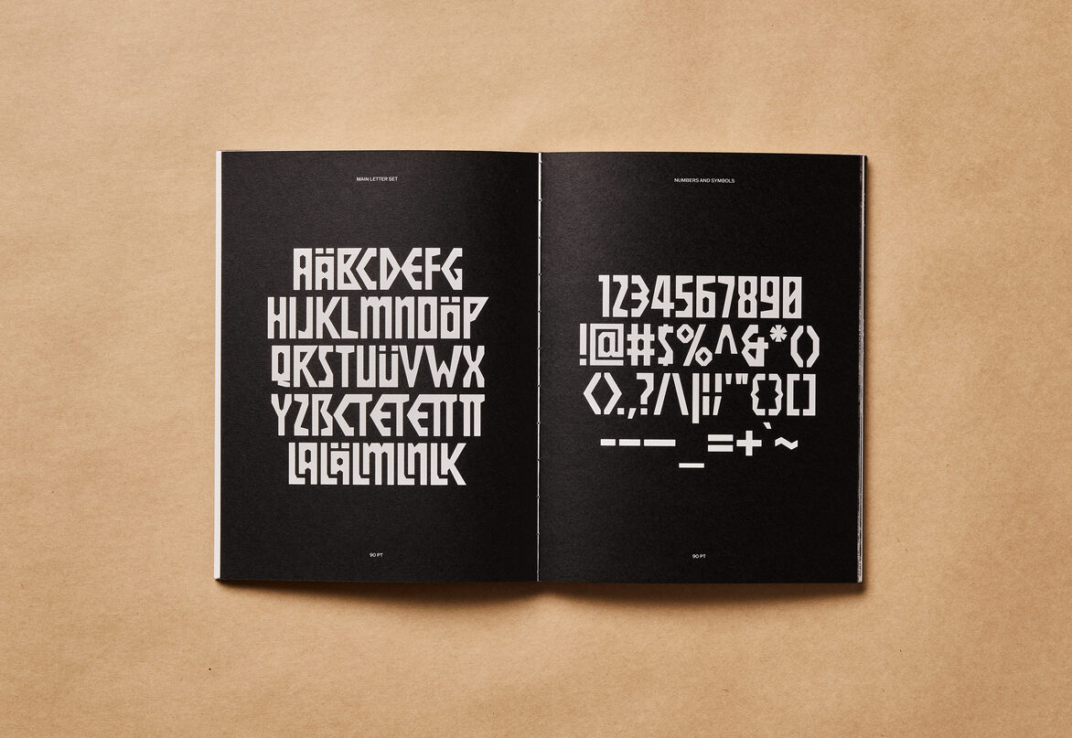
Brücke Display is an all-caps display typeface — with an accompanying set of drop caps — that mimics the hand, the tool, and the analogue. It hearkens back to the woodcut prints of Ernst Ludwig Kirchner from the early 20th century German Expressionist movement by taking direct influence from the woodcut manifesto of the artist collective Die Brücke (The Bridge). As such, this project translates and renders the hand-cut letterforms into a functional digital typeface.
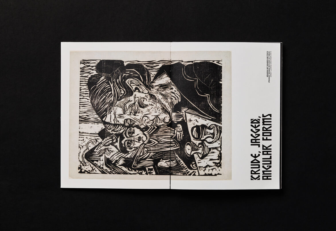
German Expressionism was founded as a rejection of traditional academic art. Characterised by the crude and the jagged shapes of woodcuts, the artists created emotionally expressive works that were underpinned by self-expression, emotional impact, spontaneity, and immediacy. They embraced and revived the woodcut medium to achieve simplified forms and radical flattening.
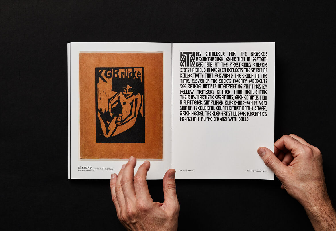
The woodcut print of the manifesto was published in 1906 by Kirchner that spoke against the older bourgeoisie, while serving as a ‘bridge’ between the present and the future. Consisting of condensed forms and triangular shapes, the manifesto typifies the visual qualities of Kirchner's woodcut prints. It is also a compelling example of using type as art, demonstrating how woodcut tools can be used to shape letterforms, and, at the same time, as a way to disseminate ideas.
Consequently, Brücke Display references the unique analogue forms in the manifesto in an effort to wield a display typeface as a gateway to appreciating the art of German Expressionism. Just as Ecuadorian female type designer Vanessa Zuñiga revitalised her cultural heritage through type design/dingbats, Brücke Display offers an alternative (interactive) point of entry into German Expressionism.
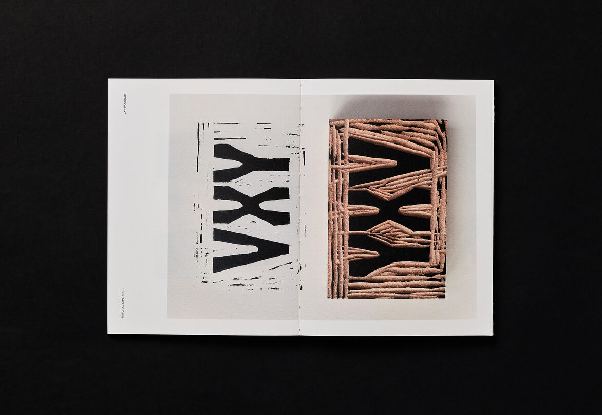
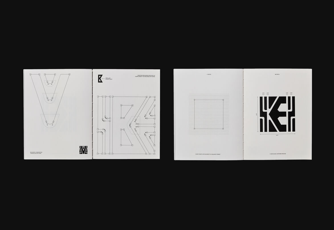
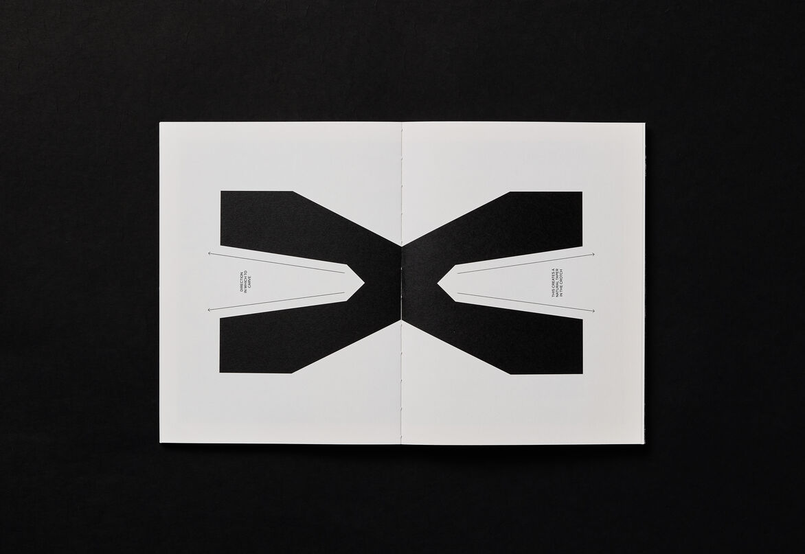
Although constructed in a digital space, Brücke Display endeavours to stay true to the original manifesto by taking visual cues from the sharp angular forms and interlocking triangular shapes. Formed on the foundation of three basic shapes, it aims to embody the nuances, physicality and crude qualities of the woodcut print by honing in on the brutal effects of wood-gouging and carving motions. As a result, the letterforms retain a hand-made feel for a sense of authenticity, most notably through tapered counters (for example, the ‘X’) that mirror the effects of woodcutting, and also through an alternate character set with subtle differences between letterforms that allude to the imperfect motion of the hand.
A new set of drop caps are also embedded within the typeface as alternate characters. These took primary influence from the decorative patterned borders found in Die Brücke’s 1910 exhibition catalogue.
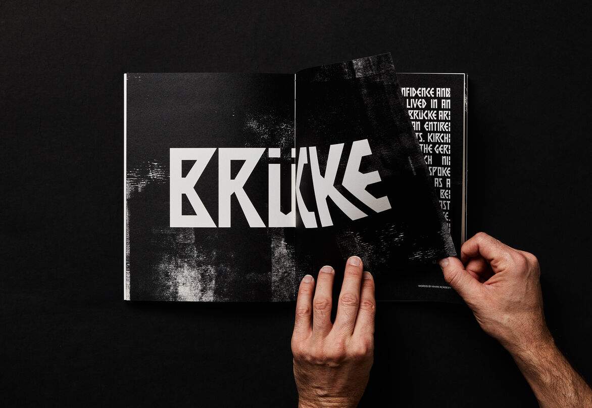
The type specimen book also became an important medium to showcase Brücke Display as it presented an opportunity to appreciate the original woodcuts by Kirchner. The use of rolled ink textures overlaid on top of numerous spreads create and complement an analogue quality that connects these type forms to printmaking, as do the scanned woodcut prints of Brücke Display over several typographic layouts.
Judge's comments:
We loved how much research went into this typeface resulting in such originality. This project was a standout in the category.