Graphic
True Limited Nectaron™
-
Ringatoi Matua / Design Directors
Shiv Narandas, Matt Heays
-
Ngā Kaimahi / Team Members
Matt Dickinson, Adnaan Narot, Jacob Douglas, Denny Monk, Celine Giovanni, Diana Simumpande, Sasha Arandelovic, Claudia Miller, Kyle Stoffberg, Andrea Lo Vetere -
Client
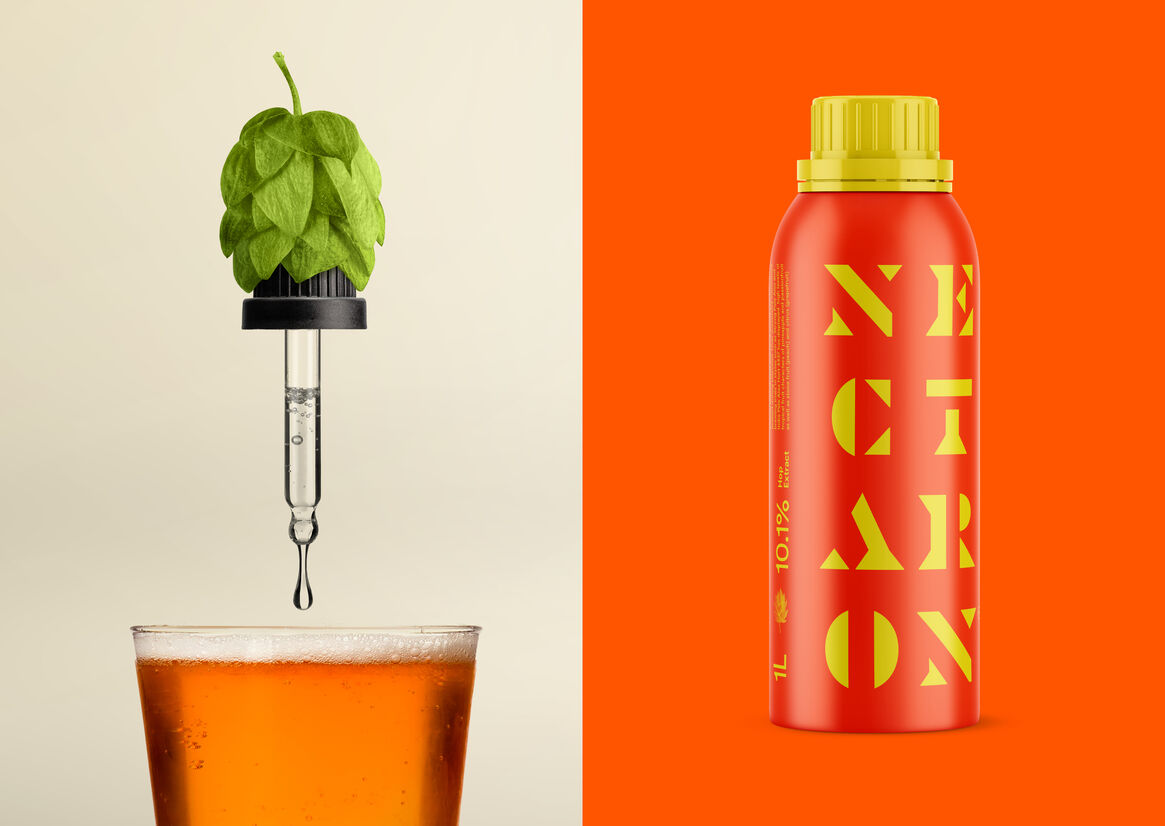
NZ Hops
Description:
The Opportunity / Challenge
NZ Hops, a collective of hops growers and innovators from the Nelson region of New Zealand, had just created a brand-new hop.
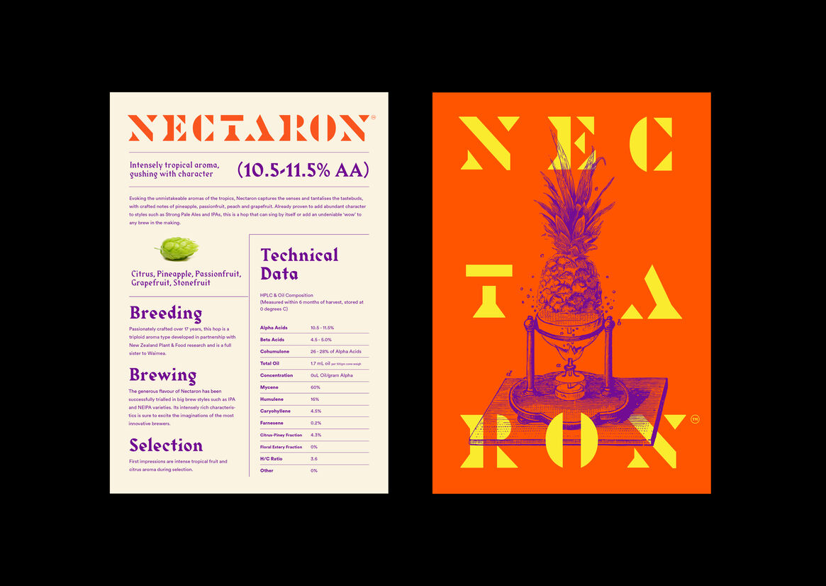
Crafted and refined over 17 years, Nectaron needed to make some noise. We were tasked with launching it to brewers with a strong new brand identity – not just to stand out, but to claim its rightful place as one of the most exciting hop cultivars in the world.
The company already had a strong reputation amongst brewers for crafting unique, highly sought-after hops. To create Nectaron, NZ Hops combined their rich history of growing with innovative modern techniques. So our brand strategy became:
Nectaron: A blend of science and art.
Approach
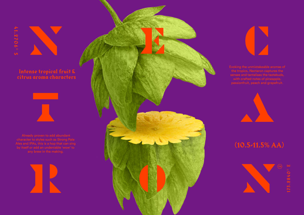
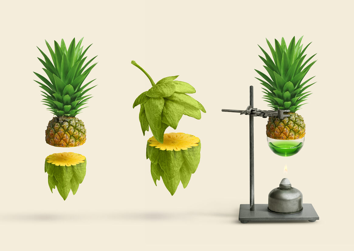
With intense tropical flavours in a bitter hop, our approach was all about combining two or more distinctive elements to create something you’d never expect.
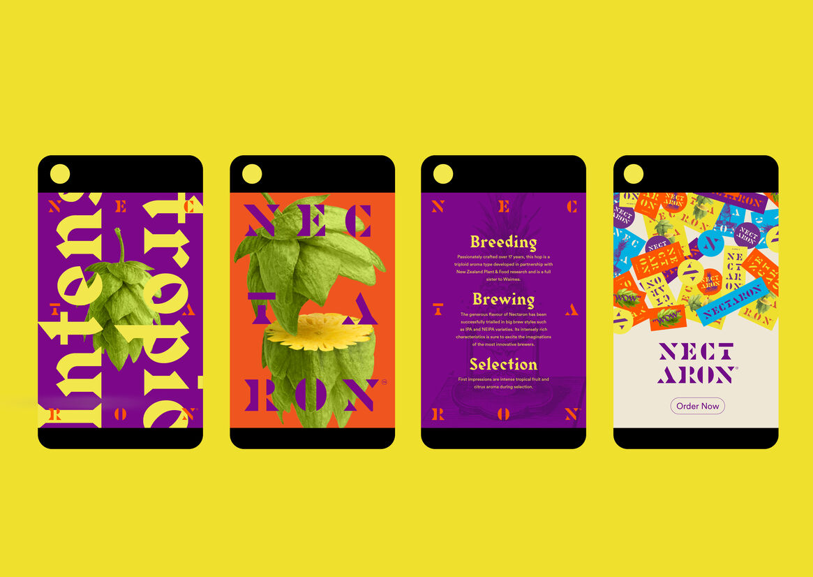
Sweet pineapple and bitter hop.
1800s-inspired scientific sketchwork with bold, modern colours.
Detailed technical data in unexpected typefaces and layouts.
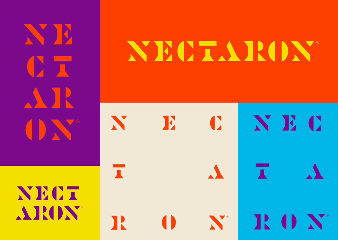
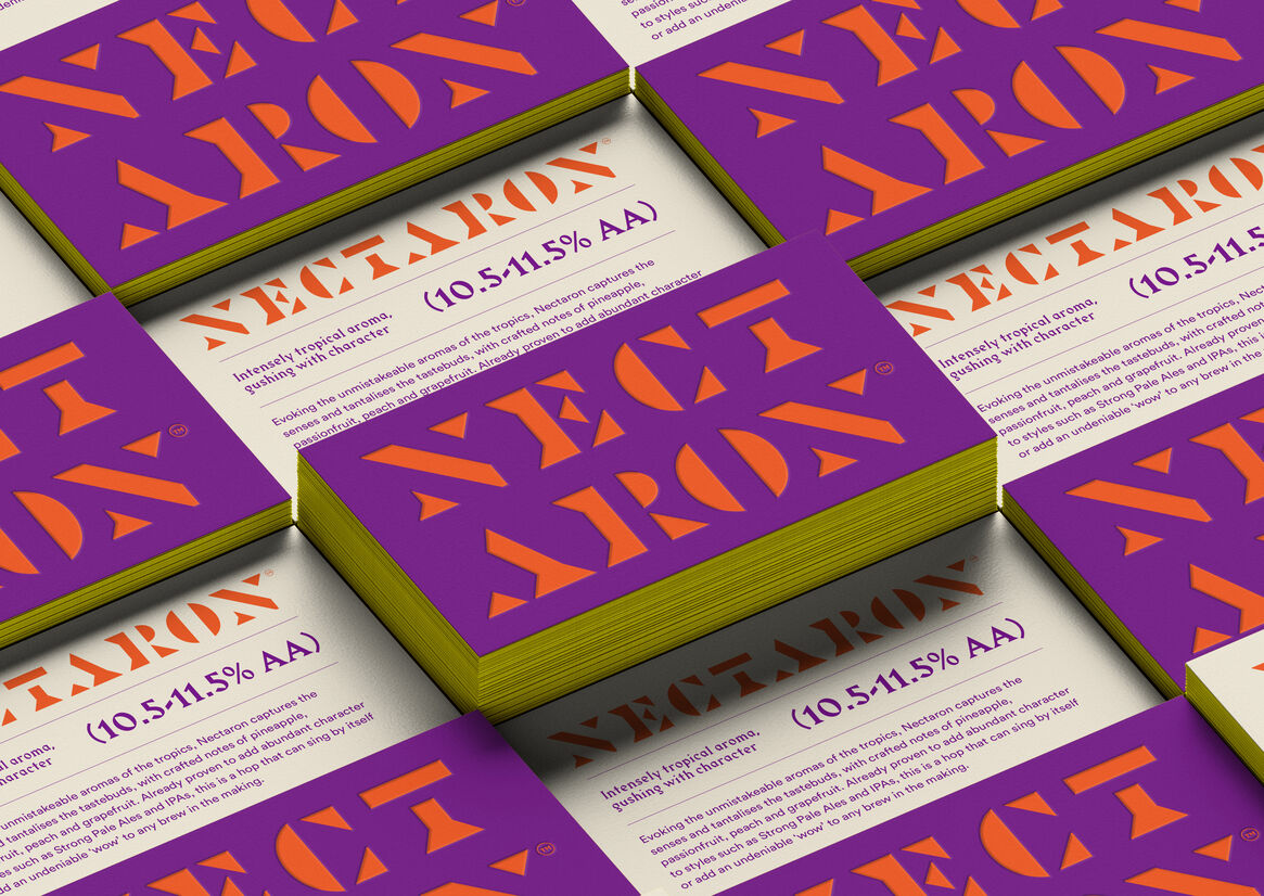
We created a custom logotype that evoked tropical aromas while nodding to our South Pacific heritage.
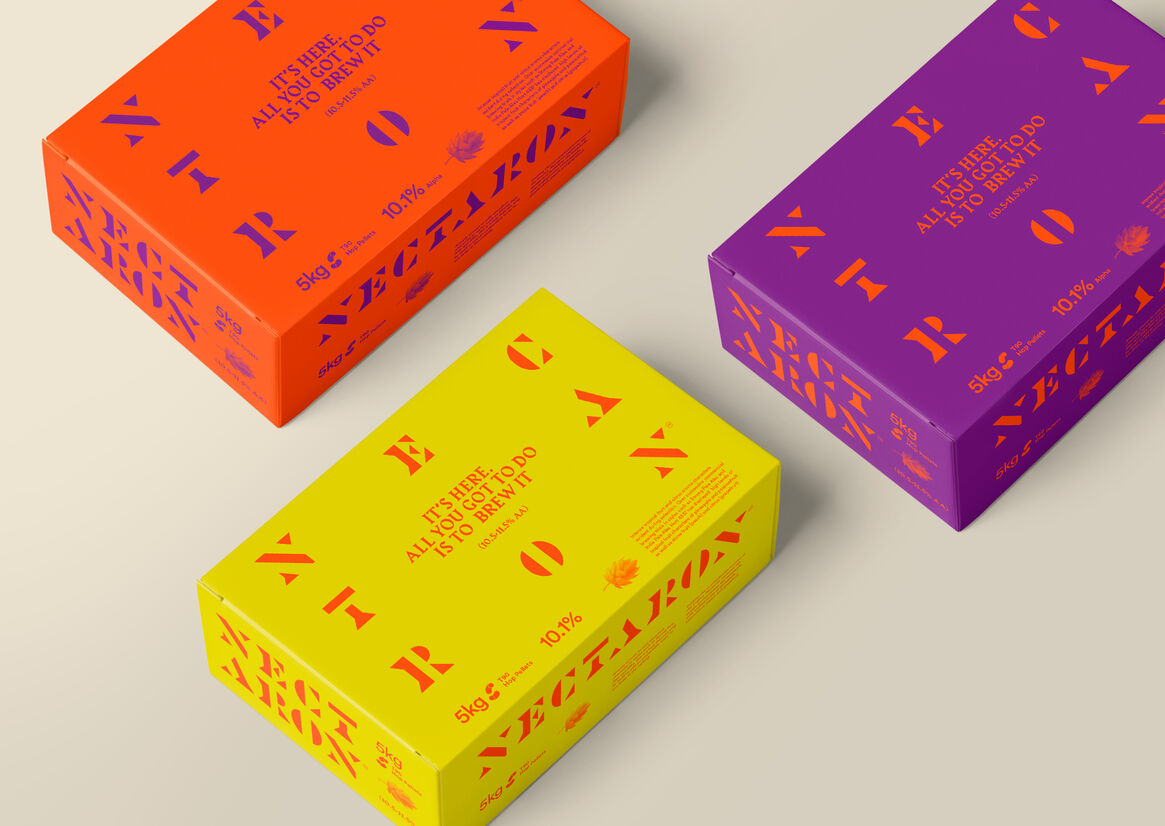
Our colour palette followed, with vibrant, vivid, intense colours that packed almost as much punch as the hop itself.
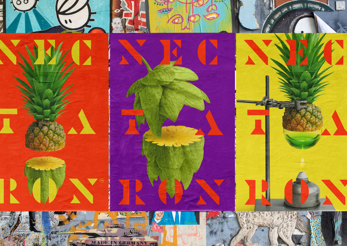
These elements became a flexible brand toolkit. They could combine in ways that became playful in comms, informative in sales material, eye-catching in motion, and practical on packaging.
All of this gave Nectaron a distinctive brand identity that kept one foot in tradition and another in innovation, allowing it to stand out in the tough-to-crack international craft brewer’s market.