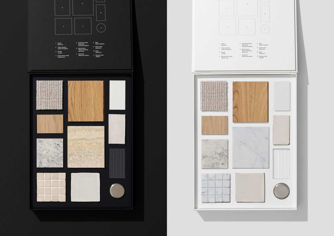
A singular presence in the harbourside suburb of Darling Point, MONA is home to a luxurious selection of 1, 2 and 3-bedroom apartments. Defined by nuanced detail and elegant flourishes. Inspired by the chic urban edge of apartment living in 1970s New York. Bold shapes and materiality reflect the surrounding Art Deco buildings. Crafted tonal bricks add artisanal warmth. Window portals frame enviable outlooks. While private terraces command sweeping views of Rushcutters Bay, the city skyline and Sydney Harbour.
MONA presented the opportunity for a narrative never seen in Sydney’s Eastern Suburbs. Urban culture meets New York chic. The inspiration was the circa 1976 NYC studio of Elsa Perretti, the Italian model-turned-revolutionary jewellery designer. With a highly discerning audience, the MONA design needed to reflect ‘a life well lived’. Beyond merely a property, MONA was a platform that would enhance each buyer’s lifestyle and personal brand.
The design response imagines MONA not as a building, but as an individual. A strong mind carving her own path, celebrating personal style and never compromising.
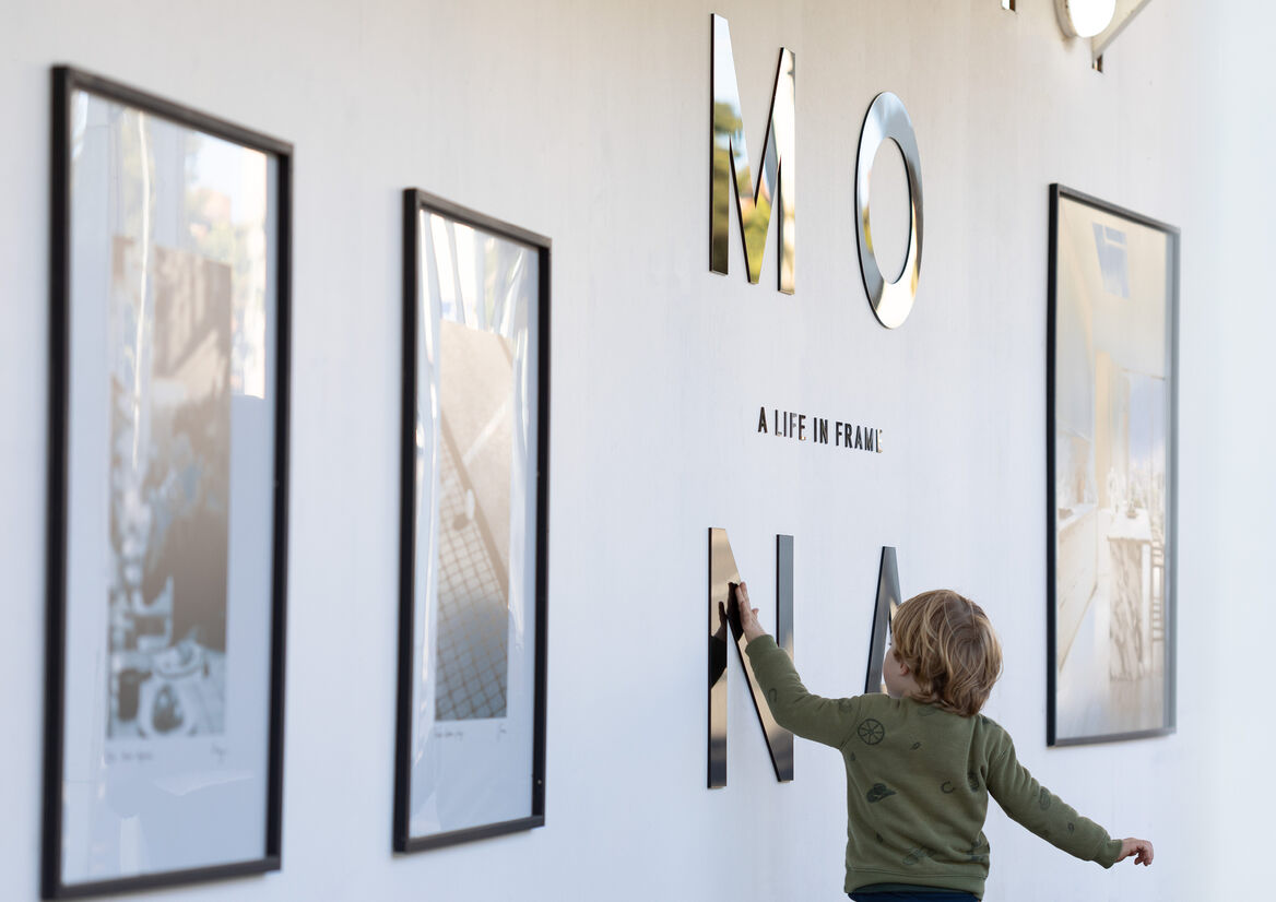
MONA frames modern life with rich beauty. Bold, minimal and timeless, MONA’s restrained monochromatic palette reflects a life of elegance and simplicity. To evoke a sense of style and play, MONA presents black and white reportage-style street photography as a candid gallery of modern life.
Strong black framing elements draw the eye to MONA’s key messages and moments. Her copy is simple and effortless, interspersed with expressive, handwritten notes as though penned by Elsa Perretti herself.
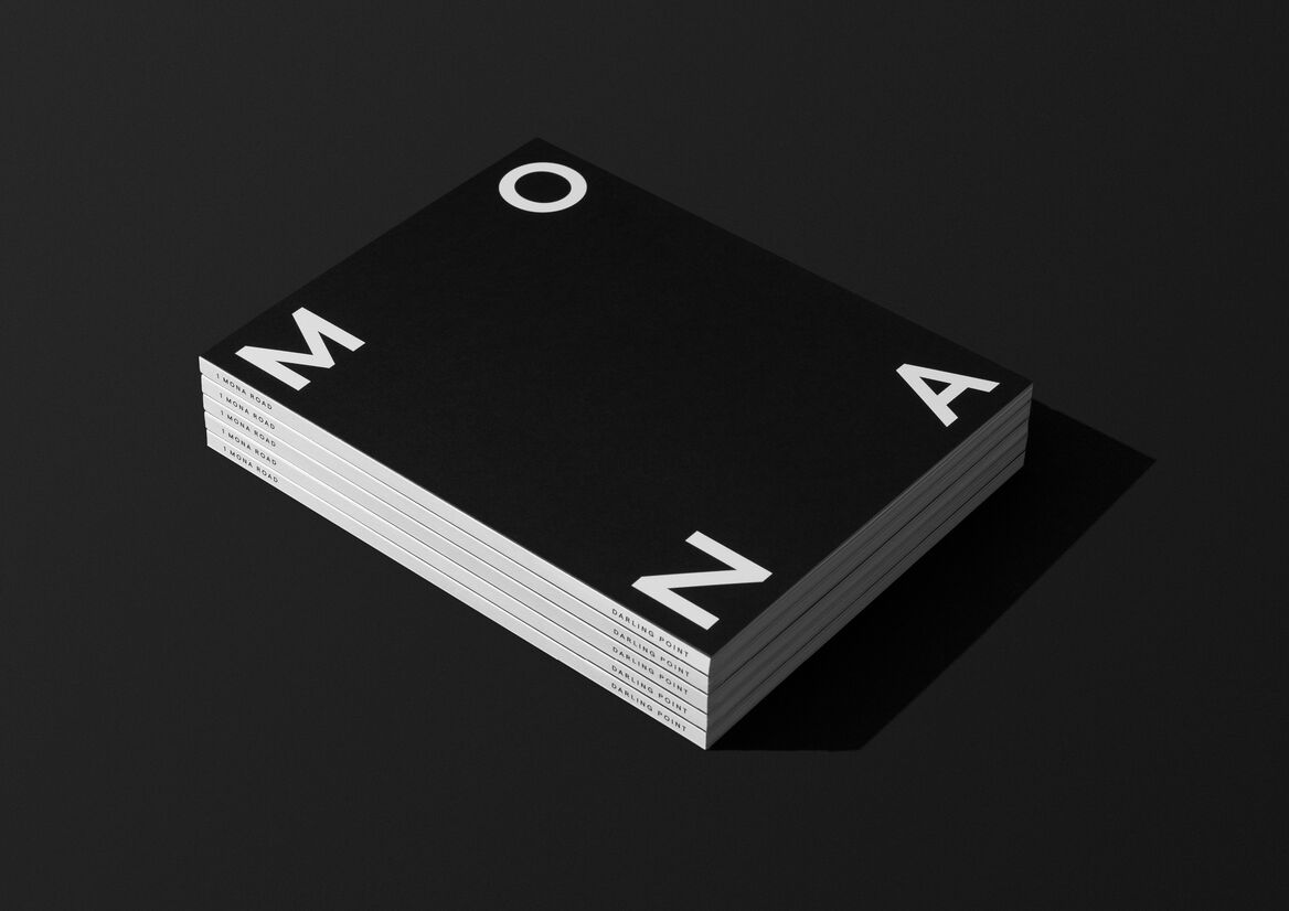
The MONA logo presents as its own abstract frame. The custom width four letters lock to corners and morph effortlessly with each application.
Paragraph copy is justified at full width, resulting in hard-edged sides and right angles that amplify the ‘A life in frame’ positioning. Handwritten elements provide personalised touches. Die-cut frames create focussed moments to draw in the reader.
The hoarding was used to present a gallery of framed campaign images with individual vinyl lettering crowned by a striking MONA lightbox. For the display suite, custom entry brickwork and exterior glass ‘frame’ decals of the display suite reflected New York apartment living. Inside, visitors experience a walk-through gallery of MONA renders and B&W photography.


Description:
MONA—A life in frame
A singular presence in the harbourside suburb of Darling Point, MONA is home to a luxurious selection of 1, 2 and 3-bedroom apartments. Defined by nuanced detail and elegant flourishes. Inspired by the chic urban edge of apartment living in 1970s New York. Bold shapes and materiality reflect the surrounding Art Deco buildings. Crafted tonal bricks add artisanal warmth. Window portals frame enviable outlooks. While private terraces command sweeping views of Rushcutters Bay, the city skyline and Sydney Harbour.
MONA presented the opportunity for a narrative never seen in Sydney’s Eastern Suburbs. Urban culture meets New York chic. The inspiration was the circa 1976 NYC studio of Elsa Perretti, the Italian model-turned-revolutionary jewellery designer. With a highly discerning audience, the MONA design needed to reflect ‘a life well lived’. Beyond merely a property, MONA was a platform that would enhance each buyer’s lifestyle and personal brand.
The design response imagines MONA not as a building, but as an individual. A strong mind carving her own path, celebrating personal style and never compromising.
MONA frames modern life with rich beauty. Bold, minimal and timeless, MONA’s restrained monochromatic palette reflects a life of elegance and simplicity. To evoke a sense of style and play, MONA presents black and white reportage-style street photography as a candid gallery of modern life.
Strong black framing elements draw the eye to MONA’s key messages and moments. Her copy is simple and effortless, interspersed with expressive, handwritten notes as though penned by Elsa Perretti herself.
The MONA logo presents as its own abstract frame. The custom width four letters lock to corners and morph effortlessly with each application.
Paragraph copy is justified at full width, resulting in hard-edged sides and right angles that amplify the ‘A life in frame’ positioning. Handwritten elements provide personalised touches. Die-cut frames create focussed moments to draw in the reader.
The hoarding was used to present a gallery of framed campaign images with individual vinyl lettering crowned by a striking MONA lightbox. For the display suite, custom entry brickwork and exterior glass ‘frame’ decals of the display suite reflected New York apartment living. Inside, visitors experience a walk-through gallery of MONA renders and B&W photography.