Graphic
Principals 25 Active Super Rebrand
-
Pou Auaha / Creative Directors
Simon Wright, Darren Swain
-
Ringatoi Matua / Design Director
James Welch
-
Ngā Kaimahi / Team Members
Moensie Rossier, Hamish Cargill, Tui Horo, Jen Currie, Carolina Relander, Jordan Demetriou, David Cunningham, Nathan Mcilvain, Lisa Wilson, Blair Patterson, Mark Li -
Kaitautoko / Contributor
Video Credit: SLIK -
Client
Active Super
Description:
To kick-start step-change growth and reinvigorate its member base, industry super fund Local Government Super (LGS) needed to reposition itself to appeal to a broader range of members beyond public service.
We identified a nugget of truth that encapsulated LGS’s responsible investment philosophy and made it exciting and appealing to a new generation, while bringing existing members along the journey. With a new name, Active Super, which opened up new possibilities, and a bold new identity, we’ve shaken up the sector and set Active Super up to achieve its ambition for member growth.
While new brands in the responsible investing space were already very vocal, LGS had signed up to the UN Principles for Responsible Investment as early as 2007. It was their best kept secret. With more Australians driven by a desire for positive change in the world, as well as a desire to thrive in life, it was time to bring LGS’s hidden strengths to the fore.
We identified that LGS’s long-standing investment philosophy, “We believe responsible investing underpins strong performance,” should be the foundation of the brand positioning.
Building on LGS’s community heritage and the performance benefits of responsible investing, we developed the strategic brand idea, “Building wealth on good foundations.”
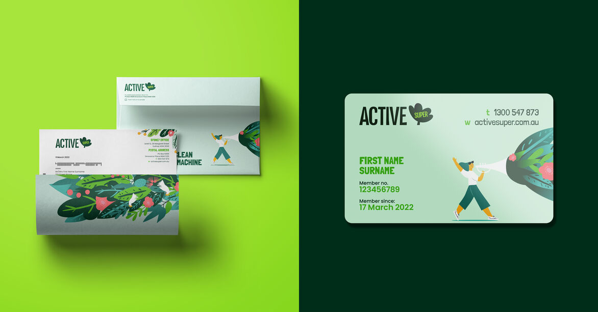
This was the springboard for a new name, Active Super, a vibrant new voice and design. The name reflects the organisation’s active involvement, driving positive change in organisations and local communities, while empowering members to take an active role in their super.
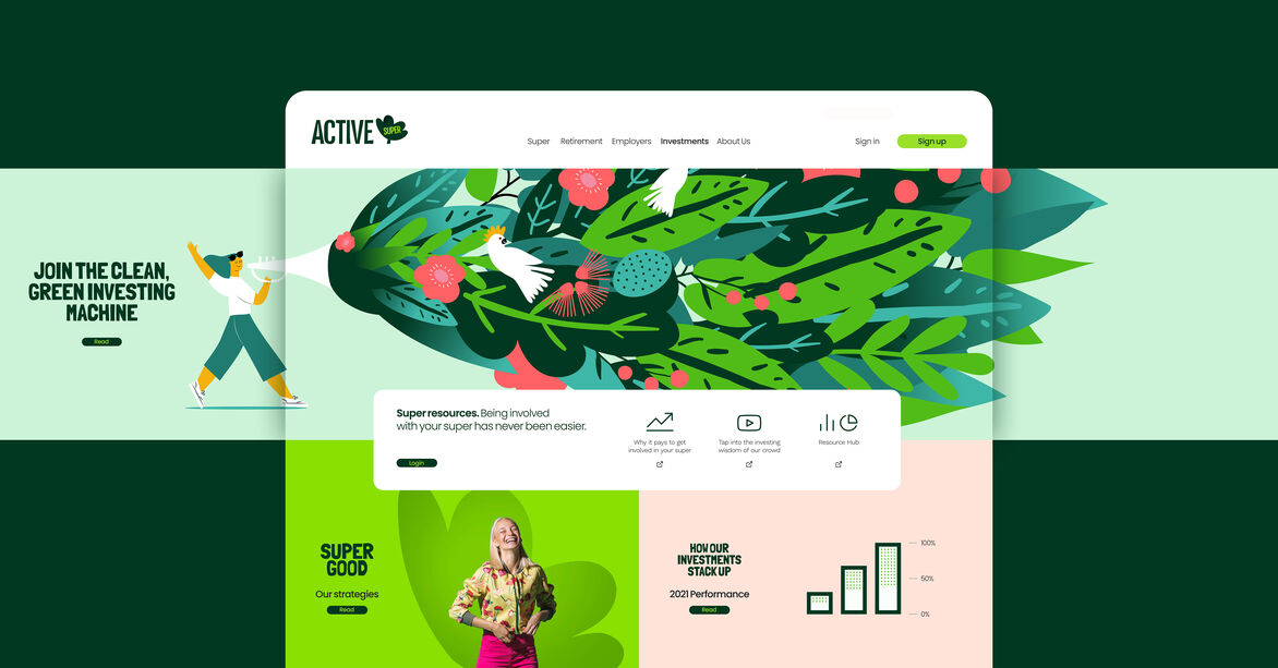
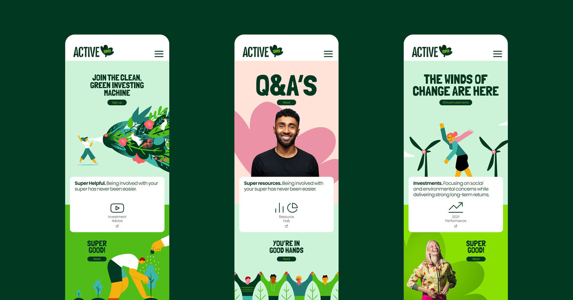
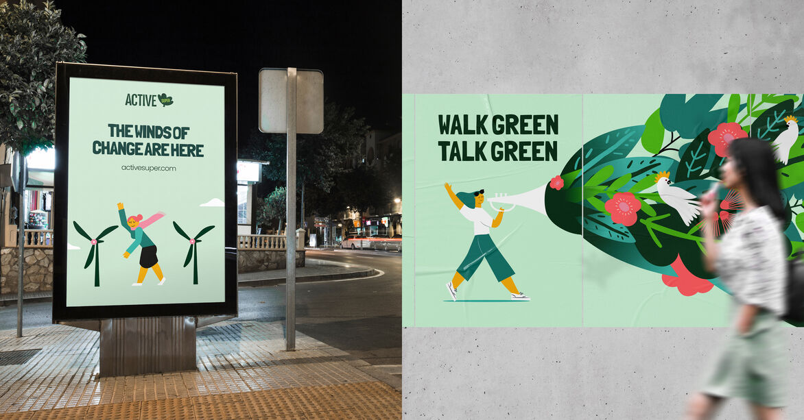
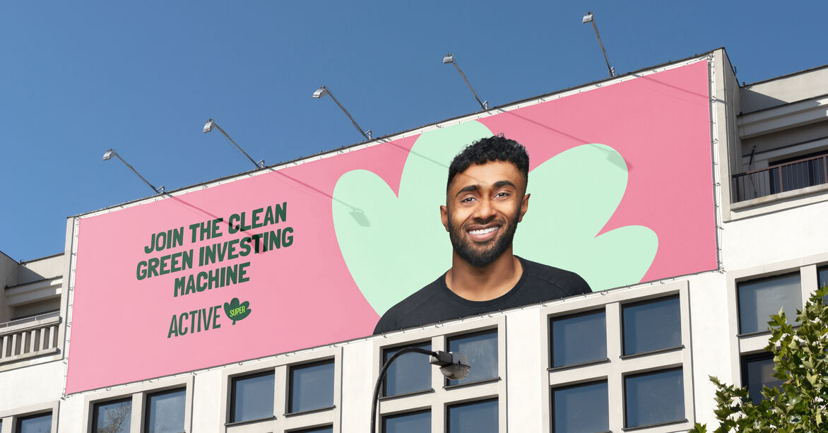
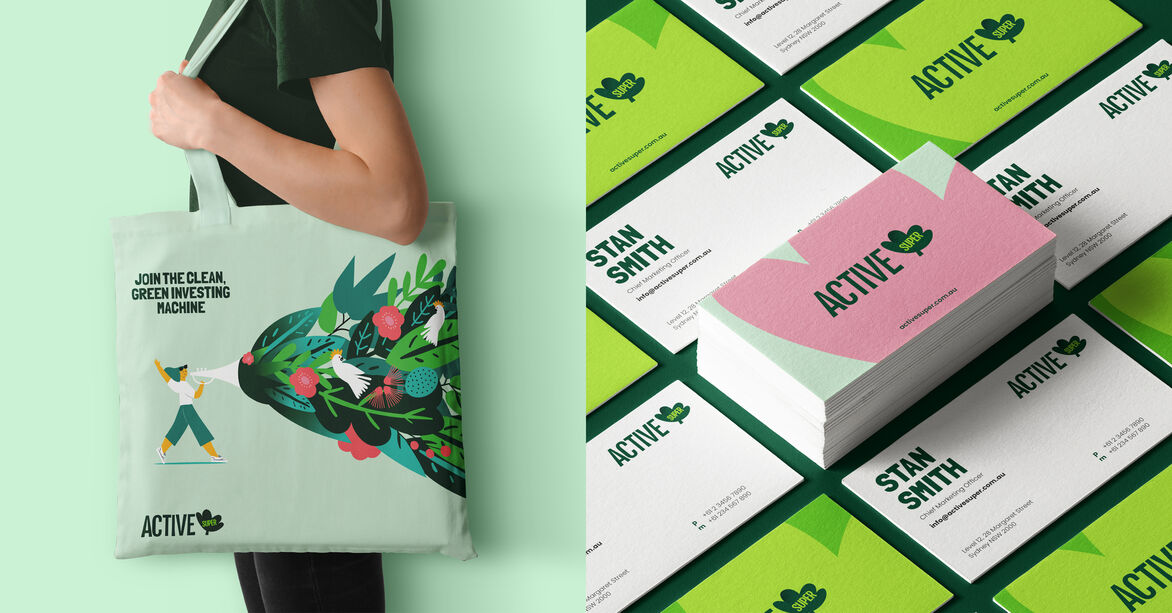
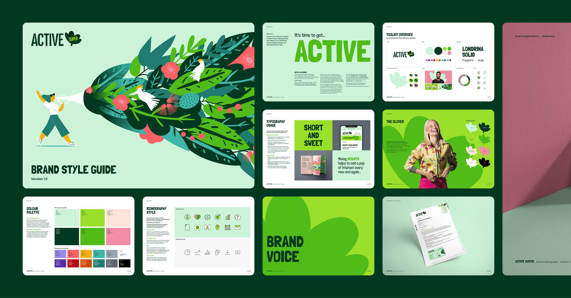
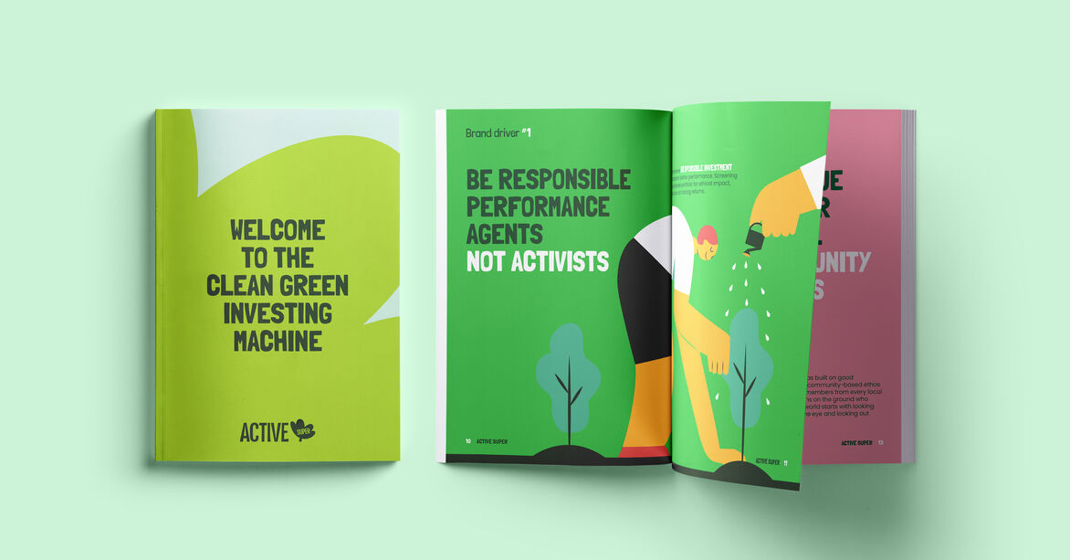
The brand idea inspired our bold new visual identity concept, “The clean green investing machine.”
In contrast to the competition, which tends to be either corporate and serious, or quite militant and activism-oriented, polarising old and young, our fresh design excites people of all ages. It reassures existing members of the fund’s strong performance, while appealing to purpose-driven Australians. Its warm-hearted optimism aligns to everyone’s hopes for the future.
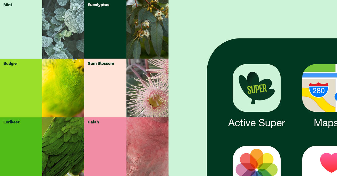
The exuberant new brand disrupts the category and appeals to multiple generations of community-minded people, who see their success and sustainability as intertwined. The illustration style is bold and colourful, with a serious message delivered in a playful way.
It transforms LGS into a modern, mobile-first digital enterprise that is innovative and authentic. It underpinned a website redesign, an upgraded app with increased functionality, and helped improve the overall multichannel member engagement experience.
Our design work and approach helped realise the client’s desire for all agency partners to work collaboratively as a combined ‘super agency’ on the project to not only provide members with a refreshed brand, but also with a new digital experience.
On the back of brand voice and alignment workshops and an energising office rebrand, the new brand is driving cultural momentum, which is translating into an improved, consistent customer experience. Chantal Walker, Chief Digital and Marketing Officer, said, “Everyone has a new revitalised spring in their step. It’s amazing what even a simple name change can do to people’s energy levels!”