Graphic
Milk 66 Blunt
-
Pou Auaha / Creative Director
Sarah Melrose -
Pou Rautaki / Strategic Lead
Ben Reid
-
Ringatoi Matua / Design Director
Anthony Hos -
Kaituhi Matua / Copywriter Lead
Kate Phillips
-
Ngā Kaimahi / Team Members
Kate Forsythe, Eden Harris, Ethan Lowe, Harriet Campbell, Alyssa Miller, Gemma Scott, Josh Daly, Adeline Chua, Michael Crampin, Simon Cairns -
Kaitautoko / Contributors
WorkGroup, Studio Almond -
Client
Blunt Umbrellas NZ

Description:
Blunt umbrellas are an award-winning iconic Aotearoa New Zealand product. Beautifully designed, they are a true kiwi innovation. But this love for Blunt was limited to our shores.
Through research, we discovered the current brand was just a sales portal, lacking emotional connection. We needed to build out a global brand platform that aligned product love with a brand love - bringing heart, emotion, and character with a rich visual language.
We started with the core strategy, and founder Greig Brebner, bringing his design journey to light through a new narrative. We created a new guiding brand idea, ‘Engineering Joy’. A shorthand that defines Blunt’s technical innovation and the love and joy they generate with customers.
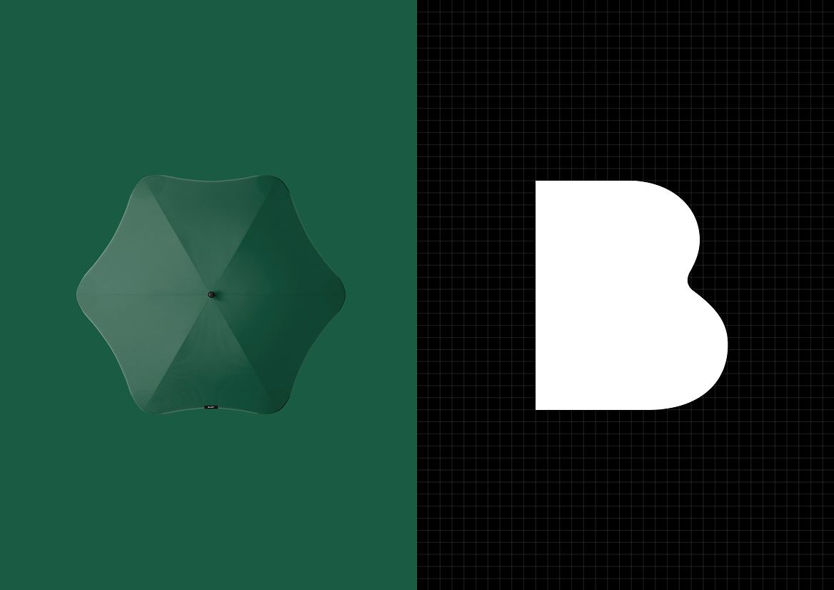
Blunt were looking to enter new regions like the UK and were designing new products that extended them into other categories, so we needed to shift them from just an umbrella brand to a lifestyle brand. This meant we needed to change the current umbrella-centric logo to something broader.
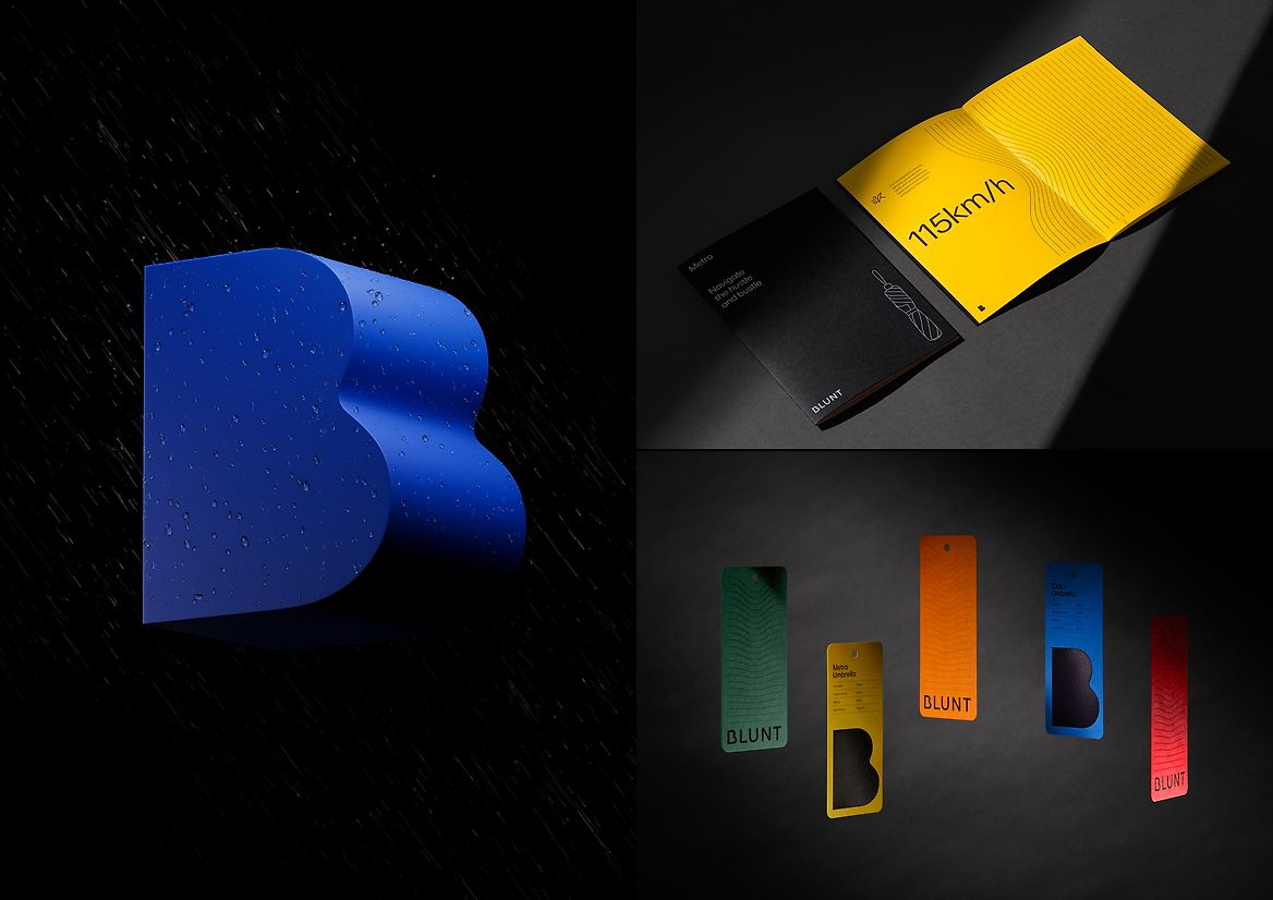
The new wordmark and ‘B’ symbol were designed to connect deeply with the iconic blunt curves of the umbrella and as a shorthand for the new design principles we set with the Blunt team – reduction, beauty, confidence, and joy. They guided every verbal and visual expressions of the brand.
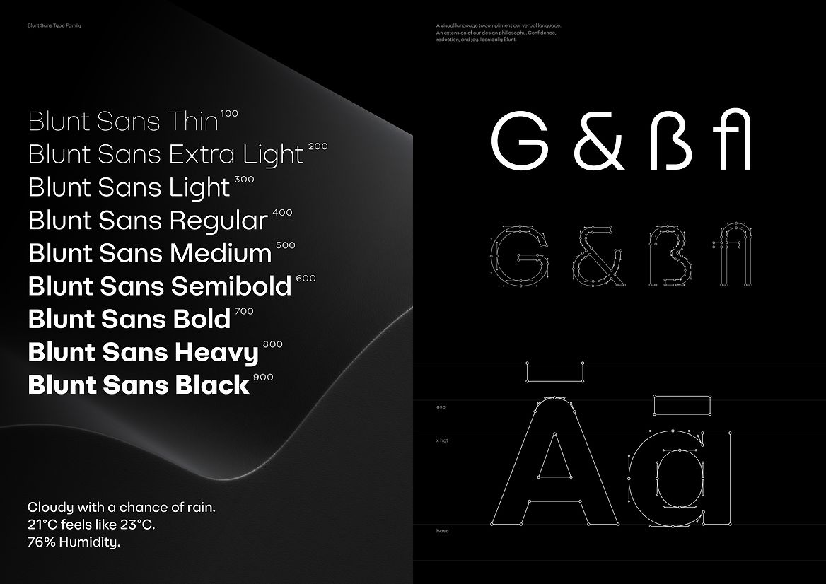
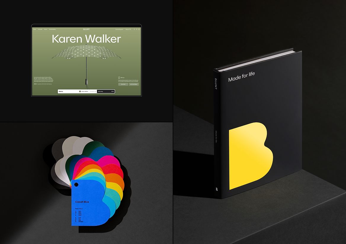
We created a new global custom typeface, Blunt Sans which was also engineered to contain the essence of the Blunt design principles. It’s both technical and refined, bold and strong, with a comprehensive type weight family able to allow different conversations through different channels.
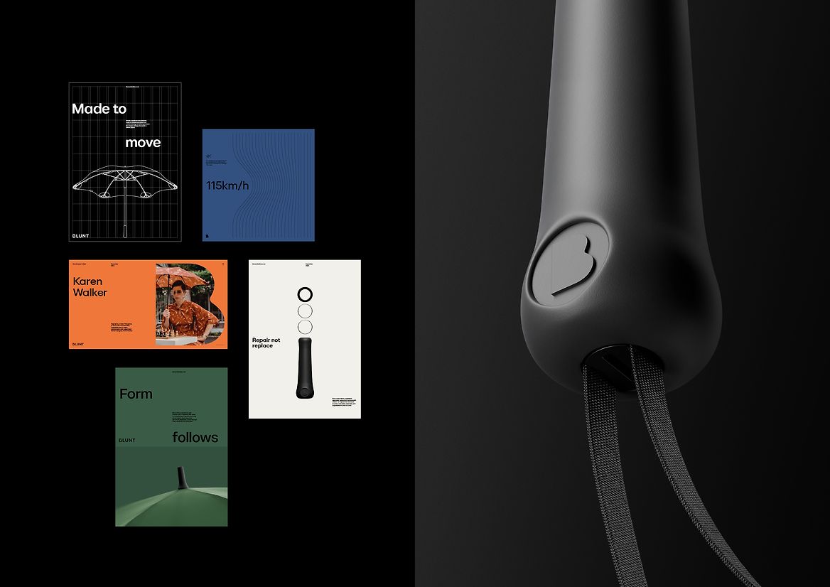
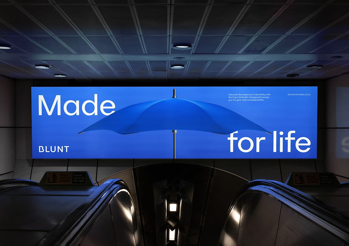
Capturing the essence of Blunt was to amplify and hero the very products that define the business. So instead of photography, we created 3D generated rendering of the umbrellas.
This gave us control over lighting, mood, and colour. We could animate and rotate the umbrella with ease to hero and highlight the beauty of their functional components.
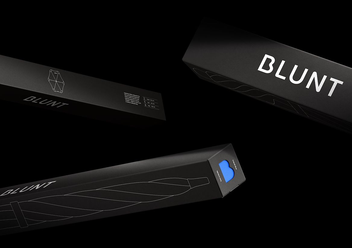
With a new sustainable lens, we redefined the way Blunt created its packaging. The existing packaging was made from 5 pieces with glue and 2 end-cap pieces of plastic. We reengineered the packaging, creating the main sleeve from a single piece of recyclable FSC certified core-flute and eliminated all glue and plastic.
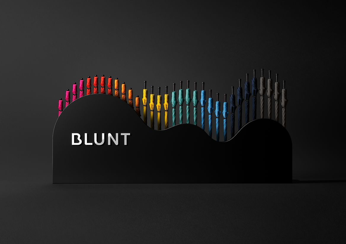
We purposefully crafted the packaging to integrate with ‘The Cloud’ merchandising system we designed. Its shape derived from a rotated Blunt B, echoing natural cloud-like forms. Our modular design meant this idea could easily scale up and down to suit any retail environment, and cleverly house the additional packaging in its sides.
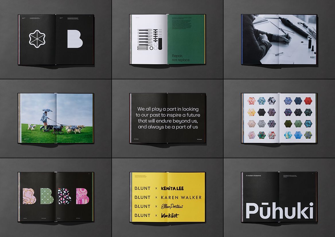
From positioning and strategy to full design system - wordmark, typeface, graphic devices, illustrations, icons, colours, product renders, packaging, merchandising, collaborations, and communications. The seamless Blunt curvature runs through everything in the system.
Driven by our design principles, the result is a brand that people love just as much as the product. A brand that’s an experience. A complete, immersive, and iconic Blunt world of beautifully designed, human centred products.
Judge's comments:
An exceptional brand & system for a unique Kiwi innovation. We loved how the “Engineering Joy” strategy informed every touchpoint of the brand, from the brand identity, display stand, typeface etc… Such an outstanding piece of work to come out of Aotearoa to take on the world!