Extended Whānau
39
Toi Tū Toi Ora: Contemporary Māori Art
Credits
-
Pou Auaha / Creative Director
Tyrone Ohia
-
Ngā Kaimahi / Team Members
Rob Lewis, Rosabel Tan, Nigel Borell, Taarati Taiaroa, Brook Konia, Kirsten Lacy, Sarah Farrar, Tania Stoyanoff, Sara Laver, Clare McIntosh, Hilary Moloughney, Rachel Salazar, Samantha McKegg, Scott Everson, Hannah Manning-Scott, Emma Pritchard, Emma Jameson, Moira Russell, Charlotte Minards-Black, Lizzie Baikie, Alice Tyler, Emma Elsom, Jennifer French, Paul Chapman, Jeremy Sherlock, Chelsea Winstanley, Maree Sheehan, Jeremy Hansen, Jodie Fay -
Kaitautoko / Contributors
Auckland Art Gallery Toi o Tāmaki, Haerewa Māori Advisory Group, Britomart Group, Angus Muir Design
-
Client
Auckland Art Gallery Toi o Tāmaki

Description:
Toi Tū Toi Ora: Contemporary Māori Art is a landmark survey exhibition at the Auckland Art Gallery Toi o Tāmaki. It celebrates the dynamic, ever-changing expression of contemporary Māori art and is the largest show in the gallery’s history, featuring over 300 artworks from 111 artists.
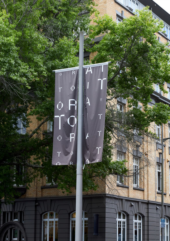
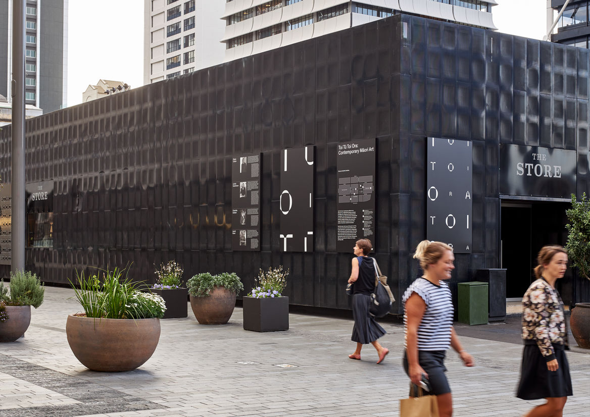
Based on the identity we created, we were tasked with designing the environmental graphics for the exhibition. The graphics spanned two locations – the gallery itself and the Britomart precinct which acted as an outdoor satellite gallery space.
Our approach was to apply the identity elements in a way that acknowledged and respected the inherent characteristics of these two different sites.
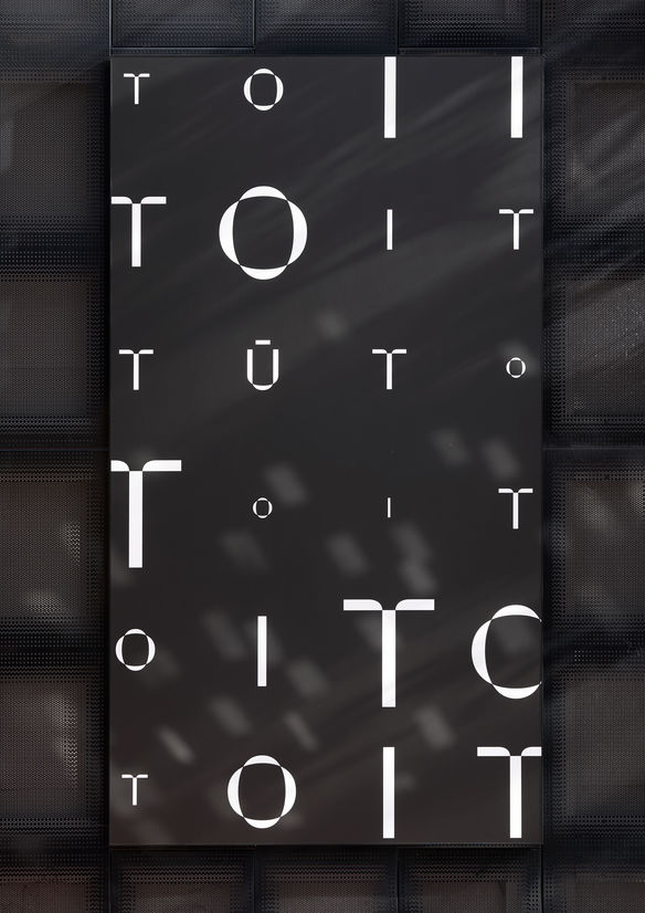
The shows curatorial framework is based on the Māori creation narrative. Rather than using conventional Western chronology to organise the works, Māori celestial origins become the organising principle.
Privileging these Māori concepts of time and space, the show’s title becomes an interwoven time scape and takes the form of an infinite, ever-changing pattern that spills out of the gallery and draws us into the Māori universe.
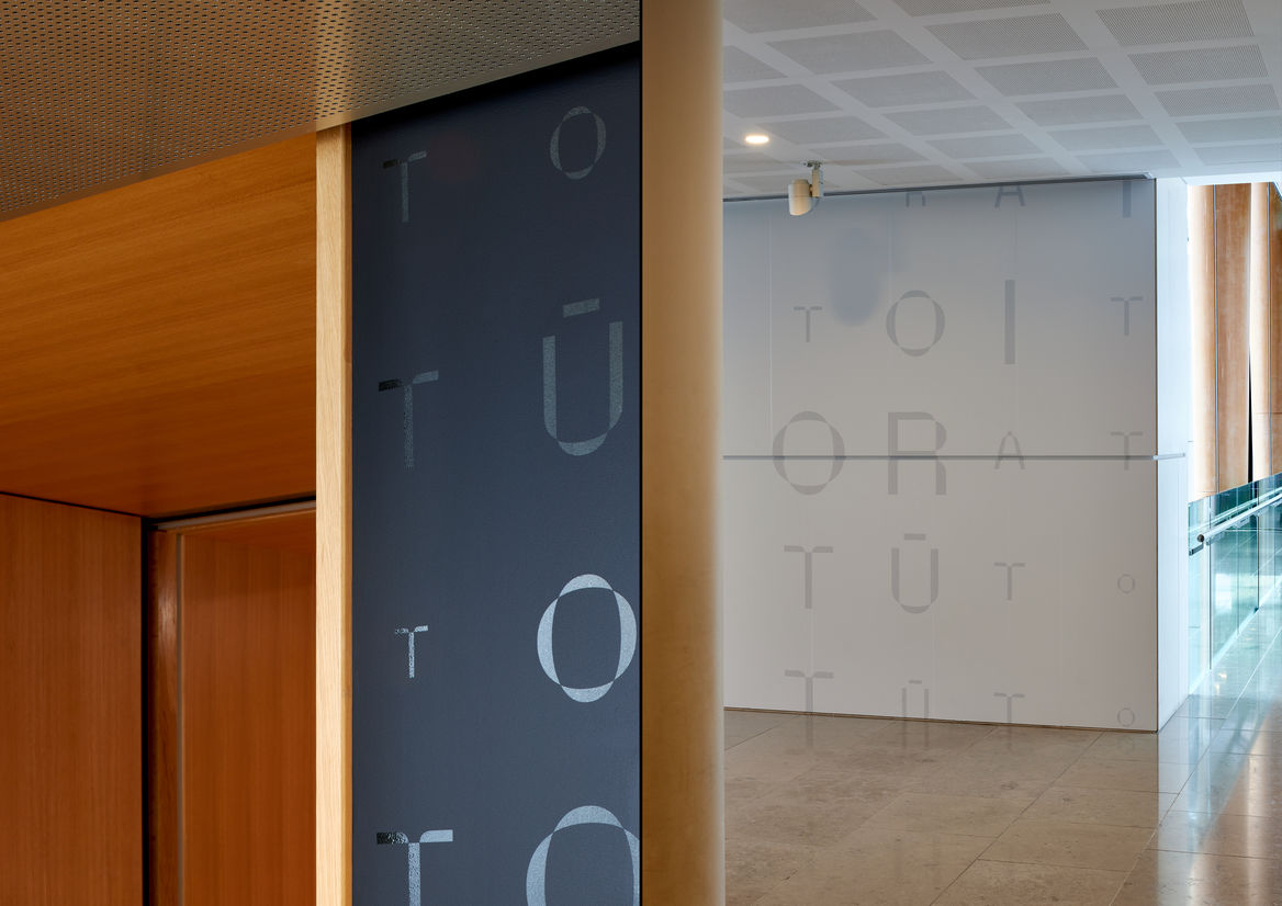
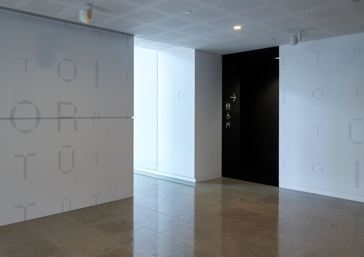
The words Toi Tū Toi Ora repeatedly chant their way through different spaces at different volumes.
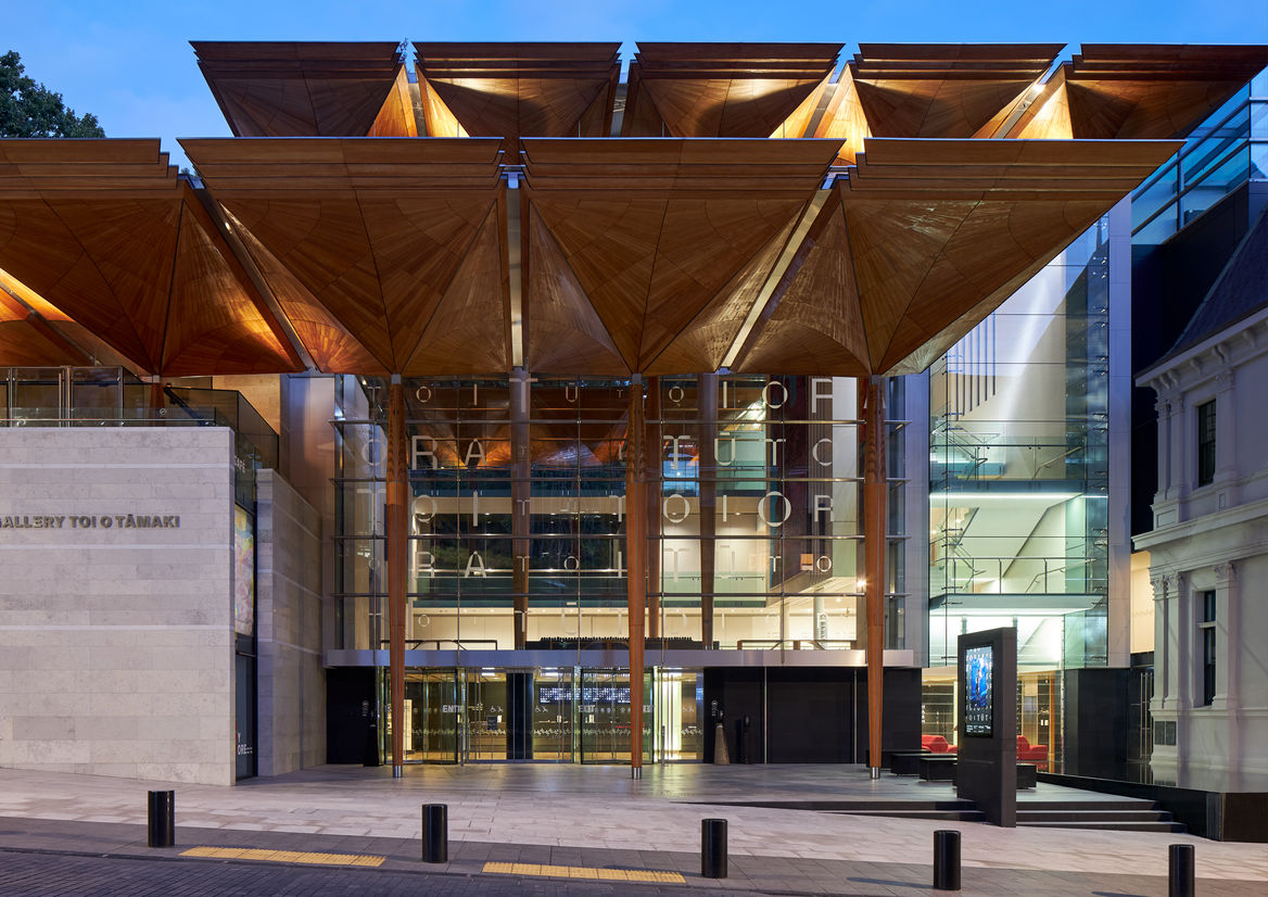
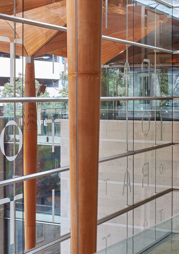
At the gallery, the graphics are informed by the Māori conceptual frameworks inherent in the architecture. Standing at the outside foyer, we are between kauri columns and the canopy in the realm of Tāne Mahuta. Here, on the exterior glass facade, the show's title becomes a collage of subtle dappled leaves.
Inside the ground floor entrance, we are in the realm of Papatūānuku, and entering Te Kore the exhibition’s first space, plunging into the darkness of the great nothingness. Here, our typographic pattern takes the form of gloss black letters sparkling against a porous black wall.
Upstairs, we enter the realm of Te Ao Mārama – the world of light and life. We see our graphics take on the lightness of white on white, marking the dramatic shift in the Māori creation narrative.
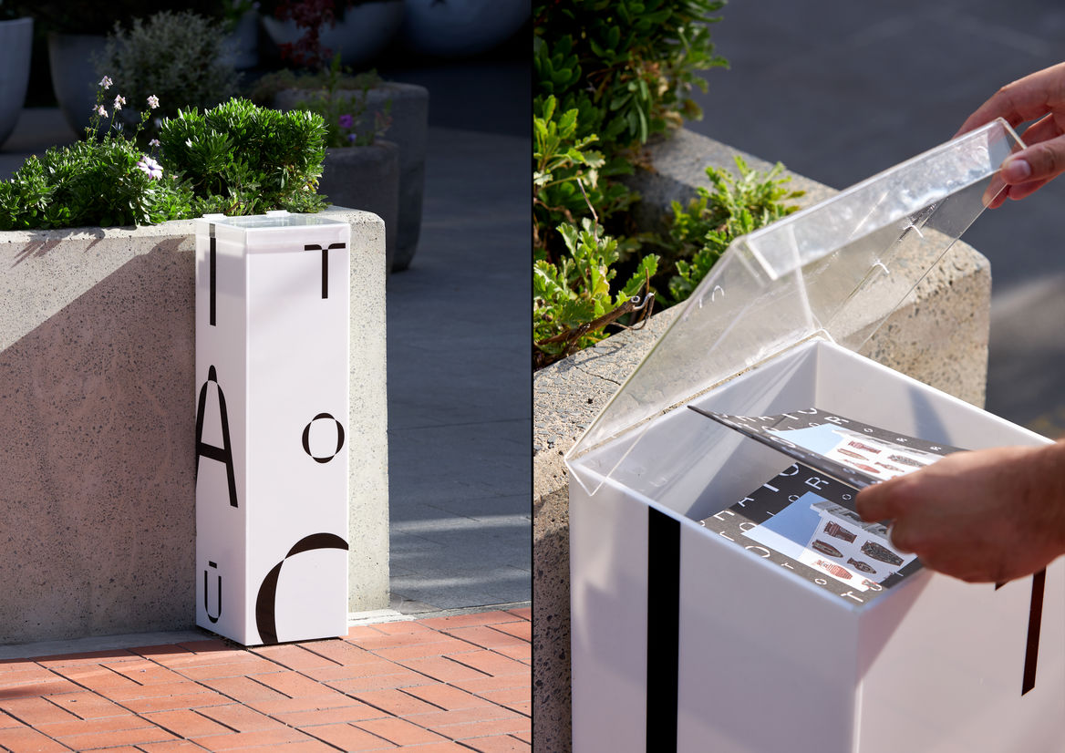
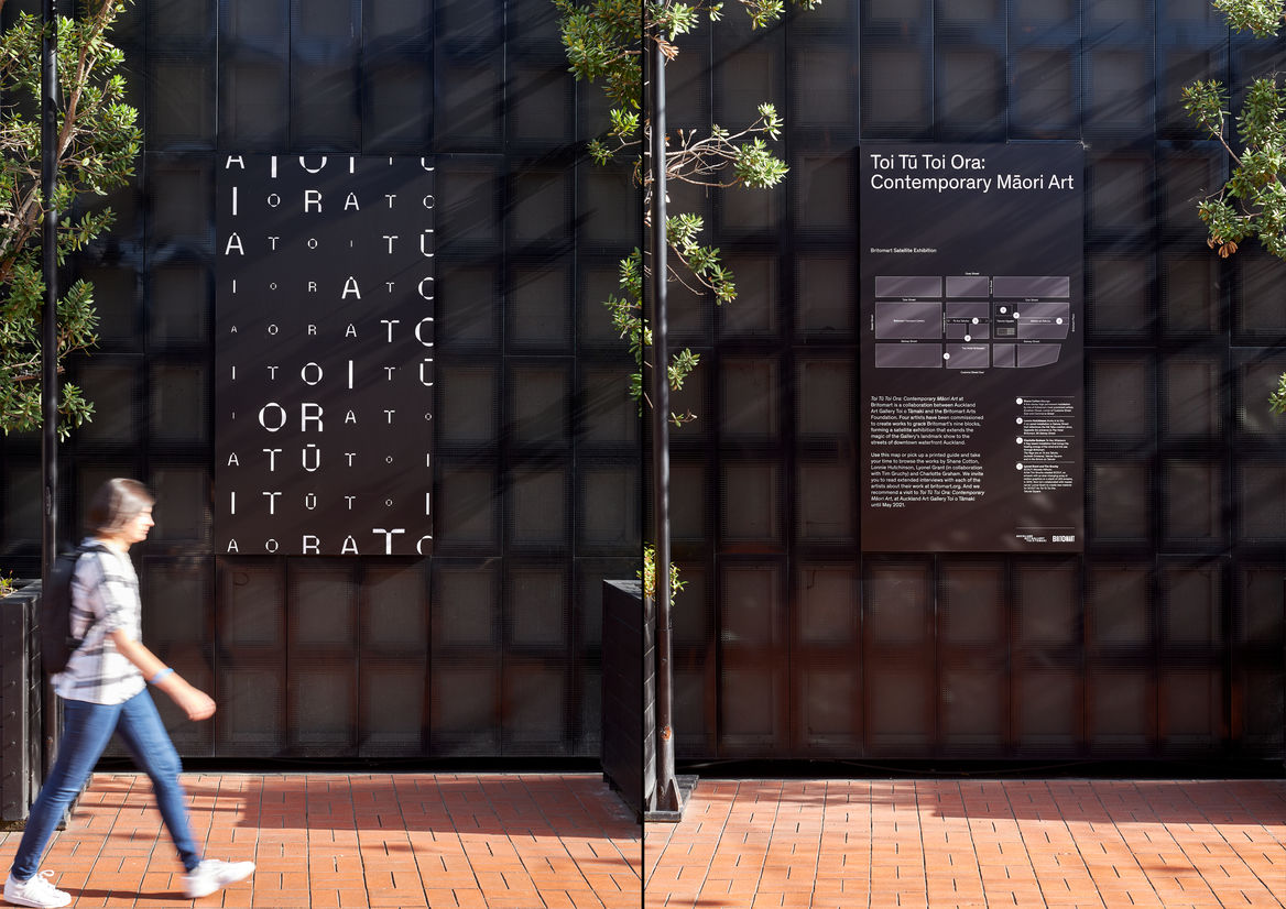
At our satellite site in Britomart, modular poster panels were created to integrate graphics into the black facade of Britomart’s central retail block. The contrast shifts to a stronger white on black palette to compete with the noise of the city. Large information panels with maps and artist bios inform passerby’s, and brochure plinths were designed and placed throughout the precinct at easy access.