Graphic
Richards Partners 34 Amaia of Takapuna
-
Ringatoi Matua / Design Director
Caroline Konarkowska
-
Ngā Kaimahi / Team Members
Kyle Ranudo, Tommy Chin, Ro Chen, Brya Taylor, Brian Richards, Scott Wallace -
Kaitautoko / Contributors
Wildlabs, Jinki Cambronero, Vertigo Motion, Jessica Gernat -
Client
Kingstone Property

Description:
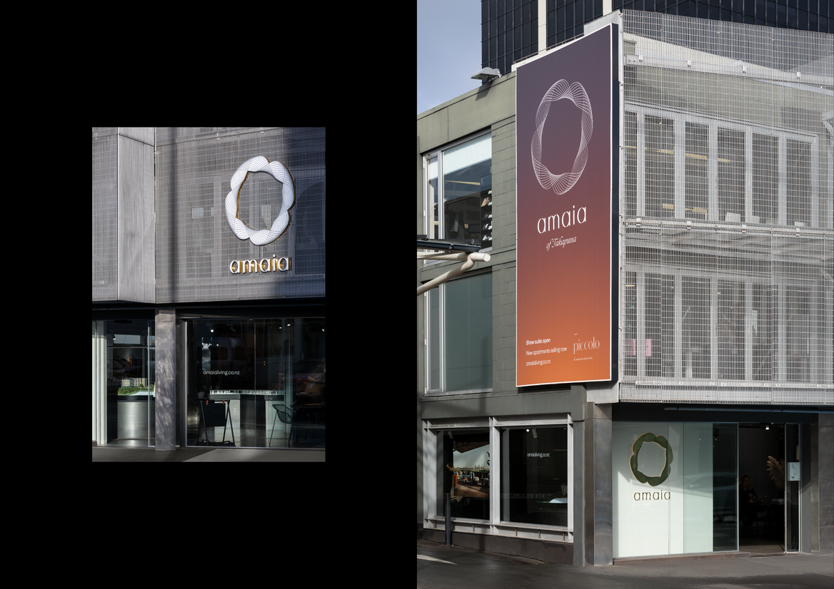
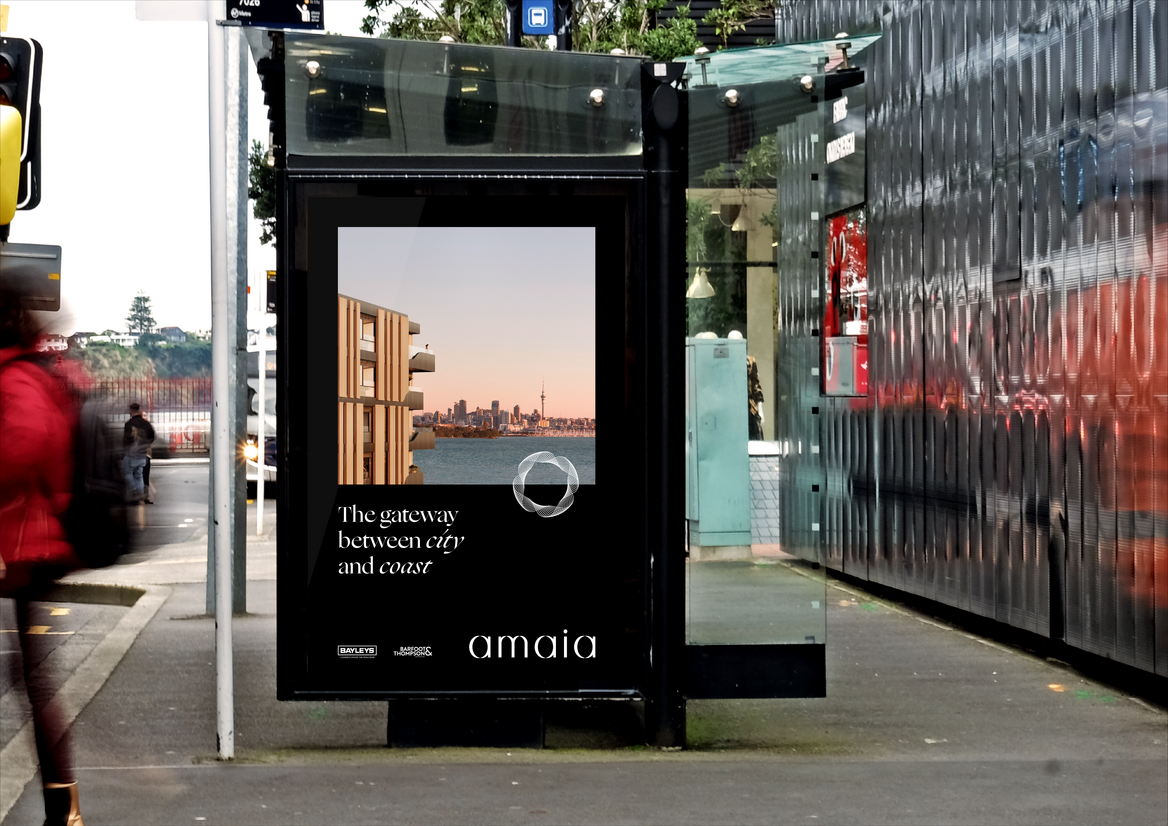
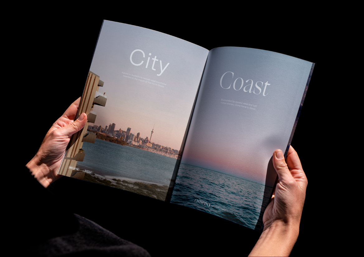
A mixed-use property development with the potential to combine the best of urban, suburban and coastal living, our client challenged us to create an appealing name, brand identity, and rollout for their new project on 48 Esmonde Road, Takapuna.
With skyrocketing housing prices and the death of the “quarter acre dream”, New Zealand is a country still adjusting to the idea that not everyone will be able to own a home and a section in the suburbs. Still, we all want to own our own space and the things that come with it; neighbourhood, community, and a sense of belonging.
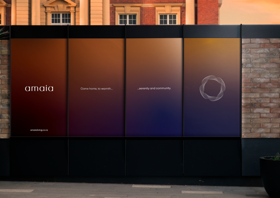
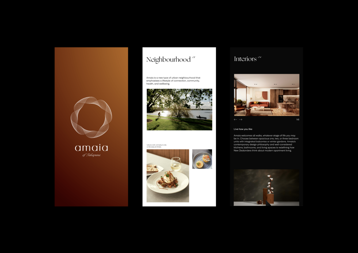
With this in mind, we set out to design an identity and rollout for more than just a property-brand. Amaia, which means “lunar rainbow” in Māori, is both a nod to the aspiring interculturalism of Auckland, and the shape of the land on which the development sits. Emphasizing warmth, connection, and community, the brand essence we developed, “redefining the urban neighbourhood”, alongside the visual identity, seeks to challenge the perception that apartment developments can’t offer the same quality of living promised by the suburban dream.
Throughout the Amaia rollout, we wanted to get across the homely sense of warmth that was foundational in the design of the brand identity. The Amaia target audience — primarily young professionals — will likely work in the CBD, finding themselves at home before and after their commutes, at sunrise and sunset.
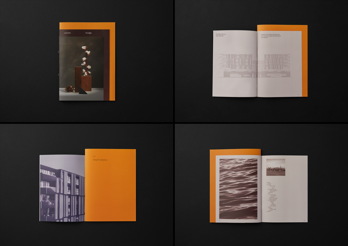
The colours and language used across comms were created to evoke the feeling of a new home, offering a glimpse of an idyllic future, and capturing the quiet golden-hour moments by the sea. Colour informed not only the print collateral and digital outputs, but guided the furniture styling in the show suite, the colour grading of the lifestyle photography, the time of day the renders depict, and even the relaxed tone of voice used in the copywriting. A poem written by one of our designers, features throughout the campaign material — typography laid out to echo the movement of the ocean.
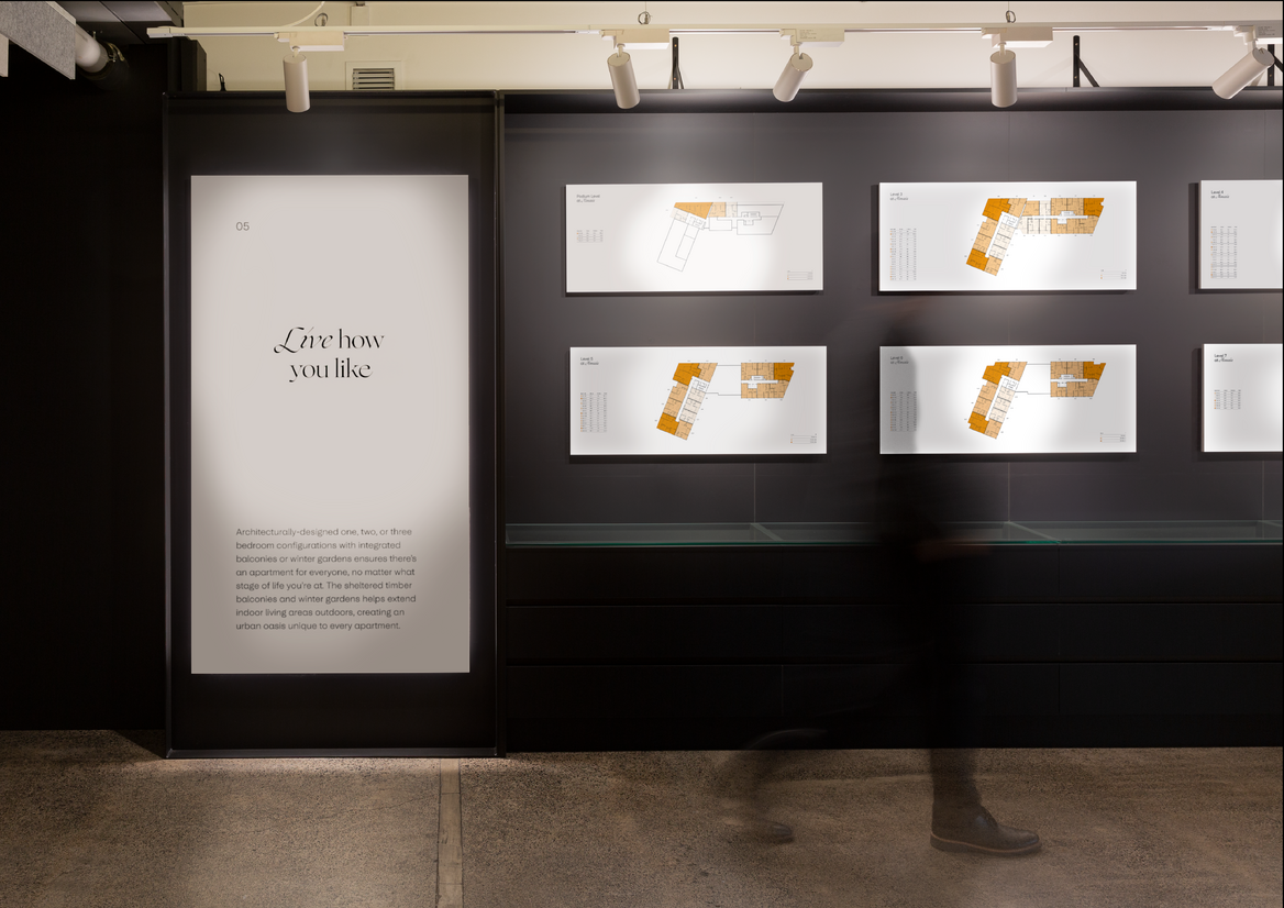
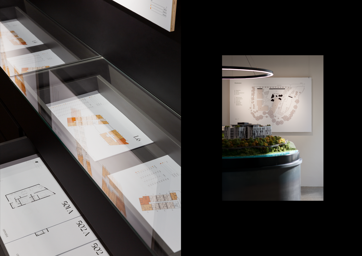
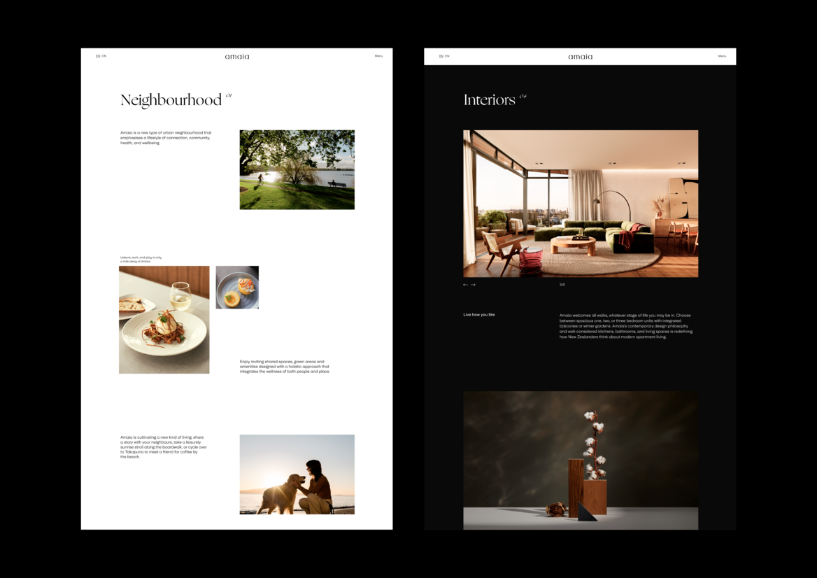
Ultimately the primary design communication task was to create a sense of place and feeling for those investing in a dream. A feeling of what it would be like to come home to Amaia on Takapuna.